🔥 Today Only: Save 30% on Premium — Offer Ends Soon! - Upgrade Now!
Table

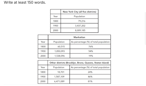
Band 4+: The first table below shows changes in the total population of New York City from 1800 to 2000. The second and third tables show changes in the population of the five districts of the city (Manhattan, Brooklyn, Bronx, Queens, Staten Island) over the same period. Summarise the information by selecting and reporting the main features, and make comparisons where relevant.

Image for topic: The first table below shows changes in the total population of New York City from 1800 to 2000. The second and third tables show changes in the population of the five districts of the city (Manhattan, Brooklyn, Bronx, Queens, Staten Island) over the same period. Summarise the information by selecting and reporting the main features, and make comparisons where relevant.
Our system will evaluate the answer based on this AI-generated description.
The image consists of three tables detailing population statistics for New York City and its districts across three selective years: 1800, 1900, and 2000. The first table displays New York City's total population, with figures: 79,216 in 1800, 3,437,202 in 1900, and 8,009,185 in 2000. The second table outlines Manhattan's population and its percentage relative to New York City's total population. Manhattan's population was 60,515 in 1800, accounting for 76% of New York City's population; in 1900 it recorded 1,850,093, comprising 54% of the total population; and in 2000 the population was 1,538,096, representing 19% of the total city population. The third table covers populations for other districts, namely Brooklyn, Bronx, Queens, and Staten Island, with respective populations: 18,701 in 1800 (24%), 1,587,109 in 1900 (46%), and 6,471,089 in 2000 (81%).
Given the complexity of the image, the above description may not be entirely accurate.
Note: Both the topic and the answer were created by one of our users.

The tables compares the percentage of population en different districts in New York City from 1800 to 2000.

Overall, it is evident that- amount of people in New York City increase in the last two decades. In addition, the percenatge of people that live in Manhattan is approximately the same with the another part of the New York City in – 1900s.

In 1800, the total population of New York City was approximately 80000 of people. At this time the percantage of people that live in Manhattan was approximatly 76%, when the other districts had one-fourth of the total population.

In 2000, the amout of people increased, and accomplished his peak- which is approximately 8 million of people. In Manhattan-lived about 20% of people from -city- which was decreased from

1800. Additionaly, the amount of people in other districts was the highest in the comparison with other years in this. districts.

Word Count: 151

Answers On The Same Topic:

The first table below shows changes in the total population of New York City from 1800 to 2000. The second and third tables show changes in the population of the five districts of the city (Manhattan, Brooklyn, Bronx, Queens, Staten Island) over the same period. Summarise the information by selecting and reporting the main features, and make comparisons where relevant.

The first table chart demonstrates the population of New York City (all five districts) between 1800 and 2000.Likewise,the other tables illusrate the population of Manhattan and other districts such as:Brooklyn,Bronx,Queens,Staten Island,but with percentage. Overall,the number of citizen in New York City increased,as the percentage of total population of other districts,not including Manhattan.Compare to other dictricts […]

The first table below shows changes in the total population of New York City from 1800 to 2000. The second and third tables show changes in the population of the five districts of the city (Manhattan, Brooklyn, Bronx, Queens, Staten Island) over the same period. Summarise the information by selecting and reporting the main features, and make comparisons where relevant.

The tables illustrate changes in New York City’s population (1800-2000), breaking down figures for Manhattan and other districts (Brooklyn, Bronx, Queens, Staten Island). Overall, New York City’s population grew significantly, from 79000 in 1800 to 8000000 in 2000. There was a notable shift in population distribution, with Manhattan gradually losing its dominant position. At the […]

The first table below shows changes in the total population of New York City from 1800 to 2000. The second and third tables show changes in the population of the five districts of the city (Manhattan, Brooklyn, Bronx, Queens, Staten Island) over the same period. Summarise the information by selecting and reporting the main features, and make comparisons where relevant.

The provided tables illustrate shifts in the demographic distribution across New York City’s districts over two centuries, from 1800 to 2000. Overall, the city’s total population experienced a dramatic hundredfold increase across the period. Concurrently, the demographic dominance shifted decisively from Manhattan to the other four districts. In 1800, New York City’s population was under […]

The first table below shows changes in the total population of New York City from 1800 to 2000. The second and third tables show changes in the population of the five districts of the city (Manhattan, Brooklyn, Bronx, Queens, Staten Island) over the same period. Summarise the information by selecting and reporting the main features, and make comparisons where relevant.

The tables show how the population was distributed across New York City’s boroughs over a 200-year period, from 1800 to 2000. Overall, the total population grew enormously, while the main concentration of people shifted away from Manhattan to the other four boroughs. In 1800, the city’s total population was under 80,000, and Manhattan accounted for […]

See All

Other Topics:

The tale below shows the estimated literacy rates by region and gender for 2000-2004. Summarise the information by selecting and reporting the main features, and make comparisons where relevant.

The table presents the approximate learning ratio by region and gender for 2000 to 2004. Overall, European and American individual had highest education rate, while africa had lowest. In all regions, literacy rate for males were higher then females. The largest gap was recognized in Africa, whereas the difference was smallest in Europe. First of […]

The table compares changes in tourism in Australia at three different time points. Summarize the information by selecting and reporting the main features and making comparisons where relevant. Write at least 150 words.

The table chart compares the number of international visitors to Australia at three different years (2013, 2018, 2023), by four main several reasons. Overall, the total number of visitors peaked substantially in 2018, before returned to its previous form in 2023. Subsequently, travelling for holiday and friends/relatives had a slight increase, while visiting for business […]

The table below shows the number of international students from five regions studying in the United Kingdom in 2019 and 2023. Summarise the information by selecting and reporting the main features, and make comparisons where relevant.

The provided table chart displays data on the number of international students in the Uk by region between 2019 and 2023. Overall, it can be seen that the highest figure was for Asia at 325,000, while +5,000 in North America accounted for the lowest rate. According to the table chart, in 2019, the number of […]

The table below gives information about the average distance in miles travelled by adults in a European capital city, by mode of travel, in 1977 and 2007. Summarise the information by selecting and reporting the main features, and make comparisons where relevant.

The table provides information about moderate distance in miles travelled by teenagers in a European capital city, by mode of travel, between 1977 and 2007. Units are measured in miles. Overall, walking, bicycle, motocycle, and bus showed decrease. Meanwhile, train and taxi experienced increase. Of particular note in car, where the highest number recorded. The […]

The table shows the average annual expenditure of university students in three different countries in 2017. Summarize the information by selecting and reporting the main features, and make comparisons where relevant.

The table illustrates the percentage of expenditure of university students in five different categories – accommodation, food, books, leisure and others – by three nations in 2017. Overall, it is clear that spending on accommodaton was relatively higher in all three nations than other expeditures. Australian students showed the highest interested on food and book, […]

SUmmarise the information by selecting and reporting some main features, and make comparisons where relevaant

The tables illustrate the results of surveys which gathered information on different aspects of living in a city were good or bad in the years 1980 and 2010. Overall, the surveys show that most people regarded on education, healthcare and environment as aspects of both years education had the lowest percentage of bad vote in […]

See All
We have detected unusual activity on your device.
Please verify your identity to continue.
Note: This verification step won't sign you in. If you have a premium account, please log in to access the service as usual.
Google/Gmail Verification
Or verify using Email/Code
We've sent a verification code to:
youremail@gmail.com (Not your email?)
Enter it below to complete the verification process.
Ensure your email address is correct, your inbox is not full, and you check your spam folder. If no email arrives, consider using an alternative email.
You will need a Premium plan to perform your action!
Note: If you already have a premium account, please log in to access our services as usual.

Plans & Pricing

Our mission is to make quality education accessible for everyone.
However, to keep our hardworking team running and this service alive, we genuinely need your support!
By opting for a premium plan, not only do you sustain us in achieving the mission, but you also unlock advanced features to enrich your learning experience.

Free

For learners who aren't pressed for time

What's included on Free
100+ Cambridge IELTS Tests
Instant IELTS Writing Task 1 & 2 Evaluation (2 times/month)
Instant IELTS Speaking Part 1, 2, & 3 Evaluation (2 times/month)
Instant IELTS Writing Task 1 & 2 Essay Generator (2 times/month)
500+ Dictation & Shadowing Exercises
100+ Pronunciation Exercises
Flashcards
Other Advanced Tools

Premium

For those serious about advancing their English proficiency, and for IELTS candidates aspiring to boost their band score by 1-2 points (especially in writing & speaking) in just 30 days or less

What's included on Premium
Save Your IELTS Test Progress & Analyze Mistakes By Question Type
Save Your Own Flashcard Sets & Use Them On Any Device
Unlock All Courses, IELTS Tests, Section & Part Practice
Unlimited AI Conversations
Unlimited AI Writing Enhancement Exercises
Unlimited IELTS Writing Task 1 & 2 Evaluation
Unlimited IELTS Speaking Part 1, 2, & 3 Evaluation
Checked Answers Will Not Be Published
Unlimited IELTS Writing Task 1 & 2 Essay Generator
Unlimited IELTS Speaking Part 1, 2, & 3 Sample Generator
Unlimited Usage Of Advanced Tools & AI Features
Priority Support within 24h (12-month plan only)

Due to the nature of our service and the provided free trials, payments are non-refundable.