🔥 Today Only: Save 30% on Premium — Offer Ends Soon! - Upgrade Now!
Multiple Graphs

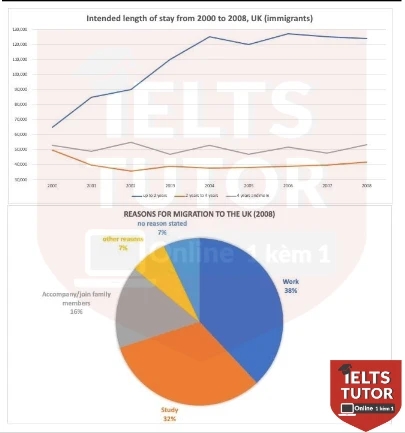
Band 5+: The graph and chart give information about the migration to the UK between 2000 and 2008. The line graph shows the intended length of stay of immigrants. The pie chart shows the reasons for migration to the UK in 2008.

Image for topic: The graph and chart give information about the migration to the UK between 2000 and 2008. The line graph shows the intended length of stay of immigrants. The pie chart shows the reasons for migration to the UK in 2008.
Our system will evaluate the answer based on this AI-generated description.
The image comprises two sections: a line graph and a pie chart. The line graph depicts the intended length of stay (less than 2 months, 2 to 12 months, and more than 12 months) of immigrants in the UK from 2000 to 2008. In 2000, the figures were approximately: less than 2 months - 40,000; 2 to 12 months - around 82,000; more than 12 months - 100,000. By 2004, these figures increased to: less than 2 months - 50,000; 2 to 12 months - around 78,000; more than 12 months - 170,000. The peak in 2007 showed: less than 2 months - 70,000; 2 to 12 months - around 95,000; more than 12 months - 160,000. In 2008, numbers were: less than 2 months - 70,000; 2 to 12 months - 85,000; more than 12 months - 130,000. The pie chart displays reasons for migration to the UK in 2008: Work - 38%; Study - 32%; Accompany/join family members - 15%; Other reasons - 7%; No reasons stated - 8%.
Given the complexity of the image, the above description may not be entirely accurate.
Note: Both the topic and the answer were created by one of our users.

The caharts presented provided data on UK migration from 2000 to 2008. The line graph illustrates information about how long immigrants intend to stay, while pie charts illustrates the motivation for migration.

Overall, it is clear that the number of immigrants staying for 4 or more years remained unchanged over an eight-year period, whereas most of the immigrants lasted up to two years. In addition, main reason for migration was study and work.

Looking at the line graph in more detail, the number of immigrants intented to stay up to 2 years and 4 or more years started at the same point, 150,000 people in 2000. The number of individuals intented to short stays increased over the period, reaching 250,000 in 2004 and remained almost stable over the next four year. The figure of people planned to stay up two to four years experienced downward and upward fluctuations, when rose gradually and reached 100,000 end of the period.

In 2008, a significant proportion of immigrants migrated for work and study, relatively 38% and 32%. Remaining 16% of immigrants moved because of accompany and visiting family. Moreover, other 7% of people had other reasons, while other 7% stated no reason.

Word Count: 199

Answers On The Same Topic:

The graph and chart give information about the migration to the UK between 2000 and 2008. The line graph shows the intended length of stay of immigrants. The pie chart shows the reasons for migration to the UK in 2008.

Given are charts providing information about the immigrants to the United Kingdom. The line graph depicts the intended length of stay between 2000 and 2008, expressed in thousands, and the pie chart compares the reasons for migration (work, study, family, or other) in the year 2008. Overall, it is evident that the number of immigrants […]

The graph and chart give information about the migration to the UK between 2000 and 2008. The line graph shows the intended length of stay of immigrants. The pie chart shows the reasons for migration to the UK in 2008.

The line and pie charts illustrate data about the migration to the United Kingdom through 2000 and 2008. The graph demonstrates the period of time of stay of immigrants, while chart shows why individuals had migrated in 2008 Overall, most common time which is spend by immigrants in UK is from 2 to 4 years, […]

The graph and chart give information about the migration to the UK between 2000 and 2008. The line graph shows the intended length of stay of immigrants. The pie chart shows the reasons for migration to the UK in 2008.

The diagram and pie chart provide information about the length of intended stay for immigrants coming to the UK from 2000 to 2008, and the reasons for migration in 2008. Overall, it is clear that there was an upward trend in the number of immigrants intending to stay in the UK for less than 4 […]

The graph and chart give information about the migration to the UK between 2000 and 2008. The line graph shows the intended length of stay of immigrants. The pie chart shows the reasons for migration to the UK in 2008.

The diagram and pie chart give information about the intended length of people immigrating to the UK from 2000 to 2008 and causes for migration in 2008. Overall, it is clear that there was an upward trend in the numbers of immigrants intending to stay in the UK below 4 years while the reverse pattern […]

See All

Other Topics:

The bar chart below shows the numbers of men and women attending various evening courses at an adult education centre in the year 2009. The pie chart gives information about the ages of these course participants. Summarise the information by selecting and reporting the main features and makin comparisons where relevant. Write at least 150 words.

The given bar chart illustrates the numbers of both genders attending four different evening courses that were held at an adult education center in 2009, and the pie chart provides information about the participants’ ages. Overall, it can be seen that women participants showed the highest rate in three courses, and the people who are […]

You should spend about 20 minutes on this task. The line graphs below show the subscriptions to mobile and fixed phone lines in four different countries between 2005 and 2015. Summarise the information by selecting and reporting the main features and make comparisons where relevant. Write at least 150 words.

The line graphs illustrate the number of mobile and fixed telephone subscriptions per hundred people in Eritrea, India, the UK, and Uruguay between 2005 and 2015. Overall, mobile phone subscriptions increased significantly across all four countries, while fixed-line subscriptions declined or remained low. Uruguay and the UK had the highest mobile usage, whereas India showed […]

The chart below shows the resources used to make 1000 disposable cups in different materials: polystyrene and paper. Summarize the information by selecting and reporting the main features and make comparisons where relevant.

The bar chart illustrates the amount of different elements used to make 1000 polystyrene cups. The table gives information about the exact quantities of each resource used for both types of cups. It is clear that the production of polystyrene cups is environmentally friendly, because it costs less energy and dose not need to any […]

The line chart shows the average daily maximum and minimum temperatures in two Australian cities, Brisbane and Canberra, throughout the year. The bar chart illustrates the average number of days with rainfall per month in these two cities.

Given graphs illustrate the weather changes throughout the year in two Australian cities. The line chart shows the average daily maximum and minimum temperatures, while the bar chart illustrates the average number of rainy days per month in Brisbane and Canberra. Overall, it is clear that temperatures in both cities experienced almost the same trend, […]

The graph shows the projected monthly use of a health club in Miami, Florida by all full-time members over the next year. The pie charts show the age profile of male and female members. Summarise the information by selecting and reporting the main features, and make comparisons where relevant.

The bar graph provides information about how many full-time members will attend the health club every month in Miami, Florida over a span of a year. The age profile of males and females is illustrated by the accompanying pie charts. In terms of attendance, more males are expected to use the club compared to females […]

The diagrams below show changes of a cinema from 1980 until now. Summarize the information by selecting and reporting the main features, and make comparisons where relevant.

The diagrams illustrate how a cinema has changed between 1980 and the present day. Overall, the cinema has undergone considerable expansion, with the number of screening rooms increasing from two to five and several new facilities being added. Meanwhile, the former car park has been removed, while the toilet has been relocated. In 1980, a […]

See All
We have detected unusual activity on your device.
Please verify your identity to continue.
Note: This verification step won't sign you in. If you have a premium account, please log in to access the service as usual.
Google/Gmail Verification
Or verify using Email/Code
We've sent a verification code to:
youremail@gmail.com (Not your email?)
Enter it below to complete the verification process.
Ensure your email address is correct, your inbox is not full, and you check your spam folder. If no email arrives, consider using an alternative email.
You will need a Premium plan to perform your action!
Note: If you already have a premium account, please log in to access our services as usual.

Plans & Pricing

Our mission is to make quality education accessible for everyone.
However, to keep our hardworking team running and this service alive, we genuinely need your support!
By opting for a premium plan, not only do you sustain us in achieving the mission, but you also unlock advanced features to enrich your learning experience.

Free

For learners who aren't pressed for time

What's included on Free
100+ Cambridge IELTS Tests
Instant IELTS Writing Task 1 & 2 Evaluation (2 times/month)
Instant IELTS Speaking Part 1, 2, & 3 Evaluation (2 times/month)
Instant IELTS Writing Task 1 & 2 Essay Generator (2 times/month)
500+ Dictation & Shadowing Exercises
100+ Pronunciation Exercises
Flashcards
Other Advanced Tools

Premium

For those serious about advancing their English proficiency, and for IELTS candidates aspiring to boost their band score by 1-2 points (especially in writing & speaking) in just 30 days or less

What's included on Premium
Save Your IELTS Test Progress & Analyze Mistakes By Question Type
Save Your Own Flashcard Sets & Use Them On Any Device
Unlock All Courses, IELTS Tests, Section & Part Practice
Unlimited AI Conversations
Unlimited AI Writing Enhancement Exercises
Unlimited IELTS Writing Task 1 & 2 Evaluation
Unlimited IELTS Speaking Part 1, 2, & 3 Evaluation
Checked Answers Will Not Be Published
Unlimited IELTS Writing Task 1 & 2 Essay Generator
Unlimited IELTS Speaking Part 1, 2, & 3 Sample Generator
Unlimited Usage Of Advanced Tools & AI Features
Priority Support within 24h (12-month plan only)

Due to the nature of our service and the provided free trials, payments are non-refundable.