🔥 Today Only: Save 30% on Premium — Offer Ends Soon! - Upgrade Now!
Multiple Graphs

Band 6+: The graph and table below show the average monthly temperatures and the average number of hours of sunshine per year in three major cities Summarise the information by selecting and reporting the main features and make comparisons where relevant.

Image for topic: The graph and table below show the average monthly temperatures and the average number of hours of sunshine per year in three major cities Summarise the information by selecting and reporting the main features and make comparisons where relevant.
Our system will evaluate the answer based on this AI-generated description.
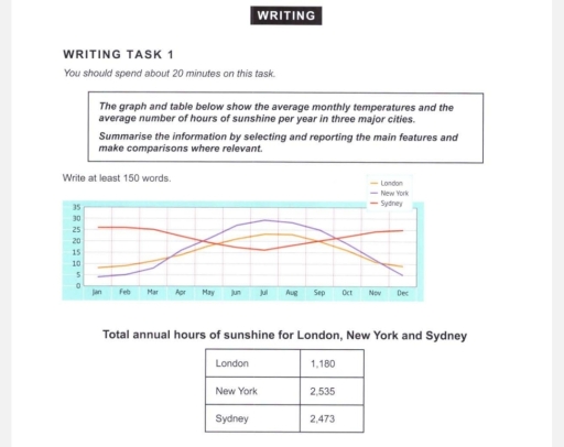
The image depicts a graph and a table; the graph illustrates average monthly temperatures over a year across three cities: London, New York, and Sydney, with temperatures in Celsius on the y-axis ranging from 0 to 30, matching months January to December on the x-axis; a line represents each city. Specific approximate monthly temperatures for London are: January 5°C, February 5°C, March 8°C, April 11°C, May 15°C, June 18°C, July 20°C, August 20°C, September 17°C, October 13°C, November 10°C, December 7°C. For New York: January 3°C, February 4°C, March 8°C, April 14°C, May 19°C, June 24°C, July 27°C, August 26°C, September 22°C, October 16°C, November 10°C, December 5°C. For Sydney: January 25°C, February 25°C, March 23°C, April 20°C, May 17°C, June 14°C, July 13°C, August 15°C, September 17°C, October 19°C, November 22°C, December 24°C. The table presents total annual hours of sunshine, with London at 1,180 hours, New York at 2,535 hours, and Sydney at 2,473 hours.
Given the complexity of the image, the above description may not be entirely accurate.
Note: Both the topic and the answer were created by one of our users.

The line graph illustrates the average monthly temperatures, while the table graph compares the popularity of different tupes of annual hours among sunshine in London, New- York, and Sydney. Overall, New York and London have similar temperature patterns, with hottest summer and coldest winter. The number of annual hours is highest in New York, followed by Sydney and London.

Looking at first, the proportion of warm months in New York increases sharply from around 5 °C in January to a peak of about 30°C in July, before a smilar pattern can be seen in London, where the temperature rises gradually from 7°C in January to around 20°C in July, followed by a decline to below 10°C in December.

In contrast, the temperature in Sydney is highest at the beginning of the year, at around 25°C and it drops steadily to about 15°C in July before rising again towards December, the number of annual sunshine in New York is 2,535 , followed by Sydney with 2, 473 . London records the lowest figure, at only 1, 180 per year.

Word Count: 178

Answers On The Same Topic:

The graph and table below show the average monthly temperatures and the average number of hours of sunshine per year in three major cities Summarise the information by selecting and reporting the main features and make comparisons where relevant.

The given datas give information about average monthly temperatures and average number of hours of sunshine per year in London, New York, and Sydney. Overall, it is very clear that New York has the highest degress of temperature and total annual hours of sunshine. In addition, London has no significant changes of temperature and has […]

The graph and table below show the average monthly temperatures and the average number of hours of sunshine per year in three major cities Summarise the information by selecting and reporting the main features and make comparisons where relevant.

The diagram illustrates the average monthly temperatures across three major cities – Sydney, London, and New York – whereas the second graph demonstrates the mean sunshine hours in the same cities. Overall, Sydney is recorded with the highest monthly temperatures, while London and New York’s temperatures have experienced major fluctuations throughout the period. New York […]

The graph and table below show the average monthly temperatures and the average number of hours of sunshine per year in three major cities Summarise the information by selecting and reporting the main features and make comparisons where relevant.

The diagram illustrates the average monthly temperatures across three major cities – Sydney, London, and New York – whereas the second graph demonstrates the mean sunshine hours in the same cities. Overall, Sydney is recorded with the highest monthly temperatures, while London and New York’s temperatures have shown a steady decline over the following months.New […]

The graph and table below show the average monthly temperatures and the average number of hours of sunshine per year in three major cities Summarise the information by selecting and reporting the main features and make comparisons where relevant.

The schemes demonstrate the average monthly degrees and entire sunny periods per year in the three megapolises. Overall, the New York and London cities witness identic trends of temperature rise in the warm periods, meanwhile Sydney’s climate follows the opposite weather alterations, getting cooled from spring to autumn. According to the table, sun shined the […]

See All

Other Topics:

The charts below show the results of a survey on adult education. The first chart shows the reasons why adults decide to study, while the pie chart shows how people think the costs of adult education should be shared.

The given charts depict data about adult education. The bar chart compares reasons for adults applying to education programs. The pie chart shows opinions about how the education fees should be divided. It is clear that the most common reasons to start getting education as a grown up are tied with maintaining an interest in […]

The bar chart shows different activities done among people participating in online education in 2024. The line graph shows the participation in online education activities from 2015 and 2024.

The bar graph compares the percentage of individuals involved in five specific types of e-learning in 2024, while the line chart illustrates the number of male and female participants in these activities from 2015 to 2024. Overall, online workshops were the most popular activity in 2024, whereas alternative activities accounted for the smallest proportion. In […]

The first chart shows the percentage of women and men in a country involved in some kinds of ne tasks (cooking, cleaning, pet caring and repairing the house). The second chart shows the amount of time each gender spent on each task per

The first chart demonstrates the percentage of women and men in a country involved doing some home tasks such as cooking, cleaning pet caring and repairing the house. However, the second chart indicates the time each gender spends on each task per day. In general, women involved and spend much time doing cooking, cleaning. Nevertheless, […]

The chart and table provide the allocation of men and women for the household activities, apart from paid work, in 2008 in the UK.

The table and bar chart give information about the allocation of male and female in the UK for household and leisure activities in 2008. Overall, the most popular leisure activities for both genders was watching TV, videos and listening to radio, while women spent more time on domestic responsibilities, especially cooking and washing. In addition, […]

The graph and the pie chart below give information on in-house training courses in a large financial company.

The diagrams depict information regarding a large financial company’s in-house training courses in pie and bar charts. Key information such as training hours per year and office workers’attitude to training are represented as figures. Overall, technical training accounts for the most number of training hours per year when compared to other types. Meanwhile, health history […]

The graph gives information about the number of yearly visits from France and North America for holiday and business. Summarise the information by selecting and reporting the main features, and make comparisons where relevant.

The graphs illustrate the number of holiday and business visits to the UK from France and North America over a twelve-month period. Overall, North America recorded higher figures for both holiday and business visits than France. While holiday visits from North America fluctuated significantly and peaked in July, the number of holiday visitors from France […]

See All
We have detected unusual activity on your device.
Please verify your identity to continue.
Note: This verification step won't sign you in. If you have a premium account, please log in to access the service as usual.
Google/Gmail Verification
Or verify using Email/Code
We've sent a verification code to:
youremail@gmail.com (Not your email?)
Enter it below to complete the verification process.
Ensure your email address is correct, your inbox is not full, and you check your spam folder. If no email arrives, consider using an alternative email.
You will need a Premium plan to perform your action!
Note: If you already have a premium account, please log in to access our services as usual.

Plans & Pricing

Our mission is to make quality education accessible for everyone.
However, to keep our hardworking team running and this service alive, we genuinely need your support!
By opting for a premium plan, not only do you sustain us in achieving the mission, but you also unlock advanced features to enrich your learning experience.

Free

For learners who aren't pressed for time

What's included on Free
100+ Cambridge IELTS Tests
Instant IELTS Writing Task 1 & 2 Evaluation (2 times/month)
Instant IELTS Speaking Part 1, 2, & 3 Evaluation (5 times/month)
Instant IELTS Writing Task 1 & 2 Essay Generator (2 times/month)
500+ Dictation & Shadowing Exercises
100+ Pronunciation Exercises
Flashcards
Other Advanced Tools

Premium

For those serious about advancing their English proficiency, and for IELTS candidates aspiring to boost their band score by 1-2 points (especially in writing & speaking) in just 30 days or less

What's included on Premium
Save Your IELTS Test Progress
Unlock All Courses & IELTS Tests
Unlimited AI Conversations
Unlimited AI Writing Enhancement Exercises
Unlimited IELTS Writing Task 1 & 2 Evaluation
Unlimited IELTS Speaking Part 1, 2, & 3 Evaluation
Checked Answers Will Not Be Published
Unlimited IELTS Writing Task 1 & 2 Essay Generator
Unlimited IELTS Speaking Part 1, 2, & 3 Sample Generator
Unlimited Usage Of Advanced Tools
Priority Support within 24h (12-month plan only)

Due to the nature of our service and the provided free trials, payments are non-refundable.
Nếu bạn là người Việt Nam và không có hoặc không muốn trả bằng credit/debit cards, bạn có thể thanh toán bằng phương thức chuyển khoản:


Chọn gói:
419,000₫ 277,000 ₫ cho gói 1 tháng (chỉ 9,233₫/ngày)
1,239,000₫ 597,000 ₫ cho gói 3 tháng (chỉ 6,633₫/ngày)
2,469,000₫ 1,027,000 ₫ cho gói 6 tháng (chỉ 5,706₫/ngày)
4,929,000₫ 1,417,000 ₫ cho gói 12 tháng (chỉ 3,936₫/ngày)


Sau khi chuyển khoản, vui lòng đợi trình duyệt tự động điều hướng bạn trở lại Engnovate và bạn sẽ ngay lập tức nhận được mã kích hoạt tài khoản premium.
Nếu có lỗi xảy ra, bạn có thể liên hệ với team thông qua một trong các phương thức: email đến helloengnovate@gmail.com hoặc nhắn tin qua facebook.com/engnovate.
Vì toàn bộ công cụ trên website đều có thể sử dụng thử miễn phí, Engnovate không hỗ trợ hoàn tiền.