🔥 Today Only: Save 30% on Premium — Offer Ends Soon! - Upgrade Now!
Line Graph

Band 4+: The graph below gives information about the percentage of the population in four Asian countries living in c/tles from 1970 to 2020, with predictions for 2030 and 2040. Summarise the information by selecting and reporting the main features, and make comparisons where relevant.

Image for topic: The graph below gives information about the percentage of the population in four Asian countries living in c/tles from 1970 to 2020, with predictions for 2030 and 2040. Summarise the information by selecting and reporting the main features, and make comparisons where relevant.
Our system will evaluate the answer based on this AI-generated description.
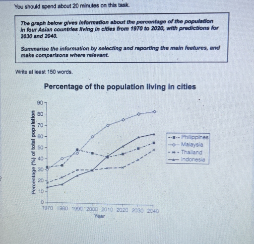
The image displays a line graph detailing the percentage of the population living in cities from 1970 to 2020, with projections for 2030 and 2040, across four Asian countries: Philippines, Malaysia, Thailand, and Indonesia. In 1970, the Philippines recorded approximately 30%, Malaysia around 28%, Thailand roughly 15%, and Indonesia near 12%. In 1980, the Philippines remained at roughly 32%, Malaysia at about 36%, Thailand at 18%, and Indonesia at 22%. In 1990, the Philippines rose to approximately 39%, Malaysia to about 46%, Thailand to 23%, and Indonesia to 30%. By 2000, the Philippines reached about 48%, Malaysia about 56%, Thailand 30%, and Indonesia 42%. In 2010, the Philippines reached approximately 45%, Malaysia 65%, Thailand 36%, and Indonesia 50%. By 2020, the Philippines approximated 48%, Malaysia 75%, Thailand 51%, and Indonesia 56%. Predictions for 2030 suggest the Philippines could reach 56%, Malaysia 80%, Thailand 66%, and Indonesia 66%. By 2040, forecasts indicate the Philippines might hit 65%, Malaysia could maintain 80%, Thailand could attain 76%, and Indonesia could achieve 70%.
Given the complexity of the image, the above description may not be entirely accurate.
Note: Both the topic and the answer were created by one of our users.

The diagram presents the persentage of the population in several Asian countries living in towns from 1970 to 2040 years.

Overall,the diagram shows how have been changing persentage of population in four asian countries. However,it is clear that Malyasia is the leading country in this competition but also it seems that Thailands persentage is the lower one.

First of all , Malaysia has the highest persent in this top,since 1970 it was growing steadily from 30 per cent to 75 in 2020 but it still has a prediction for the future to make 85 in 2040, what makes this country the leading one

However, this diagram it also shows the poorest country and it is Thailand,since 1970 it has 20 per cent which was the second lower persentage country but in the middle of 2000 it became the poorest country in diagram loosing his place to Indonesia with pesentage 30,but Thailand still has he’s prediction for grow in the future

Word Count: 160

Answers On The Same Topic:

The graph below gives information about the percentage of the population in four Asian countries living in c/tles from 1970 to 2020, with predictions for 2030 and 2040. Summarise the information by selecting and reporting the main features, and make comparisons where relevant.

The line graph illustrates the proportion of individuals residing in the urban areas of four countries in Asia between 1970 and 2020, along with projections for the next two decades. Overall, it is clear that Malaysia had a steady upward trend when compared with Thailand. However, all the four countries are assumed to have a […]

The graph below gives information about the percentage of the population in four Asian countries living in c/tles from 1970 to 2020, with predictions for 2030 and 2040. Summarise the information by selecting and reporting the main features, and make comparisons where relevant.

The given line graph illustrates the percentage of urban population in four Asian cities- Philippines, Malaysia, Thailand, Indonesia from 1970 to 2010 and a possible forecast for the year 2030 and 2040. Overall, the percentage of population in the urban areas is continuously increasing over the years. Especially in Malaysia, where population growth is the […]

The graph below gives information about the percentage of the population in four Asian countries living in c/tles from 1970 to 2020, with predictions for 2030 and 2040. Summarise the information by selecting and reporting the main features, and make comparisons where relevant.

The provided line graph illustrates the evolution of urban population percentages in four Asian nations—Philippines, Malaysia, Thailand, and Indonesia—from 1970 to 2020, alongside forecasts extending to 2030 and 2040. Overall, there is a discernible upward trend in urbanization across all four countries during the specified period, with Malaysia consistently exhibiting the highest rate of urban […]

The graph below gives information about the percentage of the population in four Asian countries living in c/tles from 1970 to 2020, with predictions for 2030 and 2040. Summarise the information by selecting and reporting the main features, and make comparisons where relevant.

The line graph represents the percentage of the population in four asian countries living in cities from 1970 to 2020, providing predictions for 2030 and 2040. Overall, Malaysia has had the most incline from 1970 to 2020 and is expected to maintain a steady increase in 2030 and 2040, with indonesia coming in as a […]

See All

Other Topics:

IELTS Academic Writing Task 1: You should spend about 20 minutes on this task. The graph below gives information about the percentage of the population in four Asian countries living in cities from 1970 to 2020, with predictions for 2030 and 2040. Summarise the information by selecting and reporting the main features, and make comparisons where relevant.

The line chart depicts how the populations of urban areas have changed from 1970 to 2020, with the predictions for 2030 and 2040 among four Asian countries. Overall, it is evident that city residents in all Asian countries experienced an upward trend, and it will continue into the forecasted year. While Malaysia will be the […]

summarise the information by selecting and reporting the main features, and make comparisons where relevante

The line graph compares the number of people attending various activities at one social center in Melbourne, Australia, from 2000 to 2020. Overall, film club dominated the number of participants over the period. Additionally, amateur dramatics showed decrease, while table tennis saw a increase. Moreover, a new activity arised, called musical performances for given years. […]

The graph below gives historical information and projections about changes in population in the United States, Nigeria and Japan.

The provided line graph presents data regarding changes in population in the US, Nigeria and Japan from 1950 to 2050. Overall, all nations are expected to witness an upward trajectory in their population; however, Nigeria is anticipated to experience the most pronounced growth, surpassing the other two countries, as opposed to a slight rise in […]

The graph shows information about the number of people in Australia who used Chinese, Arabic, Italian, and Greek as their first language.

The line graph illustrates the amount of native speakers of Chinese,Arabic,Italian and Greek in Australia. Overall, the number of Chinese and Arabic language speakers increased significantly over the period,while the figure for Greek and Italian first language speakers dropped. The number of Chinese speakers stood out other categories showing the highest number in last years. […]

The chart below shows the percentage of Australian people who were born in different places of the world.

Tha graph illustrate the data about percentage of Australian flok where were born in different areas of the world in the given period which is from 1976 to 2011 Overall, there are four places where Australians were born, which is uk, asia, total amount of borns and other areas. There are three places in the […]

The line graph below shows the number of overseas tourists (in millions) who visited France, Spain, and Japan between 1990 and 2020. Summarise the information by selecting and reporting the main features, and make comparisons where relevant.

The provided line graph illustrates the total number of tourists exploring three different foreign countries over the period of 30 years, from 1990 to 2020. Overall, the number of visitors in Spain and France surged significantly, whereas Japan increased slightly until 2000 and then declined throughout the period. Furthermore, France remained the dominant destination over […]

See All
We have detected unusual activity on your device.
Please verify your identity to continue.
Note: This verification step won't sign you in. If you have a premium account, please log in to access the service as usual.
Google/Gmail Verification
Or verify using Email/Code
We've sent a verification code to:
youremail@gmail.com (Not your email?)
Enter it below to complete the verification process.
Ensure your email address is correct, your inbox is not full, and you check your spam folder. If no email arrives, consider using an alternative email.
You will need a Premium plan to perform your action!
Note: If you already have a premium account, please log in to access our services as usual.

Plans & Pricing

Our mission is to make quality education accessible for everyone.
However, to keep our hardworking team running and this service alive, we genuinely need your support!
By opting for a premium plan, not only do you sustain us in achieving the mission, but you also unlock advanced features to enrich your learning experience.

Free

For learners who aren't pressed for time

What's included on Free
100+ Cambridge IELTS Tests
Instant IELTS Writing Task 1 & 2 Evaluation (2 times/month)
Instant IELTS Speaking Part 1, 2, & 3 Evaluation (5 times/month)
Instant IELTS Writing Task 1 & 2 Essay Generator (2 times/month)
500+ Dictation & Shadowing Exercises
100+ Pronunciation Exercises
Flashcards
Other Advanced Tools

Premium

For those serious about advancing their English proficiency, and for IELTS candidates aspiring to boost their band score by 1-2 points (especially in writing & speaking) in just 30 days or less

What's included on Premium
Save Your IELTS Test Progress
Unlock All Courses & IELTS Tests
Unlimited AI Conversations
Unlimited AI Writing Enhancement Exercises
Unlimited IELTS Writing Task 1 & 2 Evaluation
Unlimited IELTS Speaking Part 1, 2, & 3 Evaluation
Checked Answers Will Not Be Published
Unlimited IELTS Writing Task 1 & 2 Essay Generator
Unlimited IELTS Speaking Part 1, 2, & 3 Sample Generator
Unlimited Usage Of Advanced Tools
Priority Support within 24h (12-month plan only)

Due to the nature of our service and the provided free trials, payments are non-refundable.
Nếu bạn là người Việt Nam và không có hoặc không muốn trả bằng credit/debit cards, bạn có thể thanh toán bằng phương thức chuyển khoản:


Chọn gói:
419,000₫ 277,000 ₫ cho gói 1 tháng (chỉ 9,233₫/ngày)
1,239,000₫ 597,000 ₫ cho gói 3 tháng (chỉ 6,633₫/ngày)
2,469,000₫ 1,027,000 ₫ cho gói 6 tháng (chỉ 5,706₫/ngày)
4,929,000₫ 1,417,000 ₫ cho gói 12 tháng (chỉ 3,936₫/ngày)


Sau khi chuyển khoản, vui lòng đợi trình duyệt tự động điều hướng bạn trở lại Engnovate và bạn sẽ ngay lập tức nhận được mã kích hoạt tài khoản premium.
Nếu có lỗi xảy ra, bạn có thể liên hệ với team thông qua một trong các phương thức: email đến helloengnovate@gmail.com hoặc nhắn tin qua facebook.com/engnovate.
Vì toàn bộ công cụ trên website đều có thể sử dụng thử miễn phí, Engnovate không hỗ trợ hoàn tiền.