🔥 Today Only: Save 30% on Premium — Offer Ends Soon! - Upgrade Now!
Line Graph

Band 7+: The graph below gives information about the total oil use of 4 major consumers from 2009 to 2030 Summarise the information by selecting and reporting the main features, and make comparisons where relevant.

Image for topic: The graph below gives information about the total oil use of 4 major consumers from 2009 to 2030 Summarise the information by selecting and reporting the main features, and make comparisons where relevant.
Our system will evaluate the answer based on this AI-generated description.
The image is a line graph titled "Oil use of major consumers" with the x-axis representing years (2009, 2015, 2025, 2030) and the y-axis representing millions of barrels per day, ranging from 0 to 10 in increments of 2. Four lines depict the oil use of different consumers: US (dotted line), China (solid line with triangles), Western Europe and Japan (solid line), Middle East (dashed line with circles). In 2009, US used around 9 million barrels per day, Western Europe and Japan about 5, China approximately 3.5, and Middle East nearly 2. By 2015, US declined to around 8, Western Europe and Japan to 4, Middle East increased to 3, and China rose to about 6. The projected use in 2025 shows US at 6, Western Europe and Japan at 3, China at 8, and Middle East at 4. By 2030, US is expected to decrease to 5.5, Western Europe and Japan to 2.5, China to maintain at 8, and Middle East to increase to 5.
Given the complexity of the image, the above description may not be entirely accurate.
Note: Both the topic and the answer were created by one of our users.

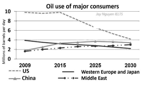
The line graph illustrates how much oil is consumed in four different countries between 2009 and 2030.

Overall, there are increases in the amounts of oil consumed in China and the Middle East, while declines are seen in the figures for the USA and Western Europe & Japan. In addition, the figure for the amount of oil consumed/ the oil consumption in the USA is consistently highest throughout.

The amount of oil consumed in the USA started at about 9 tons in 2009, followed by a slight rise to 10 tons in 2015. The oil consumption in the USA has been declining to 8 tons in 2025, before it is predicted to remain unchanged until 2030. 4 tons of oil was consumed in Western Europe and Japan, with a decline to above 3 tons in 2025, with a prediction of a progressive decrease to 2 tons in 2030, making it the smallest oil consumer at the end of the period.

The amount of oil consumed in China and the Middle East both began at 2 tons in 2009, before oil consumption in China predicted to rise to 4 tons in 2025 and decline to above 3 tons in the final year.It is predicted that the amount of oil consumed in the Middle East will increase gradually to about 3 tons in 2030.

Word Count: 222

Answers On The Same Topic:

The graph below gives information about the total oil use of 4 major consumers from 2009 to 2030 Summarise the information by selecting and reporting the main features, and make comparisons where relevant.

The line graph compares total oil consumption in the US, China, Western Europe and Japan, and the Middle East between 2009 and 2030, measured in millions of barrels per day. Overall, the US remains by far the largest consumer throughout, but its oil use falls sharply after 2015. By contrast, China and the Middle East […]

The graph below gives information about the total oil use of 4 major consumers from 2009 to 2030 Summarise the information by selecting and reporting the main features, and make comparisons where relevant.

The line graph compares oil consumption in the US, China, Western Europe and Japan, and the Middle East between 2009 and 2030, measured in millions of barrels per day. Overall, the US remains the largest oil consumer throughout the period, despite a sharp decline after 2015. By contrast, China and the Middle East show an […]

The graph below gives information about the total oil use of 4 major consumers from 2009 to 2030 Summarise the information by selecting and reporting the main features, and make comparisons where relevant.

The line graph compares aggregate daily oil consumption of four main markets – namely the USA, China, the Middle East and Western Europe combined with Japan – between 2009 and 2030. Overall, China and the Middle East are projected to record an ascending trend in their oil demand, while the USA and Western Europe with […]

The graph below gives information about the total oil use of 4 major consumers from 2009 to 2030 Summarise the information by selecting and reporting the main features, and make comparisons where relevant.

The given line graph represents the usage of oil per day by four major consumers:USA, China, Western Europe & Japan and Middle East, over the period between 2009 and 2030. Overall, it is clear that the all lines of the consume of oil ,fluctuate throughout the period .Although the China and Middle East were only […]

The graph below gives information about the total oil use of 4 major consumers from 2009 to 2030 Summarise the information by selecting and reporting the main features, and make comparisons where relevant.

The given line graphs delineates information on the consumption of oil that use daily in units of barrels during 2009 to 2025 and an estimation for the year of 2030. Overall it can be seen that, The United State remained for the largest consumer of oil throughtout the period. It is apparently seen that, in […]

See All

Other Topics:

The graph below shows average carbon dioxide (CO2) emissions per person in the Uk, sweden, portugal and italy

The line graph demonstrates the average carbon footprint per individual in the United Kingdom, Sweden, Italy and Portugal in 1967 to 2007. Overview, United Kingdom was releasing CO2 most over the years but after a decade, emission got decreased as year passed. Whereas Portugal was ejecting CO2 gas comparatively low than other countries. Initially, Portugal […]

The graph below shows the number of international tourists visiting three different regions (Asia, Europe, and America) between 2000 and 2020. Summarize the information by selecting and reporting the main features, and make comparisons where relevant.

In this graph we can observe the fluctuations between the years 2000 and 2020 in international tourism over three different regions, them being Asia, Europe and America. It is noticeable that the number of international tourists in america has grown significantly, going from less than a hundred million vistors at the start of the century, […]

The line graph shows the average number of deaths during the second wave of covid-19 in the UK, US, EU-27, and Brazil in 2021.

The line graph illustrates the average number of deaths during the second wave of covid-19 in the four countries between january and april. Overall, the UK shown the biggest fluctuations thoroughout the period, As a result, Uk had been the lowest deaths in April. While, Brazil was the highest number in the end. By contrast, […]

The line graph below shows changing patterns of business communication in New Stratford from 1980 to 2005. Summarise the information by selecting and reporting the main features, and make comparisons where relevant. Write at least 150 words.

The graph illustrates the business communication trend from 1980 to 2005 in New Standford. In general, landline phone was the most popular communication media in 25 years. On the other hand, the email usage related to business communication improved significantly from 1980 to 2005. Particularly, many companies utilized the cell phone, e-mail, and other internet […]

The line chart below shows the percentage of people in different age groups who played video games more than ten hours a week between 2010 and 2015

The data presents the percentage of different ages people, who spent more than 10 hours per week by playing video games. In general, the category of people who are from 16 to 24 dominated the graph over the provided period. On the contrary, seniors registered fairly low figures.Those aged from 25 to 64 occupied the […]

he graph below shows the number of immigrants to there countries from 1990 to 2001. Summarise the information by selecting and reporting the main features, and make comparisons where relevant.

The line graph illustrates the persantages of immigrants came in 1990 and 2001. overall USA experienced an upward trend by domanating, whereas Canada and Australia stay stable over the period . in the first year in USA the figure for people came from another country climbed from about 1300 to 1800 in 1992 . however […]

See All
We have detected unusual activity on your device.
Please verify your identity to continue.
Note: This verification step won't sign you in. If you have a premium account, please log in to access the service as usual.
Google/Gmail Verification
Or verify using Email/Code
We've sent a verification code to:
youremail@gmail.com (Not your email?)
Enter it below to complete the verification process.
Ensure your email address is correct, your inbox is not full, and you check your spam folder. If no email arrives, consider using an alternative email.
You will need a Premium plan to perform your action!
Note: If you already have a premium account, please log in to access our services as usual.

Plans & Pricing

Our mission is to make quality education accessible for everyone.
However, to keep our hardworking team running and this service alive, we genuinely need your support!
By opting for a premium plan, not only do you sustain us in achieving the mission, but you also unlock advanced features to enrich your learning experience.

Free

For learners who aren't pressed for time

What's included on Free
100+ Cambridge IELTS Tests
Instant IELTS Writing Task 1 & 2 Evaluation (2 times/month)
Instant IELTS Speaking Part 1, 2, & 3 Evaluation (5 times/month)
Instant IELTS Writing Task 1 & 2 Essay Generator (2 times/month)
500+ Dictation & Shadowing Exercises
100+ Pronunciation Exercises
Flashcards
Other Advanced Tools

Premium

For those serious about advancing their English proficiency, and for IELTS candidates aspiring to boost their band score by 1-2 points (especially in writing & speaking) in just 30 days or less

What's included on Premium
Save Your IELTS Test Progress
Unlock All Courses & IELTS Tests
Unlimited AI Conversations
Unlimited AI Writing Enhancement Exercises
Unlimited IELTS Writing Task 1 & 2 Evaluation
Unlimited IELTS Speaking Part 1, 2, & 3 Evaluation
Checked Answers Will Not Be Published
Unlimited IELTS Writing Task 1 & 2 Essay Generator
Unlimited IELTS Speaking Part 1, 2, & 3 Sample Generator
Unlimited Usage Of Advanced Tools
Priority Support within 24h (12-month plan only)

Due to the nature of our service and the provided free trials, payments are non-refundable.
Nếu bạn là người Việt Nam và không có hoặc không muốn trả bằng credit/debit cards, bạn có thể thanh toán bằng phương thức chuyển khoản:


Chọn gói:
419,000₫ 277,000 ₫ cho gói 1 tháng (chỉ 9,233₫/ngày)
1,239,000₫ 597,000 ₫ cho gói 3 tháng (chỉ 6,633₫/ngày)
2,469,000₫ 1,027,000 ₫ cho gói 6 tháng (chỉ 5,706₫/ngày)
4,929,000₫ 1,417,000 ₫ cho gói 12 tháng (chỉ 3,936₫/ngày)


Sau khi chuyển khoản, vui lòng đợi trình duyệt tự động điều hướng bạn trở lại Engnovate và bạn sẽ ngay lập tức nhận được mã kích hoạt tài khoản premium.
Nếu có lỗi xảy ra, bạn có thể liên hệ với team thông qua một trong các phương thức: email đến helloengnovate@gmail.com hoặc nhắn tin qua facebook.com/engnovate.
Vì toàn bộ công cụ trên website đều có thể sử dụng thử miễn phí, Engnovate không hỗ trợ hoàn tiền.