🔥 Today Only: Save 30% on Premium — Offer Ends Soon! - Upgrade Now!
Line Graph

Band 7+: The graph below shows relative price changes for fresh fruits and vegetables, sugar and sweets, and carbonated drinks between 1978 and 2009. Summarize the information by selecting and reporting the main features, and make comparisons where relevant.

Image for topic: The graph below shows relative price changes for fresh fruits and vegetables, sugar and sweets, and carbonated drinks between 1978 and 2009. Summarize the information by selecting and reporting the main features, and make comparisons where relevant.
Our system will evaluate the answer based on this AI-generated description.
The image depicts a line graph illustrating relative price changes from 1978 to 2009 for three categories: fresh fruits and vegetables, sugars and sweets, carbonated drinks, alongside a consumer price index. Fresh fruits and vegetables rose from approximately 60 in 1978 to around 330 in 2009, exhibiting a steady increase with notable spikes in the years 1988, 1990, and 2008. The consumer price index started at 60 in 1978 and gradually elevated to about 220 by 2009. Sugars and sweets increased from 60 in 1978 to approximately 170 in 2009, showing steadier growth, with minor fluctuations. Carbonated drinks rose from around 60 in 1978 to about 140 in 2009, maintaining the slowest rise among the four lines. All categories show general upward trends, with fresh fruits and vegetables experiencing the most significant increase over the given period.
Given the complexity of the image, the above description may not be entirely accurate.
Note: Both the topic and the answer were created by one of our users.

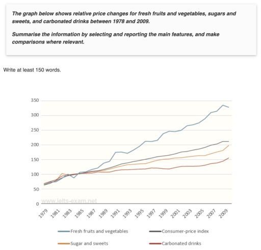
The line graph illustrates the relative price changes for three food categories – fresh fruits and vegetables, sugar and sweets, and carbonated drinks – from 1978 to 2009, along with the total consumer-price index.

Overall, the level of consumer-price index showed an overall increase, as well as the price chages for all food categories. Fresh fruits and vegetables recorded the most substantial growth over the years, while the price of carbonated drinks presented the fewest changes.

In 1979, the consumer-price index stood at 60. After rising slightly to 100 in 1985, it increased gradually, reaching 210 by the final year. Likewise, the price changes of fresh fruits and vegetables increased marginally from 60 in 1979 to 100 in 1985. However, the figure for this category rose dramatically, peaking at roughly 325 by 2009.

From 1979 to 2009, sugar and sweets and carbonated drinks had similar upward trend from 60 to 100. The price changes of sugar and sweets experienced a steady grow, just below the consumer-price index, ending at 200 in 2009. Meanwhile, carbonated drinks saw a lower rise, reaching 150 at the end of the years.

Word Count: 187

Answers On The Same Topic:

The graph below shows relative price changes for fresh fruits and vegetables, sugar and sweets, and carbonated drinks between 1978 and 2009. Summarize the information by selecting and reporting the main features, and make comparisons where relevant.

The graph illustrates relative price changes for different commodities during a 31 years period from 1978 to 2009. Overall, they all started with equal qauntity of products. Fresh fruits and vegetables are moved upward. Carbonated drinks the reverse of the case, they demonstrated the less increase between others. Sugar and sweets and Consumers-price index showed […]

The graph below shows relative price changes for fresh fruits and vegetables, sugar and sweets, and carbonated drinks between 1978 and 2009. Summarize the information by selecting and reporting the main features, and make comparisons where relevant.

The provided linegraph illustrates the transformation of cost of products from 1978 to 2009. Overall, it is clear that the valuation of fresh fruits and vegetables increased significantly over the period, whereas the market value of carbonated drinks increased slightly during all period. First of all, the products such as fresh fruits and vegetables soared […]

The graph below shows relative price changes for fresh fruits and vegetables, sugar and sweets, and carbonated drinks between 1978 and 2009. Summarize the information by selecting and reporting the main features, and make comparisons where relevant.

The graph demonstrates changes in price for fresh fruits and vegetables, sugars and sweets, and carbonated drinks over the period between 1978 and 2009. Overall, fresh fruits and vegetables showed a rapid growth compared to the other three categories. From 1979, fresh fruits and vegetables rose rapidly from roughly 60 units to around 325 units […]

The graph below shows relative price changes for fresh fruits and vegetables, sugar and sweets, and carbonated drinks between 1978 and 2009. Summarize the information by selecting and reporting the main features, and make comparisons where relevant.

The line graph illustrates the changes in prices of three different categories of products—fresh fruits and vegetables, sugar and sweets, and carbonated drinks—between 1978 and 2009. Overall, the price of fresh fruits and vegetables showed the greatest increase over the period, rising significantly compared to other categories. In contrast, the prices of sugar and sweets, […]

See All

Other Topics:

the chart below shows information about European people of different age groups who went to gym once a month or more between 1900 and 2010

The line graph above displays between 1990 and 2010, the variations in the proportions of European people who went to gyms once a month or more. According to the line graph, the percentage of all age groups continually increased over the twenty years, though with different rates. The only exception was the adolescent group (18-24), […]

The graph below shows carbon dioxide emissions from four different sectors in a country between 2000 and 2020. Summarise the information by selecting and reporting the main features, and make comparisons where relevant. Write at least 150 words.

The line graph illustrates carbon dioxide emissions from four different sectors in a country over a 20-year period from 2000 to 2020. Units are given in million tonnes. Overall, the figure for Transport was the highest by the end of the period, while the reverse was true for Agriculture. It is worth noting that the […]

The graph shows information about the amount of money which was earned by three bakeries in Calgary, over a ten-year period between 2000 and 2010.

The following graph shows the annual earning of three bakeries in Calgary- Amandine Bakery, Mari Bakeshop and Bolo Cakery from 2000 to 2010. Overall,the graph shows that the Amandine Bakeshop had the most earning at aproximatly 100000 in 2010, Bolo Cakery had a steady increament in yearly income roughly at 60000. Unlike these two bakeries […]

The graph below gives information about then number of jobs in four sectors of the economy in the US between 1960 and 2020.

The graph illustrates the number of jobs available in four different sectors of the US economy between 1960 and 2020. Overall, employment in the retail and healthcare sectors increased significantly over the period. In contrast, the number of jobs in manufacturing and agriculture declined. While manufacturing remained one of the largest employment sectors for most […]

The graph below shows the amount of time taken to produce a vehicle by four US-based car manufacturers in the years 1998 to 2002. Summarise the information by selecting and reporting the main features, and make comparisons where relevant.

The graph illustrates that how much time was spent in making a vahicle by four US -based car suppliers during the period from 1998 to 2002. It shows number of years along the horizontal line and the number of hours per vahicle along the vertical line. The graph uses different patterns of lines to show […]

The graph below provides a breakdown of the UK weekly market share of visits to three social networking websites between March 2007 and March 2008. Summarise the information by selecting and reporting the main features, and make comparisons where relevant. Write at least 150 words.

The given graph illustrates the weekly proportions of visits of three different websites in the UK between March 2007 and March 2008. Overall, Facebook had the most dramatic increase during the whole period and became as the most visited website, while Myspace steadily decreased its number of visits. In addition, Bebo website had moderate fluctuations. […]

See All
We have detected unusual activity on your device.
Please verify your identity to continue.
Note: This verification step won't sign you in. If you have a premium account, please log in to access the service as usual.
Google/Gmail Verification
Or verify using Email/Code
We've sent a verification code to:
youremail@gmail.com (Not your email?)
Enter it below to complete the verification process.
Ensure your email address is correct, your inbox is not full, and you check your spam folder. If no email arrives, consider using an alternative email.
You will need a Premium plan to perform your action!
Note: If you already have a premium account, please log in to access our services as usual.

Plans & Pricing

Our mission is to make quality education accessible for everyone.
However, to keep our hardworking team running and this service alive, we genuinely need your support!
By opting for a premium plan, not only do you sustain us in achieving the mission, but you also unlock advanced features to enrich your learning experience.

Free

For learners who aren't pressed for time

What's included on Free
100+ Cambridge IELTS Tests
Instant IELTS Writing Task 1 & 2 Evaluation (2 times/month)
Instant IELTS Speaking Part 1, 2, & 3 Evaluation (5 times/month)
Instant IELTS Writing Task 1 & 2 Essay Generator (2 times/month)
500+ Dictation & Shadowing Exercises
100+ Pronunciation Exercises
Flashcards
Other Advanced Tools

Premium

For those serious about advancing their English proficiency, and for IELTS candidates aspiring to boost their band score by 1-2 points (especially in writing & speaking) in just 30 days or less

What's included on Premium
Save Your IELTS Test Progress
Unlock All Courses & IELTS Tests
Unlimited AI Conversations
Unlimited AI Writing Enhancement Exercises
Unlimited IELTS Writing Task 1 & 2 Evaluation
Unlimited IELTS Speaking Part 1, 2, & 3 Evaluation
Checked Answers Will Not Be Published
Unlimited IELTS Writing Task 1 & 2 Essay Generator
Unlimited IELTS Speaking Part 1, 2, & 3 Sample Generator
Unlimited Usage Of Advanced Tools
Priority Support within 24h (12-month plan only)

Due to the nature of our service and the provided free trials, payments are non-refundable.
Nếu bạn là người Việt Nam và không có hoặc không muốn trả bằng credit/debit cards, bạn có thể thanh toán bằng phương thức chuyển khoản:


Chọn gói:
419,000₫ 277,000 ₫ cho gói 1 tháng (chỉ 9,233₫/ngày)
1,239,000₫ 597,000 ₫ cho gói 3 tháng (chỉ 6,633₫/ngày)
2,469,000₫ 1,027,000 ₫ cho gói 6 tháng (chỉ 5,706₫/ngày)
4,929,000₫ 1,417,000 ₫ cho gói 12 tháng (chỉ 3,936₫/ngày)


Sau khi chuyển khoản, vui lòng đợi trình duyệt tự động điều hướng bạn trở lại Engnovate và bạn sẽ ngay lập tức nhận được mã kích hoạt tài khoản premium.
Nếu có lỗi xảy ra, bạn có thể liên hệ với team thông qua một trong các phương thức: email đến helloengnovate@gmail.com hoặc nhắn tin qua facebook.com/engnovate.
Vì toàn bộ công cụ trên website đều có thể sử dụng thử miễn phí, Engnovate không hỗ trợ hoàn tiền.