🔥 Today Only: Save 30% on Premium — Offer Ends Soon! - Upgrade Now!
Line Graph

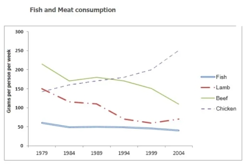
Band 4+: the graph below shows the consumption of fish and some different kinds of meat in a european country between 1979 and 2004. summarise the infomrations by selecting and reporting the main features and make comparison where relevant

Image for topic: the graph below shows the consumption of fish and some different kinds of meat in a european country between 1979 and 2004. summarise the infomrations by selecting and reporting the main features and make comparison where relevant
Our system will evaluate the answer based on this AI-generated description.
The image shows a line graph titled 'Fish and Meat consumption' with the x-axis labeled with years from 1979 to 2004 in 5-year intervals and the y-axis labeled with 'Grams per person per week' starting from 0 to 300 in 50-gram increments. Four lines represent different types of meat: Fish (solid line), Lamb (dashed line), Beef (solid line), and Chicken (dashed line). Fish consumption starts at around 60 grams and shows a slight increase over the years, reaching just above 100 grams in 2004. Lamb consumption starts at approximately 150 grams, decreases steeply to around 75 grams by 1989, then levels off and fluctuates slightly. Beef consumption begins at 250 grams, declines steadily to almost 150 grams by 2004. Chicken consumption starts at nearly 150 grams, remains stable until 1989, then rises sharply, surpassing beef by 1999 and reaching just below 250 grams in 2004.
Given the complexity of the image, the above description may not be entirely accurate.
Note: Both the topic and the answer were created by one of our users.

The chart illustrates four different foods consumed in a European country from 1987 to 2003.

Overall, what is stands out from the figure is that the chicken’s consumition increased significantly, however the other three products declined their preference.

Firstly, for the chicken and beef, the former climbed gradually throughout the period with some slight drops in 1983, 1993 and 1998, while the latter fell considerably from 225g to 125g in 25 years. The chicken climbed from the third position to the top with a peak of 250g in 2000, nevertheless, the beef was in first position until 1990 when they had exacty the same preference, therefore it went down rapidly.

Secondly, lamb moved from the second to the third in the ranking, due to it decreased slowly from 1978 to 1988 and then it fell quickly the last 15 years. Even though, the fish declined steadily thier consume during the period.

Word Count: 151

Answers On The Same Topic:

the graph below shows the consumption of fish and some different kinds of meat in a european country between 1979 and 2004. summarise the infomrations by selecting and reporting the main features and make comparison where relevant

The line chart illustrates weekly per-capita consumption of fish, lamb, beef, and chicken in a European country from 1979 until 2004. Overall, poultry consumption climbed steadily, whereas fish, lamb, and beef declined. In 1979, beef was the most commonly eaten protein by the population. Each individual consumed about 200 grams of beef weekly, four times […]

the graph below shows the consumption of fish and some different kinds of meat in a european country between 1979 and 2004. summarise the infomrations by selecting and reporting the main features and make comparison where relevant

The graph given the information about consumption three meat and fish in a week at 1976 until 2004. At 1980’s the most popular was beef and the unpopular consumption was fish. From the graph the consumption beef slightly decrease, but the consumption of chicken increase. In the last 25 years consumption lamb slightly decrease. The […]

the graph below shows the consumption of fish and some different kinds of meat in a european country between 1979 and 2004. summarise the infomrations by selecting and reporting the main features and make comparison where relevant

The line graph illustrates the consumption of fish and three different kinds of meat – beef, lamb, and chicken in a European country between 1978 and 2003. Overall, at the beginning of the period, beef was the most consumed, while lamb had the lowest level of consumption.By the end of the period, chicken had become […]

the graph below shows the consumption of fish and some different kinds of meat in a european country between 1979 and 2004. summarise the infomrations by selecting and reporting the main features and make comparison where relevant

The given line graph demonstrates how much fish and three different kinds of meat were consumed in a European country during the years 1979-2004. Overall, it can be seen that chicken consumption increased rapidly over the period, while beef and lamb had a gradual downward trend. Meanwhile, fish remained relatively stable at the lowest point, […]

the graph below shows the consumption of fish and some different kinds of meat in a european country between 1979 and 2004. summarise the infomrations by selecting and reporting the main features and make comparison where relevant

The graph demonstrate in European country consumption of fish and variety sort of meat from 1979 to 2004. Overall, what stand out of the graph is that one of the popularity meat was beef for 10 years, after chicken was increase while other meats was stable and decreasing. With regards to beef and chicken, starts […]

See All

Other Topics:

The line graph below shows the percentage of households in Singapore owned in four different consumer items (computer, car, air conditioning, washing machine) between 1973 and 2008.

The line graph shows the percentage of households in Singapore that owned four different electronic devices, including air conditioning, washing machines, cars and computers between 1973 and 2008. Overall, the percentage of household with all four type of devices increased over the period. Washing machines were the most common device for most of the years, […]

The line graph below shows the changes that took place in three different areas of crime in New Port city center from 2003 to 2012. Summarize the information by selecting and reporting the main features and make comparisons where relevant.

Burglary began at around 3,400 incidents and peaked at approximately 3,700 in 2004, making it the most frequent crime at that point. It then declined steeply, falling below car theft in 2007 and reaching its lowest point of roughly 1,200 in 2008. Thereafter, the figure recovered slightly and fluctuated between about 1,300 and 1,500 until […]

The line graph below shows past and current overweight rates, as well as a projected future overweight rate in nine selected countries. Summarise the information by selecting and reporting the main features, and make comparisons where relevant.

The provided line graph illustrates the percentage of obesity across nine OECD countries between 1970 to 2020. Overall, it is clearly evident that the rate of overweight increased in almost all countries throughout the given period.The USA had the highest proportion of overweight people, while the Korea had the lowest. In detail, the rate of […]

The chart below gives information on the average cost of a monthly plan from four different mobile phone providers in a European country, between January and September 2012, measured in euros.

The line chart demonstrates changes in the plan of monthly expense of four distinct mobile phone suppliers – Domo, Lex, Sim TX, and Alpha – in a nation in Europe during the first three quarters of 2012, in euros. Overall, almost all providers witnessed a considerable increase in their monthly cost, with the exception of […]

The graph below gives information about the percentage of the population in four Asian countries living in cities from 1970 to 2020, with predictions for 2030 and 2040. Summarise the information by selecting and reporting the main features, and make comparisons where relevant. Write at least 150 words.

The line graph illustrates the information about the proportion of citizens in four Asian countries (Philippines, Malaysia, Thailand, and Indonesia) between 1970 and 2020, with a forecast for 2030 to 2040. Overall, the population of each nation increased over the years, while the Philippines and Malaysia have dominated the period of five decades, and this […]

The chart below gives information about car ownership in the UK from 1975 to 2005. Summarize the information by selecting and reporting the main features and make comparisons where relevant.

The line illustrates the percentage of people owning one, two, three or four cars in the UK between 1975 and 2005. Overall,owning one car remained the largest category throughout this period while it is rare for people to own four cars.In addition, the percentage of people owning two cars fell slowly,whereas the figures for three […]

See All
We have detected unusual activity on your device.
Please verify your identity to continue.
Note: This verification step won't sign you in. If you have a premium account, please log in to access the service as usual.
Google/Gmail Verification
Or verify using Email/Code
We've sent a verification code to:
youremail@gmail.com (Not your email?)
Enter it below to complete the verification process.
Ensure your email address is correct, your inbox is not full, and you check your spam folder. If no email arrives, consider using an alternative email.
You will need a Premium plan to perform your action!
Note: If you already have a premium account, please log in to access our services as usual.

Plans & Pricing

Our mission is to make quality education accessible for everyone.
However, to keep our hardworking team running and this service alive, we genuinely need your support!
By opting for a premium plan, not only do you sustain us in achieving the mission, but you also unlock advanced features to enrich your learning experience.

Free

For learners who aren't pressed for time

What's included on Free
100+ Cambridge IELTS Tests
Instant IELTS Writing Task 1 & 2 Evaluation (2 times/month)
Instant IELTS Speaking Part 1, 2, & 3 Evaluation (2 times/month)
Instant IELTS Writing Task 1 & 2 Essay Generator (2 times/month)
500+ Dictation & Shadowing Exercises
100+ Pronunciation Exercises
Flashcards
Other Advanced Tools

Premium

For those serious about advancing their English proficiency, and for IELTS candidates aspiring to boost their band score by 1-2 points (especially in writing & speaking) in just 30 days or less

What's included on Premium
Save Your IELTS Test Progress & Analyze Mistakes By Question Type
Save Your Own Flashcard Sets & Use Them On Any Device
Unlock All Courses, IELTS Tests, Section & Part Practice
Unlimited AI Conversations
Unlimited AI Writing Enhancement Exercises
Unlimited IELTS Writing Task 1 & 2 Evaluation
Unlimited IELTS Speaking Part 1, 2, & 3 Evaluation
Checked Answers Will Not Be Published
Unlimited IELTS Writing Task 1 & 2 Essay Generator
Unlimited IELTS Speaking Part 1, 2, & 3 Sample Generator
Unlimited Usage Of Advanced Tools & AI Features
Priority Support within 24h (12-month plan only)

Due to the nature of our service and the provided free trials, payments are non-refundable.