24 Hours Only: Get 39% OFF on Our Premium Plan - Check Out Now!
Bar Chart

Band 7+: The graph below shows the contribution of three sectors, agriculture manufacturing and business and financial services to the UK economy in the twentieth century.summarizing information by selecting and reporting the main features and make a comparisons were relevant.

Image for topic: The graph below shows the contribution of three sectors, agriculture manufacturing and business and financial services to the UK economy in the twentieth century.summarizing information by selecting and reporting the main features and make a comparisons were relevant.
Our system will evaluate the answer based on this AI-generated description.
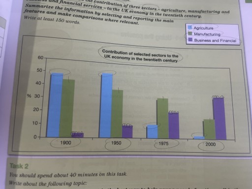
The image depicts a bar graph representing the contribution of selected sectors to the UK economy in the twentieth century, with data points in 1900, 1950, 1975, and 2000. The graph shows three sectors: Agriculture (in blue), Manufacturing (in green), and Business and Financial (in purple). In 1900, Agriculture contributed approximately 10%, Manufacturing 50%, and Business and Financial 40%. In 1950, the contributions were approximately 5% for Agriculture, 45% for Manufacturing, and 50% for Business and Financial. By 1975, Agriculture's contribution decreased to around 2%, while Manufacturing and Business and Financial had contributions of roughly 35% and 63% respectively. In 2000, Agriculture's contribution was negligible at less than 5%, Manufacturing decreased further to around 25%, and Business and Financial increased to around 70%.
Given the complexity of the image, the above description may not be entirely accurate.
Note: Both the topic and the answer were created by one of our users.

The bar chart illustrates how agriculture, manufacturing, and business and financial services contributed to british economy during 1990 and 2000.

Overall, the contribution of agriculture and manufacturing to the UK economy declined, while that of business and financial services increased over the period given.

There was a slight rise in the contribution of agriculture to british economy from 1990 to 1950, starting from just below 50% to over half of the UK economy. In 1975, agricultural contribution plummeted to around 10%, becoming the lowest proportion of the three sectors afterwards. Similarly, the contribution of manufacturing decreased during the period, from around 45% in 1990 to about 15% in 2000. In 1975, manufacturing surpassed agriculture, coming to the top of the contribution to economy.

Business and financial contribution, on the other hand, rose significantly from under 5% to around 35% in 1990 and 2000 respectively. In 2000, the contribution of business and financial service became the top of the three sectors.

Word Count: 160

Answers On The Same Topic:

The graph below shows the contribution of three sectors, agriculture manufacturing and business and financial services to the UK economy in the twentieth century.summarizing information by selecting and reporting the main features and make a comparisons were relevant.

At first,we look at the contribution of agriculture in 1900.it is placed a bit lower than 50%.To 1950 it rose to above 50%. Then it was getting lower,In 1975 it hit a little more than 10% and to 2000 it hit almost 0%. As we look to the manufacturing sector,we can say,that it was getting […]

The graph below shows the contribution of three sectors, agriculture manufacturing and business and financial services to the UK economy in the twentieth century.summarizing information by selecting and reporting the main features and make a comparisons were relevant.

The graph illustrates how the contribution of agriculture, manufacturing, and business and financial services to the UK economy changed over the 20th century. Overall, it can be seen that the agriculture and manufacturing saw a stable decrease during the entire period, whilst the business and financial witnessed a noticeable rise. Agriculture accounted for almost 50% […]

The graph below shows the contribution of three sectors, agriculture manufacturing and business and financial services to the UK economy in the twentieth century.summarizing information by selecting and reporting the main features and make a comparisons were relevant.

The diagram provides a supplement of three economic fields of the UK in the twentieth century, including agriculture, manufacturing, and business and financial services. Overall, the contribution of the trio showed some fluctuation from 1900 to 2000; each of them had general upward and downward trends. In the period between 1900 and 1950, agriculture occupied […]

The graph below shows the contribution of three sectors, agriculture manufacturing and business and financial services to the UK economy in the twentieth century.summarizing information by selecting and reporting the main features and make a comparisons were relevant.

The graph illustrates how the contributions of agriculture, manufacturing, and business and financial services to the UK economy changed over the 20th century. Overall, the financial and business sector saw a remarkable rise, the manufacturing sector witnessed a steady decrease, and agriculture had undergone a dramatic decline by the end of the century. Manufacturing accounted […]

The graph below shows the contribution of three sectors, agriculture manufacturing and business and financial services to the UK economy in the twentieth century.summarizing information by selecting and reporting the main features and make a comparisons were relevant.

The Bart chart describes data about three different fields – agriculture, manufacturing, and business and financial services- contributed to the economy in the UK in last the century. Overall, there were downward trends in the contribution of agriculture and manufacturing, while business and financial services experienced an upward trend, becoming the most profitable. Focusing on […]

See All

Other Topics:

The chart below shows the results of a survey about people's coffee and tea buying and drinking habits in five Australian cities.

The bar chart compares the percentage of residents in five Australian cities who bought fresh coffee, bought instant coffee, or went to a café for coffee or tea during the previous four weeks. Overall, visiting cafés was the most popular activity in all five cities, while buying fresh coffee was generally the least common. In […]

The graph below shows the answers to a survey about the most important factor needed for the success of a business by people in the USA and Europe. Summarize the information by selecting and reporting the main features, and make comparisons where relevant.

Overall, people in both regions consider the type of business and personality of the director as the most influential factors, while external factors and political situation are seen as less important. However, there are noticeable differences in how strongly each region values these factors. In detail, the type of business is rated highly in both […]

The chart below shows the sales figures for children's toys in 2012 and 2016 in six different countries. Summarise the information by selecting and reporting the main features, and make comparisons where relevant.

The bar graph illustrates the sales, in terms of US billion dollars, for children’s toys across 6 countries – the USA, the UK, Japan, Brazil, India, and China – in the 2012 and 2016. Overall, total sales have increased for all countries in the latter year with the UK leading other in both years followed […]

The graph below shows the way in which men and women used the Internet in Canada in 2000. Summarise the information making comparisons where relevant

The bar chart compares the percentage of men and women who used the Internet for various purposes in Canada in the year 2000. Overall, e-mail and accessing goods and services were the most common activities for both genders, whereas research and education accounted for the smallest proportions. In terms of Internet users, around 70% of […]

The chart below shows the percentage of Irish language speakers by province (Leinster, Munster, Connacht and Ulster) in the Republic of Ireland (State) in five different years.

The bar chart illustrate the proportion of Irish language speakers by province (Leinster, Munster, Connacht and Ulster) in the Republic of Ireland (state) in five different years. Overall, Connacht contributed the highest proportion of Irish speaker over the period. Whereas Leinster accounted for the lowest persentage. All province and state evidently increased from 1981 to […]

The chart shows the number of college students in the town of Freemont who were studying in a face-to-face or an online course during four time periods Summarise the information by selecting and reporting the main features, and make comparisons where relevant.

Well, firstly, there have been more college students every year, but especially the online enrollment has increased the most in this graphic. In 2015-2016, face-to-face students numbered 5 thousand,and online students numbered 3 thousand. Secondly, in 2016-2017, face-to-face students numbered a little bit more than 5 thousand, but the online students numbered higher than 3 […]

See All
We have detected unusual activity on your device.
Please verify your identity to continue.
Note: This verification step won't sign you in. If you have a premium account, please log in to access the service as usual.
Google/Gmail Verification
Or verify using Email/Code
We've sent a verification code to:
youremail@gmail.com (Not your email?)
Enter it below to complete the verification process.
Ensure your email address is correct, your inbox is not full, and you check your spam folder. If no email arrives, consider using an alternative email.
You will need a Premium plan to perform your action!
Note: If you already have a premium account, please log in to access our services as usual.

Plans & Pricing

Our mission is to make quality education accessible for everyone.
However, to keep our hardworking team running and this service alive, we genuinely need your support!
By opting for a premium plan, not only do you sustain us in achieving the mission, but you also unlock advanced features to enrich your learning experience.

Free

For learners who aren't pressed for time

What's included on Free
100+ Cambridge IELTS Tests
Instant IELTS Writing Task 1 & 2 Evaluation (2 times/month)
Instant IELTS Speaking Part 1, 2, & 3 Evaluation (5 times/month)
Instant IELTS Writing Task 1 & 2 Essay Generator (2 times/month)
500+ Dictation & Shadowing Exercises
100+ Pronunciation Exercises
Flashcards
Other Advanced Tools

Premium

For those serious about advancing their English proficiency, and for IELTS candidates aspiring to boost their band score by 1-2 points (especially in writing & speaking) in just 30 days or less

What's included on Premium
Save Your IELTS Test Progress
Unlock All Courses & IELTS Tests
Unlimited AI Conversations
Unlimited AI Writing Enhancement Exercises
Unlimited IELTS Writing Task 1 & 2 Evaluation
Unlimited IELTS Speaking Part 1, 2, & 3 Evaluation
Checked Answers Will Not Be Published
Unlimited IELTS Writing Task 1 & 2 Essay Generator
Unlimited IELTS Speaking Part 1, 2, & 3 Sample Generator
Unlimited Usage Of Advanced Tools

Due to the nature of our service and the provided free trials, payments are non-refundable.
Nếu bạn là người Việt Nam và không có hoặc không muốn trả bằng credit/debit cards, bạn có thể thanh toán bằng phương thức chuyển khoản:


Chọn gói:
279,000₫ 157,000 ₫ cho gói 1 tháng (chỉ 5,233₫/ngày)
819,000₫ 397,000 ₫ cho gói 3 tháng (chỉ 4,411₫/ngày)
1,649,000₫ 667,000 ₫ cho gói 6 tháng (chỉ 3,706₫/ngày)
3,299,000₫ 857,000 ₫ cho gói 12 tháng (chỉ 2,381₫/ngày)


Sau khi chuyển khoản, vui lòng đợi trình duyệt tự động điều hướng bạn trở lại Engnovate và bạn sẽ ngay lập tức nhận được mã kích hoạt tài khoản premium.
Nếu có lỗi xảy ra, bạn có thể liên hệ với team thông qua một trong các phương thức: email đến helloengnovate@gmail.com hoặc nhắn tin qua facebook.com/engnovate.
Vì toàn bộ công cụ trên website đều có thể sử dụng thử miễn phí, Engnovate không hỗ trợ hoàn tiền.