Our system will evaluate the answer based on this AI-generated description.
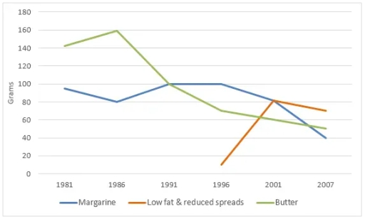
The image shows a line graph with three different lines representing Margarine, Low fat & reduced spreads, and Butter; X-axis ranges from 1981 to 2007 in intervals of 5 years except for the last interval which is 6 years, Y-axis measures grams from 0 to 180 in intervals of 20; In 1981, Margarine has the highest grams at 160, Low fat & reduced spreads start at 0, Butter at 140; In 1986, Margarine decreases to 100, Low fat & reduced spreads rise to 80, Butter drops to 120; In 1991, Margarine and Butter intersect at 80 grams while Low fat & reduced spreads peak at 160; In 1996, Margarine rises to 100, Low fat & reduced spreads slightly dip to 140, Butter falls to 40; In 2001, Margarine drops to 60, Low fat & reduced spreads decrease to 100, Butter remains at 40; In 2007, Margarine remains at 60, Low fat & reduced spreads fall to 80, and Butter increases to 60 grams.
Given the complexity of the image, the above description may not be entirely accurate.
Skyrocket your IELTS band score by 1-2 points in under a month with our premium plan!
Note: Both the topic and the answer were created by one of our users.
the graph illustrates the amount of 3 spreads (margarine, low fat and reduced spreads, butter) in years between 1981 to 2007
Overall, it’s clear that in every graph shows different grams, the consumption of butter was higher than other sources in earlier years and in middle years the low fat and reduced spreads beginning to rise however the grams of butter started falling
by comparison with other spreads the highest line shows the butter with 160 grams in 1986
therefore it started to decrease in 2007 to 40 grams
However the lowest line shows 15 grams of low fat and reduced spreads in 1996 then it’s extremely increased to 80 grams in period between 1996 and 2001, but in 2001 it’s slightly decreased to 55 grams
Word Count: 126
