🔥 Today Only: Save 30% on Premium — Offer Ends Soon! - Upgrade Now!
Multiple Graphs

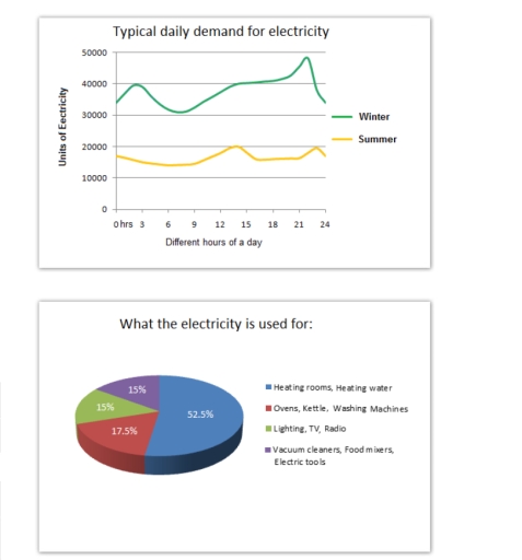
Band 6+: The graph below shows the demand for electricity in England during typical days in winter and summer. The pie chart shows how electricity is used in an average English home.

Image for topic: The graph below shows the demand for electricity in England during typical days in winter and summer. The pie chart shows how electricity is used in an average English home.
Our system will evaluate the answer based on this AI-generated description.
The image contains two separate data visualizations. The first is a graph titled "Typical daily demand for electricity" displaying units of electricity on the y-axis, from 0 to 50000 in increments of 10000, and different hours of a day on the x-axis from 0 to 24. It depicts two lines representing winter and summer electricity demand, with winter starting at about 40000 units at 0 hrs, dropping to just above 20000 units at 3 hrs, rising to approximately 45000 units at 9 hrs and slowly declining to 30000 units by 24 hrs; meanwhile, summer starts at just above 20000 units at 0 hrs, dips slightly below until 6 hrs, gradually increases to nearly 30000 units at 15 hrs and drops back to around 20000 units by 24 hrs. The second visualization is a pie chart titled "What the electricity is used for" indicating percentages for different uses: Heating rooms, Heating water 52.5%, Ovens, Kettle, Washing Machines 17.5%, Lighting, TV, Radio 15%, and Vacuum cleaners, food mixers, Electric tools 15%.
Given the complexity of the image, the above description may not be entirely accurate.
Note: Both the topic and the answer were created by one of our users.

The line graph demonstrates the need for electricity in England during normal days in winter and summer. The pie chart on the other hand illustrates the usage of electricity in an average British Home.

Overall, the demand for light in typical day in cold weather is twice than that of hot weather. There is a fluctuation in demand in the winter season. However, in summer it remained approximately steady. In England, over half of the families used electricity mostly for heating rooms and water. However, it remained the same for lighting, television, radio, vacuum cleaners, food mixers and other electronics.

In winter season, the usage of electricity in average house of England starts from approximately 35,000 units to almost 45,000 units in a normal day. In summer, they use of electricity remains almost steady which is somehow 19,000 units. The demand for electricity in winter is higher than summer.

Just over half of the electricity 52.5% is used for warming rooms and heating water in English homes. 17.5% is consumed for making food and laundry. Lighting, televisions, radios, vacuum cleaners, food mixers and other electrical tools uses the same 15% of electricity.

Word Count: 192

Answers On The Same Topic:

The graph below shows the demand for electricity in England during typical days in winter and summer. The pie chart shows how electricity is used in an average English home.

The given line graph provides information about typical everyday needs for electricity in two seasons such as winter and summer, while the pie chart compares the electricity usage in 4 different sections. Overall, it is clear that electricity consumption reaches a peak during night, whereas the largest proportion of electricity is used for heating. When […]

The graph below shows the demand for electricity in England during typical days in winter and summer. The pie chart shows how electricity is used in an average English home.

The line graph illustrates everyday use of electricity in two distant seasons, whereas the bar chart compares the purpose of electricity usage. Overall, electricity consumption is consistently higher in winter than in summer throughout the day. In addition, more than half of the electricity is used for heating rooms and water, making it the largest […]

The graph below shows the demand for electricity in England during typical days in winter and summer. The pie chart shows how electricity is used in an average English home.

The pie chart illustrates the typical demand for electricity in winter and summer, whereas the chart compares the items electricity used for. Overall, it is clear from the line graph that electricity demand is substantially higher in winter than in summer throughout the day. When it comes to the bar chart, heating rooms and water […]

The graph below shows the demand for electricity in England during typical days in winter and summer. The pie chart shows how electricity is used in an average English home.

The graph illustrates the variation in electricity demand between winter and summer in England at different times of the day, while the pie chart depicts how electricity is used in a typical English household. Overall, electricity demand is far higher in winter than in summer throughout the day, with the highest figure recorded late in […]

The graph below shows the demand for electricity in England during typical days in winter and summer. The pie chart shows how electricity is used in an average English home.

The line graph illustrates demand for electricity in England during usual days in winter and summer. On the other hand, the pie chart represents the proportion of electricity usage in an average English household. Overall, it is clear that there is a significant difference in electricity usage in winter and summer. It is also noticeable […]

See All

Other Topics:

The charts below the protein and calorie intakes of people in different parts of the world. Summarize the information by selecting and reporting the main features, and make comparisons where relevant.

The charts below provides information about protein and calorie intakes of individuals in different parts of the world. overall , it is evident that , the highest value is of animal protein and other protein in the country north america and lowest value is of animal protein and other animal is in india. TO commence […]

The pie chart shows the the expenditure of the people of a country on different activities in 2000 and 2010. Summarize information by slelting and reporting the mein features and comparison where relevant.

The pie charts compare the change in percentage of expenditure of the people on five different categories in 2000 and 2010. Overall, it can be clearly seen that apart from education, over the years, a growth in the percentage of expenditure can be observed in all other sectors. Whereas, the health sector remained as an […]

The bar chart shows the distribution of employment among agriculture, services, and industries in three countries in 1990 and projected distribution in 2030. Summarize by selecting and reporting the main features, and make comparisons where relevant.

The bar chart below introduces the employment distribution in countries A, B and C in three spheres: agriculture, industry and services. The scheme reflects the situation in 1990 and 2030. Overall, the share of people involved in services went up in all the states in 2030. The biggest increase can be noticed in country B […]

The pie chart below shows the average household expenditures in a country in 1950 and 2010. Write a report for a university lecturer describing the information below.

The pie charts illustrate the average household expenditures in a country in 6 different categories in the years 1950 and 2010. Overall, spendings on housing experienced the biggest decline while food and transportation showed a gradual increase. Additionally, health care had the lowest costing in both years. In the year 1950, domestic expenditures in housing […]

The charts below show the percentage of workers in three sectors across four countries in 1980 and 2010 Summerise the information by selecting and reporting the main features, and make comparisons where relevant

The two bar charts illustrate the proportion of the workforce employed in three economic sectors across four countries in 1980 and 2010. Overall, industry became the largest sector in Germany, the USA and Japan by 2010, while agriculture remained dominant in China despite a marked decline. By contrast, agriculture dominated China’s workforce in 1980, although […]

The bar chart and pie chart show the amount of carbon dioxide (CO₂) emitted by three different income groups in 1990 and 2000, and the proportion of the world's population represented by each income group in 2000.

The bar chart illustrates the amount of carbon dioxide emitted into the air by different income classes from 1990 to 2000, whereas the pie chart demonstrates the proportion of population represented by high, low and middle income groups in the world in 2000. Overall, the low-income group recorded considerably lower figures, while the middle-income group […]

See All
We have detected unusual activity on your device.
Please verify your identity to continue.
Note: This verification step won't sign you in. If you have a premium account, please log in to access the service as usual.
Google/Gmail Verification
Or verify using Email/Code
We've sent a verification code to:
youremail@gmail.com (Not your email?)
Enter it below to complete the verification process.
Ensure your email address is correct, your inbox is not full, and you check your spam folder. If no email arrives, consider using an alternative email.
You will need a Premium plan to perform your action!
Note: If you already have a premium account, please log in to access our services as usual.

Plans & Pricing

Our mission is to make quality education accessible for everyone.
However, to keep our hardworking team running and this service alive, we genuinely need your support!
By opting for a premium plan, not only do you sustain us in achieving the mission, but you also unlock advanced features to enrich your learning experience.

Free

For learners who aren't pressed for time

What's included on Free
100+ Cambridge IELTS Tests
Instant IELTS Writing Task 1 & 2 Evaluation (2 times/month)
Instant IELTS Speaking Part 1, 2, & 3 Evaluation (2 times/month)
Instant IELTS Writing Task 1 & 2 Essay Generator (2 times/month)
500+ Dictation & Shadowing Exercises
100+ Pronunciation Exercises
Flashcards
Other Advanced Tools

Premium

For those serious about advancing their English proficiency, and for IELTS candidates aspiring to boost their band score by 1-2 points (especially in writing & speaking) in just 30 days or less

What's included on Premium
Save Your IELTS Test Progress & Analyze Mistakes By Question Type
Save Your Own Flashcard Sets & Use Them On Any Device
Unlock All Courses, IELTS Tests, Section & Part Practice
Unlimited AI Conversations
Unlimited AI Writing Enhancement Exercises
Unlimited IELTS Writing Task 1 & 2 Evaluation
Unlimited IELTS Speaking Part 1, 2, & 3 Evaluation
Checked Answers Will Not Be Published
Unlimited IELTS Writing Task 1 & 2 Essay Generator
Unlimited IELTS Speaking Part 1, 2, & 3 Sample Generator
Unlimited Usage Of Advanced Tools & AI Features
Priority Support within 24h (12-month plan only)

Due to the nature of our service and the provided free trials, payments are non-refundable.