Our system will evaluate the answer based on this AI-generated description.
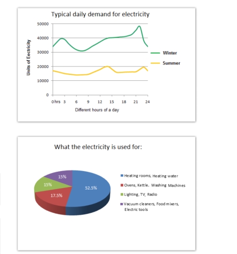
The image contains two separate data visualizations. The first is a graph titled "Typical daily demand for electricity" displaying units of electricity on the y-axis, from 0 to 50000 in increments of 10000, and different hours of a day on the x-axis from 0 to 24. It depicts two lines representing winter and summer electricity demand, with winter starting at about 40000 units at 0 hrs, dropping to just above 20000 units at 3 hrs, rising to approximately 45000 units at 9 hrs and slowly declining to 30000 units by 24 hrs; meanwhile, summer starts at just above 20000 units at 0 hrs, dips slightly below until 6 hrs, gradually increases to nearly 30000 units at 15 hrs and drops back to around 20000 units by 24 hrs. The second visualization is a pie chart titled "What the electricity is used for" indicating percentages for different uses: Heating rooms, Heating water 52.5%, Ovens, Kettle, Washing Machines 17.5%, Lighting, TV, Radio 15%, and Vacuum cleaners, food mixers, Electric tools 15%.
Given the complexity of the image, the above description may not be entirely accurate.
Skyrocket your IELTS band score by 1-2 points in under a month with our premium plan!
Note: Both the topic and the answer were created by one of our users.
The line graph illustrates demand for electricity in England during usual days in winter and summer. On the other hand, the pie chart represents the proportion of electricity usage in an average English household.
Overall, it is clear that there is a significant difference in electricity usage in winter and summer. It is also noticeable from the pie chart that the majority of electricity is consumed for heating rooms and water.
Looking at the details, at 3:00 the winter figure increases to 40,000 units of electricity, while in summer there is a moderate decrease. At around 14:00 the figure climbs up to 20,000 units, in summer. In comparison with the winter trend, the summer one is smaller by 20,000 units. At 21.00 demand for electricity reaches a peak of just under 50,000, while in summer the figure stays stable at around 15,000 units.
Turning to the pie chart, just over one half of electricity is used for heating rooms and water, whereas categories of vacuum cleaners, food mixers, electric tools and lighting, TV, radio account for 15,0 per cent. A further 17.5% is consumed by ovens, kettles, and washing machines.
Word Count: 190
