🔥 Today Only: Save 30% on Premium — Offer Ends Soon! - Upgrade Now!
Line Graph

Band 6+: The graph below shows the number of overseas visitors who cam to the USA for different purposes between 1989 and 2009.

Image for topic: The graph below shows the number of overseas visitors who cam to the USA for different purposes between 1989 and 2009.
Our system will evaluate the answer based on this AI-generated description.
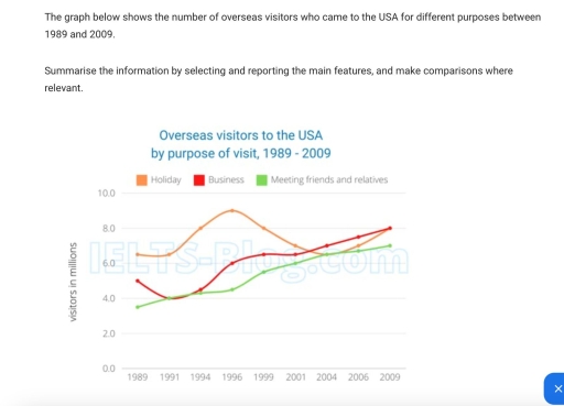
The image depicts a line graph showing overseas visitors to the USA from 1989 to 2009 categorized by purpose: holiday, business, and meeting friends and relatives in millions. In 1989, holiday visitors were approximately 4 million, business visitors around 3 million, and those meeting friends and relatives about 1 million. By 1994, holiday visitors reached nearly 7 million, business visitors remained around 3 million, and visitors meeting friends and relatives increased slightly above 2 million. In 1999, holiday visitors rose to about 8 million, business visitors increased to 5 million, and those meeting friends and relatives were above 3 million. By 2004, holiday visitors dipped to about 6 million, business visitors climbed to nearly 7 million, and those meeting friends and relatives rose above 3 million. In 2009, holiday and business visitors both approximated 9 million, while visitors meeting friends and relatives were nearly 4 million.
Given the complexity of the image, the above description may not be entirely accurate.
Note: Both the topic and the answer were created by one of our users.

The line graph depicts the number of tourists who came to visit the USA for 3 main purposes which includes vacation, business and meeting relatives for the year 1989 to 2009.

During the earlier year up to the 90s, holiday purposes dominates the others. In the first 2 years, it was pretty segment but it increases slowly from the year 1991 and reaches its peak in 1996. The number of visitors for the other 2 reasons are relatively similar altough the number of visitors for business is slightly higher by around 2 million in the late 90s.

In the new melinium, they had almost the same number (6 million) of visitors for each purposes. The trend for business and catching up with relatives are increasing rapidly with the same gradient. On the other hand, for leisure purposes, it experience a steep fall (~ 3 million) in the number of visitors from 1997 to 2004, but increase gradually until 2009.

Word Count: 159

Answers On The Same Topic:

The graph below shows the number of overseas visitors who cam to the USA for different purposes between 1989 and 2009.

The given line graph illustrates the number of overseas visitors who travelled to the USA for holidays, business and visiting friends and relatives between 1989 and 2009. Overall, holidays were the main purpose of travel for most of the period, in spite of noticeable fluctuations. Meanwhile, business travel and visits to friends and relatives increased […]

The graph below shows the number of overseas visitors who cam to the USA for different purposes between 1989 and 2009.

The graph illustrates the number of tourists who came to the USA for different purposes from 1989 to 2009. The number of overseas visitors to the USA for holiday fluctuated over the period, while the number of overseas visitors in the same country for business experienced an upward trend and was the highest of the […]

The graph below shows the number of overseas visitors who cam to the USA for different purposes between 1989 and 2009.

The graph below illustrates how many visitors came from abroad to USA for three distinct reasons in the past twenty years. Overall, there was an upward trend in three categories from 2004 to 2009. Looking into the purpose for holiday, the number of visitors significantly rose from approximately 6.5 million in 1991 to 8 million […]

The graph below shows the number of overseas visitors who cam to the USA for different purposes between 1989 and 2009.

The graph below gives information about the number of overseas visitors who came to the USA for different purposes from 1989 to 2009. Overall, the number of visitors who are came for the holiday although there are fluctuations has been witnessed a slightly increase throughout the period. Likewise, there are also an increase in the […]

See All

Other Topics:

Writing task 1 The line graph illustrates the amount of spreads consumed from 1981 to 2007, in grams per person per week

The line graph illustates of tree spreads consumption (margarine, butter, low fat and reduced spreads) since from the period 1981 to 2007. The measured are grams. Overall, the consumption margarine and butter was decreased over the given period, while low fat and reduced spreads rose. At start of the period butter was the most popular […]

the line graph shows three different crimes in England and Wales in 1970-2005

The line graph illustrates the number of different crimes (car theft, house burglary, and street robbery) in England and Wales between 1970 and 2005. Overall, while car thefts and house burglaries showed an initial increase followed by a decline, street robbery remained consistently low throughout the period. It is also notable that car theft was […]

The graph below shows the amount in grams of potatoes, pasta and rice eaten in a European country between 1976 and 2006.

The given line graph illustrates how many grams of potatoes, pasta, and rice were consumed in a specific European country over a 30-year period, from 1976 to 2006. Overall, it is clear that the consumption of potatoes and rice decreased over the period, while pasta consumption showed a gradual increase. Additionally ,although potatoes were consumed […]

The chart below shows the monthly income of 4 restaurants in Melbourne over a 12-month period

The line graph shows the income of four restaurants throughout the year in thousands of dollars. Overall, Spicy Fortune had the highest income at the beginning of the year, while Evening Paradise showed the biggest increase by the end of the year. On the other hand, Delicacy had the lowest income for most months. Spicy […]

The line chart below shows information on fast food consumption in the UK. rite a report describing the information given

The line graph illustrates the amount of three kinds of fast food (hamburger, fish and chips pizza), wich were consumed from 1970 to 1990 in United Kingdom, the data is given in grams. Overall, the consumption of pizza decreased over the period, while the amount of hamburger and fish and chips increased. In 1970, pizza […]

line graph shows the changes in the use of internet for different activities in the future.

This line graph depicts the changes in the use of internet for different activities in the future. It is clear from the graph that there is a lot of differences of how people are going to use the internet in the future. According to what is shown in the graph it is clear that using […]

See All
We have detected unusual activity on your device.
Please verify your identity to continue.
Note: This verification step won't sign you in. If you have a premium account, please log in to access the service as usual.
Google/Gmail Verification
Or verify using Email/Code
We've sent a verification code to:
youremail@gmail.com (Not your email?)
Enter it below to complete the verification process.
Ensure your email address is correct, your inbox is not full, and you check your spam folder. If no email arrives, consider using an alternative email.
You will need a Premium plan to perform your action!
Note: If you already have a premium account, please log in to access our services as usual.

Plans & Pricing

Our mission is to make quality education accessible for everyone.
However, to keep our hardworking team running and this service alive, we genuinely need your support!
By opting for a premium plan, not only do you sustain us in achieving the mission, but you also unlock advanced features to enrich your learning experience.

Free

For learners who aren't pressed for time

What's included on Free
100+ Cambridge IELTS Tests
Instant IELTS Writing Task 1 & 2 Evaluation (2 times/month)
Instant IELTS Speaking Part 1, 2, & 3 Evaluation (5 times/month)
Instant IELTS Writing Task 1 & 2 Essay Generator (2 times/month)
500+ Dictation & Shadowing Exercises
100+ Pronunciation Exercises
Flashcards
Other Advanced Tools

Premium

For those serious about advancing their English proficiency, and for IELTS candidates aspiring to boost their band score by 1-2 points (especially in writing & speaking) in just 30 days or less

What's included on Premium
Save Your IELTS Test Progress
Unlock All Courses & IELTS Tests
Unlimited AI Conversations
Unlimited AI Writing Enhancement Exercises
Unlimited IELTS Writing Task 1 & 2 Evaluation
Unlimited IELTS Speaking Part 1, 2, & 3 Evaluation
Checked Answers Will Not Be Published
Unlimited IELTS Writing Task 1 & 2 Essay Generator
Unlimited IELTS Speaking Part 1, 2, & 3 Sample Generator
Unlimited Usage Of Advanced Tools
Priority Support within 24h (12-month plan only)

Due to the nature of our service and the provided free trials, payments are non-refundable.
Nếu bạn là người Việt Nam và không có hoặc không muốn trả bằng credit/debit cards, bạn có thể thanh toán bằng phương thức chuyển khoản:


Chọn gói:
419,000₫ 277,000 ₫ cho gói 1 tháng (chỉ 9,233₫/ngày)
1,239,000₫ 597,000 ₫ cho gói 3 tháng (chỉ 6,633₫/ngày)
2,469,000₫ 1,027,000 ₫ cho gói 6 tháng (chỉ 5,706₫/ngày)
4,929,000₫ 1,417,000 ₫ cho gói 12 tháng (chỉ 3,936₫/ngày)


Sau khi chuyển khoản, vui lòng đợi trình duyệt tự động điều hướng bạn trở lại Engnovate và bạn sẽ ngay lập tức nhận được mã kích hoạt tài khoản premium.
Nếu có lỗi xảy ra, bạn có thể liên hệ với team thông qua một trong các phương thức: email đến helloengnovate@gmail.com hoặc nhắn tin qua facebook.com/engnovate.
Vì toàn bộ công cụ trên website đều có thể sử dụng thử miễn phí, Engnovate không hỗ trợ hoàn tiền.