🔥 Today Only: Save 30% on Premium — Offer Ends Soon! - Upgrade Now!
Line Graph

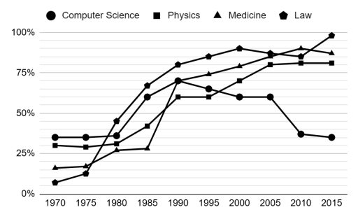
Band 8+: The graph below shows the percentage of female students in four different courses at one university from 1970 to 2015.

Image for topic: The graph below shows the percentage of female students in four different courses at one university from 1970 to 2015.
Our system will evaluate the answer based on this AI-generated description.
The image shows a line graph for four categories from 1970 to 2015: Computer Science, Physics, Medicine, and Law. In 1970, Computer Science is at 10%, Physics at 5%, Medicine at 0%, Law at 5%. In 1975, Computer Science is at 25%, Physics at 15%, Medicine at 5%, Law at 10%. In 1980, Computer Science is at 40%, Physics at 30%, Medicine at 20%, Law at 20%. In 1985, Computer Science is at 50%, Physics at 40%, Medicine at 40%, Law at 35%. In 1990, Computer Science is at 60%, Physics at 50%, Medicine at 55%, Law at 50%. In 1995, Computer Science is at 75%, Physics at 60%, Medicine at 70%, Law at 65%. In 2000, Computer Science is at 85%, Physics at 75%, Medicine at 80%, Law at 77%. In 2005, Computer Science remains at 85%, Physics increases to 85%, Medicine to 90%, Law to 85%. In 2010, Computer Science remains at 85%, Physics at 90%, Medicine dips to 85%, Law decreases to 50%. In 2015, Computer Science at 100%, Physics 95%, Medicine 90%, Law drops to 35%.
Given the complexity of the image, the above description may not be entirely accurate.
Note: Both the topic and the answer were created by one of our users.

Given in the line graph is the proportion of female learners majoring in 4 distinct courses at the same university over the 45-year period spanning from 1970.

Overall, in 1970, Law and Computer Science correspondingly had the lowest and greatest attraction toward schoolgirls. However, a contrast was registered in the last year of the survey. In addition, both women’s attendance rates in Physics and Medicine registered a stable, positive trajectory.

In terms of subjects with continuous growth since 1970, Medicine exhibited a burst to 70% (1990), towering over figures for Physics despite the former’s initially lower statistics. Moreover, the Medicine major fluctuated around 75–85% and reached its peak at 90% in 2010 whereas 80% was the steady feature of Physics in the last 15 years after rocketing from 60% in 1990.

With regards to the contents of the two other subjects, after an unchanged ratio of 35% until 1980, Computer Science suddenly mushroomed to 70%, which coincided with that of Medicine in 1990. Nevertheless, in the five years later, it recognized a successive downswing and culminated at the same percentage as the starting point. Furthermore, Law commanded a lead in the final year subsequent to an oscillation of 10% from 2000.

Word Count: 201

Answers On The Same Topic:

The graph below shows the percentage of female students in four different courses at one university from 1970 to 2015.

The graph illustrates the percentage of female students in four different courses at one university from 1970 to 2015. As regards the computer science course, around 35% of female students remain unchanged between1970 and 1980. After some sharp rises and downs, it returned to 25% in 2015 as the same in the beginning. With a […]

The graph below shows the percentage of female students in four different courses at one university from 1970 to 2015.

The graph above illustrates percentage of female learners accordingly computer science, physics, medicine, and law at one university from 1970 to 2015. Overall, the percentage of students were increasing from 1970 to 2015. The law was more preferred courses among them, in contrast the attention to medicine was the lowest. Acceptance to law showed the […]

The graph below shows the percentage of female students in four different courses at one university from 1970 to 2015.

The line graph presents the ratio of woman scholars in 4 distinct courses at a specific university between 1970 and 2015. Overall, the percentage of female learners increased in physics, and medicine stream throught the given period. Desite the majority computer science course initially, this was surpassed by those choose law path in the middle. […]

The graph below shows the percentage of female students in four different courses at one university from 1970 to 2015.

Given in the line graph is the proportion of female learners majoring in 4 distinct courses at the same university over the 45-year period spanning from 1970. Overall, in 1970, Law and Computer Science correspondingly valued the lowest and greatest attraction toward schoolgirls. However, the contrast was registered in the last year of the survey. […]

See All

Other Topics:

The chart below shows the percentage of households with different kinds of technology in the UK from 1997 to 2001. Summarise the information by selecting and reporting the main features, and make comparisons where relevant.

The line graph illustrates proportion of households with five different types of technology (CD player, Telephone, Computer, Internet, DVD player) in the UK between 1997 to 2001. Overall, it is evident that CD player remained the dominant technology in the UK throughout the period, despite significant fluctuations. Furthermore, while telephone and computer experienced a steady […]

The below line graph shows the percentage of population living in cities.

The line graph illustrates the changes in the population rate of people living in cities in four Asian countries between 1970 and 2020, along with predictions for 2030 and 2040. Overall, all four countries experienced an increase in the urban population, with different trends throughout the decades. To commence, the percentage of the Indonesian population […]

The below line graph shows the percentage of population living in cities.

The line graph illustrates the changes in population rate living in cities in four Asian countries between 1970 and 2020 along with predictions for 2030 and 2040. Overall, all four countries experienced an increase in terms of the urban population with different trends throughout the decades. To commence, the percentage of Indonesian population in 1970 […]

This graph shows the average temperatures in three cities over a two-month period.

The line chart illustrates the mean temperature in Paris, Dubai, and Melbourne throughout the sixty-day timeframe. Overall, the degree of heat in Paris and Duabi grew steadly, whereas Melbourne experienced a minor decline. Paris remained the warmest city across the entire period. It can be observed that the average thermal condition in Paris was around […]

The line graph shows the number of tourists visiting three different countries between 2005 and 2015.

The line graph illustrates the number of visitors three different countries from 2005 to 2015. Overall, it is clear that the number of visitors to country C was at the top of the chart in the first year, while by the end of the period, the number of tourists visiting to country A peaked. Country […]

The graph below shows radio amd television audiences throughout the day in 1992. Summarize the information by selecting and reporting the main features and make comparison where relevant

The graph illustrates radio listeners and television watchers during the day in the UK in 1992. Overall, television was the most watched in the evening, whereas users listened to the radio more in the morning. It is also evident that both media were least used in the early morning. In terms of radio listening, the […]

See All
We have detected unusual activity on your device.
Please verify your identity to continue.
Note: This verification step won't sign you in. If you have a premium account, please log in to access the service as usual.
Google/Gmail Verification
Or verify using Email/Code
We've sent a verification code to:
youremail@gmail.com (Not your email?)
Enter it below to complete the verification process.
Ensure your email address is correct, your inbox is not full, and you check your spam folder. If no email arrives, consider using an alternative email.
You will need a Premium plan to perform your action!
Note: If you already have a premium account, please log in to access our services as usual.

Plans & Pricing

Our mission is to make quality education accessible for everyone.
However, to keep our hardworking team running and this service alive, we genuinely need your support!
By opting for a premium plan, not only do you sustain us in achieving the mission, but you also unlock advanced features to enrich your learning experience.

Free

For learners who aren't pressed for time

What's included on Free
100+ Cambridge IELTS Tests
Instant IELTS Writing Task 1 & 2 Evaluation (2 times/month)
Instant IELTS Speaking Part 1, 2, & 3 Evaluation (2 times/month)
Instant IELTS Writing Task 1 & 2 Essay Generator (2 times/month)
500+ Dictation & Shadowing Exercises
100+ Pronunciation Exercises
Flashcards
Other Advanced Tools

Premium

For those serious about advancing their English proficiency, and for IELTS candidates aspiring to boost their band score by 1-2 points (especially in writing & speaking) in just 30 days or less

What's included on Premium
Save Your IELTS Test Progress & Analyze Mistakes By Question Type
Save Your Own Flashcard Sets & Use Them On Any Device
Unlock All Courses, IELTS Tests, Section & Part Practice
Unlimited AI Conversations
Unlimited AI Writing Enhancement Exercises
Unlimited IELTS Writing Task 1 & 2 Evaluation
Unlimited IELTS Speaking Part 1, 2, & 3 Evaluation
Checked Answers Will Not Be Published
Unlimited IELTS Writing Task 1 & 2 Essay Generator
Unlimited IELTS Speaking Part 1, 2, & 3 Sample Generator
Unlimited Usage Of Advanced Tools & AI Features
Priority Support within 24h (12-month plan only)

Due to the nature of our service and the provided free trials, payments are non-refundable.