🔥 Today Only: Save 30% on Premium — Offer Ends Soon! - Upgrade Now!
Line Graph

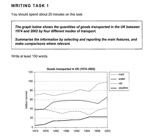
Band 4+: The graph below shows the quantities of goods transported in the UK between 1974 and 2002 by 4 different modes of transport.

Image for topic: The graph below shows the quantities of goods transported in the UK between 1974 and 2002 by 4 different modes of transport.
Our system will evaluate the answer based on this AI-generated description.
The image presents a line graph displaying the quantities of goods transported in the UK between 1974 and 2002 by road, water, rail, and pipeline. In 1974, road transport started at approximately 70 million tonnes, saw a gradual increase peaking at around 100 million tonnes in 1998, and a slight decrease to just below 100 million tonnes by 2002. Water transport began just above 40 million tonnes, fluctuated with a peak at approximately 60 million tonnes in 1994, and ended around 58 million tonnes in 2002. Rail transport started at roughly 40 million tonnes, dipped to about 30 million tonnes by 1982, and then had a steady growth to peak at approximately 42 million tonnes in 2002. Pipeline transport had the least amount in 1974 at around 5 million tonnes, then showed a sharp increase reaching about 20 million tonnes by 1978, followed by a steady growth to nearly 25 million tonnes in 2002.
Given the complexity of the image, the above description may not be entirely accurate.
Note: Both the topic and the answer were created by one of our users.

Writing & test 4 teed 1

7. Un graph illustrates hay in about the quantites a good tranthesed the United kingdom tom 1974 to 2002 y four ways al transpert. The twite GN NE in million tonnes.

Overall, it can be charly seen from thu chart that the highest hind modis Η κονιμος two road, whereas the lowart waar pipeline in all period. Looking at the details, we can noter that mad mode at hansport slightly Increased from 1944 at approximately Omula tonnes. As regards water mode of manημαί started nearly 40 million tonnes through four years, ather that stightly nose unh approximately 48 million tonnes until 1962) until 1994, and the end of the period shouply nowowa until around od million tonnes.

In ims of rail, in hist five years and end Dive years war Fame valur 40 million tonnes, and one middel period was fluctuated beaucen 40 and so million tonnes.

Word Count: 153

Answers On The Same Topic:

The graph below shows the quantities of goods transported in the UK between 1974 and 2002 by 4 different modes of transport.

The line graph illustarte the quantities of goods transported across four different modes of transportation in the UK from 1974 to 2002. Overall, it can be seen that the quantities of goods increased road, water, and pipeline during the 28 years period. In contrast, rail saw a decline the quantities of goods over the last […]

The graph below shows the quantities of goods transported in the UK between 1974 and 2002 by 4 different modes of transport.

The graph shows figures of good transported and compares the different modes of transport in the UK between 1974 and 2002 years. Overall, road and water transport were good results throughout the timeframe. However, Road transported in the UK more than onhers and remained leader. Rail and pipeline transports remained the lowest. Units are given […]

The graph below shows the quantities of goods transported in the UK between 1974 and 2002 by 4 different modes of transport.

the line graph illustrates the number of goods transported in the UK from 1974 to 2002 by four different modes ( road , water , rail and pipeline ) of transport. Overall , the transported goods by road had the highest and it picked up among the other modes of transport while the transported goods […]

The graph below shows the quantities of goods transported in the UK between 1974 and 2002 by 4 different modes of transport.

The line chart delineates the number of products being transported in the United Kingdom by four disparate types of transportation from 1974 to 2002, quantified in million tonnes. Overall, the quantity of goods carried on roads was consistently higher than the others, whereas transporting through pipelines was the least favoured. Additionally, while most cohorts witnessed […]

See All

Other Topics:

The chart below shows the percentage of households with different kinds of technology in the UK from 1997 to 2001. Summarise the information by selecting and reporting the main features, and make comparisons where relevant.

the graph below illustrates the percentage of huseholds with innocent kind of thechniques in the uk from 1997 to 2001 Overall, all of the figures had a growth,but cd player stayed on the top of list in all period. starting from the lowest , the internet was the lowest figure untill 1998 after which the […]

The chart below shows the percentage of households with different kinds of technology in the UK from 1997 to 2001. Summarise the information by selecting and reporting the main features, and make comparisons where relevant.

The line graph illustrates the percentage of households with five different kind of technology namely, CD player, telephone, computer, internet, DVD player, in the UK between 1997 and 2001. Overall, the percentage of all five households technology rose noticeably with. However, the houses with CD player technology led in top of the statistics with noticeable […]

The graph illustrates the price in Euros of 800 grams of four types of bread in one European country from 2001 to 2006.

The line graph compares the prices of four different types of bread in one Europian country between 2001 and 2006. Overall, at the start of the period the wholegrain bread’s cost was the highest, before experiencing a dramatic fall. Other 3 types of bread started at the same point and they all rose throughout the […]

The graph below gives information about the percentage of the population in four Asian countries living in cities from 1970 to 2020, with predictions for 2030 and 2040. Summarise the information by selecting and reporting the main features, and make comparisons where relevant.

The graph shows the changes in the percentage of the population of citizens in four Asian countries between 1970 and 2020. Moreover,it predicts the population from 2030 to 2040. Overall, there is a rising trend for figures for the population living in cities in four Asian nations, with the biggest change shown in the proportion […]

The line graph illustrates how many armed robberies, assaults and murders happened in London from 2003 to 2012

The given line graph illustrates how many major crimes, namely armed robbery, assault, and murder happened in London from the year 2003 to 2012. Overall, armed robbery was the most reported crime at the start of the period, yet it experienced a continuous plunge over the years, before it plateaued at the end. Conversely, assault […]

You should spend about 20 minutes on this task. The line graph below shows the percentage of spending in Turkey, from 1960 to 2000. Summarise the information by selecting and reporting the main features, and make comparisons where relevant. You should write at least 150 words.

The line graph illustrates the percentage of total expenditure on five categories in Turkey, namely food, leisure, clothing, transport and energy, between 1960 and 2000. Overall, food experienced a sharp decline throughout the period, whereas spending on clothing increased significantly. Meanwhile, the proportions spent on leisure, transport and energy also followed downward trends. Looking first […]

See All
We have detected unusual activity on your device.
Please verify your identity to continue.
Note: This verification step won't sign you in. If you have a premium account, please log in to access the service as usual.
Google/Gmail Verification
Or verify using Email/Code
We've sent a verification code to:
youremail@gmail.com (Not your email?)
Enter it below to complete the verification process.
Ensure your email address is correct, your inbox is not full, and you check your spam folder. If no email arrives, consider using an alternative email.
You will need a Premium plan to perform your action!
Note: If you already have a premium account, please log in to access our services as usual.

Plans & Pricing

Our mission is to make quality education accessible for everyone.
However, to keep our hardworking team running and this service alive, we genuinely need your support!
By opting for a premium plan, not only do you sustain us in achieving the mission, but you also unlock advanced features to enrich your learning experience.

Free

For learners who aren't pressed for time

What's included on Free
100+ Cambridge IELTS Tests
Instant IELTS Writing Task 1 & 2 Evaluation (2 times/month)
Instant IELTS Speaking Part 1, 2, & 3 Evaluation (2 times/month)
Instant IELTS Writing Task 1 & 2 Essay Generator (2 times/month)
500+ Dictation & Shadowing Exercises
100+ Pronunciation Exercises
Flashcards
Other Advanced Tools

Premium

For those serious about advancing their English proficiency, and for IELTS candidates aspiring to boost their band score by 1-2 points (especially in writing & speaking) in just 30 days or less

What's included on Premium
Save Your IELTS Test Progress & Analyze Mistakes By Question Type
Save Your Own Flashcard Sets & Use Them On Any Device
Unlock All Courses, IELTS Tests, Section & Part Practice
Unlimited AI Conversations
Unlimited AI Writing Enhancement Exercises
Unlimited IELTS Writing Task 1 & 2 Evaluation
Unlimited IELTS Speaking Part 1, 2, & 3 Evaluation
Checked Answers Will Not Be Published
Unlimited IELTS Writing Task 1 & 2 Essay Generator
Unlimited IELTS Speaking Part 1, 2, & 3 Sample Generator
Unlimited Usage Of Advanced Tools & AI Features
Priority Support within 24h (12-month plan only)

Due to the nature of our service and the provided free trials, payments are non-refundable.