Our system will evaluate the answer based on this AI-generated description.
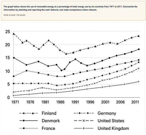
The image features a line graph with the vertical axis displaying values from 0 to 25 in increments of 5, and the horizontal axis showing years from 1971 to 2011 in 5-year intervals (1971, 1976, 1981, 1986, 1991, 1996, 2001, 2006, 2011). The legend lists six countries: Finland (dashed line with triangles), Denmark (solid line with filled circles), France (dotted line with squares), Germany (dash-dotted line with diamonds), United States (dashed line with crosses), and United Kingdom (solid line with plus signs). Approximate data points per country across the years are: Finland: 1971: ~24.1, 1973: ~20.8, 1975: ~21.5, 1978: ~19.5, 1980: ~18.3, 1981: ~20.0, 1982: ~21.7, 1984: ~20.1, 1986: ~17.9, 1988: ~16.5, 1990: ~17.0, 1992: ~17.9, 1995: ~18.7, 1997: ~19.3, 2000: ~20.3, 2002: ~20.8, 2005: ~20.4, 2007: ~21.7, 2009: ~22.6, 2011: ~23.2; Denmark: 1971: ~15.0, 1975: ~12.3, 1980: ~13.5, 1982: ~11.9, 1985: ~12.4, 1986: ~10.3, 1987: ~10.7, 1989: ~13.3, 1991: ~14.4, 1993: ~13.0, 1996: ~12.1, 1998: ~12.8, 2000: ~13.9, 2002: ~14.9, 2005: ~15.8, 2007: ~16.4, 2009: ~17.2, 2011: ~18.2; France: 1971: ~8.0, 1975: ~10.1, 1980: ~9.3, 1982: ~8.6, 1985: ~8.0, 1987: ~8.0, 1990: ~8.9, 1993: ~9.5, 1996: ~10.0, 1998: ~10.5, 2000: ~11.0, 2002: ~11.6, 2005: ~12.5, 2007: ~13.0, 2009: ~13.5, 2011: ~14.1; Germany: 1971: ~5.2, 1974: ~5.3, 1976: ~5.2, 1980: ~5.2, 1982: ~5.2, 1985: ~4.5, 1987: ~4.8, 1990: ~5.1, 1993: ~5.9, 1996: ~6.7, 1998: ~7.4, 2000: ~8.3, 2002: ~9.0, 2005: ~9.8, 2007: ~10.8, 2009: ~12.0, 2011: ~13.3; United States: 1971: ~2.0, 1975: ~2.5, 1980: ~3.6, 1985: ~2.8, 1990: ~3.6, 1996: ~4.6, 1998: ~5.3, 2000: ~6.4, 2002: ~7.0, 2005: ~7.7, 2007: ~8.6, 2009: ~9.6, 2011: ~11.0; United Kingdom: 1971: ~0.7, 1975: ~1.2, 1980: ~1.7, 1985: ~1.9, 1990: ~2.4, 1996: ~3.2, 2000: ~3.8, 2002: ~4.2, 2007: ~4.9, 2011: ~5.9.
Given the complexity of the image, the above description may not be entirely accurate.
Skyrocket your IELTS band score by 1-2 points in under a month with our premium plan!
Note: Both the topic and the answer were created by one of our users.
The line graph illustrates the proportions of renewable energy use as a percentage of total energy consumption in six countries between 1971 and 2011.
Overall, of all countries, Finland demonstrated the highest consumption of renewable energy, whereas the United Kingdom remained consistently the lowest throughout the period. Additionally, with the exception of Finland, all other states experienced significant growth in usage.
At the beginning of the period, Finland’s renewable energy represented almost 25% of total power, while Denmark’s sustainable energy accounted for 15%. Then, in both Finland and Denmark, there were fluctuating trends before hitting a low of 13-17% in 2006. After recovering, the share of renewable energy rose gradually, finishing the period at approximately 23% in Finland and nearly 19% in Denmark in 2011.
In France, there was a sharp decline between 1976 and 1986; subsequently, renewable energy increased significantly, finishing the period at 15%. By contrast, Germany’s renewable energy levelled off at a low figure until 1986; after that, it soared to around 10% in 2011. Along with this, the figure for the United Kingdom considerably increased from a negligible 0% to under 6% over the entire period, whereas the United States, after bottoming out in 1986, increased markedly to 10%.
Word Count: 203
