24 Hours Only: Get 20% OFF on Our Premium Plan - Upgrade Now!
Bar Chart

Band 5+: The graph gives information about coffee production in 4 different countries from 1990 to 2010.

Image for topic: The graph gives information about coffee production in 4 different countries from 1990 to 2010.
Our system will evaluate the answer based on this AI-generated description.
The image presents a bar graph illustrating the production of an unspecified item in million tonnes from 1990 to 2010 for Brazil, Colombia, Indonesia, and Vietnam. In 1990, Brazil produced approximately 0.8 million tonnes, Colombia around 0.2 million tonnes, Indonesia roughly 0.6 million tonnes, and Vietnam close to 0.4 million tonnes. In 1995, Brazil's production increased to around 1 million tonnes, Colombia's slightly rose to just above 0.2 million tonnes, Indonesia's jumped to nearly 1.4 million tonnes, and Vietnam's escalated to approximately 1.6 million tonnes. By 2000, Brazil's production decreased to about 0.4 million tonnes, Colombia's remained stable at just above 0.2 million tonnes, Indonesia's reduced to roughly 0.8 million tonnes, and Vietnam's slightly increased to nearly 1.8 million tonnes. Lastly, in 2010, Brazil produced around 0.2 million tonnes, Colombia approximately 0.2 million tonnes, Indonesia close to 0.4 million tonnes, and Vietnam maintained its production at nearly 1.8 million tonnes.
Given the complexity of the image, the above description may not be entirely accurate.
Note: Both the topic and the answer were created by one of our users.

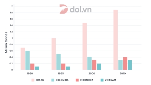
The chart illustrates the coffee production in 4 varied regions in the in a different times from 1990 to 2010. Units are measured in million tonnes.

Overall, it is clear that the Brazil produced bigger amout in comparison with Vietnam who has mostly lagged behind . The production of coffee raised up in all the countries. Furthermore, the most significant changes hapenned in Brazil, while in the the changes are less visible.

In 1990, the difference between regions was not very noticeable. For constant, comparing Brazil and Colombia with only 0,1 million tonnes of variation, same as Indonesia and Vietnam. However, in 1995 Brazil rose on 0,3 million tones as opposed to Colombia whose manufacturing dropped on 0,1 million tonnes. Other 2 countries maintained the indicators on the same level.

Later on, in 2000 and 2010, which is a longer period, Brazil extremely continued to grow and other countries either stabilized in the numbers or fell down. Such as Vietnam whose indicators fell down by 2010.

Word Count: 166

Answers On The Same Topic:

The graph gives information about coffee production in 4 different countries from 1990 to 2010.

The provided bar graph delineates coffee production across four nations over two decades, specifically from 1990 to 2010. Overall, while Brazil maintained a dominant position in coffee production throughout the period, Colombia experienced a significant decline. In contrast, Vietnam displayed a relatively stable output, contributing to a nuanced landscape of coffee production. In 1990, Brazil […]

The graph gives information about coffee production in 4 different countries from 1990 to 2010.

The bar chart illustrates the amount of coffee produced (in million tonnes) in Vietnam, Brazil, Colombia, and Indonesia between 1990 and 2010. Overall, Brazil consistently produced the most coffee throughout the period, with a significant upward trend. In contrast, Colombia was the only country that experienced a decline, while the other three nations all saw […]

The graph gives information about coffee production in 4 different countries from 1990 to 2010.

The bar chart illustrates information about coffee manufacture in 4 different countries around 20 years from 1990. Overall, while Brazil, Indonesia and Vietnam produced more and more coffee over time, Colombia’s coffee production decreased every years. The figure of coffee in Brazil remained the highest over 20 years, with around 0.7 million tonnes at first […]

The graph gives information about coffee production in 4 different countries from 1990 to 2010.

The bar chart compares the total amounts of coffee manufactured across Brazil, Colombia, Indonesia and Vietnam, measured by million tons, between 1990 and 2010, with five-years intervals. Overall, most of coffee manufacturers experienced an upward trend in production over the observed period, except for Colombia which decreased. Another notable point is that Brazil was the […]

See All

Other Topics:

The bar chart illustrates the percentage of students selecting different univeristy subjects in a university in the UK in 2010.

The bar chart shows the figure for students, who choosing diversity university subjects(engineering, business, medicine, arts, laws, computer science, psychology and education) in the UK by 2010. The data measured by percentages. Overall, it it clear that, the amount of chose subjects such as computer science, engineering, business and medicine showed the highest points while […]

The bar chart below illustrates the average daily water consumption (in liters) per person in five different countries in 2010 and 2020.

The bar chart illustrates the average daily water consumption per capita across five different nations between 2010 and 2020. Overall, it is evident that the USA consistently maintained the highest consumption rates throughout the decade, whereas India recorded the lowest figures. Furthermore, every country witnessed an upward trend in water usage by the end of […]

The chart below shows the average earnings of people in various areas of work in one country in 2000 and 2010. The table shows the average salary for all sectors in the same years. Provide an overview of the information by identifying and describing the key details, and include comparisions where appropriate.

The chart illustrates the average payout for different full-time employees in different sectors for a full year in 2000 and 2010. Overall, the bar chart shows the highest salary secor is Financial Services in both years comparing to the tourism as lower sector for both years. In 2000, Full time employees in financial services received […]

The bar chart shows the number of visits to a community website in the first and second years of use Number of visits to a community website: First and second years of use

The bar chart illustrates the number of visits to a community. Overall, I can say that on the first year of used a website was not so many. But in October visitors was less then first month we see how visitors increase. In November it was already 10,000 visitors for 2 month, but than it […]

The bar chart below shows the number of international students enrolled in different types of courses at a Canadian university in 2010 and 2020.

This graph illustrates the number of foreign students undertaking different programs for tertiary education in Canada in the years 2010 and 2020. Overall, there was limited variation in the number of students undertaking university courses between 2010 and 2020, despite a marginal increase favoring 2020 throughout each program. Undergraduate courses remained the most popular throughout […]

The graph below shows the average daily sales of selected food items ar the Brisk Cafe, by season.

The provided bar chart compares information about the number of average daily sakes of selected food items at the Brisk cafe, by season. Overall, it can be seen that the highest number of average daily sales on Hot coffee in winter. While the lowest digit of Ice cream in summer. There are similar trend between […]

See All
We have detected unusual activity on your device.
Please verify your identity to continue.
Note: This verification step won't sign you in. If you have a premium account, please log in to access the service as usual.
Google/Gmail Verification
Or verify using Email/Code
We've sent a verification code to:
youremail@gmail.com (Not your email?)
Enter it below to complete the verification process.
Ensure your email address is correct, your inbox is not full, and you check your spam folder. If no email arrives, consider using an alternative email.
You will need a Premium plan to perform your action!
Note: If you already have a premium account, please log in to access our services as usual.

Plans & Pricing

Our mission is to make quality education accessible for everyone.
However, to keep our hardworking team running and this service alive, we genuinely need your support!
By opting for a premium plan, not only do you sustain us in achieving the mission, but you also unlock advanced features to enrich your learning experience.

Free

For learners who aren't pressed for time

What's included on Free
100+ Cambridge IELTS Tests
Instant IELTS Writing Task 1 & 2 Evaluation (2 times/month)
Instant IELTS Speaking Part 1, 2, & 3 Evaluation (5 times/month)
Instant IELTS Writing Task 1 & 2 Essay Generator (2 times/month)
500+ Dictation & Shadowing Exercises
100+ Pronunciation Exercises
Flashcards
Other Advanced Tools

Premium

For those serious about advancing their English proficiency, and for IELTS candidates aspiring to boost their band score by 1-2 points (especially in writing & speaking) in just 30 days or less

What's included on Premium
Save Your IELTS Test Progress
Unlock All Courses & IELTS Tests
Unlimited AI Conversations
Unlimited AI Writing Enhancement Exercises
Unlimited IELTS Writing Task 1 & 2 Evaluation
Unlimited IELTS Speaking Part 1, 2, & 3 Evaluation
Checked Answers Will Not Be Published
Unlimited IELTS Writing Task 1 & 2 Essay Generator
Unlimited IELTS Speaking Part 1, 2, & 3 Sample Generator
Unlimited Usage Of Advanced Tools
Priority Support within 24h (12-month plan only)

Due to the nature of our service and the provided free trials, payments are non-refundable.
Nếu bạn là người Việt Nam và không có hoặc không muốn trả bằng credit/debit cards, bạn có thể thanh toán bằng phương thức chuyển khoản:


Chọn gói:
459,000₫ 347,000 ₫ cho gói 1 tháng (chỉ 11,567₫/ngày)
1,359,000₫ 797,000 ₫ cho gói 3 tháng (chỉ 8,856₫/ngày)
2,699,000₫ 1,367,000 ₫ cho gói 6 tháng (chỉ 7,594₫/ngày)
5,399,000₫ 1,997,000 ₫ cho gói 12 tháng (chỉ 5,547₫/ngày)


Sau khi chuyển khoản, vui lòng đợi trình duyệt tự động điều hướng bạn trở lại Engnovate và bạn sẽ ngay lập tức nhận được mã kích hoạt tài khoản premium.
Nếu có lỗi xảy ra, bạn có thể liên hệ với team thông qua một trong các phương thức: email đến helloengnovate@gmail.com hoặc nhắn tin qua facebook.com/engnovate.
Vì toàn bộ công cụ trên website đều có thể sử dụng thử miễn phí, Engnovate không hỗ trợ hoàn tiền.