🔥 Today Only: Save 30% on Premium — Offer Ends Soon! - Upgrade Now!
Line Graph

Band 7+: The graph gives information about people of different age groups in New Zealand who went to a fitness center twice a week or more. Summarize the information by selecting and reporting the main features, and make comparisons where relevant. Write at least 150 words.

Image for topic: The graph gives information about people of different age groups in New Zealand who went to a fitness center twice a week or more. Summarize the information by selecting and reporting the main features, and make comparisons where relevant. Write at least 150 words.
Our system will evaluate the answer based on this AI-generated description.
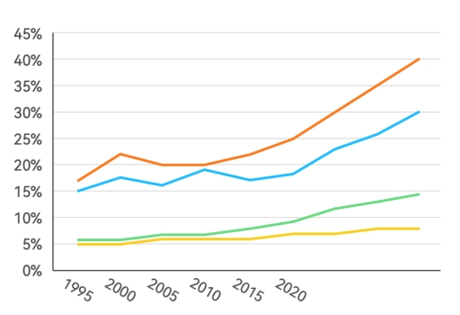
The image shows a line chart with four lines representing different data trends plotted against years 1995, 2000, 2005, 2010, 2015, 2020 on the x-axis and percentages ranging from 0% to 45% on the y-axis; the topmost line starts just above 15% in 1995, increases steadily to just under 25% by 2005, follows a steeper incline to almost 35% by 2010, and continues the rise to surpass 40% by 2020; the second-highest line begins just below 15% in 1995, experiences a slight dip to above 10% by 2000, ascends to just over 20% by 2010 and finishes near 30% by 2020; the third line, starting near 5%, progresses modestly to approach 10% in 2010 and concludes near 15% by 2020; the lowest line also commences at approximately 5%, shows a gradual incline to 10% by 2010, and reaches above 10% by 2020; no specific data points are labeled or marked on any lines.
Given the complexity of the image, the above description may not be entirely accurate.
Note: Both the topic and the answer were created by one of our users.

The line chart displays information regarding the various age groups of individuals who frequented a fitness center at least twice a week in New Zealand.

The most common age group of individuals visiting the fitness center at least twice a week was between 29 and 39 years old, with the percentage of this age group rising from around 17% in 1995 to 25% in 2020.

The trend for the age group of 18 to 28 years old who visited a fitness center differed from the 29 to 39 age group. The percentage for the 18-28 age group fluctuated between nearly 20% and 15% from 1995 to 2020.

The trends for the age groups of 40 to 50 and 51 to 61 were similar, with both age groups showing a gradual increase from 1995 to 2020 (from approximately 6% to 10% for the 40-50 age group and from 5% to 7% for the 51-61 age group).

In total, between 1995 and 2020, there was a significant growth in the overall percentage of individuals aged 28 to 61 who visited a fitness center at least twice a week, except for a slight decrease in the percentage of the 18 to 28 age group.

Word Count: 201

Answers On The Same Topic:

The graph gives information about people of different age groups in New Zealand who went to a fitness center twice a week or more. Summarize the information by selecting and reporting the main features, and make comparisons where relevant. Write at least 150 words.

The line chart illustrates the percentage of Europeans from four different age groups who visited the gym at least once per month between 1995 and 2025. Overall, gym attendance increased across all age groups over the 30-year period. The highest participation was consistently recorded among the youngest age group (18-24), while the oldest group (45 […]

The graph gives information about people of different age groups in New Zealand who went to a fitness center twice a week or more. Summarize the information by selecting and reporting the main features, and make comparisons where relevant. Write at least 150 words.

The graph illustrates the proportion of New Zealanders from different age groups who attended a fitness center at least twice per week. Overall, younger people were more likely to engage in regular fitness activities compared with older age groups, and participation generally declined with age. However, there were some fluctuations across the categories. The highest […]

The graph gives information about people of different age groups in New Zealand who went to a fitness center twice a week or more. Summarize the information by selecting and reporting the main features, and make comparisons where relevant. Write at least 150 words.

The line graph given compare four age groups 18-24;25;34;35-44 and 45 and over based on number of people went to gyms once a month or more between 1990 and 2010 at 4-year intervals.Looking at the illustrations it is immediately evident 18-24 age groups recorded the highest figures all throughout the period ,whereas the opposite was […]

The graph gives information about people of different age groups in New Zealand who went to a fitness center twice a week or more. Summarize the information by selecting and reporting the main features, and make comparisons where relevant. Write at least 150 words.

The line chart illustrates the percentage of European individuals from various age groups who frequented gyms at least once a month from 1990 to 2010, at 4-year intervals. Overall, the data reveals significant differences in gym attendance among the age groups, with those aged 18-24 consistently exhibiting the highest engagement, while the older demographic demonstrated […]

The graph gives information about people of different age groups in New Zealand who went to a fitness center twice a week or more. Summarize the information by selecting and reporting the main features, and make comparisons where relevant. Write at least 150 words.

The provided chart illustrates the proportion of Europeans in different age groups who visited gyms at least once a month from 1990 to 2010. Overall, all age groups experienced a significant increase in gym memberships, with the 18-24-year-old cohort registering the most pronounced growth, even though it started at the second position. It is also […]

See All

Other Topics:

The chart below shows the evolution of the major world exporters of liquefied gas from 2017 to 2023. Summarize the information by selecting and reporting the main features, and make comparisons where relevant.

The line chart illustrates the changes that occurred between the years 2017 and 2023 in the amount of liguified gas exported by three countries, namely: Quatar, Australia, and the US. Overall, the US enjoyed the most significant growth of the featured countries, while Australia saw minor rise and Quatar remained at roughly the same value […]

The graph below shows the average number of people attending top-level football matches in three European countries from 1980 to 2004. Summarize the information by selecting and reporting the main features, and make comparisons where relevant

The line graph illustrates the number of people attending top level football matches in Italy, England and Germany over a 24 years , beginning at 1980 Overall, the number of people attending top level football matches in Italy decreased significantly, while the number of people from England and Germamy saw sharp climb. Notably, the highest […]

The graph below shows relative price changes for fresh fruits and vegetables, sugars and sweets, and carbonated drinks between 1978 and 2009. Summarise the information by selecting and reporting the main features, and make comparisons where relevant.

The line graph illustrates the changes in the prices of four different food and consumer items between 1979 and 2009. Overall, the trends show that the prices for all categories increased over the 30-year period. Fresh fruits and vegetables experienced the highest and fastest growth, while carbonated drinks saw the lowest increase. In 1979, the […]

The graph below shows relative price changes for fresh fruits and vegetables, sugars and sweets, and carbonated drinks between 1978 and 2009. Summarise the information by selecting and reporting the main features, and make comparisons where relevant.

The line graph shows the price changes of three different food categories compared to the consumer price index between 1979 and 2009. Overall, the prices of all items increased over the 30-year period. The cost of fresh fruits and vegetables grew the fastest and rose well above the consumer price index. In contrast, the two […]

The graph below gives information about car ownership in one European country from 1975 to 2005.

The line graph illustrates changes in the proportion of household’s car ownership in four different categories in a particular European nation over a 40-year period starting in 1975. In general, it is noticeable that different trends were observed in all the given groups throughout the period. ‘1 car’ recorded the highest percentage of car ownership […]

The graph below shows the number of enquiries received by the Tourists Information Office in one city over a six-month period in 2011.

The graph shows the number on enquiries received by Tourist Information Office over first half of 2011, divided by the communication method used. The amount of enquiries hit the highest point in June with nearly 3.900 received, while the lowest was in February with 2.100 received. Walk-ins and Telephone were the method that growing over […]

See All
We have detected unusual activity on your device.
Please verify your identity to continue.
Note: This verification step won't sign you in. If you have a premium account, please log in to access the service as usual.
Google/Gmail Verification
Or verify using Email/Code
We've sent a verification code to:
youremail@gmail.com (Not your email?)
Enter it below to complete the verification process.
Ensure your email address is correct, your inbox is not full, and you check your spam folder. If no email arrives, consider using an alternative email.
You will need a Premium plan to perform your action!
Note: If you already have a premium account, please log in to access our services as usual.

Plans & Pricing

Our mission is to make quality education accessible for everyone.
However, to keep our hardworking team running and this service alive, we genuinely need your support!
By opting for a premium plan, not only do you sustain us in achieving the mission, but you also unlock advanced features to enrich your learning experience.

Free

For learners who aren't pressed for time

What's included on Free
100+ Cambridge IELTS Tests
Instant IELTS Writing Task 1 & 2 Evaluation (2 times/month)
Instant IELTS Speaking Part 1, 2, & 3 Evaluation (2 times/month)
Instant IELTS Writing Task 1 & 2 Essay Generator (2 times/month)
500+ Dictation & Shadowing Exercises
100+ Pronunciation Exercises
Flashcards
Other Advanced Tools

Premium

For those serious about advancing their English proficiency, and for IELTS candidates aspiring to boost their band score by 1-2 points (especially in writing & speaking) in just 30 days or less

What's included on Premium
Save Your IELTS Test Progress & Analyze Mistakes By Question Type
Save Your Own Flashcard Sets & Use Them On Any Device
Unlock All Courses, IELTS Tests, Section & Part Practice
Unlimited AI Conversations
Unlimited AI Writing Enhancement Exercises
Unlimited IELTS Writing Task 1 & 2 Evaluation
Unlimited IELTS Speaking Part 1, 2, & 3 Evaluation
Checked Answers Will Not Be Published
Unlimited IELTS Writing Task 1 & 2 Essay Generator
Unlimited IELTS Speaking Part 1, 2, & 3 Sample Generator
Unlimited Usage Of Advanced Tools & AI Features
Priority Support within 24h (12-month plan only)

Due to the nature of our service and the provided free trials, payments are non-refundable.