🔥 Today Only: Save 30% on Premium — Offer Ends Soon! - Upgrade Now!
Multiple Graphs

Band 9: The graph gives information about the number of yearly visits from France and North America for holiday and business. Summarise the information by selecting and reporting the main features, and make comparisons where relevant.

Image for topic: The graph gives information about the number of yearly visits from France and North America for holiday and business. Summarise the information by selecting and reporting the main features, and make comparisons where relevant.
Our system will evaluate the answer based on this AI-generated description.
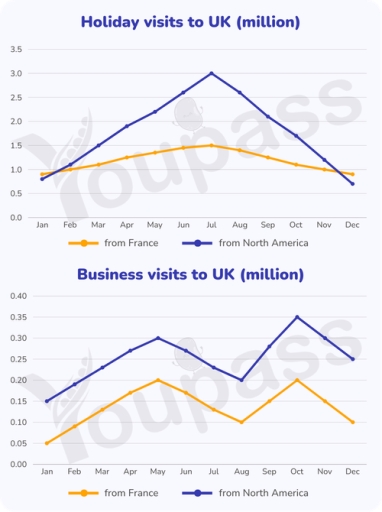
The image presents two line graphs detailing monthly visits to the UK in millions. The first graph, titled "Holiday visits to UK (million)", shows data from France and North America. For France, the monthly visit figures are: Jan 0.9, Feb 1.0, Mar 1.1, Apr 1.2, May 1.3, Jun 1.4, Jul 1.5, Aug 1.4, Sep 1.3, Oct 1.2, Nov 1.0, and Dec 0.9. For North America, the figures are: Jan 0.8, Feb 1.2, Mar 1.6, Apr 2.0, May 2.3, Jun 2.7, Jul 3.0, Aug 2.7, Sep 2.3, Oct 1.8, Nov 1.3, and Dec 0.7. The second graph, "Business visits to UK (million)", displays monthly data for the same regions. For France, the figures are: Jan 0.05, Feb 0.10, Mar 0.15, Apr 0.18, May 0.20, Jun 0.15, Jul 0.12, Aug 0.10, Sep 0.15, Oct 0.20, Nov 0.15, and Dec 0.10. For North America, the figures are: Jan 0.15, Feb 0.20, Mar 0.25, Apr 0.28, May 0.30, Jun 0.25, Jul 0.22, Aug 0.20, Sep 0.28, Oct 0.35, Nov 0.30, and Dec 0.25.
Given the complexity of the image, the above description may not be entirely accurate.
Note: Both the topic and the answer were created by one of our users.

The graphs illustrate the number of holiday and business visits to the UK from France and North America over a twelve-month period.

Overall, North America recorded higher figures for both holiday and business visits than France. While holiday visits from North America fluctuated significantly and peaked in July, the number of holiday visitors from France remained relatively stable throughout the year.

In terms of business travel, visits from North America increased from 0.15 million in January to a peak of 0.35 million in October before declining slightly at the end of the year. France followed a similar trend but at a much lower level, rising from 0.05 million to 0.2 million in both May and October.

Regarding holiday visits, North America experienced a dramatic increase from around 0.9 million in January to 3 million in July, after which the figure declined steadily to approximately 0.7 million in December. By contrast, holiday visits from France rose gradually to about 1.5 million in July before falling back to around 0.9 million by the end of the period.

Word Count: 175

Answers On The Same Topic:

The graph gives information about the number of yearly visits from France and North America for holiday and business. Summarise the information by selecting and reporting the main features, and make comparisons where relevant.

The two given line graphs compare the number of trips made to the UK for 2 different purposes from France and North America across the 12 months. Overall, what stand out from the two line is that the proportion for North America was consistently higher than that for France in both types of visits. Additionally, […]

The graph gives information about the number of yearly visits from France and North America for holiday and business. Summarise the information by selecting and reporting the main features, and make comparisons where relevant.

The listed graphs illustrate the number of visitors coming from France and North America for either vacation or business over one year. Overall, each visit purpose has a different pattern. On the one hand, holiday trips reach their peak in July of the summer. On the other hand, the business pattern is divided into two […]

The graph gives information about the number of yearly visits from France and North America for holiday and business. Summarise the information by selecting and reporting the main features, and make comparisons where relevant.

The two line graphs compare the number of visits to the UK from France and North America for holiday and business purposes over the course of a year. Overall, holiday travel attracted substantially more visitors than business travel throughout the year. Holiday visits showed much greater fluctuations, whereas business travel remained comparatively stable, with North […]

The graph gives information about the number of yearly visits from France and North America for holiday and business. Summarise the information by selecting and reporting the main features, and make comparisons where relevant.

The two graphs illustrate the number of visits from France and North America to the Uk for holiday and business purposes. Overall, French and North America visitors share similar trends in relation to two different purposes. While holiday season shows a single peak in July, the pattern for business trips fluctuates more considerably and records […]

The graph gives information about the number of yearly visits from France and North America for holiday and business. Summarise the information by selecting and reporting the main features, and make comparisons where relevant.

The two line graphs illustrate the annual number of trips from France and North America to the UK for both holiday and business purposes. Overall, it is evident that visitors from both regions followed similar seasonal patterns. Notably, July stands out as the busiest month for holidaymakers, whereas October is the most popular time for […]

See All

Other Topics:

WRITING TASK 1 You should spend about 20 minutes on this task. The chart and table below show the results of a survey of library users at a university. Summarise the information by selecting and reporting the main features, and make comparisons where relevant. Write at least 150 words.

The pie chart illustrates five categories of library users, while the table presents their satisfaction levels with different library facilities. Overall, full-time undergraduates account for the largest proportion of library users, whereas academic staff represent the smallest group. In terms of satisfaction, the helpfulness of staff receives the highest rating, while the availability of journals […]

WRITING TASK 1 You should spend about 20 minutes on this task. The chart and table below show the results of a survey of library users at a university. Summarise the information by selecting and reporting the main features, and make comparisons where relevant. Write at least 150 words.

A pie chart is given to us, which is divided into 5 categories of the library users, along with the table that shows the satisfaction level of the users for the different facilities available at the library. The pie chart shows nearly half of the users are full-time undergraduates, around 44% while rest of the […]

The line graph below shows the average number of hours per week that young adults and older adults in Brazil spent on various leisure activities from 1990 to 2020. Summarise the information by selecting and reporting the main features, and make comparisons where relevant.

The line graph illustrates the average number of hours per week that young adults and older adults in Brazil spent on their various leisure activities from 1990 to 2020. Overall, watching TV or streaming was the most time-consuming leisure activity among both age groups, although the trends differed over the period. While older adults spent […]

The line graph below shows the average number of hours per week that young adults and older adults in Brazil spent on various leisure activities from 1990 to 2020. Summarise the information by selecting and reporting the main features, and make comparisons where relevant.

The line graph illustrates the average number of hours per week that young adults and older adults in Brazil spent on their various leisure activities from 1990 to 2020. Overall, watching TV or streaming was the most time-consuming leisure activity among both age groups, although the trends differed over the period. While older adults spent […]

The charts below show the percentage of working time in office spending on different tasks in the US in 1980 and 2006.

The pie charts compare the proportion of working time in office spending on different tasks in the US in 1980 and 2006. Overall, in the first year the using computer category showed absolute dominance, while using telephone and talking with colleagues accounted for almost identical proportions. The other things category constituted the smallest percentage. Meanwhile, […]

The charts below give information about 14 to 16-year-old students studying modern foreign languages in an English-speaking country in 1984 and 2007. Summarize the information by selecting and reporting the main features, and make comparisons where relevant

The two bar chart illustrates the percentages of 14 to 16 years-old students learning a modern additional language in an English-speaking country in two different years-1984 and 2007. Overall, the former bar chart provided information about the proportion of girls and boys in both years, therefore in two years girls contributed higher percentages than boy’s […]

See All
We have detected unusual activity on your device.
Please verify your identity to continue.
Note: This verification step won't sign you in. If you have a premium account, please log in to access the service as usual.
Google/Gmail Verification
Or verify using Email/Code
We've sent a verification code to:
youremail@gmail.com (Not your email?)
Enter it below to complete the verification process.
Ensure your email address is correct, your inbox is not full, and you check your spam folder. If no email arrives, consider using an alternative email.
You will need a Premium plan to perform your action!
Note: If you already have a premium account, please log in to access our services as usual.

Plans & Pricing

Our mission is to make quality education accessible for everyone.
However, to keep our hardworking team running and this service alive, we genuinely need your support!
By opting for a premium plan, not only do you sustain us in achieving the mission, but you also unlock advanced features to enrich your learning experience.

Free

For learners who aren't pressed for time

What's included on Free
100+ Cambridge IELTS Tests
Instant IELTS Writing Task 1 & 2 Evaluation (2 times/month)
Instant IELTS Speaking Part 1, 2, & 3 Evaluation (2 times/month)
Instant IELTS Writing Task 1 & 2 Essay Generator (2 times/month)
500+ Dictation & Shadowing Exercises
100+ Pronunciation Exercises
Flashcards
Other Advanced Tools

Premium

For those serious about advancing their English proficiency, and for IELTS candidates aspiring to boost their band score by 1-2 points (especially in writing & speaking) in just 30 days or less

What's included on Premium
Save Your IELTS Test Progress & Analyze Mistakes By Question Type
Save Your Own Flashcard Sets & Use Them On Any Device
Unlock All Courses, IELTS Tests, Section & Part Practice
Unlimited AI Conversations
Unlimited AI Writing Enhancement Exercises
Unlimited IELTS Writing Task 1 & 2 Evaluation
Unlimited IELTS Speaking Part 1, 2, & 3 Evaluation
Checked Answers Will Not Be Published
Unlimited IELTS Writing Task 1 & 2 Essay Generator
Unlimited IELTS Speaking Part 1, 2, & 3 Sample Generator
Unlimited Usage Of Advanced Tools & AI Features
Priority Support within 24h (12-month plan only)

Due to the nature of our service and the provided free trials, payments are non-refundable.