🔥 Today Only: Save 30% on Premium — Offer Ends Soon! - Upgrade Now!
Line Graph

Band 6+: The graph shows data about the annual earnings of three bakeries in Calgary, 2000-2010. Summarize the information by selecting and reporting the main features, and make comparisons where relevant.

Image for topic: The graph shows data about the annual earnings of three bakeries in Calgary, 2000-2010. Summarize the information by selecting and reporting the main features, and make comparisons where relevant.
Our system will evaluate the answer based on this AI-generated description.
The image presents a line graph detailing yearly income in dollars from 2000 to 2010 for three entities: Amandine Bakery, Mari Bakeshop, and Bolo Cakery. In 2000: Amandine Bakery $55,000, Mari Bakeshop $75,000, Bolo Cakery $20,000. In 2001: Amandine Bakery $60,000, Mari Bakeshop $70,000, Bolo Cakery $25,000. In 2002: Amandine Bakery $55,000, Mari Bakeshop $85,000, Bolo Cakery $30,000. In 2003: Amandine Bakery $60,000, Mari Bakeshop $80,000, Bolo Cakery $35,000. In 2004: Amandine Bakery $65,000, Mari Bakeshop $75,000, Bolo Cakery $35,000. In 2005: Amandine Bakery $60,000, Mari Bakeshop $80,000, Bolo Cakery $40,000. In 2006: Amandine Bakery $65,000, Mari Bakeshop $70,000, Bolo Cakery $45,000. In 2007: Amandine Bakery $70,000, Mari Bakeshop $60,000, Bolo Cakery $50,000. In 2008: Amandine Bakery $90,000, Mari Bakeshop $50,000, Bolo Cakery $50,000. In 2009: Amandine Bakery $100,000, Mari Bakeshop $50,000, Bolo Cakery $55,000. In 2010: Amandine Bakery $110,000, Mari Bakeshop $50,000, Bolo Cakery $60,000.
Given the complexity of the image, the above description may not be entirely accurate.
Note: Both the topic and the answer were created by one of our users.

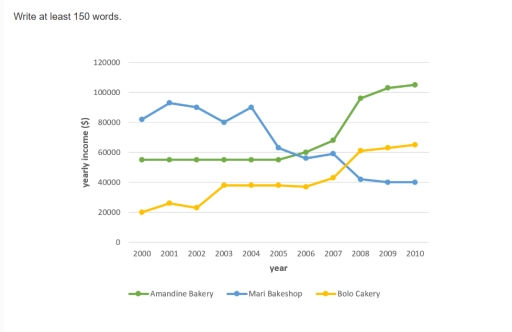
The diagram demonstrates the fluctuations in annual income of three different bakeries in Calgary between the years 2000 and 2010.

Overall, from the graph we can see that in 2000 the most profitable bakery among these three was Mari Bakeshop with an earning of nearly $80000 the same year, followed by Amandine bakery (slightly below $60000) and Bolo Cakery (about $2000). However, in 2010 the first line of the list was taken by Amandine Bakery, surpassing Bolo Cakery and Mari Bakeshop.

It is noticeable, that from 2000 to 2010 the two bakeries, Amandine Bakery and Bolo Cakery performed a significant growth in their annual incomes, whereas Mari Bakeshop’s income per year has been decreasing, until it reached the point $40000 in 2010.

Looking at the details, from 2000 to 2005 the annual income of Amandine bakery remained constant, until it skyrocketed during the next five years and reached the indicator of just over $100000. The peak of annual profit in Bolo bakery occurred in 2010 (just above $60000) and while Mari Bakeshop had its highest earnings in 2001 and 2004.

Word Count: 180

Answers On The Same Topic:

The graph shows data about the annual earnings of three bakeries in Calgary, 2000-2010. Summarize the information by selecting and reporting the main features, and make comparisons where relevant.

The graph illustrates data about annual earnings of Amandine Bakery, Mari Bakeshop and Bolo Cakery in Calgary from 2000 to 2010. Annual earnings data of the of Amandine Bakery and Bolo Cakery showed a significant rise over the periods, while data about annual earnings waste in Mari Bakeshop exprienced a downard trend. In 2000 annual […]

The graph shows data about the annual earnings of three bakeries in Calgary, 2000-2010. Summarize the information by selecting and reporting the main features, and make comparisons where relevant.

The graph illustrates information regarding the yearly income of Amadine Bakery, Mari Bakeshop and Bolo cakery between 2000-2016 in ten years which is located in Calgary. It shows that fluctuations the Amadine Bakery has progressed over the ten years in terms of earning compared to other two bakeries. In 40 years, in 2000 AD, Mari […]

The graph shows data about the annual earnings of three bakeries in Calgary, 2000-2010. Summarize the information by selecting and reporting the main features, and make comparisons where relevant.

The Line graph illustrates the data about the yearly income of amandine bakery, mari bakeshop and bolo cakery located in calgary between 2000 and 2010. Overall, Mari Bakeshop’s annual income decreased over the period, while Amandine Bakery and Bolo Cakery income increased. Amandine Bakery shows the most significant growth. In 2000, Mari Bakeshop annual income […]

The graph shows data about the annual earnings of three bakeries in Calgary, 2000-2010. Summarize the information by selecting and reporting the main features, and make comparisons where relevant.

The graph illustrates the number of three bakeries yearly income in Calgary, between 2000 and 2010. Overall, it is clear that Amandine Bakery have the highest revenue, meanwhile the Bollo Cakery are in the middle of the graph. In contrast, the Mari Bakery are declined to the lowest result. From 2000 to 2005 the income […]

The graph shows data about the annual earnings of three bakeries in Calgary, 2000-2010. Summarize the information by selecting and reporting the main features, and make comparisons where relevant.

The line graph illustrates, yearly income of three different bakeries , in calgary over the period of ten years from 2000 to 2010. Overall , Amandine bakery and Bolo bakery, had considerable high trends shows growth in their earning by 2010. While, Mari bake shop majorly had fallen in their income over the period of […]

See All

Other Topics:

The graphs shows the number of tourists visiting a particular Caribbean island between 2010 and 2017.

The line graph present the number of visitors to a specific caribbean dwstination from 2010 to 2017. Overall the total number of visitors on island increased throughout the given period.Despite majority staying on island initially.This was surpassed by those arrived on crusis liners in last two years. The total number of visitors in 2010 was […]

The graph below gives information about the main purposes of overseas residents' visit to China between 2000 and 2016. Summarise the information by selecting and reporting the main features, and make comparisons where relevant.

The line graph illustrates information about several reasons why overseas residents visit China between 2000 and 2016.Overall, most categories increased over the period. Holidays remained the dominant purpose of visiting China, while miscellaneous reasons showed relatively little change compared with the other categories. At the beginning, business trips were the second most common reason for […]

the line graph shows the number of mobile phone subscriptions in three countries

the line graph provided information about the number of mobile phone subscriptions in three different countries between 2000 and 2020 it is clear that all countries experienced growth over the period shown.overall although three figures increased,the figure of country A showed a significant upward trend.the second figure rose considerably while the country C increased marginally […]

WRITING TASK 1 You should spend about 20 minutes on this task. The graph below gives information on the usage of water for agricultural purposes in two different countries between 2000 to 2010. Summarise the information by selecting and reporting the main features, and make comparisons where relevant. Write at least 150 words.

The line graph compares the consumption of water for agricultural reasons between Australia and Russia over a ten-year period from 2000 to 2010. Overall, it is evident that both countries had a substantial increased usage at the end of the period. But Russia had increased slightly more than the opposing nation. To begin with, in […]

the graph shows the average trip length(in miles) in US children aged 5 to 15 years old.

The provided line graph represents the the average distance traveled during several types of trips for kids between 5 and 15, from 1970 till 2020. The x-axis represents period, whereas the y-axis represents miles traveled. Generally speaking, throughout the period thelongest distance was covered by bus trip, while the shortest one by walking adventure. Furthermore, […]

The graph below gives information about one company's unit sales of 5 different types of jam from 2009 to 2014. Summarise the information by selecting and reporting the main features, and make comparisons where relevant.

Given is a graph demonstrating the unit sales of a company from 2009 to 2014 which concentrates on 5 different types of jam. A glance at the graph reveals that the revenues coming from most of the types of jam products followed an upward trajectory while plum jam was the only exception which underwent a […]

See All
We have detected unusual activity on your device.
Please verify your identity to continue.
Note: This verification step won't sign you in. If you have a premium account, please log in to access the service as usual.
Google/Gmail Verification
Or verify using Email/Code
We've sent a verification code to:
youremail@gmail.com (Not your email?)
Enter it below to complete the verification process.
Ensure your email address is correct, your inbox is not full, and you check your spam folder. If no email arrives, consider using an alternative email.
You will need a Premium plan to perform your action!
Note: If you already have a premium account, please log in to access our services as usual.

Plans & Pricing

Our mission is to make quality education accessible for everyone.
However, to keep our hardworking team running and this service alive, we genuinely need your support!
By opting for a premium plan, not only do you sustain us in achieving the mission, but you also unlock advanced features to enrich your learning experience.

Free

For learners who aren't pressed for time

What's included on Free
100+ Cambridge IELTS Tests
Instant IELTS Writing Task 1 & 2 Evaluation (2 times/month)
Instant IELTS Speaking Part 1, 2, & 3 Evaluation (5 times/month)
Instant IELTS Writing Task 1 & 2 Essay Generator (2 times/month)
500+ Dictation & Shadowing Exercises
100+ Pronunciation Exercises
Flashcards
Other Advanced Tools

Premium

For those serious about advancing their English proficiency, and for IELTS candidates aspiring to boost their band score by 1-2 points (especially in writing & speaking) in just 30 days or less

What's included on Premium
Save Your IELTS Test Progress
Unlock All Courses & IELTS Tests
Unlimited AI Conversations
Unlimited AI Writing Enhancement Exercises
Unlimited IELTS Writing Task 1 & 2 Evaluation
Unlimited IELTS Speaking Part 1, 2, & 3 Evaluation
Checked Answers Will Not Be Published
Unlimited IELTS Writing Task 1 & 2 Essay Generator
Unlimited IELTS Speaking Part 1, 2, & 3 Sample Generator
Unlimited Usage Of Advanced Tools
Priority Support within 24h (12-month plan only)

Due to the nature of our service and the provided free trials, payments are non-refundable.
Nếu bạn là người Việt Nam và không có hoặc không muốn trả bằng credit/debit cards, bạn có thể thanh toán bằng phương thức chuyển khoản:


Chọn gói:
419,000₫ 277,000 ₫ cho gói 1 tháng (chỉ 9,233₫/ngày)
1,239,000₫ 597,000 ₫ cho gói 3 tháng (chỉ 6,633₫/ngày)
2,469,000₫ 1,027,000 ₫ cho gói 6 tháng (chỉ 5,706₫/ngày)
4,929,000₫ 1,417,000 ₫ cho gói 12 tháng (chỉ 3,936₫/ngày)


Sau khi chuyển khoản, vui lòng đợi trình duyệt tự động điều hướng bạn trở lại Engnovate và bạn sẽ ngay lập tức nhận được mã kích hoạt tài khoản premium.
Nếu có lỗi xảy ra, bạn có thể liên hệ với team thông qua một trong các phương thức: email đến helloengnovate@gmail.com hoặc nhắn tin qua facebook.com/engnovate.
Vì toàn bộ công cụ trên website đều có thể sử dụng thử miễn phí, Engnovate không hỗ trợ hoàn tiền.