🔥 Today Only: Save 30% on Premium — Offer Ends Soon! - Upgrade Now!
Line Graph

Band 5+: THE GRAPH SHOWS THE NUMBER OF MARRIAGES AND DIVORCES IN THE UK BETWEEN 1975 AND 2000. SUMMARISE THE INFORMATION BY REPORTING AND SELECTING THE MAIN FEATURES AND MAKE COMPARISONS WHERE RELEVANT.

Image for topic: THE GRAPH SHOWS THE NUMBER OF MARRIAGES AND DIVORCES IN THE UK BETWEEN 1975 AND 2000. SUMMARISE THE INFORMATION BY REPORTING AND SELECTING THE MAIN FEATURES AND MAKE COMPARISONS WHERE RELEVANT.
Our system will evaluate the answer based on this AI-generated description.
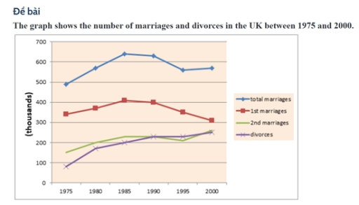
The image features a line graph detailing the number of total marriages, first marriages, second marriages, and divorces in the UK from 1975 to 2000. For 1975, total marriages stand at 400,000, first marriages at 340,000, second marriages at approximately 60,000, and divorces around 130,000. In 1980, total marriages rise to about 480,000, first marriages to around 400,000, second marriages remain near 60,000, and divorces increase slightly to about 140,000. By 1985, total marriages decrease to approximately 380,000, first marriages drop to around 290,000, second marriages increase to about 80,000, and divorces rise to 160,000. In 1990, total marriages are around 340,000, first marriages at 250,000, second marriages rise again to 90,000, and divorces reduce marginally to 150,000. For 1995, the figures are 280,000 for total marriages, 230,000 for first marriages, nearly 95,000 second marriages, and divorces drop to about 140,000. In the year 2000, total marriages continue to decrease to 260,000, first marriages to 200,000, second marriages slightly decrease to about 90,000, and divorces settle around 140,000.
Given the complexity of the image, the above description may not be entirely accurate.
Note: Both the topic and the answer were created by one of our users.

This graph shows the count of marriages and divorces in the UK from 1975 to 2000.

The total marriage number consist of first marriages and second marriages. This increased constantly between 1975 and 1985, it peaked in 1985 however the numbers of total marriages decreased sharply until 1995.

The 1st marriages number started with approximately 410 and it reached its maximum count in 1985, it reached its minimum count in 2000.

The 2nd marriages average count was 200 over the 25- year period. In 1975 its count was lower than 200 but after that its count usually rose thus when it came to the year 2000, it reached 300

The number of divorces rose gradually between 1975 and 2000. Although the divorces count was more than 2nd marriages in 1995, the 2nd marriages count was higher than the divorces count in 2000.To sum up, the divorces and marriages count changed in over the years, These were not lower than 90 and higher than from 700

Word Count: 165

Answers On The Same Topic:

THE GRAPH SHOWS THE NUMBER OF MARRIAGES AND DIVORCES IN THE UK BETWEEN 1975 AND 2000. SUMMARISE THE INFORMATION BY REPORTING AND SELECTING THE MAIN FEATURES AND MAKE COMPARISONS WHERE RELEVANT.

The line graph illustrates information about the number of marriages and divorces, measured in thousands, in the UK from 1975 to 2000. Overall, while the number of marriages witnessed an upward trend over the period, the number of first marriages decreased. In addition, the figure for divorces rose steadily. Looking at the details, the total […]

THE GRAPH SHOWS THE NUMBER OF MARRIAGES AND DIVORCES IN THE UK BETWEEN 1975 AND 2000. SUMMARISE THE INFORMATION BY REPORTING AND SELECTING THE MAIN FEATURES AND MAKE COMPARISONS WHERE RELEVANT.

The graph illustrates information about the number of people who had marriages and divorces in the UK, over a twenty-five-year period between 1975 and 2000 Overall, what stands out from the graph is that there was considerable upward trends in the number of divorces and 2nd marriages, except for 1st marriages. Another interesting point is […]

THE GRAPH SHOWS THE NUMBER OF MARRIAGES AND DIVORCES IN THE UK BETWEEN 1975 AND 2000. SUMMARISE THE INFORMATION BY REPORTING AND SELECTING THE MAIN FEATURES AND MAKE COMPARISONS WHERE RELEVANT.

The line graph illustrates information about the number of marriages and divorces in the UK over a twenty-five-year period between 1975 and 2000. Overall, what stands out from the graph is that there were significant upward trends in both divorces and 2nd marriages, while the total marriages and 1st marriages saw a considerable fluctuation over […]

THE GRAPH SHOWS THE NUMBER OF MARRIAGES AND DIVORCES IN THE UK BETWEEN 1975 AND 2000. SUMMARISE THE INFORMATION BY REPORTING AND SELECTING THE MAIN FEATURES AND MAKE COMPARISONS WHERE RELEVANT.

The data presents the quantity of marital formations and dissolutions in the UK From 1975 to 2000. Overall, the total number of marriages is the highest, and people who married once are also substantial. Individuals that engaged twice and number of divorces seemed equal last year. In terms of divorces, In 1975 the number of […]

THE GRAPH SHOWS THE NUMBER OF MARRIAGES AND DIVORCES IN THE UK BETWEEN 1975 AND 2000. SUMMARISE THE INFORMATION BY REPORTING AND SELECTING THE MAIN FEATURES AND MAKE COMPARISONS WHERE RELEVANT.

The line graph illustrates the number of marriages and divorces in the UK between 1975 and 2000. Generalizing the diagram from an overall perspective, it is clear that the total number of marriages increased, but the data for divorces rose steadily. Firstly, the graph shows that total marriages started with 490 thousand in 1975 and […]

See All

Other Topics:

The graph below shows the crime rate in England & wales from 1970 to 2005.

The line graph compares crime rates across three categories, namely car theft, house burglary and street robbery in England and Wales over a 35-year period. Overall, car theft and house burglary, despite experiencing steady growth initially, both ended the period with a decline between 1995 and 2005. In contrast, street robbery remained stagnant for the […]

The line chart below shows the employment in the agricultural sector in four African countries (Nigeria, Kenya, South Africa, and Algeria) from 1985 to 2019. Summarise the information by selecting and reporting the main features and make comparisons where relevant.

The graph illustrates the proportion of people employed in the agricultural sector in four African countries(Nigeria, Kenya, South Africa, and Algeria) between 1985 and 2019. Overall, it is clear that Nigera and Kenya was the leader one by one before Nigeria reach absolute peak in 2000, while Algeria showed the lowest outcome. South Africa increased […]

The graph below shows the number of shops that closed and the number of new shops that opened in one country between 2011 and 2018. Summarise the information by selecting and reporting the main features, and make comparisons where relevant. Write at least 150 words.

The line graph illustrates the amount of stores that closed and the amount of new stores that opened in a country around 2011 and 2018. Overall, there was a fluctuation for the opening stores with a decreased trend. On the other hand, there was a remain steady trend with one rocket drop on one year […]

The graph below shows the population of particular coutry by age group starting in 1960 and including a forecast to 2040

The graph depicts the population of a nation in three age groups from 0 up to 65 years old between 1960 and including a forecast to 2040. Overall, the young from 0 to 14 years old a decline among 80 years, while the older groups who are over 65 years old experiencing a significant increased. […]

The graph below shows the results of a survey among online adults on their use of various social media in the USA between 2012 and 201 5.

In today’s fast – paced world, there are many various social medias. This allows them to choose that they really need. This essay is about line graph, that shows us the usage websites in the USA between 2012 and 2015. Overall, the data reveals that users in all social networks generally increased. The Facebook consistently […]

The line graph shows the percentage of spending in a European country from 1960 to 2000. Summarise the information by selecting and reporting the main features, and make comparisons where relevant.

The graph illustrates the proportion of household expenditure on food, leisure, clothing, transport, and energy in a distinct European country from 1960 to 2000. Overall, the figure for energy, clothing, leisure, and food decreased gradually, while that for transport increased consistently. Notably, the gap between several expenditure categories became much smaller by the end of […]

See All
We have detected unusual activity on your device.
Please verify your identity to continue.
Note: This verification step won't sign you in. If you have a premium account, please log in to access the service as usual.
Google/Gmail Verification
Or verify using Email/Code
We've sent a verification code to:
youremail@gmail.com (Not your email?)
Enter it below to complete the verification process.
Ensure your email address is correct, your inbox is not full, and you check your spam folder. If no email arrives, consider using an alternative email.
You will need a Premium plan to perform your action!
Note: If you already have a premium account, please log in to access our services as usual.

Plans & Pricing

Our mission is to make quality education accessible for everyone.
However, to keep our hardworking team running and this service alive, we genuinely need your support!
By opting for a premium plan, not only do you sustain us in achieving the mission, but you also unlock advanced features to enrich your learning experience.

Free

For learners who aren't pressed for time

What's included on Free
100+ Cambridge IELTS Tests
Instant IELTS Writing Task 1 & 2 Evaluation (2 times/month)
Instant IELTS Speaking Part 1, 2, & 3 Evaluation (5 times/month)
Instant IELTS Writing Task 1 & 2 Essay Generator (2 times/month)
500+ Dictation & Shadowing Exercises
100+ Pronunciation Exercises
Flashcards
Other Advanced Tools

Premium

For those serious about advancing their English proficiency, and for IELTS candidates aspiring to boost their band score by 1-2 points (especially in writing & speaking) in just 30 days or less

What's included on Premium
Save Your IELTS Test Progress
Unlock All Courses & IELTS Tests
Unlimited AI Conversations
Unlimited AI Writing Enhancement Exercises
Unlimited IELTS Writing Task 1 & 2 Evaluation
Unlimited IELTS Speaking Part 1, 2, & 3 Evaluation
Checked Answers Will Not Be Published
Unlimited IELTS Writing Task 1 & 2 Essay Generator
Unlimited IELTS Speaking Part 1, 2, & 3 Sample Generator
Unlimited Usage Of Advanced Tools
Priority Support within 24h (12-month plan only)

Due to the nature of our service and the provided free trials, payments are non-refundable.
Nếu bạn là người Việt Nam và không có hoặc không muốn trả bằng credit/debit cards, bạn có thể thanh toán bằng phương thức chuyển khoản:


Chọn gói:
419,000₫ 277,000 ₫ cho gói 1 tháng (chỉ 9,233₫/ngày)
1,239,000₫ 597,000 ₫ cho gói 3 tháng (chỉ 6,633₫/ngày)
2,469,000₫ 1,027,000 ₫ cho gói 6 tháng (chỉ 5,706₫/ngày)
4,929,000₫ 1,417,000 ₫ cho gói 12 tháng (chỉ 3,936₫/ngày)


Sau khi chuyển khoản, vui lòng đợi trình duyệt tự động điều hướng bạn trở lại Engnovate và bạn sẽ ngay lập tức nhận được mã kích hoạt tài khoản premium.
Nếu có lỗi xảy ra, bạn có thể liên hệ với team thông qua một trong các phương thức: email đến helloengnovate@gmail.com hoặc nhắn tin qua facebook.com/engnovate.
Vì toàn bộ công cụ trên website đều có thể sử dụng thử miễn phí, Engnovate không hỗ trợ hoàn tiền.