🔥 Today Only: Save 30% on Premium — Offer Ends Soon! - Upgrade Now!
Bar Chart

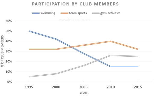
Band 8+: The graph shows the rates of participation in three different activities in a UK sports club between 1995 and 2015.

Image for topic: The graph shows the rates of participation in three different activities in a UK sports club between 1995 and 2015.
Our system will evaluate the answer based on this AI-generated description.
The image shows a line graph titled 'PARTICIPATION BY CLUB MEMBERS' with the Y-axis labeled '% OF CLUB MEMBERS' ranging from 0% to 60% in increments of 10%, and the X-axis labeled 'YEAR' with markers for 1995, 2000, 2005, 2010, 2015. Three lines represent swimming, team sports, and gym activities. In 1995, swimming starts at just below 50%, team sports at just above 30%, and gym activities at just over 20%. By 2000, swimming decreases to just over 40%, team sports increase to just over 40%, and gym activities rise to about 25%. In 2005, swimming continues to decline to around 35%, team sports drops to just above 30%, gym activities climb to just over 30%. By 2010, swimming reaches around 30%, team sports rises to above 35%, and gym activities peak at near 40%. In 2015, swimming stabilizes around 30%, team sports decreases slightly to just under 35%, and gym activities dip to just below 40%.
Given the complexity of the image, the above description may not be entirely accurate.
Note: Both the topic and the answer were created by one of our users.

The graph illustrates the participation percentages in swimming, team sports, and gym activities at sports clubs in the UK over a period of 20 years, from 1995 to 2015.

It is evident that most club members participated in swimming in 1995; however, over time, the percentage of swimming participants decreased. In contrast, the percentages for team sports and gym activities saw an increase.

Swimming was the most popular activity in 1995, with nearly 50% of club members participating. Since that time, the number of people attending swimming has gradually declined. After a certain period, swimming became the second choice for participants, eventually dropping to the least preferred activity in the club.

Team sports were the second most popular choice in 1995, attracting about 32% of club members. The participation rates for team sports remained stable until 2000. However, starting in 2000, these rates began to rise, ultimately becoming the most popular category for participation. Between 1995 and 2015, gym activities moved from third to second place in terms of participation.

Word Count: 170

Answers On The Same Topic:

The graph shows the rates of participation in three different activities in a UK sports club between 1995 and 2015.

The line graph illustrates the proportion of people in the separated sports in a UK from 1995 to 2015. In 1995, the number of people who swim was 50%, which was the most popular activity in the UK, but it significantly dropped by around 20% by 2005. Those declined to around 15% in 2010 and […]

The graph shows the rates of participation in three different activities in a UK sports club between 1995 and 2015.

The graphs illustrates the percentage of competitors in swimming ,team sports and gym activities in a UK sports club in 1995 to 2015. Overall, the perticipator in swimming was decreased over the time, while the percentage of gym activites experienced a significant increased. The competitors of team sports remain almost stable in rest of the […]

The graph shows the rates of participation in three different activities in a UK sports club between 1995 and 2015.

The line graph compares the proportion of participation in three different forms of activities (swimming, team sports, and gym activities) in a UK sports club from 1995 to 2015. The units are measured in percentages. Overall, the most considerable decrease was seen in the figure for swimming, whereas the reverse was true for gym activities. […]

The graph shows the rates of participation in three different activities in a UK sports club between 1995 and 2015.

The Line graph illustrates thale data of participation by club members in three key activities like swimming, team sport,and gym activities for year between 1995 to 2015. Overall, in 1995 swimming had higher percentage of ther members other then two activities.however, it’s decline to least favorable activities in 2015.while gym activities show sudden growth. Firstly, […]

The graph shows the rates of participation in three different activities in a UK sports club between 1995 and 2015.

The given line graph illustrates the proportion of participation in three different activities in sports clubs in the United Kingdom (UK) from 1995 to 2015. Overall, the ratio of gym activities witnessed an upward trend. Meanwhile, the percentage of swimming decreased dramatically during these periods. The figure for swimming activities only dropped year by year. […]

See All

Other Topics:

The graph below gives information about average housing prices throughout the city of Plimsburgh. Summarize the information by selecting and reporting the main features, and make comparisons where relevant.

The bar chart illustrate the typical accomodation costs in the city of Plimsburgh. Overall, we could see that the Uptown housing had the highest prices at the start of the given period, followed by University park, Waterfront and Downtown respectively. While at the end of the given period, University park lead the chart with Uptown, […]

the chart below shows the avarage minutes per day that men and women spend on household activities.

The bar chart illustrates the amount of time males and females spend on household activities. Overall, while the amount of time on women activities involved in preparing food, cleaning and laundry is higher, that of men in garden care and repair work is considerable higher than the opposite gender. In addition females spend more time […]

The bar chart below shows the employment of all male and female workers by occupation in the UK in the year 2005. Summarize the information by selecting and reporting the main features, and make comparisons where relevant.

The bar chart illustrates 9 categories of the employment of male and female workers in percentage terms in the UK in 2005. The huge gender gap was noticed in six categories. Men generally dominated in jobs involving manual labor, while most women were more prevalent in administrative tasks and personal service. Men dominated outnumber in […]

The Chart below shows the places visited by different people living in Canada.

The bar chart compares the percentages of three groups of individuals living in Canada who visited four different places. Overall, the cinema was the most popular place among for all three groups, while the theatre was the least popular. In terms of categories, for the cinema, people born in Canada had the highest proportion at […]

The bar chart shows the number of non-medical staff in a particular clinic between 2000 and 2015. Summarize the information by selecting and reporting the main features, and make comparisons where relevant.

The bar chart illustrates the figure of non- medical staff in a particular clinic which disributed by department from 2000 to 2015. Overall, it is clear that the number of staff in cleaning and administration were increasing throughout the period, whereas maintenance and catering service staff were some flactuate when security staff was the same […]

The chart shows the percentage of male and female teachers in six different types of educational setting in the UK in 2019. Summarise the information by selecting and reporting the main features, and make comparisons where relevant.

The bar chart below illustrates the percentage of male and female educators in six different types of academic settings in the UK during 2019. Overall, it shows the difference in genders for male and female teachers was varied by the school settings they were in. Women made up a large proportion of teachers compared to […]

See All
We have detected unusual activity on your device.
Please verify your identity to continue.
Note: This verification step won't sign you in. If you have a premium account, please log in to access the service as usual.
Google/Gmail Verification
Or verify using Email/Code
We've sent a verification code to:
youremail@gmail.com (Not your email?)
Enter it below to complete the verification process.
Ensure your email address is correct, your inbox is not full, and you check your spam folder. If no email arrives, consider using an alternative email.
You will need a Premium plan to perform your action!
Note: If you already have a premium account, please log in to access our services as usual.

Plans & Pricing

Our mission is to make quality education accessible for everyone.
However, to keep our hardworking team running and this service alive, we genuinely need your support!
By opting for a premium plan, not only do you sustain us in achieving the mission, but you also unlock advanced features to enrich your learning experience.

Free

For learners who aren't pressed for time

What's included on Free
100+ Cambridge IELTS Tests
Instant IELTS Writing Task 1 & 2 Evaluation (2 times/month)
Instant IELTS Speaking Part 1, 2, & 3 Evaluation (2 times/month)
Instant IELTS Writing Task 1 & 2 Essay Generator (2 times/month)
500+ Dictation & Shadowing Exercises
100+ Pronunciation Exercises
Flashcards
Other Advanced Tools

Premium

For those serious about advancing their English proficiency, and for IELTS candidates aspiring to boost their band score by 1-2 points (especially in writing & speaking) in just 30 days or less

What's included on Premium
Save Your IELTS Test Progress & Analyze Mistakes By Question Type
Save Your Own Flashcard Sets & Use Them On Any Device
Unlock All Courses, IELTS Tests, Section & Part Practice
Unlimited AI Conversations
Unlimited AI Writing Enhancement Exercises
Unlimited IELTS Writing Task 1 & 2 Evaluation
Unlimited IELTS Speaking Part 1, 2, & 3 Evaluation
Checked Answers Will Not Be Published
Unlimited IELTS Writing Task 1 & 2 Essay Generator
Unlimited IELTS Speaking Part 1, 2, & 3 Sample Generator
Unlimited Usage Of Advanced Tools & AI Features
Priority Support within 24h (12-month plan only)

Due to the nature of our service and the provided free trials, payments are non-refundable.