🔥 Today Only: Save 30% on Premium — Offer Ends Soon! - Upgrade Now!
Bar Chart

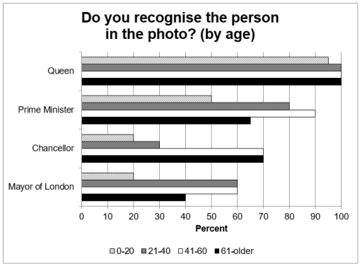
Band 7+: The graph shows the results of a survey of British public figures that people can recognise from their photographs. Summarise the information by selecting and reporting the main features, and make comparisons where relevant. You should spend about 20 minutes on this task.

Image for topic: The graph shows the results of a survey of British public figures that people can recognise from their photographs. Summarise the information by selecting and reporting the main features, and make comparisons where relevant. You should spend about 20 minutes on this task.
Our system will evaluate the answer based on this AI-generated description.
The image is a bar graph depicting recognition of a person in a photo by age. The horizontal axis shows percentages ranging from 0 to 100%, and the vertical axis lists four categories: Queen, Prime Minister, Chancellor, and Mayor of London. There are four bars for each category, representing age groups 0-20, 21-40, 41-60, and 61-older. The Queen has the highest recognition, with all age groups above 90%, except for 0-20 at approximately 85%. Prime Minister recognition is also high, with the 61-older group at nearly 100%, 41-60 around 90%, 21-40 near 80%, and 0-20 just above 60%. Chancellor recognition is lower, with 61-older around 65%, 41-60 near 55%, 21-40 approximately 45%, and 0-20 just below 20%. Mayor of London has varied recognition, with 61-older at nearly 70%, 41-60 around 60%, 21-40 just above 40%, and 0-20 at approximately 35%.
Given the complexity of the image, the above description may not be entirely accurate.
Note: Both the topic and the answer were created by one of our users.

The graph depicts outcomes of a survey conducted among various age-groups to recognize some of the famous British personalities with the help of their pictures.

Almost all the survey prospects were able to recognize the queen of England, whereas the chancellor and mayor of London were not spotted by many. Additionally, the 0-20 aged individuals were lesser in count throughout the survey to identify correctly, wherein 41-60 age group was the most accurate overall.

The queen’s photograph was easily recognizable by all the age groups except a mere negligible 5% difference of the youth belonging to 0-20 years of age. 90% of the 41-60 years old people in the survey were accurate at identifying the prime minister’s photo.

Conversely, over a maximum of 60-70 percent of the survey takers were able to identify chancellor and the mayor of London. Moreover, only about 20% of the children of 0-20 age were able to know them by their images.

Word Count: 157

Answers On The Same Topic:

The graph shows the results of a survey of British public figures that people can recognise from their photographs. Summarise the information by selecting and reporting the main features, and make comparisons where relevant. You should spend about 20 minutes on this task.

The graph shows the results of a survey conducted on British public figures that common people can recognize according to age from the photographs. The photo of British queen was one of the most recoganised one and the least belonged to the mayer of london from the varying dagree aged groups. Among the age group […]

The graph shows the results of a survey of British public figures that people can recognise from their photographs. Summarise the information by selecting and reporting the main features, and make comparisons where relevant. You should spend about 20 minutes on this task.

The provided graph elucidates data about people at varying ages who recognize well-known individuals’ pictures in a British survey. Overall, the picture of the Queen is the leader , whereas the opposite pattern can be observed at the Mayor of London’s. Moreover, the figure for the queen stands out its other competitors, regarding all aged […]

The graph shows the results of a survey of British public figures that people can recognise from their photographs. Summarise the information by selecting and reporting the main features, and make comparisons where relevant. You should spend about 20 minutes on this task.

The bar chart illustrates the results of a social experiment held among the British public, showing pictures of government officials to see whether they recognized them or not, across different age groups. Overall, it can be clearly seen that the most well-known person was the leader of this nation, while the Mayor of London was […]

The graph shows the results of a survey of British public figures that people can recognise from their photographs. Summarise the information by selecting and reporting the main features, and make comparisons where relevant. You should spend about 20 minutes on this task.

The bar chart illustrates results of a social experiment that helded among the British public by showing pictures of governtment officials whether they recognise or not in a different age groups. Overal, it can be clearly seen that the most well known person was the leader of this nation, while, Mayor of London was the […]

The graph shows the results of a survey of British public figures that people can recognise from their photographs. Summarise the information by selecting and reporting the main features, and make comparisons where relevant. You should spend about 20 minutes on this task.

The bar graph presents the findings of a survey assessing the recognizability of notable British public figures based on age demographics. Overall, the British monarchy, represented by the Queen, exhibits the highest level of recognizability across all age groups, while the Chancellor and the Mayor of London rank lower in public identification. In detail, the […]

See All

Other Topics:

The chart gives information about the proportion of students choosing different science subjects in a university in 1992 and 2000.

The bar chart compares the percentage of students who chose between three science disciplines in a university from 1992 to 2012. Overall, the figures for males fell, while females rose. As for science subjects, the proportion of students taking biology and physics decreased; however, the share of undergraduates who applied for computer science increased dramatically. […]

The bar chart shows the percentage of people in the united kingdom per age group without any qualifications.

The bar chart compares the proportion of unqualified people across various age groups in the United Kingdom in the year of 2009. Overall, the figure of both non-qualified men and women generally increased across different age groups. The highest percentage was recorded among women aged 50-59/64, while the lowest figure was seen also among women […]

The charts below give information about the price of tickets on one airline between Sydney and Melbourne, Australia, over a two-week period in 2013.

The bar charts below demonstrate two week period data about price for tickets on airplane on the line between Sydney and Melbourne, Australia in 2013. Overall,three days in both weeks on airline, Tuesday, Wednesday, and Thursday was most stable. In contrast, on Monday price of tickets fell dramatically, while on the rest of the days […]

The graph below presents the information about Nathan's Hot Dog Eating Contest in Brooklyn's Coney Island, USA.

The chart illustrates the current record of Nathan’s hot dog eating contest which is 68 hot dogs and buns consumed in 15 minutes. This contest is held in Brooklyn’s coney island every 4th of July by American Joey Chestnut, where Takeru of Japan won 6 years in a row. Overall, the US citizens won most […]

The charts below show the marriage and divorce rates in the UK, Sweden, and Italy for the years 2000 and 2020. Summarise the information by selecting and reporting the main features, and make comparisons where relevant.

The bar charts below give a comparison in marriage and divorce rate within UK, sweden, and italy for the years 2000 and 2020. Overall, the rate of marriages in the following three countries appears to experience a significant decline ( especially in the UK and italy where it decreased by approximately half ), meanwhile sweden […]

The chart below shows information about Heart attacks by ages and genders in the USA

The bar chart compares the number of heart attacks among men and women in different age groups in the USA. In general, it is evident that males are at higher risk of suffering heart attacks than females in all age groups. In addition, the figure of heart attacks increases significantly with age for both genders. […]

See All
We have detected unusual activity on your device.
Please verify your identity to continue.
Note: This verification step won't sign you in. If you have a premium account, please log in to access the service as usual.
Google/Gmail Verification
Or verify using Email/Code
We've sent a verification code to:
youremail@gmail.com (Not your email?)
Enter it below to complete the verification process.
Ensure your email address is correct, your inbox is not full, and you check your spam folder. If no email arrives, consider using an alternative email.
You will need a Premium plan to perform your action!
Note: If you already have a premium account, please log in to access our services as usual.

Plans & Pricing

Our mission is to make quality education accessible for everyone.
However, to keep our hardworking team running and this service alive, we genuinely need your support!
By opting for a premium plan, not only do you sustain us in achieving the mission, but you also unlock advanced features to enrich your learning experience.

Free

For learners who aren't pressed for time

What's included on Free
100+ Cambridge IELTS Tests
Instant IELTS Writing Task 1 & 2 Evaluation (2 times/month)
Instant IELTS Speaking Part 1, 2, & 3 Evaluation (2 times/month)
Instant IELTS Writing Task 1 & 2 Essay Generator (2 times/month)
500+ Dictation & Shadowing Exercises
100+ Pronunciation Exercises
Flashcards
Other Advanced Tools

Premium

For those serious about advancing their English proficiency, and for IELTS candidates aspiring to boost their band score by 1-2 points (especially in writing & speaking) in just 30 days or less

What's included on Premium
Save Your IELTS Test Progress & Analyze Mistakes By Question Type
Save Your Own Flashcard Sets & Use Them On Any Device
Unlock All Courses, IELTS Tests, Section & Part Practice
Unlimited AI Conversations
Unlimited AI Writing Enhancement Exercises
Unlimited IELTS Writing Task 1 & 2 Evaluation
Unlimited IELTS Speaking Part 1, 2, & 3 Evaluation
Checked Answers Will Not Be Published
Unlimited IELTS Writing Task 1 & 2 Essay Generator
Unlimited IELTS Speaking Part 1, 2, & 3 Sample Generator
Unlimited Usage Of Advanced Tools & AI Features
Priority Support within 24h (12-month plan only)

Due to the nature of our service and the provided free trials, payments are non-refundable.