🔥 Today Only: Save 30% on Premium — Offer Ends Soon! - Upgrade Now!
Multiple Graphs

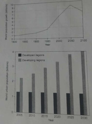
Band 7+: The graphs below provide information on global population figures and figures for urban populations in different world regions. Summarise the information by selecting and reporting the main features, and make comparisons where relevant

Image for topic: The graphs below provide information on global population figures and figures for urban populations in different world regions. Summarise the information by selecting and reporting the main features, and make comparisons where relevant
Our system will evaluate the answer based on this AI-generated description.
The image contains two graphs. The first graph, a line graph, displays the world population from 1800 to 2100 in billions, with points marked at 1800 (approximately 1 billion), 1900 (approximately 1.6 billion), 1950 (approximately 2.5 billion), 2000 (approximately 6 billion), 2050 (around 9 billion), and 2100 (a decline to about 7 billion). The second graph, a bar graph, shows the world urban population in billions, split into developed and developing regions from 2005 to 2030, with values for developed regions in 2005 (approximately 0.9 billion), 2010 (approximately 1 billion), 2015 (approximately 1.1 billion), 2020 (approximately 1.2 billion), 2025 (approximately 1.3 billion), 2030 (approximately 1.4 billion); and for developing regions in 2005 (approximately 1.8 billion), 2010 (approximately 2.2 billion), 2015 (approximately 2.6 billion), 2020 (approximately 3 billion), 2025 (approximately 3.4 billion), 2030 (approximately 3.8 billion).
Given the complexity of the image, the above description may not be entirely accurate.
Note: Both the topic and the answer were created by one of our users.

The first curve graph shows information about global population figure and the bar chat presents urban population in developed and developing regions.

Overall, the global population is projected to increase steadily before experiencing a significant decline. Furthermore, while urban populations in developing regions are expected to rise, those in developed regions will remain relatively consistent.

According to the data provided in the first graph, the world population was around 1.0 billion in the year of 1800, afterwards it experienced a slight increase and arrived at 2.0 billion in 1920. However, it started to climb dramatically since 1940 and this tendency is predicted to continue until the figure will hit its record high at 8.0 billion in 2040, followed by a sharp decline.

From the second graph, it is evident that urban population in developed regions will remain stable, between 1.0 to 1.5 billion from 2015 to 2040. In contrast, the situation in developing countries will be totally different: the urban population is projected to be around 2.1 billion in 2015, then gradually increase to 4 billion by 2040, nearly doubling compared to the 2015 figures.

Word Count: 185

Answers On The Same Topic:

The graphs below provide information on global population figures and figures for urban populations in different world regions. Summarise the information by selecting and reporting the main features, and make comparisons where relevant

The line graph demonstrates the world population growth from 1800 until projection of year 2100, while the bar chart gives information about world urban residents in both developed and developing regions from 2005 until expectation of 2030. Both figures measured in billions. Overall, it is clear that although the urban citizens number increasing significantly over […]

The graphs below provide information on global population figures and figures for urban populations in different world regions. Summarise the information by selecting and reporting the main features, and make comparisons where relevant

The line graph illustrates data on global population and bar graph provided information for urban populations in different world areas. Overall, it clear that value of world population growth’ fluctuated, while population in developed regions remains same and in developing countries shows upward trend. To start with, in the beginning of the period world population […]

The graphs below provide information on global population figures and figures for urban populations in different world regions. Summarise the information by selecting and reporting the main features, and make comparisons where relevant

The bar chart provide key information for urban population among different areas around the world . The units are measured in million of people. Overall, it is clear from the graph that from 2035 to 2040, the number of million people have a significant increase.in addition, the chart show a notable increase in developing areas […]

The graphs below provide information on global population figures and figures for urban populations in different world regions. Summarise the information by selecting and reporting the main features, and make comparisons where relevant

The line graph shows the population size across three centuries, from the 19th to the 21st. Meanwhile, the bar chart compares the population in two different regions of the globe (developed and developing regions) from 2015 to 2040. Overall, it is evident that the world population experienced a significant increase over the period, with a […]

The graphs below provide information on global population figures and figures for urban populations in different world regions. Summarise the information by selecting and reporting the main features, and make comparisons where relevant

The line graph shows how much population there was in three various centuries between 19th and 21st. Meanwhile, the bar chart compares the number of people in two different regions of globe (developed and developing regions) from 2015 to 2040. Overall, it is evident that the world population experienced a significant increase over the period, […]

See All

Other Topics:

The pie charts below show the number of hours spent in a british university library by undergraduates, postgraduates and the total student population.

The three pie charts compare the proportion of time spent by undergraduates, postgraduates, and the total student population in the library at a UK university. They also provide data on how many hours students spent there. Overall, the prominent fact from the pie charts is that most postgraduate students spent more than 15 hours in […]

The pie charts below show the number of hours spent in a british university library by undergraduates, postgraduates and the total student population.

The three pie charts compare the proportion of time spent by undergraduates, postgraduates, and the total student population in the library in the UK university. They also give data about how many hours spent by the student in there. Overall, the prominant fact from the pie charts is the most postgraduate students spent more than […]

The chart below shows the reasons why people travel to work by bicycle or by car. Summarize the information by selecting and reporting. Summarize the information by selecting and reporting the main features and make comparisons where relevant

The pie chart shows the resons why people perfer go to work by car or by bicycle. Overall, the main reason for driving to work is comfort. In contrast, people who choose cycling think about health benefits and enviroment. In addition, cycling save a lot of money and solve the parking problem. Individuals who need […]

The pie charts show the sales of new cars in Australia in 1984, 1993 and 2013

The pie charts below illustrate the sales of new cars in Australia in three different years. Overall, the new cars called Sedan showed the highest results in the market over the three-year period compared with the others. Although sedan sales declined each year, they still maintained their position in the market. While SUV and other […]

The chart below shows the value of one country's exports in various categories during 2015 and 2016. The table shows the percentage change in each category of exports in 2016 compared with 2015. Summarize the information by selecting and reporting the main features, and make comparisons where relevant.

he bar chart compares the value of a country’s exports in five different categories in 2015 and 2016, while the table indicates the percentage change in export earnings over the same period. Overall, export earnings increased in four out of the five categories, with textiles experiencing the most substantial growth. By contrast, the value of […]

The two pie charts below show how an average households in Australia used energy for different purposes in 1995 to 2015

The two pie charts compare the energy utilization on an everage household in Australia for different purposes in 1995 and 2015. Overall, heating received the largest share of energy consumption on both year, whereas lighting, refrigeration, and usage of other appliances share the smallest proportion in 1995 while lighting recorded the lowest ratio in 2015. […]

See All
We have detected unusual activity on your device.
Please verify your identity to continue.
Note: This verification step won't sign you in. If you have a premium account, please log in to access the service as usual.
Google/Gmail Verification
Or verify using Email/Code
We've sent a verification code to:
youremail@gmail.com (Not your email?)
Enter it below to complete the verification process.
Ensure your email address is correct, your inbox is not full, and you check your spam folder. If no email arrives, consider using an alternative email.
You will need a Premium plan to perform your action!
Note: If you already have a premium account, please log in to access our services as usual.

Plans & Pricing

Our mission is to make quality education accessible for everyone.
However, to keep our hardworking team running and this service alive, we genuinely need your support!
By opting for a premium plan, not only do you sustain us in achieving the mission, but you also unlock advanced features to enrich your learning experience.

Free

For learners who aren't pressed for time

What's included on Free
100+ Cambridge IELTS Tests
Instant IELTS Writing Task 1 & 2 Evaluation (2 times/month)
Instant IELTS Speaking Part 1, 2, & 3 Evaluation (2 times/month)
Instant IELTS Writing Task 1 & 2 Essay Generator (2 times/month)
500+ Dictation & Shadowing Exercises
100+ Pronunciation Exercises
Flashcards
Other Advanced Tools

Premium

For those serious about advancing their English proficiency, and for IELTS candidates aspiring to boost their band score by 1-2 points (especially in writing & speaking) in just 30 days or less

What's included on Premium
Save Your IELTS Test Progress & Analyze Mistakes By Question Type
Save Your Own Flashcard Sets & Use Them On Any Device
Unlock All Courses, IELTS Tests, Section & Part Practice
Unlimited AI Conversations
Unlimited AI Writing Enhancement Exercises
Unlimited IELTS Writing Task 1 & 2 Evaluation
Unlimited IELTS Speaking Part 1, 2, & 3 Evaluation
Checked Answers Will Not Be Published
Unlimited IELTS Writing Task 1 & 2 Essay Generator
Unlimited IELTS Speaking Part 1, 2, & 3 Sample Generator
Unlimited Usage Of Advanced Tools & AI Features
Priority Support within 24h (12-month plan only)

Due to the nature of our service and the provided free trials, payments are non-refundable.