24 Hours Only: Get 39% OFF on Our Premium Plan - Check Out Now!
Multiple Graphs

Band 8+: The graphs below show the Expenditure on Health & Education, UAE as percentages of GDP and Infant mortality and life expectancy.

Image for topic: The graphs below show the Expenditure on Health & Education, UAE as percentages of GDP and Infant mortality and life expectancy.
Our system will evaluate the answer based on this AI-generated description.
The image contains two graphs; the top graph is a bar chart labeled 'Expenditure on Health & Education, UAE as % of GDP' and has three pairs of bars representing the years 1985, 1990, and 1993. In 1985, health expenditure was around 4.0%, and education was approximately 12.0%. In 1990, health was just under 6.0%, and education was around 8.0%. In 1993, health was about 6.5%, and education was approximately 13.5%. The bottom graph is a line chart labeled 'Infant Mortality and Life Expectancy, 1970 - 1992' with two lines, one for life expectancy (years) and the other for infant mortality (per 1000 births). In 1970, life expectancy was about 65 years, and infant mortality was roughly 80 per 1000 births. By 1992, life expectancy had increased to just under 75 years, whereas infant mortality had decreased significantly to about 20 per 1000 births.
Given the complexity of the image, the above description may not be entirely accurate.
Note: Both the topic and the answer were created by one of our users.

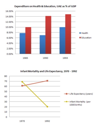
The given bar chart compares and contrasts data on the changes in the proportion of government spending on health and education in the UAE from 1985 to 1993, while the line graph illustrates changes in life expectancy and infant mortality between 1970 and 1992.

Overall, as the percentage spent on health and education increases, infant mortality decreases and life expectancy improves.

As can be seen, graph 1 shows a significant rise in both areas. In detail, health expenditure stood at nearly 8% in 1985 but decreased by 1% in 1990, then climbed to 10% in 1993. Besides, spending on education was even higher. It was 10% in 1985, and rose to 14% in 1990 and 15% in 1993, a 15% increase in just 8 years.

According to graph 2, life expectancy was just 60 in 1970 but went up to over 70 in 1992. In contrast, the number of babies dying dropped dramatically, from 70 per 1000 in 1970 to only 20 in 1992. In conclusion, people in the UAE are living longer and healthier lives because of the government’s spending on education and medical facilities.

Word Count: 186

Answers On The Same Topic:

The graphs below show the Expenditure on Health & Education, UAE as percentages of GDP and Infant mortality and life expectancy.

The graphs show the percentage of GDP spent on health and education in the UAE between 1985 and 1993, and data on life expectancy and infant mortality from 1970 to 1992. Overall, spending on both sectors increased over time, and this was followed by a longer life expectancy and lower infant mortality. In 1985, around […]

The graphs below show the Expenditure on Health & Education, UAE as percentages of GDP and Infant mortality and life expectancy.

The bar chart given illustrates the proportions of expenditure on health and education in the UAE over a seven-year period, from 1985 to 1993, while the line graph elucidates the numbers of infant mortality and life expectancy over a twenty-two-year period, ending in 1992 . Viewed together, there appears to be a relationship between the […]

The graphs below show the Expenditure on Health & Education, UAE as percentages of GDP and Infant mortality and life expectancy.

The provided bar chart illustrates how much money UAE’s people spend on health and education over 8 years, from 1985 to 1993, measured in percentage of GDP and the second graph demonstrates the number of infant mortality rates per 1000 births and life expectancy per years from 1970 to 1992. Overall, it is apparent that […]

The graphs below show the Expenditure on Health & Education, UAE as percentages of GDP and Infant mortality and life expectancy.

The bar chart illustrates the percentages of health & education in 1985 to 1993 and the line graph depicts infant mortality and life expectancy between 1970 and 1992. Overall, education was the one that started and ended up with the highest rate compared with health from the bar chart while in the line graph life […]

The graphs below show the Expenditure on Health & Education, UAE as percentages of GDP and Infant mortality and life expectancy.

The bar chart compares the expenditure on health and education from 1985 to 1993 in UAE, while the line graph illustrates how life expectancy and infant mortality in UAE change between 1970 to 1992. We can observe from the bar chart that both spending on health and education in UAE increased from over the eight-year […]

See All

Other Topics:

The charts below show the number of tourists to Australia from three countries in 1995 and 2005, and the types of travels between 1995 and 2005. Summarize the information by selecting and reporting the main features, and make comparisons where relevant.

The bar chart compares the number of visitors to Australia from the UK, the US, and Japan in 1995 and 2005, while the line graph illustrates trends in two types of travel – staying at resorts and backpacking – over the same decade. Overall, Australia saw a significant increase in tourists from the UK and […]

The graphs below show the types of music albums purchased by people in Britain according to s3x and age. Write a report for a university lecturer describing the information shown below. • You should write at least 150 words. • You should spend about 20 minutes on this task

The three diagrams illustrate the types of music albums purchased by people in Britain such as rock, classical and pop music, according to age and gender of people. Bar charts describe the males, females and different age groups such as 16-24, 25-34, 35-44, 45+, and how many albums they bought in percentages. Actually, pop music […]

The graphs give information about the visits from France and North America for holiday and business.

The line graph illustartes the Level of people who visited UK for holiday and business from France and North America. Overall, the figure of travellers that came to UK (with holiday visits) from France and North America were remained stable, while the number of indvididuls who came to UK (with work reasons) showed an upward […]

(2024) The graphs below show the percentage of students who studied for different amounts of time for s test and the average score students obtained based on hours studied. Summarise and write relevant response

The pie chart illustrates the number of hours pupils studied for exam. Whereas bar graph depicts the markes achieved by students on the bases of hours they spent on studing. Overall, It is evident, that maximum number of pupils studied for 51-75 hours while, the least number of students studied for 0-25 hours. Notably, students […]

The line graph below shows the average high and low temperatures in Glasgow, Scotland, over the course of a year, while the table provides information on the average monthly rainfall and sunshine hours. Summarise the information by selecting and reporting the main features, and make comparisons where relevant.

The line graph illustrates the average temperature fluctuations in Glasgow, Scotland during 1-year period, while the table gives data aboutthe average rainfall and sunshines hours during the same period. Overall, it can be clearly seen that in the graph the highest temperature was in the august and july, whereas the longest time of rainfall was […]

The bar charts show how many local and international students were enrolled in the Bachelor of Science and Bachelor of Law courses at Bond University between 2010 and 2012. Summarise the information by selecting and reporting the main features, and make comparisons where relevant.

THE GIVEN BAR CHART ILLUSTRATES THE INFORMATION ABOUT THE NUMBER OF LOCAL AND INTERNATIONAL STUDENTS WERE TAKE ADMISSION IN GRADUATION IN THE FIELDS OF SCIENCE AND LAW AT BOND UNIVERSITY FROM 2010 TO 2012. OVERALL , IT IS CLEAR FROM THE CHARTS THAT THERE IS THE COMPARISION OF ENROLLEMENT OF STUDENTS IN THE GIVEN PERIOD […]

See All
We have detected unusual activity on your device.
Please verify your identity to continue.
Note: This verification step won't sign you in. If you have a premium account, please log in to access the service as usual.
Google/Gmail Verification
Or verify using Email/Code
We've sent a verification code to:
youremail@gmail.com (Not your email?)
Enter it below to complete the verification process.
Ensure your email address is correct, your inbox is not full, and you check your spam folder. If no email arrives, consider using an alternative email.
You will need a Premium plan to perform your action!
Note: If you already have a premium account, please log in to access our services as usual.

Plans & Pricing

Our mission is to make quality education accessible for everyone.
However, to keep our hardworking team running and this service alive, we genuinely need your support!
By opting for a premium plan, not only do you sustain us in achieving the mission, but you also unlock advanced features to enrich your learning experience.

Free

For learners who aren't pressed for time

What's included on Free
100+ Cambridge IELTS Tests
Instant IELTS Writing Task 1 & 2 Evaluation (2 times/month)
Instant IELTS Speaking Part 1, 2, & 3 Evaluation (5 times/month)
Instant IELTS Writing Task 1 & 2 Essay Generator (2 times/month)
500+ Dictation & Shadowing Exercises
100+ Pronunciation Exercises
Flashcards
Other Advanced Tools

Premium

For those serious about advancing their English proficiency, and for IELTS candidates aspiring to boost their band score by 1-2 points (especially in writing & speaking) in just 30 days or less

What's included on Premium
Save Your IELTS Test Progress
Unlock All Courses & IELTS Tests
Unlimited AI Conversations
Unlimited AI Writing Enhancement Exercises
Unlimited IELTS Writing Task 1 & 2 Evaluation
Unlimited IELTS Speaking Part 1, 2, & 3 Evaluation
Checked Answers Will Not Be Published
Unlimited IELTS Writing Task 1 & 2 Essay Generator
Unlimited IELTS Speaking Part 1, 2, & 3 Sample Generator
Unlimited Usage Of Advanced Tools

Due to the nature of our service and the provided free trials, payments are non-refundable.
Nếu bạn là người Việt Nam và không có hoặc không muốn trả bằng credit/debit cards, bạn có thể thanh toán bằng phương thức chuyển khoản:


Chọn gói:
279,000₫ 157,000 ₫ cho gói 1 tháng (chỉ 5,233₫/ngày)
819,000₫ 397,000 ₫ cho gói 3 tháng (chỉ 4,411₫/ngày)
1,649,000₫ 667,000 ₫ cho gói 6 tháng (chỉ 3,706₫/ngày)
3,299,000₫ 857,000 ₫ cho gói 12 tháng (chỉ 2,381₫/ngày)


Sau khi chuyển khoản, vui lòng đợi trình duyệt tự động điều hướng bạn trở lại Engnovate và bạn sẽ ngay lập tức nhận được mã kích hoạt tài khoản premium.
Nếu có lỗi xảy ra, bạn có thể liên hệ với team thông qua một trong các phương thức: email đến helloengnovate@gmail.com hoặc nhắn tin qua facebook.com/engnovate.
Vì toàn bộ công cụ trên website đều có thể sử dụng thử miễn phí, Engnovate không hỗ trợ hoàn tiền.