🔥 Today Only: Save 30% on Premium — Offer Ends Soon! - Upgrade Now!
Multiple Graphs

Band 7+: The graphs below show the Expenditure on Health & Education, UAE as percentages of GDP and Infant mortality and life expectancy.

Image for topic: The graphs below show the Expenditure on Health & Education, UAE as percentages of GDP and Infant mortality and life expectancy.
Our system will evaluate the answer based on this AI-generated description.
The image contains two graphs; the top graph is a bar chart labeled 'Expenditure on Health & Education, UAE as % of GDP' and has three pairs of bars representing the years 1985, 1990, and 1993. In 1985, health expenditure was around 4.0%, and education was approximately 12.0%. In 1990, health was just under 6.0%, and education was around 8.0%. In 1993, health was about 6.5%, and education was approximately 13.5%. The bottom graph is a line chart labeled 'Infant Mortality and Life Expectancy, 1970 - 1992' with two lines, one for life expectancy (years) and the other for infant mortality (per 1000 births). In 1970, life expectancy was about 65 years, and infant mortality was roughly 80 per 1000 births. By 1992, life expectancy had increased to just under 75 years, whereas infant mortality had decreased significantly to about 20 per 1000 births.
Given the complexity of the image, the above description may not be entirely accurate.
Note: Both the topic and the answer were created by one of our users.

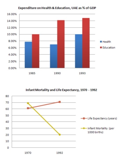
The graphs show the percentage of GDP spent on health and education in the UAE between 1985 and 1993, and data on life expectancy and infant mortality from 1970 to 1992.

Overall, spending on both sectors increased over time, and this was followed by a longer life expectancy and lower infant mortality.

In 1985, around 8% of GDP was spent on education and 6% on health. By 1993, both figures had risen, with education reaching almost 15% and health about 10%.

Between 1970 and 1992, life expectancy increased slightly from around 60 to 72 years. In contrast, infant mortality dropped dramatically from about 70 deaths per 1,000 births to only 20, showing clear improvement in living standards.

Word Count: 117

Answers On The Same Topic:

The graphs below show the Expenditure on Health & Education, UAE as percentages of GDP and Infant mortality and life expectancy.

The bar chart given illustrates the proportions of expenditure on health and education in the UAE over a seven-year period, from 1985 to 1993, while the line graph elucidates the numbers of infant mortality and life expectancy over a twenty-two-year period, ending in 1992 . Viewed together, there appears to be a relationship between the […]

The graphs below show the Expenditure on Health & Education, UAE as percentages of GDP and Infant mortality and life expectancy.

The provided bar chart illustrates how much money UAE’s people spend on health and education over 8 years, from 1985 to 1993, measured in percentage of GDP and the second graph demonstrates the number of infant mortality rates per 1000 births and life expectancy per years from 1970 to 1992. Overall, it is apparent that […]

The graphs below show the Expenditure on Health & Education, UAE as percentages of GDP and Infant mortality and life expectancy.

The bar chart illustrates the percentages of health & education in 1985 to 1993 and the line graph depicts infant mortality and life expectancy between 1970 and 1992. Overall, education was the one that started and ended up with the highest rate compared with health from the bar chart while in the line graph life […]

The graphs below show the Expenditure on Health & Education, UAE as percentages of GDP and Infant mortality and life expectancy.

The bar chart compares the expenditure on health and education from 1985 to 1993 in UAE, while the line graph illustrates how life expectancy and infant mortality in UAE change between 1970 to 1992. We can observe from the bar chart that both spending on health and education in UAE increased from over the eight-year […]

See All

Other Topics:

The pie charts show the labour force by gender in three separate sectors in countries A and B.

The pie charts compare the percentage of male and female workers in three different sectors in country A and country B. Overall, services was the dominant job for both genders in country A and country B. Notably, industry made up the lowest share in country A, while the lowest figure in country B can be […]

the charts below show the average money spent per customer on various types of equipment in a Canadian sports store. summarise the information by selecting and reporting the main features, and make comparison where relevant

Two pie charts illustrate how much money customers spent on several types of equipment in a Canadian sports store between 2000 and 2020. Overall, while the amount of money spent on football and swimming increased, rugby and tennis witnessed a fall. In addition, football recorded the highest budget allocated to sport equipments throutout the period. […]

The pie chart shows the distribution of water consumption in a country in 1998 and 2008. Summarise the information by selecting and reporting the main features and making comparisons where relevant

The pie charts compare how people use water in their house in both two years. Overall, in 1988, the most water was used for washing, while, in 2008, Kitchen became the most water-consumption category. In addition, over two decades, the usage for Bathroom and Kitchen increased, whereas a reverse pattern could be seen in that […]

The pie chart shows the information about the reasons for death of patients in two different hospitals.

The chart displays the reasons patient dies in two different hospitals, In review, it seen that in both hospitals, the highest form of death is caused by cancer, but in different in the lowest death rate. Hospital one had allergy as the lowest death rate while healing centre two had tuberculosis as the least rate. […]

The pie chart shows the information about the reasons for death of patients in two different hospitals.

The given picture demondstrates top casing of deaths in treating of the two hospital and their scale. Overall, the hospital got the more equal in distribution between the kinds of dease, while the second one has cancer up to a half. Besides, these is a diffirence in number of the deases and there unsimilar scale. […]

The charts below show the qualifications of staff in an advertising company in 1990 and 2010. Provide an overview of the information by identifying and describing the key details, and include comparisons where appropriate.

The provided pie charts depict the distribution of qualifications among staff in an advertising company for the years 1990 and 2010. A notable shift in staff qualifications is observed over the two decades, characterized by a significant decline in the percentage of individuals holding first degrees in both science and arts, coupled with an increase […]

See All
We have detected unusual activity on your device.
Please verify your identity to continue.
Note: This verification step won't sign you in. If you have a premium account, please log in to access the service as usual.
Google/Gmail Verification
Or verify using Email/Code
We've sent a verification code to:
youremail@gmail.com (Not your email?)
Enter it below to complete the verification process.
Ensure your email address is correct, your inbox is not full, and you check your spam folder. If no email arrives, consider using an alternative email.
You will need a Premium plan to perform your action!
Note: If you already have a premium account, please log in to access our services as usual.

Plans & Pricing

Our mission is to make quality education accessible for everyone.
However, to keep our hardworking team running and this service alive, we genuinely need your support!
By opting for a premium plan, not only do you sustain us in achieving the mission, but you also unlock advanced features to enrich your learning experience.

Free

For learners who aren't pressed for time

What's included on Free
100+ Cambridge IELTS Tests
Instant IELTS Writing Task 1 & 2 Evaluation (2 times/month)
Instant IELTS Speaking Part 1, 2, & 3 Evaluation (5 times/month)
Instant IELTS Writing Task 1 & 2 Essay Generator (2 times/month)
500+ Dictation & Shadowing Exercises
100+ Pronunciation Exercises
Flashcards
Other Advanced Tools

Premium

For those serious about advancing their English proficiency, and for IELTS candidates aspiring to boost their band score by 1-2 points (especially in writing & speaking) in just 30 days or less

What's included on Premium
Save Your IELTS Test Progress
Unlock All Courses & IELTS Tests
Unlimited AI Conversations
Unlimited AI Writing Enhancement Exercises
Unlimited IELTS Writing Task 1 & 2 Evaluation
Unlimited IELTS Speaking Part 1, 2, & 3 Evaluation
Checked Answers Will Not Be Published
Unlimited IELTS Writing Task 1 & 2 Essay Generator
Unlimited IELTS Speaking Part 1, 2, & 3 Sample Generator
Unlimited Usage Of Advanced Tools
Priority Support within 24h (12-month plan only)

Due to the nature of our service and the provided free trials, payments are non-refundable.
Nếu bạn là người Việt Nam và không có hoặc không muốn trả bằng credit/debit cards, bạn có thể thanh toán bằng phương thức chuyển khoản:


Chọn gói:
419,000₫ 277,000 ₫ cho gói 1 tháng (chỉ 9,233₫/ngày)
1,239,000₫ 597,000 ₫ cho gói 3 tháng (chỉ 6,633₫/ngày)
2,469,000₫ 1,027,000 ₫ cho gói 6 tháng (chỉ 5,706₫/ngày)
4,929,000₫ 1,417,000 ₫ cho gói 12 tháng (chỉ 3,936₫/ngày)


Sau khi chuyển khoản, vui lòng đợi trình duyệt tự động điều hướng bạn trở lại Engnovate và bạn sẽ ngay lập tức nhận được mã kích hoạt tài khoản premium.
Nếu có lỗi xảy ra, bạn có thể liên hệ với team thông qua một trong các phương thức: email đến helloengnovate@gmail.com hoặc nhắn tin qua facebook.com/engnovate.
Vì toàn bộ công cụ trên website đều có thể sử dụng thử miễn phí, Engnovate không hỗ trợ hoàn tiền.