🔥 Today Only: Save 30% on Premium — Offer Ends Soon! - Upgrade Now!
Line Graph

Band 5+: the line chart shows the per capita meat consumption in four different countries (USA, UK, India, Brazil) from1985 to 2019

Image for topic: the line chart shows the per capita meat consumption in four different countries (USA, UK, India, Brazil) from1985 to 2019
Our system will evaluate the answer based on this AI-generated description.
The image shows a line graph with four lines, each representing a different country. The x-axis shows years from 1985 to 2019 at five-year intervals, and the y-axis shows numerical values from 0 to 140 at 20-unit intervals. The line for the USA starts at approximately 40 in 1985 and ends at approximately 120 in 2019, showing a steady increase over time. The UK line starts at approximately 35 in 1985, reaching a value of just over 100 in 2019, also showing a steady increase. Brazil's line begins at approximately 15 in 1985 and ends at roughly 30 in 2019, indicating a slower and less significant growth. India's line starts at approximately 10 in 1985 and ends at just under 40 in 2019, showing a steady but modest increase. The lines do not display any sharp peaks or drops and maintain consistent trajectories throughout the years. The data points on each line are marked by dots.
Given the complexity of the image, the above description may not be entirely accurate.
Note: Both the topic and the answer were created by one of our users.

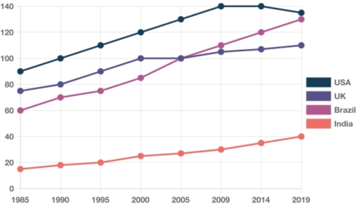
The graph demonstrates how much meat people eat per person in countries like the USA, UK, Brazil and India in the period of time from 1985 to 2019.

Overall, the graphs below show constant growth except the USA and UK that fell marginally at some moment.

India and Brazil went up throughout the entire period from 1985 to 2019 with minimum differences in dynamics, but with differences in consumption. The India peaked at 40 in 2019 and no more. It is important to mark that In 2005, the Brazil rocketed, dramatically overtook the UK and in 2019 it peaked at 130.

On the other hand, The UK illustrated a climb to 100 by 2000 and fell off till 2005. Then grew at a slow pace till 2019. From 1985 The USA successfully doubled to 140 to 2009, but then dropped by 10 points to 130 till 2019.

Word Count: 147

Answers On The Same Topic:

the line chart shows the per capita meat consumption in four different countries (USA, UK, India, Brazil) from1985 to 2019

The line chart delineates the changes in per capita meat consumption across four countries (the USA, the UK, Brazil, and India) over a 34-year period starting from 1985, at five-year intervals. Overall, the period was characterized by divergent trends. While the USA and the UK experienced relatively steady growth, Brazil witnessed a much sharper rise, […]

the line chart shows the per capita meat consumption in four different countries (USA, UK, India, Brazil) from1985 to 2019

The line graph provides a breakdown of the changes in the per capita meat consumption across four categories in four different countries (USA, UK, India, Brazil) spanning 34-year period starting from 1985, at 5-year intervals. Overall, it is manifest that the meat consumption rate in all surveyed categories followed an upward trajectory. Notably, USA maintained […]

the line chart shows the per capita meat consumption in four different countries (USA, UK, India, Brazil) from1985 to 2019

The line chart delineates the changes in the per capita meat consumption across four categories spanning a 34-year period starting from 1985,at 1985-year intervals. Overall, it is manifest that average meat consumption per person in all surveyed categories followed an upward trajectory. Notably, the USA maintains its status as the leader, while India was the […]

the line chart shows the per capita meat consumption in four different countries (USA, UK, India, Brazil) from1985 to 2019

The line chart dlineates the changes in meat consumption across 4 categories consumption in four different countries (USA, UK, India, Brazil) spanning a 34- year period starting from 1985, at 5- year intervals. Overall, it is manifest that the per capita in all surveyed categoris followed an upward trajectory. Notably. Usa maintained its status as […]

the line chart shows the per capita meat consumption in four different countries (USA, UK, India, Brazil) from1985 to 2019

The given line graph illustrates the amount of meat consumed per capita across four certain nations, namely the USA, the UK, India, and Brazil between 1985 and 2019. Overview, throughout the 34-year period, all the four countries witnessed an upward trend in the per capita meat consumption. Notably, meat consumption in the USA consistently remained […]

See All

Other Topics:

The graph below gives information about the number of jobs in four sectors of the economy in the US between 1960 and 2020.

The line graph provides the data about the number of jobs in four eceonomy sectors as -healthcare,agriculture,retail and manufacturing in US between the years 1960 and 2020. Overall, we can see from the graph that in 1960 healthcare was the least popular amog the emloyers .In comparison,manufacturing was the most popular job.Talking about retail and […]

The line chart shows attandance at the cinema among various age groups in the US form 2000 to 2011

The line graph below illustrates the average attendance at the cinema among different age groups in the US between 2000 and 2011. Overall, it can be seen that youth accounted for the majority of visitors, while people in their middle thirties and over accounted for the lowest rate throughout the period. More specifically, with regard […]

The line graph shows number to 5 attractions in the city of Parkvale from1996 to 2016.

The line graph illustrates the number of visitors to five attractions in the city of Parkvale between 1996 and 2016. The attractions include the State Zoo, National Gallery, Indigenous Art Centre, Museum, and Aquarium. Overall, almost all attractions experienced fluctuations over the period. However, the Museum remained relatively stable throughout, while the National Gallery recorded […]

The line graph shows number to 5 attractions in the city of Parkvale from1996 to 2016.

The line graph illustrates number of tourists attract some place namely State Zoo, National Galary, Indegenous Art Centre, Museum and Aquarium in parkvale urban area in the year between 1996 and 2016. Overall, almost all places shows flactuation except Museum visitors, which is remain stable but national Galary indicates dramatic growth over time. In the […]

Renewable energy as a percentage of total electricity generation, four countries, 1995-2020

The line graph compares the proportion of electricity generated from renewable energy resources in four countries (Norway, Germany, UK and Poland) from 1995 to 2020. Overall, it is clear that Norway accounted for the largest proportion of power generation as it remained stable throughout the given period whereas the other three nations remained significantly far […]

The line graph shows the percentage of Australians who were employed between 1976 and 2011 in four groups.

The linear graph compares the percentage of 4 age groups with job who were from Australia for over a thirty five-year period ending at 2010. The units are provided in percentages. Overall, while the figures for both women groups mainly experienced a growth, that for men underwent a decline. Moreover, all age groups saw a […]

See All
We have detected unusual activity on your device.
Please verify your identity to continue.
Note: This verification step won't sign you in. If you have a premium account, please log in to access the service as usual.
Google/Gmail Verification
Or verify using Email/Code
We've sent a verification code to:
youremail@gmail.com (Not your email?)
Enter it below to complete the verification process.
Ensure your email address is correct, your inbox is not full, and you check your spam folder. If no email arrives, consider using an alternative email.
You will need a Premium plan to perform your action!
Note: If you already have a premium account, please log in to access our services as usual.

Plans & Pricing

Our mission is to make quality education accessible for everyone.
However, to keep our hardworking team running and this service alive, we genuinely need your support!
By opting for a premium plan, not only do you sustain us in achieving the mission, but you also unlock advanced features to enrich your learning experience.

Free

For learners who aren't pressed for time

What's included on Free
100+ Cambridge IELTS Tests
Instant IELTS Writing Task 1 & 2 Evaluation (2 times/month)
Instant IELTS Speaking Part 1, 2, & 3 Evaluation (5 times/month)
Instant IELTS Writing Task 1 & 2 Essay Generator (2 times/month)
500+ Dictation & Shadowing Exercises
100+ Pronunciation Exercises
Flashcards
Other Advanced Tools

Premium

For those serious about advancing their English proficiency, and for IELTS candidates aspiring to boost their band score by 1-2 points (especially in writing & speaking) in just 30 days or less

What's included on Premium
Save Your IELTS Test Progress
Unlock All Courses & IELTS Tests
Unlimited AI Conversations
Unlimited AI Writing Enhancement Exercises
Unlimited IELTS Writing Task 1 & 2 Evaluation
Unlimited IELTS Speaking Part 1, 2, & 3 Evaluation
Checked Answers Will Not Be Published
Unlimited IELTS Writing Task 1 & 2 Essay Generator
Unlimited IELTS Speaking Part 1, 2, & 3 Sample Generator
Unlimited Usage Of Advanced Tools
Priority Support within 24h (12-month plan only)

Due to the nature of our service and the provided free trials, payments are non-refundable.
Nếu bạn là người Việt Nam và không có hoặc không muốn trả bằng credit/debit cards, bạn có thể thanh toán bằng phương thức chuyển khoản:


Chọn gói:
419,000₫ 277,000 ₫ cho gói 1 tháng (chỉ 9,233₫/ngày)
1,239,000₫ 597,000 ₫ cho gói 3 tháng (chỉ 6,633₫/ngày)
2,469,000₫ 1,027,000 ₫ cho gói 6 tháng (chỉ 5,706₫/ngày)
4,929,000₫ 1,417,000 ₫ cho gói 12 tháng (chỉ 3,936₫/ngày)


Sau khi chuyển khoản, vui lòng đợi trình duyệt tự động điều hướng bạn trở lại Engnovate và bạn sẽ ngay lập tức nhận được mã kích hoạt tài khoản premium.
Nếu có lỗi xảy ra, bạn có thể liên hệ với team thông qua một trong các phương thức: email đến helloengnovate@gmail.com hoặc nhắn tin qua facebook.com/engnovate.
Vì toàn bộ công cụ trên website đều có thể sử dụng thử miễn phí, Engnovate không hỗ trợ hoàn tiền.