🔥 Today Only: Save 30% on Premium — Offer Ends Soon! - Upgrade Now!
Line Graph

Band 8+: The line graph below gives information about the percentage of women aged 15-64 in employment between 2003 and 2009.

Image for topic: The line graph below gives information about the percentage of women aged 15-64 in employment between 2003 and 2009.
Our system will evaluate the answer based on this AI-generated description.
The image shows a line graph displaying the percentage of women aged 15-64 in employment between 2003 and 2009 in five different countries (Iceland, Canada, Germany, Chile, and Turkey). Data points for each country are represented by distinct shapes for each year. In 2003, Iceland had about 80%, Canada had about 70%, Germany had around 60%, Chile had approximately 35%, and Turkey started with about 25%. By 2005, Iceland's percentage increased slightly to just above 80%, Canada remained close to 70%, Germany showed a small increase to just above 60%, Chile's percentage dropped to just below 35%, and Turkey decreased to around 23%. In 2007, Iceland's percentage remained above 80%, Canada's stayed near 70%, Germany's increased to about 65%, Chile rose slightly to just above 35%, and Turkey decreased further to just above 20%. In the final year, 2009, Iceland's percentage remained steady above 80%, Canada's stayed near 70%, Germany's increased slightly to around 67%, Chile decreased to just below 35%, and Turkey decreased further to just below 20%. The graph illustrates trends over the six-year period for each country in terms of the percentage of women employed within the specified age range.
Given the complexity of the image, the above description may not be entirely accurate.
Note: Both the topic and the answer were created by one of our users.

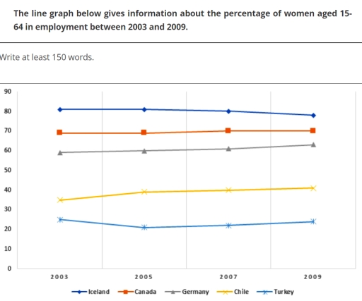
The line chart illustrates the employment rates of women aged 15 to 64 in five different countries between 2003 and 2009.

Overall, it is clear that Iceland consistently recorded the highest proportion of female employees, while Turkey remained at the lowest position throughout the period. Additionally, although most nations experienced relatively modest changes, Chile witnessed the most significant growth. A noticeable gap of approximately 55-60% between Iceland and Turkey was also maintained over the entire timeframe.

In terms of the countries with a declining trend, despite a 5% decrease over the period, Iceland consistently ranked first in terms of female employment, starting at 80% in 2003 and ending at around 75% in 2009. By contrast, Turkey, which accounted for 25% at the beginning, experienced a slight fall to 21% in 2005 before recovering to 24% in the final year, though this figure remained lower than its initial value.

Regarding the nations with modest increases, not only did Chile and Canada witness a stable period from 2003 to 2005, but their figures also showed a similarly marginal increase of approximately 1-2% over the following years. Notably, so dramatic was the surge in Chile’s employment rate that it rose from 35% in 2003 to 40% by the end of the period, marking the most substantial growth among the five countries. Meanwhile, Germany’s figure remained steady at 60% before climbing to 62% in 2009.

Word Count: 231

Answers On The Same Topic:

The line graph below gives information about the percentage of women aged 15-64 in employment between 2003 and 2009.

The graph shows data about the percentage of women aged 15-54 in job between 2003-2009. Overall,The Iceland have the highest female employment percentage among the countries while The turkey shows the lowest rates over the years. In 2003,Iceland started at 80% higher than Canada which stated at 70%. From 2003 to 2007 Iceland remained unchanged,by […]

The line graph below gives information about the percentage of women aged 15-64 in employment between 2003 and 2009.

The line graph illustrate the data of proportion of women employed at the of aged 15-64 in countries Iceland , Canada ,Germany ,Chile and turkey between 2003 and 2009. Overall , Iceland has the highest amount of women employed throughout the period followed by Canada and Germany while the lowest proportion are the Chile and […]

The line graph below gives information about the percentage of women aged 15-64 in employment between 2003 and 2009.

The line graph illustrates changes in the employment rates of women aged 15 to 64 across five nations over a six-year period, from 2003 to 2009. Iceland maintained a clear lead, starting at approximately 82% in 2003. Despite a slight dip to around 78% in 2005, it recovered strongly, ending the period at roughly 85%. […]

The line graph below gives information about the percentage of women aged 15-64 in employment between 2003 and 2009.

The line graph performs data about the percentage of female around 15-64 year old who are employed in the period of 2003 to 2009. As a shole, in the five nations, including Iceland, Canada, Germany, Chile and Turkey remained constant throughout the whole peroid between 2003 to 2009. The rankings of the level of female […]

The line graph below gives information about the percentage of women aged 15-64 in employment between 2003 and 2009.

The graph illustrates the percentage of the female employees in five different countries, namely Iceland, Canada, Germany, Chile, Turkey, between 15 to 64-years-old, spanning from 2003 to 2009. Overall the change of percentage experienced a fluctuation and is stable, while Iceland stand at the top status, Canada act as the first-runner-up, Germany at he middle, […]

See All

Other Topics:

The graph below shows the number of overseas visitors to three different areas of a European country between 1987 and 2007.

The line chart illustrates the number of overseas visitors to three various areas of a European country from 1987 to 2007. Overall, the coast area had the most visitors over the time of period. By contrast, the number of visitors of the lakes were the lowest at beginning and increased significantly over the period. In […]

Summarise the information by selecting and reporting the main features, and make comparison where relevent

The line graph illustrates varous activities at one social centre and their amount of participants in Melbourne, Australia between 2000 to 2020. It is evident that the most people participanted for film club among other activities despite of being stable over twenty years. Moreover, number of musical performances and that of table tennis increased. However, […]

The line graph shows the percentage of obesity among four age groups

The line graph illustrates the percentage of people suffering from obesity in four different age rates between 1971 and 2005 Overall, obesity rates rose considerably across all age categories during the period shown. People aged 45-64 recorded the highest proportions throughout most years, whereas the youngest group, aged 18-29, consistently had the lowest obesity levels. […]

the graph how reginial household recyling rates in three different countires between 2005 and 2015

The line graph compares three European countries, including the UK, France, and Germany in terms of their household recycling rates from 2005 to 2015, with figures expressed in percentages Overall, for most of the timeframe, the United Kingdom recorded the highest rate of household recycling, whereas the figure declined steadliy throughout the period and remained […]

The line graph below shows the average high and low temperatures in Glasgow, Scotland, over the course of a year, while the table provides information on the average monthly rainfall and sunshine hours. Summarise the information by selecting and reporting the main features, and make comparisons where relevant.

The chart compares the average high and low temperatures in Glasgow, Scotland, over a year, whereas the table illustrates the average rainfall and sunshine hours each month. Overall, the figures for high and low temperatures follow similar trends, both peaking in July. There is generally an inverse relationship between rainfall and sunshine hours, with sunny […]

The graph below shows the daily consumption of three spreads per person from 1981 to 2007 in a country. Summarise the information by selecting and reporting the main features, and make comparisons where relevant. You should write at least 150 words.

The line graphs demonstrate the daily intake of three toppings per person over a period of three years from 1981 to 2007 in a country. Overall, the data shows that while consumption of margarine declined, consumptions of low-fat spread and butter experienced a remarkable increase before 2007 and 1991. At the beginning of the period, […]

See All
We have detected unusual activity on your device.
Please verify your identity to continue.
Note: This verification step won't sign you in. If you have a premium account, please log in to access the service as usual.
Google/Gmail Verification
Or verify using Email/Code
We've sent a verification code to:
youremail@gmail.com (Not your email?)
Enter it below to complete the verification process.
Ensure your email address is correct, your inbox is not full, and you check your spam folder. If no email arrives, consider using an alternative email.
You will need a Premium plan to perform your action!
Note: If you already have a premium account, please log in to access our services as usual.

Plans & Pricing

Our mission is to make quality education accessible for everyone.
However, to keep our hardworking team running and this service alive, we genuinely need your support!
By opting for a premium plan, not only do you sustain us in achieving the mission, but you also unlock advanced features to enrich your learning experience.

Free

For learners who aren't pressed for time

What's included on Free
100+ Cambridge IELTS Tests
Instant IELTS Writing Task 1 & 2 Evaluation (2 times/month)
Instant IELTS Speaking Part 1, 2, & 3 Evaluation (5 times/month)
Instant IELTS Writing Task 1 & 2 Essay Generator (2 times/month)
500+ Dictation & Shadowing Exercises
100+ Pronunciation Exercises
Flashcards
Other Advanced Tools

Premium

For those serious about advancing their English proficiency, and for IELTS candidates aspiring to boost their band score by 1-2 points (especially in writing & speaking) in just 30 days or less

What's included on Premium
Save Your IELTS Test Progress
Unlock All Courses & IELTS Tests
Unlimited AI Conversations
Unlimited AI Writing Enhancement Exercises
Unlimited IELTS Writing Task 1 & 2 Evaluation
Unlimited IELTS Speaking Part 1, 2, & 3 Evaluation
Checked Answers Will Not Be Published
Unlimited IELTS Writing Task 1 & 2 Essay Generator
Unlimited IELTS Speaking Part 1, 2, & 3 Sample Generator
Unlimited Usage Of Advanced Tools
Priority Support within 24h (12-month plan only)

Due to the nature of our service and the provided free trials, payments are non-refundable.
Nếu bạn là người Việt Nam và không có hoặc không muốn trả bằng credit/debit cards, bạn có thể thanh toán bằng phương thức chuyển khoản:


Chọn gói:
419,000₫ 277,000 ₫ cho gói 1 tháng (chỉ 9,233₫/ngày)
1,239,000₫ 597,000 ₫ cho gói 3 tháng (chỉ 6,633₫/ngày)
2,469,000₫ 1,027,000 ₫ cho gói 6 tháng (chỉ 5,706₫/ngày)
4,929,000₫ 1,417,000 ₫ cho gói 12 tháng (chỉ 3,936₫/ngày)


Sau khi chuyển khoản, vui lòng đợi trình duyệt tự động điều hướng bạn trở lại Engnovate và bạn sẽ ngay lập tức nhận được mã kích hoạt tài khoản premium.
Nếu có lỗi xảy ra, bạn có thể liên hệ với team thông qua một trong các phương thức: email đến helloengnovate@gmail.com hoặc nhắn tin qua facebook.com/engnovate.
Vì toàn bộ công cụ trên website đều có thể sử dụng thử miễn phí, Engnovate không hỗ trợ hoàn tiền.