🔥 Today Only: Save 30% on Premium — Offer Ends Soon! - Upgrade Now!
Line Graph

Band 6+: The line graph below shows changes in the proportion of energy produced from different sources in a country from 1980 to 2015. Summarise the information by selecting and reporting the main features, and make comparisons where relevant.

Image for topic: The line graph below shows changes in the proportion of energy produced from different sources in a country from 1980 to 2015. Summarise the information by selecting and reporting the main features, and make comparisons where relevant.
Our system will evaluate the answer based on this AI-generated description.
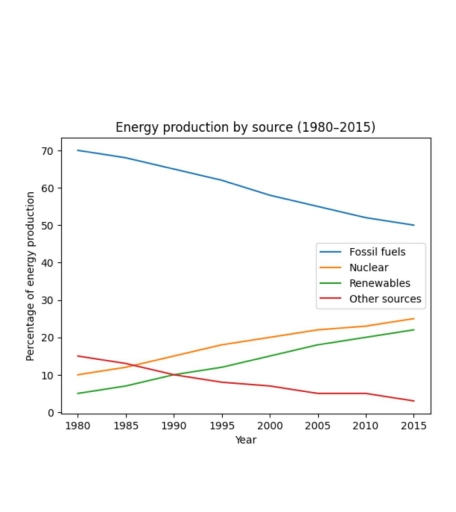
The image displays a line graph titled "Energy production by source (1980–2015)", showing the percentage of energy production against the year. In 1980, Fossil fuels were at 70%, Nuclear at 10%, Renewables at 5%, and Other sources at 15%. By 1985, Fossil fuels were approximately 68%, Nuclear 13%, Renewables 8%, and Other sources 12%. In 1990, Fossil fuels were at 65%, Nuclear 16%, Renewables 11%, and Other sources 10%. In 1995, Fossil fuels accounted for about 62%, Nuclear 19%, Renewables 14%, and Other sources 8%. Around 2000, Fossil fuels were at 58%, Nuclear 21%, Renewables 17%, and Other sources 7%. In 2005, the data points were: Fossil fuels 55%, Nuclear 22%, Renewables 20%, and Other sources 5%. For 2010, the values were approximately: Fossil fuels 52%, Nuclear 23%, Renewables 22%, and Other sources 5%. Finally, in 2015, Fossil fuels were at 50%, Nuclear at 25%, Renewables at 24%, and Other sources at 3%.
Given the complexity of the image, the above description may not be entirely accurate.
Note: Both the topic and the answer were created by one of our users.

The line graph illustrates change of energy production by fossil fuels, renewables, nuclear, and other sources over a thirty five-year period between 1980 and 2015.

Overall, energy production from fossil fuels constituted the largest share of throughout the period. By contrast, nuclear and renewables accounted for the smallest proportion of energy production, they experienced a slight growth at the end of the timeframe.

Fossil fuels made up the majority of produced energy at around 70% . However this figure gradually decreased reaching 50% by the end of the period. Nuclear accounted for the 10% of generated energy in 1980, before climbing to 20% in 1995. A similar pattern can be seen in renewables which represented a roughly 5% in 1980 and followed a steady growth reaching 15% at the end of the period. Other sources meanwhile, begun at around 16%, but feel markedly to 5%in 2015.

After this low percentage of energy production by other sources remained steady until 2010 and followed a reduction to 3% in 2015

Word Count: 168

Answers On The Same Topic:

The line graph below shows changes in the proportion of energy produced from different sources in a country from 1980 to 2015. Summarise the information by selecting and reporting the main features, and make comparisons where relevant.

The line graph illustrates change in energy production from fossil fuels, renewables, nuclear, and other sources over a thirty-five-year period between 1980 and 2015. Overall, energy production from fossil fuels constituted the largest share throughout the period. By contrast, nuclear and renewables accounted for the smallest proportions of energy production, they experienced a slight growth […]

The line graph below shows changes in the proportion of energy produced from different sources in a country from 1980 to 2015. Summarise the information by selecting and reporting the main features, and make comparisons where relevant.

The line graph illustrates the change in energy production from fossil fuels, renewables, nuclear, and other sources over a thirty-five-year period between 1980 and 2015. Overall, energy production from fossil fuels constituted the largest share throughout the period. By contrast, nuclear and renewables accounted for the smallest percentage of energy production, they experienced slight growth […]

The line graph below shows changes in the proportion of energy produced from different sources in a country from 1980 to 2015. Summarise the information by selecting and reporting the main features, and make comparisons where relevant.

The line graph illustrates shifts in the percentage of energy produced from four sources-the fossil fuels, nuclear, renewables, and other sources in a certain country from 1980 to 2015. Overall, other sources experienced a downward trend, while the reverse was reported in nuclear and renewables, with the fossil fuels being a major source throughout the […]

See All

Other Topics:

The line graph shows number to 5 attractions in the city of Parkvale from1996 to 2016.

The line graph illustrates the number of visitors to five attractions in the city of Parkvale between 1996 and 2016. The attractions include the State Zoo, National Gallery, Indigenous Art Centre, Museum, and Aquarium. Overall, almost all attractions experienced fluctuations over the period. However, the Museum remained relatively stable throughout, while the National Gallery recorded […]

The line graph shows number to 5 attractions in the city of Parkvale from1996 to 2016.

The line graph illustrates number of tourists attract some place namely State Zoo, National Galary, Indegenous Art Centre, Museum and Aquarium in parkvale urban area in the year between 1996 and 2016. Overall, almost all places shows flactuation except Museum visitors, which is remain stable but national Galary indicates dramatic growth over time. In the […]

Renewable energy as a percentage of total electricity generation, four countries, 1995-2020

The line graph compares the proportion of electricity generated from renewable energy resources in four countries (Norway, Germany, UK and Poland) from 1995 to 2020. Overall, it is clear that Norway accounted for the largest proportion of power generation as it remained stable throughout the given period whereas the other three nations remained significantly far […]

The line graph shows the percentage of Australians who were employed between 1976 and 2011 in four groups.

The linear graph compares the percentage of 4 age groups with job who were from Australia for over a thirty five-year period ending at 2010. The units are provided in percentages. Overall, while the figures for both women groups mainly experienced a growth, that for men underwent a decline. Moreover, all age groups saw a […]

The graph below shows information about the percentage of female students on four different courses at one university from 1970 to 2015

The graph delineates the proportion of females engaging in four distinct courses, namely Computer Science, Physics, Medicine and Law. The survey was conducted at one particular university in the period from 1975 to 2015. Overall, the computer science experienced a fluctuation during the period, with a downward trend from 1990 onwards; while three remaining courses […]

The graph below shows the number of visitors to two different tourist attractions in the city of Grenby during one particular week.

The presented line graph depicts the comparison between two tourist attractions with different topics but with the same location in the city of Grenby in terms of daily visitors in one particular week. Looking from an overall view, it is apparent that Amusement Park is dominating through whole chart, while History Museum experiences some fluctuations, […]

See All
We have detected unusual activity on your device.
Please verify your identity to continue.
Note: This verification step won't sign you in. If you have a premium account, please log in to access the service as usual.
Google/Gmail Verification
Or verify using Email/Code
We've sent a verification code to:
youremail@gmail.com (Not your email?)
Enter it below to complete the verification process.
Ensure your email address is correct, your inbox is not full, and you check your spam folder. If no email arrives, consider using an alternative email.
You will need a Premium plan to perform your action!
Note: If you already have a premium account, please log in to access our services as usual.

Plans & Pricing

Our mission is to make quality education accessible for everyone.
However, to keep our hardworking team running and this service alive, we genuinely need your support!
By opting for a premium plan, not only do you sustain us in achieving the mission, but you also unlock advanced features to enrich your learning experience.

Free

For learners who aren't pressed for time

What's included on Free
100+ Cambridge IELTS Tests
Instant IELTS Writing Task 1 & 2 Evaluation (2 times/month)
Instant IELTS Speaking Part 1, 2, & 3 Evaluation (5 times/month)
Instant IELTS Writing Task 1 & 2 Essay Generator (2 times/month)
500+ Dictation & Shadowing Exercises
100+ Pronunciation Exercises
Flashcards
Other Advanced Tools

Premium

For those serious about advancing their English proficiency, and for IELTS candidates aspiring to boost their band score by 1-2 points (especially in writing & speaking) in just 30 days or less

What's included on Premium
Save Your IELTS Test Progress
Unlock All Courses & IELTS Tests
Unlimited AI Conversations
Unlimited AI Writing Enhancement Exercises
Unlimited IELTS Writing Task 1 & 2 Evaluation
Unlimited IELTS Speaking Part 1, 2, & 3 Evaluation
Checked Answers Will Not Be Published
Unlimited IELTS Writing Task 1 & 2 Essay Generator
Unlimited IELTS Speaking Part 1, 2, & 3 Sample Generator
Unlimited Usage Of Advanced Tools
Priority Support within 24h (12-month plan only)

Due to the nature of our service and the provided free trials, payments are non-refundable.
Nếu bạn là người Việt Nam và không có hoặc không muốn trả bằng credit/debit cards, bạn có thể thanh toán bằng phương thức chuyển khoản:


Chọn gói:
419,000₫ 277,000 ₫ cho gói 1 tháng (chỉ 9,233₫/ngày)
1,239,000₫ 597,000 ₫ cho gói 3 tháng (chỉ 6,633₫/ngày)
2,469,000₫ 1,027,000 ₫ cho gói 6 tháng (chỉ 5,706₫/ngày)
4,929,000₫ 1,417,000 ₫ cho gói 12 tháng (chỉ 3,936₫/ngày)


Sau khi chuyển khoản, vui lòng đợi trình duyệt tự động điều hướng bạn trở lại Engnovate và bạn sẽ ngay lập tức nhận được mã kích hoạt tài khoản premium.
Nếu có lỗi xảy ra, bạn có thể liên hệ với team thông qua một trong các phương thức: email đến helloengnovate@gmail.com hoặc nhắn tin qua facebook.com/engnovate.
Vì toàn bộ công cụ trên website đều có thể sử dụng thử miễn phí, Engnovate không hỗ trợ hoàn tiền.