🔥 Today Only: Save 30% on Premium — Offer Ends Soon! - Upgrade Now!
Line Graph

Band 8+: The line graph below shows the percentage of tourists to England who visited four different attractions in Brighton.

Image for topic: The line graph below shows the percentage of tourists to England who visited four different attractions in Brighton.
Our system will evaluate the answer based on this AI-generated description.
The image shows a graph plotting percentage against time from 1980 to 2010 at 5-year intervals for four categories: Art Gallery, Pavilion, Pier, and Festival. Art Gallery starts at 20% in 1980, increases to 32.5% in 1985, 22.5% in 1990, drops to 20% in 1995, rises to 27.5% in 2000, declines to 22.5% in 2005, and finishes at 25% in 2010. Pavilion begins at 15% in 1980, rises to 27.5% in 1985, drops to 22.5% in 1990, increases to 30% in 1995, falls to 22.5% in 2000, remains steady through 2005, and ends at 17.5% in 2010. Pier starts at 25% in 1980, falls to 15% in 1985, rises sharply to 47.5% in 1990, drops to 42.5% in 1995, plummets to 12.5% in 2000, rises slightly to 17.5% in 2005, and finishes at 20% in 2010. Festival commences at 40% in 1980, decreases to 25% in 1985, jumps to 37.5% in 1990, declines steeply to 5% in 1995, increases to 10% in 2000, remains stable in 2005, and ends at 37.5% in 2010.
Given the complexity of the image, the above description may not be entirely accurate.
Note: Both the topic and the answer were created by one of our users.

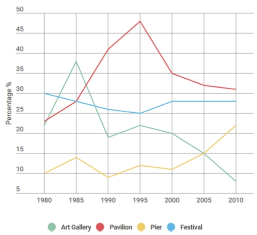
The line graph illustrates the percentage of tourists to England who visited four attractions in Brighton—Art Gallery, Pavilion, Pier, and Festival—over a thirty-year period from 1980 to 2010.

Overall, the Pavilion saw a dramatic rise in popularity, becoming the most visited attraction for much of the period, while the Art Gallery and Festival declined or remained stable. The Pier showed a gradual but steady increase in tourist interest, ending as one of the more visited sites by 2010.

In 1980, the Festival attracted the highest proportion of tourists at around 30%, followed by the Art Gallery and Pavilion at just under 25%. The Pavilion experienced a sharp rise, peaking at nearly 50% in 1995, before declining slightly to just above 30% in 2010. Conversely, the Art Gallery rose briefly to 38% in 1985, then steadily declined to under 10%. The Festival’s popularity remained consistent, hovering around 30%, while the Pier rose from 10% to approximately 22% by 2010.

Word Count: 158

Answers On The Same Topic:

The line graph below shows the percentage of tourists to England who visited four different attractions in Brighton.

The line graph illustrates how many percentages of travellers to England who visited Brighton attractions, between 1980 and 2010. Overall, it is evident that Pavilion increased at the beginning of the period but showed noticeable fluctuations. In contrast, Art gallery experienced experienced gradually declined. Looking at the details, people, who visited pavilion attraction began at […]

The line graph below shows the percentage of tourists to England who visited four different attractions in Brighton.

The line graph illustrates how many percentage of tourists to England who visited Brighton attractions between 1980 and 2010. Overall,Pier and Pavilion showed an insignificant increase from 1980 to 2010.At this time Art Galery and Festival decreased Tourists percentage increased significantly from 23% to 28% in Pavilion.In the next 10 years it continued it is […]

The line graph below shows the percentage of tourists to England who visited four different attractions in Brighton.

The line chart illustrates the percentage of people who visited four attractions in Brighton between 1980 and 2010. In 1980, the Festival attracted by far the highest proportion of tourists, at around 30%. The Pier, on the other hand, accounted for about 12%, and its figure fluctuated over the period. By 2010, the Festival’s share […]

The line graph below shows the percentage of tourists to England who visited four different attractions in Brighton.

The line graph represents the rate of visitors to England who attended Art Gallery,Pavilion,Pier and Festival in Brighton from 1980 to 2010. Overall, the percentage of tourist to Art Gallery and Festval decreased while Pavilion and Pier increased. notably,although the tourist percentage of Festival was the highest initially,it was later surpassed by that of Pavilion […]

The line graph below shows the percentage of tourists to England who visited four different attractions in Brighton.

The line diagram illustrates England’s visitors who visited distinct tourist attractions from 1980 to 2010 in Brighton. The unit is measured in percentage. Overall, a comparative analysis reveals that there were all the attractions gradually fluctuated except Pavilion over the given period. However, Festival was remaining steadily. According to the data, nearly 25% of English […]

See All

Other Topics:

the graph shows the average trip length(in miles) in US children aged 5 to 15 years old.

The provided chart illustrates the average length of trip (in miles) among teenagers in the United States for twenty years old). Overall, It can be seen that there is a difference between the standard of long travels in the United States in which the bus becomes the highest trend and walking is the lowest one. […]

The graph below shows the number of tourists visiting a particular Caribbean island between 2010 and 2017. Summaries the information by selecting and reporting the main features and make comparisons where relavant.

The line graph illustrates a plethora of tourists visiting a specific Caribbean island, in million, within 7-year periods from 2010 to 2017. The statistics shows how many people staying on cruise ships, how many visitors staying on island and eventually the people totaling in the island. Overall, they all were commenced with same year. however, […]

The line graph illustrates the percentage of employed Australian men and women aged between 18 and 34 in 1971 and 2011.

The line graph illustrates the proportion of employed Australians aged from 18 to 34 in 1971 and 2011. Men consistenly recorded higher employment rate than women in both year. The proportion of employ women rose consistenly in 2011, the figure for women in 1971 declined with age. By contrast, employment among men remained retively stable […]

The line graph below shows the production of paper, wood pulp and sawn-wood in the UK from 1980 to 2000.

The line graph compares the production of paper, wood pulp and sawn-wood in the UK between 1980 and 2000. Taken as a whole, the production of paper witnessed an upward trend, meanwhile the opposite was true for wood pulp and sawn-wood. Additionally, the production of paper was the highest thoughout the period. Regarding the period […]

The line graph below shows the cost of four types of bread for 800 grams of in one European country from 2001 to 2007.

The chart illustrates the expenses of four types of bread for 800 grams in one European country between 2001 and 2007. Overall, black bread was the most expensive type throughout the given period except in 2001. Moreover, except for wholemeal bread, the cost for the others increased generally. In detail, the expense of black bread […]

The graph below shows the number of tourists visiting a particular Caribbean island between 2010 and 2017. Summaries the information by selecting and reporting the main features and make comparisons where relavant.

The line graph demonstrates the number of tourists visiting a Caribbean island from 2010 to 2017. Overall, the total number of tourists increased significantly over the period. In addition, visitors staying on cruise ships showed a considerable rise, while the number of tourists staying on the island remained relatively stable after 2013. The first group […]

See All
We have detected unusual activity on your device.
Please verify your identity to continue.
Note: This verification step won't sign you in. If you have a premium account, please log in to access the service as usual.
Google/Gmail Verification
Or verify using Email/Code
We've sent a verification code to:
youremail@gmail.com (Not your email?)
Enter it below to complete the verification process.
Ensure your email address is correct, your inbox is not full, and you check your spam folder. If no email arrives, consider using an alternative email.
You will need a Premium plan to perform your action!
Note: If you already have a premium account, please log in to access our services as usual.

Plans & Pricing

Our mission is to make quality education accessible for everyone.
However, to keep our hardworking team running and this service alive, we genuinely need your support!
By opting for a premium plan, not only do you sustain us in achieving the mission, but you also unlock advanced features to enrich your learning experience.

Free

For learners who aren't pressed for time

What's included on Free
100+ Cambridge IELTS Tests
Instant IELTS Writing Task 1 & 2 Evaluation (2 times/month)
Instant IELTS Speaking Part 1, 2, & 3 Evaluation (5 times/month)
Instant IELTS Writing Task 1 & 2 Essay Generator (2 times/month)
500+ Dictation & Shadowing Exercises
100+ Pronunciation Exercises
Flashcards
Other Advanced Tools

Premium

For those serious about advancing their English proficiency, and for IELTS candidates aspiring to boost their band score by 1-2 points (especially in writing & speaking) in just 30 days or less

What's included on Premium
Save Your IELTS Test Progress
Unlock All Courses & IELTS Tests
Unlimited AI Conversations
Unlimited AI Writing Enhancement Exercises
Unlimited IELTS Writing Task 1 & 2 Evaluation
Unlimited IELTS Speaking Part 1, 2, & 3 Evaluation
Checked Answers Will Not Be Published
Unlimited IELTS Writing Task 1 & 2 Essay Generator
Unlimited IELTS Speaking Part 1, 2, & 3 Sample Generator
Unlimited Usage Of Advanced Tools
Priority Support within 24h (12-month plan only)

Due to the nature of our service and the provided free trials, payments are non-refundable.
Nếu bạn là người Việt Nam và không có hoặc không muốn trả bằng credit/debit cards, bạn có thể thanh toán bằng phương thức chuyển khoản:


Chọn gói:
419,000₫ 277,000 ₫ cho gói 1 tháng (chỉ 9,233₫/ngày)
1,239,000₫ 597,000 ₫ cho gói 3 tháng (chỉ 6,633₫/ngày)
2,469,000₫ 1,027,000 ₫ cho gói 6 tháng (chỉ 5,706₫/ngày)
4,929,000₫ 1,417,000 ₫ cho gói 12 tháng (chỉ 3,936₫/ngày)


Sau khi chuyển khoản, vui lòng đợi trình duyệt tự động điều hướng bạn trở lại Engnovate và bạn sẽ ngay lập tức nhận được mã kích hoạt tài khoản premium.
Nếu có lỗi xảy ra, bạn có thể liên hệ với team thông qua một trong các phương thức: email đến helloengnovate@gmail.com hoặc nhắn tin qua facebook.com/engnovate.
Vì toàn bộ công cụ trên website đều có thể sử dụng thử miễn phí, Engnovate không hỗ trợ hoàn tiền.