🔥 Today Only: Save 30% on Premium — Offer Ends Soon! - Upgrade Now!
Line Graph

Band 8+: The line graph below shows the percentage of tourists to England who visited four different attractions in Brighton.

Image for topic: The line graph below shows the percentage of tourists to England who visited four different attractions in Brighton.
Our system will evaluate the answer based on this AI-generated description.
The image shows a graph plotting percentage against time from 1980 to 2010 at 5-year intervals for four categories: Art Gallery, Pavilion, Pier, and Festival. Art Gallery starts at 20% in 1980, increases to 32.5% in 1985, 22.5% in 1990, drops to 20% in 1995, rises to 27.5% in 2000, declines to 22.5% in 2005, and finishes at 25% in 2010. Pavilion begins at 15% in 1980, rises to 27.5% in 1985, drops to 22.5% in 1990, increases to 30% in 1995, falls to 22.5% in 2000, remains steady through 2005, and ends at 17.5% in 2010. Pier starts at 25% in 1980, falls to 15% in 1985, rises sharply to 47.5% in 1990, drops to 42.5% in 1995, plummets to 12.5% in 2000, rises slightly to 17.5% in 2005, and finishes at 20% in 2010. Festival commences at 40% in 1980, decreases to 25% in 1985, jumps to 37.5% in 1990, declines steeply to 5% in 1995, increases to 10% in 2000, remains stable in 2005, and ends at 37.5% in 2010.
Given the complexity of the image, the above description may not be entirely accurate.
Note: Both the topic and the answer were created by one of our users.

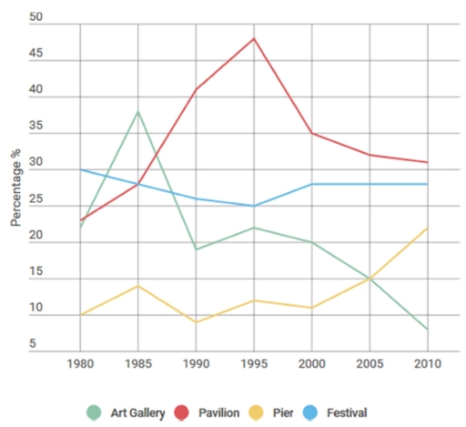
The line graph shows the proportion of visitors to England who visited certain Brighton tourist spots between 1980 and 2010.

Overall, it can be seen that the percentage of people visiting the pier and pavilion, despite fluctuations, increased over the 30-year period. The figure for those deciding to go to the art gallery dropped significantly over the time span, whilst the proportion of festivalgoers stayed relatively stable.

During the 1980s and 1990s, there was a sharp increase in visitors to the pavilion from around 23% to about 48%, and then the percentage declined significantly to approximately 31% in 2010. The trend for the art gallery was similar to the pavilion. Visitor numbers increased rapidly from about 22% to around 37% from 1980 to 1985 and then decreased to just below 10% over the next 25 years.

The number of tourists who visited Brighton’s festival experienced only slight fluctuations, never falling below 25% or rising above 30%. Visitors to the pier fluctuated from 1980 to 2000 between roughly 4% and almost 15% and then rose significantly from around 12% to approximately 22% between 2000 and 2010.

Word Count: 185

Answers On The Same Topic:

The line graph below shows the percentage of tourists to England who visited four different attractions in Brighton.

The line graph illustrates how many percentages of travellers to England who visited Brighton attractions, between 1980 and 2010. Overall, it is evident that Pavilion increased at the beginning of the period but showed noticeable fluctuations. In contrast, Art gallery experienced experienced gradually declined. Looking at the details, people, who visited pavilion attraction began at […]

The line graph below shows the percentage of tourists to England who visited four different attractions in Brighton.

The line graph illustrates how many percentage of tourists to England who visited Brighton attractions between 1980 and 2010. Overall,Pier and Pavilion showed an insignificant increase from 1980 to 2010.At this time Art Galery and Festival decreased Tourists percentage increased significantly from 23% to 28% in Pavilion.In the next 10 years it continued it is […]

The line graph below shows the percentage of tourists to England who visited four different attractions in Brighton.

The line chart illustrates the percentage of people who visited four attractions in Brighton between 1980 and 2010. In 1980, the Festival attracted by far the highest proportion of tourists, at around 30%. The Pier, on the other hand, accounted for about 12%, and its figure fluctuated over the period. By 2010, the Festival’s share […]

The line graph below shows the percentage of tourists to England who visited four different attractions in Brighton.

The line graph represents the rate of visitors to England who attended Art Gallery,Pavilion,Pier and Festival in Brighton from 1980 to 2010. Overall, the percentage of tourist to Art Gallery and Festval decreased while Pavilion and Pier increased. notably,although the tourist percentage of Festival was the highest initially,it was later surpassed by that of Pavilion […]

The line graph below shows the percentage of tourists to England who visited four different attractions in Brighton.

The line diagram illustrates England’s visitors who visited distinct tourist attractions from 1980 to 2010 in Brighton. The unit is measured in percentage. Overall, a comparative analysis reveals that there were all the attractions gradually fluctuated except Pavilion over the given period. However, Festival was remaining steadily. According to the data, nearly 25% of English […]

See All

Other Topics:

Writing task 1 The line graph illustrates the amount of spreads consumed from 1981 to 2007, in grams per person per week

The line graph illustates of tree spreads consumption (margarine, butter, low fat and reduced spreads) since from the period 1981 to 2007. The measured are grams. Overall, the consumption margarine and butter was decreased over the given period, while low fat and reduced spreads rose. At start of the period butter was the most popular […]

the line graph shows three different crimes in England and Wales in 1970-2005

The line graph illustrates the number of different crimes (car theft, house burglary, and street robbery) in England and Wales between 1970 and 2005. Overall, while car thefts and house burglaries showed an initial increase followed by a decline, street robbery remained consistently low throughout the period. It is also notable that car theft was […]

The graph below shows the amount in grams of potatoes, pasta and rice eaten in a European country between 1976 and 2006.

The given line graph illustrates how many grams of potatoes, pasta, and rice were consumed in a specific European country over a 30-year period, from 1976 to 2006. Overall, it is clear that the consumption of potatoes and rice decreased over the period, while pasta consumption showed a gradual increase. Additionally ,although potatoes were consumed […]

The chart below shows the monthly income of 4 restaurants in Melbourne over a 12-month period

The line graph shows the income of four restaurants throughout the year in thousands of dollars. Overall, Spicy Fortune had the highest income at the beginning of the year, while Evening Paradise showed the biggest increase by the end of the year. On the other hand, Delicacy had the lowest income for most months. Spicy […]

The line chart below shows information on fast food consumption in the UK. rite a report describing the information given

The line graph illustrates the amount of three kinds of fast food (hamburger, fish and chips pizza), wich were consumed from 1970 to 1990 in United Kingdom, the data is given in grams. Overall, the consumption of pizza decreased over the period, while the amount of hamburger and fish and chips increased. In 1970, pizza […]

line graph shows the changes in the use of internet for different activities in the future.

This line graph depicts the changes in the use of internet for different activities in the future. It is clear from the graph that there is a lot of differences of how people are going to use the internet in the future. According to what is shown in the graph it is clear that using […]

See All
We have detected unusual activity on your device.
Please verify your identity to continue.
Note: This verification step won't sign you in. If you have a premium account, please log in to access the service as usual.
Google/Gmail Verification
Or verify using Email/Code
We've sent a verification code to:
youremail@gmail.com (Not your email?)
Enter it below to complete the verification process.
Ensure your email address is correct, your inbox is not full, and you check your spam folder. If no email arrives, consider using an alternative email.
You will need a Premium plan to perform your action!
Note: If you already have a premium account, please log in to access our services as usual.

Plans & Pricing

Our mission is to make quality education accessible for everyone.
However, to keep our hardworking team running and this service alive, we genuinely need your support!
By opting for a premium plan, not only do you sustain us in achieving the mission, but you also unlock advanced features to enrich your learning experience.

Free

For learners who aren't pressed for time

What's included on Free
100+ Cambridge IELTS Tests
Instant IELTS Writing Task 1 & 2 Evaluation (2 times/month)
Instant IELTS Speaking Part 1, 2, & 3 Evaluation (5 times/month)
Instant IELTS Writing Task 1 & 2 Essay Generator (2 times/month)
500+ Dictation & Shadowing Exercises
100+ Pronunciation Exercises
Flashcards
Other Advanced Tools

Premium

For those serious about advancing their English proficiency, and for IELTS candidates aspiring to boost their band score by 1-2 points (especially in writing & speaking) in just 30 days or less

What's included on Premium
Save Your IELTS Test Progress
Unlock All Courses & IELTS Tests
Unlimited AI Conversations
Unlimited AI Writing Enhancement Exercises
Unlimited IELTS Writing Task 1 & 2 Evaluation
Unlimited IELTS Speaking Part 1, 2, & 3 Evaluation
Checked Answers Will Not Be Published
Unlimited IELTS Writing Task 1 & 2 Essay Generator
Unlimited IELTS Speaking Part 1, 2, & 3 Sample Generator
Unlimited Usage Of Advanced Tools
Priority Support within 24h (12-month plan only)

Due to the nature of our service and the provided free trials, payments are non-refundable.
Nếu bạn là người Việt Nam và không có hoặc không muốn trả bằng credit/debit cards, bạn có thể thanh toán bằng phương thức chuyển khoản:


Chọn gói:
419,000₫ 277,000 ₫ cho gói 1 tháng (chỉ 9,233₫/ngày)
1,239,000₫ 597,000 ₫ cho gói 3 tháng (chỉ 6,633₫/ngày)
2,469,000₫ 1,027,000 ₫ cho gói 6 tháng (chỉ 5,706₫/ngày)
4,929,000₫ 1,417,000 ₫ cho gói 12 tháng (chỉ 3,936₫/ngày)


Sau khi chuyển khoản, vui lòng đợi trình duyệt tự động điều hướng bạn trở lại Engnovate và bạn sẽ ngay lập tức nhận được mã kích hoạt tài khoản premium.
Nếu có lỗi xảy ra, bạn có thể liên hệ với team thông qua một trong các phương thức: email đến helloengnovate@gmail.com hoặc nhắn tin qua facebook.com/engnovate.
Vì toàn bộ công cụ trên website đều có thể sử dụng thử miễn phí, Engnovate không hỗ trợ hoàn tiền.