24 Hours Only: Get 39% OFF on Our Premium Plan - Check Out Now!
Line Graph

Band 6+: The line graph below shows the unemployment rates in four countries (A, B, C, and D) between 2000 and 2020.

Image for topic: The line graph below shows the unemployment rates in four countries (A, B, C, and D) between 2000 and 2020.
Our system will evaluate the answer based on this AI-generated description.
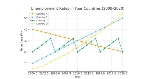
The image displays a line graph titled 'Unemployment Rates in Four Countries (2000-2020)', with the vertical axis representing 'Percentage (%)' and the horizontal axis representing 'Year'. Data for Country A shows the following unemployment rates (%): 2000(40), 2001(39), 2002(38), 2003(37), 2004(36), 2005(35), 2006(34), 2007(33), 2008(32), 2009(31), 2010(30), 2011(29), 2012(28), 2013(27), 2014(26), 2015(25), 2016(24), 2017(23), 2018(22), 2019(21), and 2020(20). Country B's rates (%) are: 2000(10), 2001(12), 2002(14), 2003(16), 2004(18), 2005(20), 2006(22), 2007(24), 2008(26), 2009(28), 2010(30), 2011(32), 2012(34), 2013(36), 2014(38), 2015(40), 2016(42), 2017(44), 2018(46), 2019(48), and 2020(50). Country C's rates (%) for specific years are: 2000(20), 2002(26), 2004(32), 2005(20), 2007(26), 2009(32), 2010(20), 2012(26), 2014(32), 2015(20), 2017(26), 2019(32), and 2020(20). Country D's rates (%) are approximately: 2000(5), 2001(6.5), 2002(8), 2003(9.5), 2004(11), 2005(13), 2006(15), 2007(17), 2008(19.5), 2009(22), 2010(25), 2011(28), 2012(31), 2013(34), 2014(37), 2015(40), 2016(43), 2017(46), 2018(49), 2019(52), and 2020(55).
Given the complexity of the image, the above description may not be entirely accurate.
Note: Both the topic and the answer were created by one of our users.

The line graph illustrates the joblessness ratio in four countries, over a twenty-year period , between 2000 and 2020. The figures are presented as percentages.

Overall, Countries B and C showed an incredible rise while, the figure for Country A had gradually decreased. However Conutry C fluctuated over two decades , from 2000 to 2020.

In 2000, Country B started at 10%, and during all the period, between 2000 and 2020, had expected sharply increase to 50%. Although Country D started to rise from a lower about 2%, it rose more than Country B, and reached a peak of unemployment rates over 55 percentage by 2020.

In contrast, Country A showcased slightly decrease, beginning at 40% in 2000. In the following years reached a low to 20%, making it the lowest unemployment rates among the four. While all figures make the changes, the pattern for Country C witnessed the fluctuate. In 2000, stood at 20%, then with some variation return the same level by 2020.

Word Count: 165

Answers On The Same Topic:

The line graph below shows the unemployment rates in four countries (A, B, C, and D) between 2000 and 2020.

The line graph illustrates the percentages of joblessness in four different countries (A, B, C and D) during 2000 and 2020. Overall, the category B fluctuated throughout the years, while B and D groups both showed an upward trends, despite country A appeared differently. In 2000, group D had the lowest rating at only 3%, […]

See All

Other Topics:

: The graph below gives information about one company's unit sales of 5 different types of jam from 2009 to 2014

The graph demonstrates information about one campaigh’s unit sales of various types of jam over a period of 5 years. Overall,it is clear that strawberry purchasing rose sighnificantly between 2009 and 2014,while sales of plum experienced only gradual decline.We can also see that proportion of other 3 fruits also saw increase over the period shown. […]

this line graph is typical of ielts writting task 1.it shows three lines and one of the lines doesnot have any data for the first few years.see the model answer below tolearn how tacklethis task.

The diagram illustrates the trends of spreads consumption: margarine, butter and low fat & reduced spreads. Overall, butter once was the most consumed product amongst these three, but witnessed a drastic fall, while low fat & reduced spread, which was introduced on this graph later than other of these products quickly became the most consumed […]

The chart below shows the amount of money spent on fast food each week in Lakeville.

The line graph illustrates the amount of money spent per week on three types of fast food (pizza, hamburgers, and fried chicken) from 2000 to 2020. Overall, spending on pizza and hamburgers showed some fluctuations over the period, while expenditure on fried chicken increased significantly and became the highest by 2020. In 2000, people spent […]

The graph below shows the percentage of tourists who used various modes of transport within a particular country between 1989 and 2009. Each tourist may have used multiple modes of transport. Summarise the information by selecting and reporting the main features, and make comparisons where relevant.

The graph gives information about the proportion of tourists in a particular country who used different means of transport (including air, car, ferry, bus and coach) from 1989 to 2009. Overall, it can be noted that usage of car and bus has declined over the years as opposed to other modes of trasport (ferry, airplane […]

• The graph below shows the proportion of the population aged 60 and over between 1950 and 2050 in three different countries. • Summarise the information by selecting and reporting the main features, and make comparisons where relevant. • You should write at least 150 words.

The line graph compares the percentage of people aged 60 or more in three countries over a period of 100 years. It is clear that the proportion of elderly people increases in each country between 1950 and 2050. Korea is expected to see the most dramatic changes in its elderly population. In 1950, around 9% […]

The graph and table below give information about water use world wide and water consumption in two different countries. Summarise the information by selecting and reporting the main features and make comparisons where relavent.

The line graph illustrates global water usage in agriculture, industry, and domestic sectors from 1900 to 2000, while the table compares population, irrigated land, and per capita water consumption in Brazil and the Democratic Republic of Congo. Overall, agriculture accounted for the largest share of water use throughout the period, rising steadily to around 3,000 […]

See All
We have detected unusual activity on your device.
Please verify your identity to continue.
Note: This verification step won't sign you in. If you have a premium account, please log in to access the service as usual.
Google/Gmail Verification
Or verify using Email/Code
We've sent a verification code to:
youremail@gmail.com (Not your email?)
Enter it below to complete the verification process.
Ensure your email address is correct, your inbox is not full, and you check your spam folder. If no email arrives, consider using an alternative email.
You will need a Premium plan to perform your action!
Note: If you already have a premium account, please log in to access our services as usual.

Plans & Pricing

Our mission is to make quality education accessible for everyone.
However, to keep our hardworking team running and this service alive, we genuinely need your support!
By opting for a premium plan, not only do you sustain us in achieving the mission, but you also unlock advanced features to enrich your learning experience.

Free

For learners who aren't pressed for time

What's included on Free
100+ Cambridge IELTS Tests
Instant IELTS Writing Task 1 & 2 Evaluation (2 times/month)
Instant IELTS Speaking Part 1, 2, & 3 Evaluation (5 times/month)
Instant IELTS Writing Task 1 & 2 Essay Generator (2 times/month)
500+ Dictation & Shadowing Exercises
100+ Pronunciation Exercises
Flashcards
Other Advanced Tools

Premium

For those serious about advancing their English proficiency, and for IELTS candidates aspiring to boost their band score by 1-2 points (especially in writing & speaking) in just 30 days or less

What's included on Premium
Save Your IELTS Test Progress
Unlock All Courses & IELTS Tests
Unlimited AI Conversations
Unlimited AI Writing Enhancement Exercises
Unlimited IELTS Writing Task 1 & 2 Evaluation
Unlimited IELTS Speaking Part 1, 2, & 3 Evaluation
Checked Answers Will Not Be Published
Unlimited IELTS Writing Task 1 & 2 Essay Generator
Unlimited IELTS Speaking Part 1, 2, & 3 Sample Generator
Unlimited Usage Of Advanced Tools

Due to the nature of our service and the provided free trials, payments are non-refundable.
Nếu bạn là người Việt Nam và không có hoặc không muốn trả bằng credit/debit cards, bạn có thể thanh toán bằng phương thức chuyển khoản:


Chọn gói:
279,000₫ 157,000 ₫ cho gói 1 tháng (chỉ 5,233₫/ngày)
819,000₫ 397,000 ₫ cho gói 3 tháng (chỉ 4,411₫/ngày)
1,649,000₫ 667,000 ₫ cho gói 6 tháng (chỉ 3,706₫/ngày)
3,299,000₫ 857,000 ₫ cho gói 12 tháng (chỉ 2,381₫/ngày)


Sau khi chuyển khoản, vui lòng đợi trình duyệt tự động điều hướng bạn trở lại Engnovate và bạn sẽ ngay lập tức nhận được mã kích hoạt tài khoản premium.
Nếu có lỗi xảy ra, bạn có thể liên hệ với team thông qua một trong các phương thức: email đến helloengnovate@gmail.com hoặc nhắn tin qua facebook.com/engnovate.
Vì toàn bộ công cụ trên website đều có thể sử dụng thử miễn phí, Engnovate không hỗ trợ hoàn tiền.