24 Hours Only: Get 39% OFF on Our Premium Plan - Check Out Now!
Line Graph

Band 6+: The line graph below shows the unemployment rates in four countries (A, B, C, and D) between 2000 and 2020.

Image for topic: The line graph below shows the unemployment rates in four countries (A, B, C, and D) between 2000 and 2020.
Our system will evaluate the answer based on this AI-generated description.
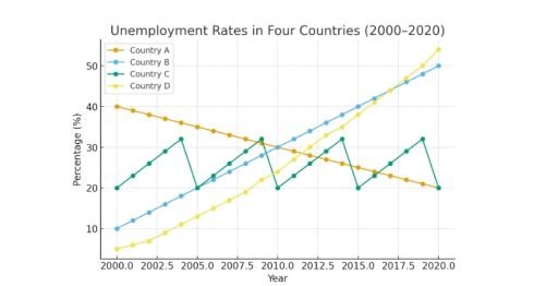
The image displays a line graph titled 'Unemployment Rates in Four Countries (2000-2020)', with the vertical axis representing 'Percentage (%)' and the horizontal axis representing 'Year'. Data for Country A shows the following unemployment rates (%): 2000(40), 2001(39), 2002(38), 2003(37), 2004(36), 2005(35), 2006(34), 2007(33), 2008(32), 2009(31), 2010(30), 2011(29), 2012(28), 2013(27), 2014(26), 2015(25), 2016(24), 2017(23), 2018(22), 2019(21), and 2020(20). Country B's rates (%) are: 2000(10), 2001(12), 2002(14), 2003(16), 2004(18), 2005(20), 2006(22), 2007(24), 2008(26), 2009(28), 2010(30), 2011(32), 2012(34), 2013(36), 2014(38), 2015(40), 2016(42), 2017(44), 2018(46), 2019(48), and 2020(50). Country C's rates (%) for specific years are: 2000(20), 2002(26), 2004(32), 2005(20), 2007(26), 2009(32), 2010(20), 2012(26), 2014(32), 2015(20), 2017(26), 2019(32), and 2020(20). Country D's rates (%) are approximately: 2000(5), 2001(6.5), 2002(8), 2003(9.5), 2004(11), 2005(13), 2006(15), 2007(17), 2008(19.5), 2009(22), 2010(25), 2011(28), 2012(31), 2013(34), 2014(37), 2015(40), 2016(43), 2017(46), 2018(49), 2019(52), and 2020(55).
Given the complexity of the image, the above description may not be entirely accurate.
Note: Both the topic and the answer were created by one of our users.

The line graph illustrates the percentages of joblessness in four different countries (A, B, C and D) during 2000 and 2020. Overall, the category B fluctuated throughout the years, while B and D groups both showed an upward trends, despite country A appeared differently.

In 2000, group D had the lowest rating at only 3%, but there was a gradual growth in unemployment in the next 20 years. Moreover by 2020, this number skyrocketed and became the largest percentage of people who does not work, which dominated all other divisions at 55%. Category B followed the trend and increased dramatically (10% to 50%). Whereas, region A, the data made up approximately 40%, which far exceeded all other nations in 2000, but it illustrated a major decrease in 2020, which became the lowest proportion at 20% along with group C.

Furthermore, the only remaining nation appeared both up and downs, but remained as same as the starting point at 20%.

Word Count: 159

Answers On The Same Topic:

The line graph below shows the unemployment rates in four countries (A, B, C, and D) between 2000 and 2020.

The line graph illustrates the joblessness ratio in four countries, over a twenty-year period , between 2000 and 2020. The figures are presented as percentages. Overall, Countries B and C showed an incredible rise while, the figure for Country A had gradually decreased. However Conutry C fluctuated over two decades , from 2000 to 2020. […]

See All

Other Topics:

The graph shows sales of songs from three musical genres during a period of ten years.

The graph demonstrates sales of songs from three different types of music during a span of ten years. Overall, the Korean pop by far had the most sales among the three, while Jazz mostly has been stable before increasing gradually. Conversely, Pop music has declined gradually in the given period. Firstly, Korean pop beginning at […]

: The graph below gives information about one company's unit sales of 5 different types of jam from 2009 to 2014

The line chart compares the sales figures across 5 distinctive fruit jam categories in one particular corporation over a 5-year timespan. From an overall perspective, revenue generated from all jam types increased over the period recorded, with the exception of plum jams, which notably declined by the end of the report. The strawberry jams considerably […]

The graph below shows the percentage of households in a European country using renewable energy (solar, wind, and biomass) for heating and electricity between 2000 and 2020.

The chart above shows the percentage of houses using three different renewable sources of power between 2000 and 2020 for heating and electricity. In the year 2000 solar energy was the less used, by 5% of the population willing to invest in this type of green energy. A steady and firm rise of its use […]

The chart below shows information about European people of different age groups who went to the gym once a month or more between 1990 and 2010.

The line chart gives information about the percentage of individuals of different age groups who went to the gym once a month or more in Europe from 1990 to 2010. Overall, the proportion of European people of different age groups increased steadily. While, the figure for the 45 and over age group going to the […]

The line grap gives information about the percentage of incidence of involuntary part time workers.

The line graph provides a comparative analysis of involuntary part-time employment as a share of total employment across various OECD member states from 1990 to 2021. Overall, the data is characterized by significant divergence. While a majority of nations experienced a peak in underemployment following the 2008 financial crisis, the trajectories vary from relative stability […]

The graph below shows UK air pollutants in millions of tonnes, from three different sources, between 1990 and 2005.

The lime graph illustrates three types of sources in UK air pollutions in millions of tonnes between 1990 and 2005. Overall it is evident, that all the given groups decreased throughout the period except transport usage. The highest increase has seen in total number of air pollutions. To be begin with the total number of […]

See All
We have detected unusual activity on your device.
Please verify your identity to continue.
Note: This verification step won't sign you in. If you have a premium account, please log in to access the service as usual.
Google/Gmail Verification
Or verify using Email/Code
We've sent a verification code to:
youremail@gmail.com (Not your email?)
Enter it below to complete the verification process.
Ensure your email address is correct, your inbox is not full, and you check your spam folder. If no email arrives, consider using an alternative email.
You will need a Premium plan to perform your action!
Note: If you already have a premium account, please log in to access our services as usual.

Plans & Pricing

Our mission is to make quality education accessible for everyone.
However, to keep our hardworking team running and this service alive, we genuinely need your support!
By opting for a premium plan, not only do you sustain us in achieving the mission, but you also unlock advanced features to enrich your learning experience.

Free

For learners who aren't pressed for time

What's included on Free
100+ Cambridge IELTS Tests
Instant IELTS Writing Task 1 & 2 Evaluation (2 times/month)
Instant IELTS Speaking Part 1, 2, & 3 Evaluation (5 times/month)
Instant IELTS Writing Task 1 & 2 Essay Generator (2 times/month)
500+ Dictation & Shadowing Exercises
100+ Pronunciation Exercises
Flashcards
Other Advanced Tools

Premium

For those serious about advancing their English proficiency, and for IELTS candidates aspiring to boost their band score by 1-2 points (especially in writing & speaking) in just 30 days or less

What's included on Premium
Save Your IELTS Test Progress
Unlock All Courses & IELTS Tests
Unlimited AI Conversations
Unlimited AI Writing Enhancement Exercises
Unlimited IELTS Writing Task 1 & 2 Evaluation
Unlimited IELTS Speaking Part 1, 2, & 3 Evaluation
Checked Answers Will Not Be Published
Unlimited IELTS Writing Task 1 & 2 Essay Generator
Unlimited IELTS Speaking Part 1, 2, & 3 Sample Generator
Unlimited Usage Of Advanced Tools

Due to the nature of our service and the provided free trials, payments are non-refundable.
Nếu bạn là người Việt Nam và không có hoặc không muốn trả bằng credit/debit cards, bạn có thể thanh toán bằng phương thức chuyển khoản:


Chọn gói:
279,000₫ 157,000 ₫ cho gói 1 tháng (chỉ 5,233₫/ngày)
819,000₫ 397,000 ₫ cho gói 3 tháng (chỉ 4,411₫/ngày)
1,649,000₫ 667,000 ₫ cho gói 6 tháng (chỉ 3,706₫/ngày)
3,299,000₫ 857,000 ₫ cho gói 12 tháng (chỉ 2,381₫/ngày)


Sau khi chuyển khoản, vui lòng đợi trình duyệt tự động điều hướng bạn trở lại Engnovate và bạn sẽ ngay lập tức nhận được mã kích hoạt tài khoản premium.
Nếu có lỗi xảy ra, bạn có thể liên hệ với team thông qua một trong các phương thức: email đến helloengnovate@gmail.com hoặc nhắn tin qua facebook.com/engnovate.
Vì toàn bộ công cụ trên website đều có thể sử dụng thử miễn phí, Engnovate không hỗ trợ hoàn tiền.