🔥 Today Only: Save 30% on Premium — Offer Ends Soon! - Upgrade Now!
Line Graph

Band 6+: The line graph illustrates the percentage of households in the UK that had access to four types of new technology -

Image for topic: The line graph illustrates the percentage of households in the UK that had access to four types of new technology -
Our system will evaluate the answer based on this AI-generated description.
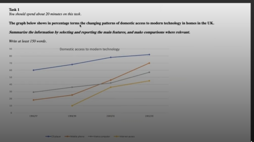
The image illustrates domestic access to modern technology in the UK from 1996/97 to 2002/03 with four lines representing CD players, mobile phones, home computers, and Internet access. In 1996/97, CD player access is around 60%, mobile phone access is at 20%, home computer access is approximately 30%, and Internet access is about 10%. By 1998/99, CD players slightly increase under 70%, mobile phone access exceeds 40%, home computer access rises to around 40%, and Internet access doubles to just over 20%. In 2000/01, CD player access reaches approximately 80%, mobile phone access climbs to nearly 60%, home computer access hits around 50%, and Internet access grows to about 35%. Finally, in 2002/03, CD player access remains just under 90%, mobile phone usage escalates to above 70%, home computer access is close to 60%, and Internet access approaches 50%.
Given the complexity of the image, the above description may not be entirely accurate.
Note: Both the topic and the answer were created by one of our users.

The line graph illustrates the percentage of households in the UK that had access to four types of new technology – CD players, mobile phones, hone com puters, and Internet access-between 1996 and 2003.Overall, there was one basic trend: upward. Access to all technologies increased over the period, with mobile phone has Showing the most significant growth.

There was considerable increase from nearly 60% to just under 80%. In addition, the trend for the CD player was higher in the 2002/03 years.

There was a slightly increase of 25% Followed by a sharp rise of 70% for the Mobile phone

The access to Home computer climbed moderatly from 1996 to 2001 The access to Home computer experienced a sharp increase.

By contrast, Internet access appeared last among the technologies. Despite being the newest, it showed rapid growth reaching approximately 45% by 2003.

Word Count: 142

Answers On The Same Topic:

The line graph illustrates the percentage of households in the UK that had access to four types of new technology –

The line graph illustrates the percentage of households in the UK that had access to four types of new technology—CD players, mobile phones, home computers, and Internet access—between 1996 and 2003. Overall, there was one basic trend: upward. Access to all technologies increased over the period, with mobile phones showing the most significant growth. There […]

See All

Other Topics:

The line graph below shows the results of a survey giving the reasons why people why people moved to the capital city of a particular country. Summarise the informatuon by selecting and reporting the main features, and comparisons where relevant.

The given line graph illustrates the outcomes of a survey providing the reasons why individuals migrated to the capital city of a particular nation. Overall, the figures for employment, study, family and adventure exhibited an upward trend over the period, while employment was the major reason behind people shifting to the city. To begin with, […]

The line chart show the percentage of four asian countries

The line chart illustrates the proportion of total population in four Asian countries living from 1970 to 2020, along with its projection until 2040. Overall, all of the percentage of the population citizen experienced an upward trends. Furthermore, Philippines was the highest proportion of total population in 1970, whereas Malaysia overtook the highest percentage of […]

The line graph shows three different types of crimes in England and Wales from 1970 to 2005. Summarise the infomation by selecting and reporting the main features, and make comparisions where relevant.

The graph below shows information about three different types of violations in England and Wales over a thirty-five-year period between 1970 and 2005. In general, what stands out from the graph is that the car theft and house burglary were at a higher level throughout the period, while street robbery had the lowest number of […]

The line chart details the proportion of residents living in Australia in millions from different regions between 1976 and 2011

The provided line chart illustrates changes in the proportion of residents living in Australia in millions from distinct regions, namely the UK, Asia, total, and other from 1976 to 2011. Overall, it is clear that, the proportion of total residents witnessed a downward trend line, before increase sharply until the end of the period. The […]

The graph illustrates the price in Euros of 800 grams of four types of bread in one European country from 2001 to 2006.

The line graph illustrates how much 800 grams of wholegrain, brown, white and rye breads cost in Eurous in one European country between 2001 and 2006. Overall, the purchasing brown, white and rye breads showed a steady but significant rise over the period, while the figure for wholegrain experienced same fluctuations and remained unchanged in […]

The graph illustrates the price in Euros of 800 grams of four types of bread in one European country from 2001 to 2006.

The line graph illustrates how much 800 grams of wholegrain, brown, white and rye breads cost in Eurous in one European country between 2001 and 2006. Overall, the purchasing brown, white and rye breads showed a steady but significant rise over the period, while the figure for wholegrain experienced same fluctuations and remained unchanged in […]

See All
We have detected unusual activity on your device.
Please verify your identity to continue.
Note: This verification step won't sign you in. If you have a premium account, please log in to access the service as usual.
Google/Gmail Verification
Or verify using Email/Code
We've sent a verification code to:
youremail@gmail.com (Not your email?)
Enter it below to complete the verification process.
Ensure your email address is correct, your inbox is not full, and you check your spam folder. If no email arrives, consider using an alternative email.
You will need a Premium plan to perform your action!
Note: If you already have a premium account, please log in to access our services as usual.

Plans & Pricing

Our mission is to make quality education accessible for everyone.
However, to keep our hardworking team running and this service alive, we genuinely need your support!
By opting for a premium plan, not only do you sustain us in achieving the mission, but you also unlock advanced features to enrich your learning experience.

Free

For learners who aren't pressed for time

What's included on Free
100+ Cambridge IELTS Tests
Instant IELTS Writing Task 1 & 2 Evaluation (2 times/month)
Instant IELTS Speaking Part 1, 2, & 3 Evaluation (2 times/month)
Instant IELTS Writing Task 1 & 2 Essay Generator (2 times/month)
500+ Dictation & Shadowing Exercises
100+ Pronunciation Exercises
Flashcards
Other Advanced Tools

Premium

For those serious about advancing their English proficiency, and for IELTS candidates aspiring to boost their band score by 1-2 points (especially in writing & speaking) in just 30 days or less

What's included on Premium
Save Your IELTS Test Progress & Analyze Mistakes By Question Type
Save Your Own Flashcard Sets & Use Them On Any Device
Unlock All Courses, IELTS Tests, Section & Part Practice
Unlimited AI Conversations
Unlimited AI Writing Enhancement Exercises
Unlimited IELTS Writing Task 1 & 2 Evaluation
Unlimited IELTS Speaking Part 1, 2, & 3 Evaluation
Checked Answers Will Not Be Published
Unlimited IELTS Writing Task 1 & 2 Essay Generator
Unlimited IELTS Speaking Part 1, 2, & 3 Sample Generator
Unlimited Usage Of Advanced Tools & AI Features
Priority Support within 24h (12-month plan only)

Due to the nature of our service and the provided free trials, payments are non-refundable.