🔥 Today Only: Save 30% on Premium — Offer Ends Soon! - Upgrade Now!
Multiple Graphs

Band 4+: The line graph shows how much money overseas visitors spent in the UK from 1980 - 2010 and the pie charts show the reasons for their visits in 1980 and 2010. Summarise the information by selecting and reporting the main features and make comparisons where relevant.

Image for topic: The line graph shows how much money overseas visitors spent in the UK from 1980 - 2010 and the pie charts show the reasons for their visits in 1980 and 2010. Summarise the information by selecting and reporting the main features and make comparisons where relevant.
Our system will evaluate the answer based on this AI-generated description.
The image contains two graphs related to spending by overseas visitors in the UK and reasons for visit in two different years, 1980 and 2010. The first graph, titled "Money spent in the UK by overseas visitors," shows the money spent in millions from 1980 to 2010. The spending starts at around 6,500 million in 1980, reaches approximately 7,500 million in 1985, dips slightly in 1990, jumps to 10,500 million in 1995, fluctuates between 10,000 and 10,500 million from 2000 to 2005, and peaks at around 12,000 million in 2010. The second graph, titled "Reasons for visit," presents pie charts for 1980 and 2010. In 1980, the reasons for visit are distributed as follows: Holidays 41.1%, Business 20.7%, Visiting Friends or Relatives 18.7%, and Other 19.5%. In 2010, the distribution changes to: Holidays 30.1%, Business 22.8%, Visiting Friends or Relatives 28.2%, and Other 19.9%.
Given the complexity of the image, the above description may not be entirely accurate.
Note: Both the topic and the answer were created by one of our users.

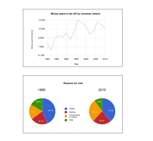
The line graph shows how many money spent in the UK by overseas visitors from 1980 to 2010, and the pie chart presents the percentages of reason the people visit the UK.

The amount of money fluctuate during the thirty years. The peak was in 1996 with 12000 millions and the dip was in 1982 with less than 7500 millions. It is evident the money spent has a dramatically change from 1993 to 1998 with an increased to 3000 millions.

In contranst to the first illustrate, the reasons for visit has a slighly variation in the two years. It is salient to note the visiting friends or relative grow in 10% while other reasons as holiday, other and business decrease in 5% and 2% respectively.

On the whole, over the thirty years the money spent in UK fluctuated; however, in diferent periods the amount gradually increase, Whereas the percentages of the reasons to visit UK remain stable

Word Count: 157

Answers On The Same Topic:

The line graph shows how much money overseas visitors spent in the UK from 1980 – 2010 and the pie charts show the reasons for their visits in 1980 and 2010. Summarise the information by selecting and reporting the main features and make comparisons where relevant.

The line graph delineates the amount of money spent by overseas visitors in the UK from 1980 to 2010, and the pie chart presents the purpose of their visits from 1980 to 2010. Overall, although the amount of money spent fluctuated, the total expenditure by visitors increased over the period, and their reasons for visiting […]

The line graph shows how much money overseas visitors spent in the UK from 1980 – 2010 and the pie charts show the reasons for their visits in 1980 and 2010. Summarise the information by selecting and reporting the main features and make comparisons where relevant.

Th image consists of two charts: a line graph and a pie chart, which illistrate the expenditure, whom spent by overseas visitors, while the pie charts depicts the reasons for their visits, over the decade of 1980 and 2010, particularly in UK. Overall, in UK the expenditure rate was remarkably increased with period of time, […]

The line graph shows how much money overseas visitors spent in the UK from 1980 – 2010 and the pie charts show the reasons for their visits in 1980 and 2010. Summarise the information by selecting and reporting the main features and make comparisons where relevant.

The line graph shows information on the amount of money spent in the UK by foreign visitors between 1980 and 2010, whereas the pie chart describes the purpose of their visit. Overall, the annual quantity of money used by overseas visitors is approximately 2000 million pounds higher in 2010 than the amount recorded in 1980, […]

The line graph shows how much money overseas visitors spent in the UK from 1980 – 2010 and the pie charts show the reasons for their visits in 1980 and 2010. Summarise the information by selecting and reporting the main features and make comparisons where relevant.

The line graph illustrates changes in internal visitors’ spending in the UK over a 30 years period from 1980 to 2010, while the pie charts present the distribution of different purposes of visiting the UK. Overall, overseas visitors’ spending increased notably after 3 decades although fluctuations were obsereved throughout the period. Additionally, holiday remained the […]

The line graph shows how much money overseas visitors spent in the UK from 1980 – 2010 and the pie charts show the reasons for their visits in 1980 and 2010. Summarise the information by selecting and reporting the main features and make comparisons where relevant.

The line graph indicates the amount of expenditure foreign visitors paid in the UK between 1980 and 2010, while the pie charts illustrate the distinct purposes for their arrivals at the same years. Overall, it is noticeable that there was more and more money spent in the UK by foreign visitors, while the percentage of […]

See All

Other Topics:

The graph ls below show the cinema attendance in Australia and the average cinema visits ny different age groups from 1996 to 2000

The table and line graph provide information on cinema attendance and the frequency of visits in Australia from 1996 to 2000. Overall, the percentage of the population that went to the cinema increased over the period, while the average number of visits per person dropped. Additionally, younger people consistently went to the cinema more often […]

The graph ls below show the cinema attendance in Australia and the average cinema visits ny different age groups from 1996 to 2000

The charts illustrate the attendance of cinema in Austria with average cinema visits of 4 distinct age groups from 1996 to 2000. Overall, according to the duration attendance experienced growth of visitors, while frequency received marginal decline. Figures were marked by percentage mark. Second graph, which show the group age, received fluctuations and slightly increased […]

Noise pollution levels in city and rural areas during day and night

The bar graphs compare how many people were affected by four types of noise pollution (traffic, train, aircraft, and insdustry) in city and rural areas during day and night. Overall, it is clear that traffic is considered the most disturbing noise both in city and countryside regions, whereas industry noise had commonly little negative effect. […]

the chart below show percentage of male and female students of different age groups who studied in Australia for full-time and part-time educaqtion in 2006.

From the begining we can clearly see that the concept of education still remains relevant no matter the age. Firstly,from the chart we can acknolage that part-time education is way more damanded for people between the ages of 20 to 24. At this age they are often studying and trying to finsh their degre while […]

The table and pie chart illustate popution in Australia according to different nationalities and areas.

The pie chart illustrated the proportion of people who lived in Australia, while the table indicated that people tend to live in urban or rual areas. Overall, the majority of the population in Australia was Australian, and most of them lived in the city, especially individuals from China. The pie chart described that in Australia […]

The charts below show the average percentages in typical meals of three nutrients.All of which may be unhealthy if eaten too much

The pie chart illustrates the consumption of 3 different nutrients-classified as unhealthy- in usual meals. Overall, dinner contained the highest amount of sodium and saturated fat, despite breakfast gathering the least figure of three consumptions. Snacks present a greater portion in added sugar than the remaining 3. On the regard of sodium consumption, dinner collected […]

See All
We have detected unusual activity on your device.
Please verify your identity to continue.
Note: This verification step won't sign you in. If you have a premium account, please log in to access the service as usual.
Google/Gmail Verification
Or verify using Email/Code
We've sent a verification code to:
youremail@gmail.com (Not your email?)
Enter it below to complete the verification process.
Ensure your email address is correct, your inbox is not full, and you check your spam folder. If no email arrives, consider using an alternative email.
You will need a Premium plan to perform your action!
Note: If you already have a premium account, please log in to access our services as usual.

Plans & Pricing

Our mission is to make quality education accessible for everyone.
However, to keep our hardworking team running and this service alive, we genuinely need your support!
By opting for a premium plan, not only do you sustain us in achieving the mission, but you also unlock advanced features to enrich your learning experience.

Free

For learners who aren't pressed for time

What's included on Free
100+ Cambridge IELTS Tests
Instant IELTS Writing Task 1 & 2 Evaluation (2 times/month)
Instant IELTS Speaking Part 1, 2, & 3 Evaluation (5 times/month)
Instant IELTS Writing Task 1 & 2 Essay Generator (2 times/month)
500+ Dictation & Shadowing Exercises
100+ Pronunciation Exercises
Flashcards
Other Advanced Tools

Premium

For those serious about advancing their English proficiency, and for IELTS candidates aspiring to boost their band score by 1-2 points (especially in writing & speaking) in just 30 days or less

What's included on Premium
Save Your IELTS Test Progress
Unlock All Courses & IELTS Tests
Unlimited AI Conversations
Unlimited AI Writing Enhancement Exercises
Unlimited IELTS Writing Task 1 & 2 Evaluation
Unlimited IELTS Speaking Part 1, 2, & 3 Evaluation
Checked Answers Will Not Be Published
Unlimited IELTS Writing Task 1 & 2 Essay Generator
Unlimited IELTS Speaking Part 1, 2, & 3 Sample Generator
Unlimited Usage Of Advanced Tools
Priority Support within 24h (12-month plan only)

Due to the nature of our service and the provided free trials, payments are non-refundable.
Nếu bạn là người Việt Nam và không có hoặc không muốn trả bằng credit/debit cards, bạn có thể thanh toán bằng phương thức chuyển khoản:


Chọn gói:
419,000₫ 277,000 ₫ cho gói 1 tháng (chỉ 9,233₫/ngày)
1,239,000₫ 597,000 ₫ cho gói 3 tháng (chỉ 6,633₫/ngày)
2,469,000₫ 1,027,000 ₫ cho gói 6 tháng (chỉ 5,706₫/ngày)
4,929,000₫ 1,417,000 ₫ cho gói 12 tháng (chỉ 3,936₫/ngày)


Sau khi chuyển khoản, vui lòng đợi trình duyệt tự động điều hướng bạn trở lại Engnovate và bạn sẽ ngay lập tức nhận được mã kích hoạt tài khoản premium.
Nếu có lỗi xảy ra, bạn có thể liên hệ với team thông qua một trong các phương thức: email đến helloengnovate@gmail.com hoặc nhắn tin qua facebook.com/engnovate.
Vì toàn bộ công cụ trên website đều có thể sử dụng thử miễn phí, Engnovate không hỗ trợ hoàn tiền.