Our system will evaluate the answer based on this AI-generated description.
The image presents a line graph indicating population growth by age groups in New Zealand from 1950 to 2050; the age groups are 0-14, 25-37, 36-45, and over 65. In 1950, percentages for age groups were as follows: 0-14 at 45%, 25-37 at 25%, 36-45 at 20%, and over 65 at 10%. In 1960, 0-14 rose to 50%, 25-37 dropped to 20%, 36-45 remained at 20%, and over 65 increased to 15%. By 1970, all groups except 36-45 increased by 5% each, but by 1980, 0-14 declined to 40%, 25-37 grew to 30%, 36-45 stayed at 25%, and over 65 reached 20%. By 1990, 0-14 dropped to 35%, 25-37 slightly grew to 35%, 36-45 maintained at 20%, and over 65 rose to 25%. In 2000, 0-14 went down to 30%, 25-37 shrunk to 30%, 36-45 increased to 30%, and over 65 remained at 25%. In 2010, 0-14 further decreased to 25%, 25-37 went up to 40%, 36-45 slightly rose to 35%, and over 65 fell to 20%. The forecast for 2020 anticipates 0-14 at 20%, 25-37 at 45%, 36-45 at 40%, and over 65 at 30%. By 2030, 0-14 is expected to continue at 20%, 25-37 at 55%, and 36-45 at 40%, with over 65 projected to hit 35%. In 2040, predictions suggest 0-14 remaining at 20%, 25-37 peaking at 60%, 36-45 staying at 40%, and over 65 climbing to 45%. Lastly, the 2050 outlook projects 0-14 at 20%, 25-37 reducing to 55%, 36-45 maintaining at 35%, and over 65 surging to 50%.
Given the complexity of the image, the above description may not be entirely accurate.
Skyrocket your IELTS band score by 1-2 points in under a month with our premium plan!
Note: Both the topic and the answer were created by one of our users.
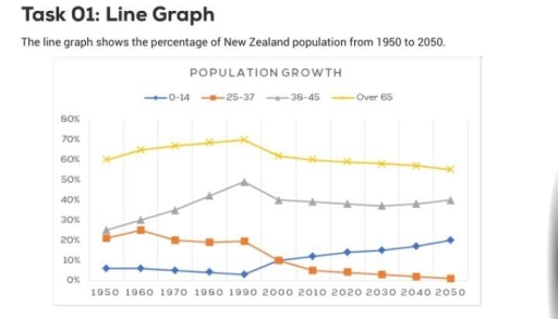
The line graph illustrates the percentage of 4 different age groups of people who live in New Zealand, over a century from 1950 to 2050.
Overall, some fluctuations are seen for each figure. By 2050, while the percentage of 25-37 and over 65 age groups will have fallen, an increase will have been seen for other 2 figures.
As for the figures for 0-14 and 25-37 age groups, starting at 5% and 20%, in turn, after some fluctuations, in 2000 both figures made up about 10% with the same percentage. After 2000, whereas the former, increasing gradually, will reach a peak of 20% in 2050, the latter shows about 1%.
Looking at the figures for 38-45 and over 65 age groups, some similar trends are seen for both. The figures reached their peak of 50% and 70%,resectively in 1960. After a considerable fall, in 2050, while the former is expected to reach about 45%, the latter will comprise about 60%.
Word Count: 160
