🔥 Today Only: Save 30% on Premium — Offer Ends Soon! - Upgrade Now!
Line Graph

Band 5+: The line graph shows TV news viewing figures over a one-year period.

Image for topic: The line graph shows TV news viewing figures over a one-year period.
Our system will evaluate the answer based on this AI-generated description.
The image displays a line graph titled "Channel one news viewing figures" with four lines representing different times: 1 pm, 6 pm, 9:30 pm, and 11 pm, tracking monthly TV news viewing figures in millions of viewers per day from January to December. The 1 pm news shows viewership starts around 3.2 million in January, peaks at nearly 4.5 million in April, and drops to about 2.8 million by December. The 6 pm news begins at approximately 4.8 million, remains relatively stable, peaking slightly above this figure around May, and ends around 4.2 million. The 9:30 pm slot starts at roughly 2.7 million, rises to a peak of around 4.2 million in May, then drops sharply to about 2.5 million by December. The 11 pm news, introduced on 1st May, starts at about 1 million, peaks at around 1.5 million in June, and drops to under 1 million by December. The graph shows seasonality in viewership patterns and a marked increase for all times around May with varying degrees of decline toward the year-end.
Given the complexity of the image, the above description may not be entirely accurate.
Note: Both the topic and the answer were created by one of our users.

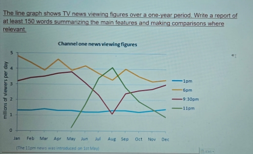
The line graph illustrates the daily viewership figures for Channel One News over a one-year period.

Overall, the 6 pm news program had the most viewers, although audience numbers did decline slightly over the period.

Moving to a detailed analysis, 6 pm show ranked first (approximately 5 million viewers per day) and between January and December the rates fluctuated and reached the lowest level of it (3.2 million). Form January to May the viewer rates of 9.30 pm news increased steadely (by 0.5 million) and reached its pick level which was 3.8 million viewer per day. Over the next 3 month, the rates decreased significantly to 1 million. In the next 4 month rates increased and finished the period at 3 million.

In terms of 1 pm news, there was no big differencen in the number of viewers in the whole period and from beginnig of the period to end of the period the rates was around 1.2 millon and 1.4 million. In first of May 11 pm news was introduced. Over the next 4 month the number of 11 pm news viewers increased dramatically and overtook the all other news’s rates and reached a pick of 4 million. After that significant decrease was observed in the rates of 11 pm news and finished the period at 1 million.

Word Count: 219

Answers On The Same Topic:

The line graph shows TV news viewing figures over a one-year period.

The given line graph illustrates the number of viewers per day in million of a TV news channel over a period of one year. Overall, the number of viewers were most during the evening time which was around 6pm through out the year whereas very few millions of people watched the channel during the mid […]

The line graph shows TV news viewing figures over a one-year period.

The line graph illustrates TV news viewing figures over a one-year period. Overall, it is evident that from the start of the year the most frequent time of viewing news was at 6 p.m. However, none of the viewer never watched TV news at 11 p.m. until first May. In January, the most TV news […]

The line graph shows TV news viewing figures over a one-year period.

The line graph illustrates TV news viewing figures on Channel One at four different times other the day a one-year period. Overall, the 6 pm and 9:30 pm news programmes attracted significantly larger audiences than the 1 pm and 11 pm bulletins. While viewing figures for most time slots fluctuated throught the year, the 11 […]

The line graph shows TV news viewing figures over a one-year period.

The line graph shows TV news viewing figures over a one-year period. The line graph illustrates the number of viewing figures on channel one on various times of the day annualy. Overall, it is evident that, the 6pm show had the highest viewership at the start, while the 1 PM show remained stable throughout the […]

The line graph shows TV news viewing figures over a one-year period.

The line graph illustrates the number of viewers for four TV shows between January and December. Overall, the 6 PM show had the highest viewership at the start, while the 1 PM show remained stable throughout the year. The 11 PM show saw the most dramatic rise, whereas other shows experienced fluctuations. At the beginning […]

See All

Other Topics:

You should spend about 20 minutes on this task. The graph below provides a breakdown of the UK weekly market share of visits to three social networking websites between March 2007 and March 2008. Summarise the information by selecting and reporting the main features, and make comparisons where relevant. Write at least 150 words.

The line graph illustrates the distribution of weekly market share percentages of visits to three prominent social networking websites in the UK from March 2007 to March 2008. In a period marked by notable fluctuations, Facebook exhibited a significant upward trajectory, surpassing its competitors, while MySpace and Bebo reflected varied patterns of decline and fluctuating […]

You should spend about 20 minutes on this task. The graph below provides a breakdown of the UK weekly market share of visits to three social networking websites between March 2007 and March 2008. Summarise the information by selecting and reporting the main features, and make comparisons where relevant. Write at least 150 words.

The line graph displays the percentage of the UK weekly market share of visits to three social networking websites during one year between March 2007 and March 2008. Overall,all three social networking websites experiences large fluctuations.However,facebook jumped and outpaced other websites in the beginning of September. The percentage of visits to myspace fluctuated between roughly […]

The graph below shows the per capita consumption of whole milk and low-fat milk in the United States between 1970 and 2015. Summarize the information by selecting and reporting the main

The line graph presented to us the per capita consumption of both whole milk and low-fat milk in US between 1970 and 2015. Overall, the whole milk have a dwindling tendency. In the beginning, 1970 year, low fat milk was unpopular and it was almost 6 per capita consumption, while whole milk was on its […]

The graph below gives information about the number of jobs in four sectors of the economy in the US between 1960 and 2020.

The line graph illustrates the number of jobs in 4 economical parts in the US in 1960, 1980, 2000 and 2020. Overall, there are manufacturing, retail, agriculture and healthcare sectors. Figures in retail industry slightly grew thoughout the years. Healthcare line increased extremely, and by 2020, the manufacturing and healthcare values were absolutely similar. Retail […]

The graph shows the Japanese average monthly salary (Yen) from 1953 to 1983, and the prices of black and white television and color television during the same period

The line chart shows the Price of color TV, Price of black and white TV and Japanese average monthly salary (Yen) from 1953 to 1983, and the prices of black-and-white televisions and color television from 1953 to 1983 in Japan. Overall, while Price of color TV and Prince of black and white TV significantly decreased, […]

the chart below shows the percentage of water in UK rivers that was classified as having good chemical quality between 1990 and 2002. Summurise the information by selecting and reporting the main features, and make comparisons where relevant.

The line graph illustrate the proportion of water in UK rivers which was classified as having good chemical quality from 1990 to 2002. Overall, what stands out is that northern Ireland, England, and Scotland followed an upward trend, while Wales showed the opposite pattern. It is also evident that England an Scotland fluctuated over the […]

See All
We have detected unusual activity on your device.
Please verify your identity to continue.
Note: This verification step won't sign you in. If you have a premium account, please log in to access the service as usual.
Google/Gmail Verification
Or verify using Email/Code
We've sent a verification code to:
youremail@gmail.com (Not your email?)
Enter it below to complete the verification process.
Ensure your email address is correct, your inbox is not full, and you check your spam folder. If no email arrives, consider using an alternative email.
You will need a Premium plan to perform your action!
Note: If you already have a premium account, please log in to access our services as usual.

Plans & Pricing

Our mission is to make quality education accessible for everyone.
However, to keep our hardworking team running and this service alive, we genuinely need your support!
By opting for a premium plan, not only do you sustain us in achieving the mission, but you also unlock advanced features to enrich your learning experience.

Free

For learners who aren't pressed for time

What's included on Free
100+ Cambridge IELTS Tests
Instant IELTS Writing Task 1 & 2 Evaluation (2 times/month)
Instant IELTS Speaking Part 1, 2, & 3 Evaluation (5 times/month)
Instant IELTS Writing Task 1 & 2 Essay Generator (2 times/month)
500+ Dictation & Shadowing Exercises
100+ Pronunciation Exercises
Flashcards
Other Advanced Tools

Premium

For those serious about advancing their English proficiency, and for IELTS candidates aspiring to boost their band score by 1-2 points (especially in writing & speaking) in just 30 days or less

What's included on Premium
Save Your IELTS Test Progress
Unlock All Courses & IELTS Tests
Unlimited AI Conversations
Unlimited AI Writing Enhancement Exercises
Unlimited IELTS Writing Task 1 & 2 Evaluation
Unlimited IELTS Speaking Part 1, 2, & 3 Evaluation
Checked Answers Will Not Be Published
Unlimited IELTS Writing Task 1 & 2 Essay Generator
Unlimited IELTS Speaking Part 1, 2, & 3 Sample Generator
Unlimited Usage Of Advanced Tools
Priority Support within 24h (12-month plan only)

Due to the nature of our service and the provided free trials, payments are non-refundable.
Nếu bạn là người Việt Nam và không có hoặc không muốn trả bằng credit/debit cards, bạn có thể thanh toán bằng phương thức chuyển khoản:


Chọn gói:
419,000₫ 277,000 ₫ cho gói 1 tháng (chỉ 9,233₫/ngày)
1,239,000₫ 597,000 ₫ cho gói 3 tháng (chỉ 6,633₫/ngày)
2,469,000₫ 1,027,000 ₫ cho gói 6 tháng (chỉ 5,706₫/ngày)
4,929,000₫ 1,417,000 ₫ cho gói 12 tháng (chỉ 3,936₫/ngày)


Sau khi chuyển khoản, vui lòng đợi trình duyệt tự động điều hướng bạn trở lại Engnovate và bạn sẽ ngay lập tức nhận được mã kích hoạt tài khoản premium.
Nếu có lỗi xảy ra, bạn có thể liên hệ với team thông qua một trong các phương thức: email đến helloengnovate@gmail.com hoặc nhắn tin qua facebook.com/engnovate.
Vì toàn bộ công cụ trên website đều có thể sử dụng thử miễn phí, Engnovate không hỗ trợ hoàn tiền.