🔥 Today Only: Save 30% on Premium — Offer Ends Soon! - Upgrade Now!
Line Graph

Band 6+: the line graph which i wrote when i get bored

Image for topic: the line graph which i wrote when i get bored
Our system will evaluate the answer based on this AI-generated description.
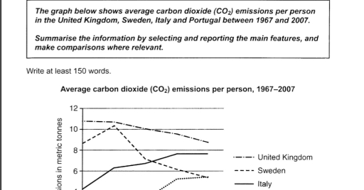
The image illustrates average carbon dioxide emissions per person (1967-2007), starting with United Kingdom: 1967 (10.5 metric tonnes), 1972 (10.8 metric tonnes), 1977 (11 metric tonnes), 1982 (9.9 metric tonnes), 1987 (9.8 metric tonnes), 1992 (9.4 metric tonnes), 1997 (9.1 metric tonnes), 2002 (9 metric tonnes), 2007 (8.5 metric tonnes); Sweden: 1967 (8.9 metric tonnes), 1972 (10 metric tonnes), 1977 (10.4 metric tonnes), 1982 (8.3 metric tonnes), 1987 (7.6 metric tonnes), 1992 (6.5 metric tonnes), 1997 (6 metric tonnes), 2002 (5.4 metric tonnes), 2007 (5 metric tonnes); Italy: 1967 (4 metric tonnes), 1972 (5.5 metric tonnes), 1977 (6.5 metric tonnes), 1982 (7 metric tonnes), 1987 (7.8 metric tonnes), 1992 (8 metric tonnes), 1997 (8.1 metric tonnes), 2002 (8 metric tonnes), 2007 (7.8 metric tonnes); Portugal: 1967 (1.5 metric tonnes), 1972 (2 metric tonnes), 1977 (3 metric tonnes), 1982 (3.9 metric tonnes), 1987 (4.9 metric tonnes), 1992 (5.1 metric tonnes), 1997 (5.7 metric tonnes), 2002 (6.3 metric tonnes), 2007 (5.8 metric tonnes).
Given the complexity of the image, the above description may not be entirely accurate.
Note: Both the topic and the answer were created by one of our users.

The graph illustrates the amount of carbon dioxide emissions per person in the United Kingdom, Sweden, Italy and Portugal between 1967 and 2007.

Overall, the emissions of all four countries fluctuated over the period,but Italy and Portugal showed a clear upward trend, while UK and Sweden experienced a significant fall.

In detail, at the start of the period, the highest emission was in UK for 11 tones, but over the period decreased to 9 tones in average. The same result showed in Sweden. In 1967 the average amount of emission was 8 tones, after several years it increased to 10, but declined by 2007 to 5.

In contrast, Italy rose steadily. For instance, in the beggining of period, there were 4 tones of emissions, but by the end it went up to 7. Moving to Portugal, there was a sharp increase, in 1967 the output of carbon dioxide in total were 2 tones, so by 2007 it grew to 5 tones, and stayed on par with Sweden. Despite of all this changes between four countries, UK stayed on the top of chart.

Word Count: 182

Answers On The Same Topic:

the line graph which i wrote when i get bored

The supplied illustration of line graph demonstrates common carbon dioxide emmissions per person across 4 regions, such as the UK, Sweden, Italy, and Portugal from 1967 to 2007. Overall, it is obvious that the Sweden individuals produced carbon emmissions fewer than other countries, while the rate of the italians increased. With regards to Italy and […]

the line graph which i wrote when i get bored

The bar graph illustrates the chemical compound carbon dioxide emissions per person in four different countries – United Kingdom,Sweden,Italy, and Portugal – between 1967 and 2007. Overall, it is clear that United Kingdom remained the highest throughout the period, while Sweden declined to become the lowest country, and Italy experienced steady growth. At first, Sweden […]

the line graph which i wrote when i get bored

The line graph presents the amount of carbon dioxide emmited per person in the United Kingdom, Sweden, anf Italy from 1967 to 2007. Overall, Italy has experienced a steady increase while Sweden and the United Kingdom decreased over the years. United Kingdom consistently produced the highest level of CO2 emmisions throughout the period. The United […]

the line graph which i wrote when i get bored

The line graph illustrates information about generation of carbon dioxide per person in four different countries-United Kingdom,Sweden,Italy and Portugal-between 1967 and 2007. Overall,United Kingdom and Sweden declined for entire period,while Portugal and Italy rose.Also,Itally surprassed Sweden by replacing seconf highest amount of carbon dioxide as well as Portugal and Sweden reached a same amout in […]

See All

Other Topics:

You should spend about 20 minutes on this task. The graph below shows the percentage of money spent on advertising in five types of media in France from 2010 and projected spending to 2040. Summarise the information by selecting and reporting the main features, and make comparisons where relevant. You should write at least 150 words. Writing Task 1

The given bar graph illustrates the money spend on advertisement in the france on different types of media from 2010 and predicted spending to 2040. Overall, spending on internet incresed in given time period while television spending faced ups and downs while other three source of information faced downfall from 2010 to 2040. Initially, advertisement […]

You should spend about 20 minutes on this task. The graph below shows the percentage of money spent on advertising in five types of media in France from 2010 and projected spending to 2040. Summarise the information by selecting and reporting the main features, and make comparisons where relevant. You should write at least 150 words. Writing Task 1

The graph shown below illustrates the dynamics of the percentage of money spent on advertising in France from 2010 and protected spending to 2040. It is separated into five sectors – television, newspaper, magazines, radio and internet. According to the given data, we can conclude that the by 2040 the internet supposedly will have reached […]

The graph below shows the population figures of different types of wild birds in the United Kingdom between 1970 and 2004.

The line graph illustrates the changes in the population of different types of wild birds in the United Kingdom between 1970 and 2004. Overall, there were significant differences among the four categories. While the total number of all species remained relatively stable with minor fluctuations, coastal species showed a clear upward trend. In contrast, both […]

the graph below shops the number of people taking in four different kinds of sports in a particular region between 1985 and 2005.Summarize the information by selecting and reporting the main features, and make comparison where relevant.

The line graph illustrates how many individuals took part in four different sports in a particular area from 1985 to 2005. Overall, rugby was the most played game by the people during the following years, whereas basketball was the least popular game. In contrast, badminton and tennis both witnessed minimal changes over the period. On […]

the graph shows the average trip length(in miles) in US children aged 5 to 15 years old.

The line graph demonstrates the average travel length in lilws in US children aged 5 to 15 years old. Overall, bus and car rose over the period while, cycling walking dropped. Taxi and train had fluctuated throughout the time. In 1970 bus and cycling had the same miles at around 30 miles and were the […]

You should spend about 20 minutes on this task. The graph below shows the percentage of money spent on advertising in five types of media in France from 2010 and projected spending to 2040. Summarise the information by selecting and reporting the main features, and make comparisons where relevant. You should write at least 150 words. Writing Task 1

The given graph illustrates the percentage of money spent on advertising across five types of media such as Television, Newspapers, Magazines, Radio and Internet in Francefrom 2010 to 2040. The expense ratio on television were approximately 37% in 2010, 45% in 2020, 40% in 2030 and in 2040 36%. For newspaper the ratio were 34% […]

See All
We have detected unusual activity on your device.
Please verify your identity to continue.
Note: This verification step won't sign you in. If you have a premium account, please log in to access the service as usual.
Google/Gmail Verification
Or verify using Email/Code
We've sent a verification code to:
youremail@gmail.com (Not your email?)
Enter it below to complete the verification process.
Ensure your email address is correct, your inbox is not full, and you check your spam folder. If no email arrives, consider using an alternative email.
You will need a Premium plan to perform your action!
Note: If you already have a premium account, please log in to access our services as usual.

Plans & Pricing

Our mission is to make quality education accessible for everyone.
However, to keep our hardworking team running and this service alive, we genuinely need your support!
By opting for a premium plan, not only do you sustain us in achieving the mission, but you also unlock advanced features to enrich your learning experience.

Free

For learners who aren't pressed for time

What's included on Free
100+ Cambridge IELTS Tests
Instant IELTS Writing Task 1 & 2 Evaluation (2 times/month)
Instant IELTS Speaking Part 1, 2, & 3 Evaluation (5 times/month)
Instant IELTS Writing Task 1 & 2 Essay Generator (2 times/month)
500+ Dictation & Shadowing Exercises
100+ Pronunciation Exercises
Flashcards
Other Advanced Tools

Premium

For those serious about advancing their English proficiency, and for IELTS candidates aspiring to boost their band score by 1-2 points (especially in writing & speaking) in just 30 days or less

What's included on Premium
Save Your IELTS Test Progress
Unlock All Courses & IELTS Tests
Unlimited AI Conversations
Unlimited AI Writing Enhancement Exercises
Unlimited IELTS Writing Task 1 & 2 Evaluation
Unlimited IELTS Speaking Part 1, 2, & 3 Evaluation
Checked Answers Will Not Be Published
Unlimited IELTS Writing Task 1 & 2 Essay Generator
Unlimited IELTS Speaking Part 1, 2, & 3 Sample Generator
Unlimited Usage Of Advanced Tools
Priority Support within 24h (12-month plan only)

Due to the nature of our service and the provided free trials, payments are non-refundable.
Nếu bạn là người Việt Nam và không có hoặc không muốn trả bằng credit/debit cards, bạn có thể thanh toán bằng phương thức chuyển khoản:


Chọn gói:
419,000₫ 277,000 ₫ cho gói 1 tháng (chỉ 9,233₫/ngày)
1,239,000₫ 597,000 ₫ cho gói 3 tháng (chỉ 6,633₫/ngày)
2,469,000₫ 1,027,000 ₫ cho gói 6 tháng (chỉ 5,706₫/ngày)
4,929,000₫ 1,417,000 ₫ cho gói 12 tháng (chỉ 3,936₫/ngày)


Sau khi chuyển khoản, vui lòng đợi trình duyệt tự động điều hướng bạn trở lại Engnovate và bạn sẽ ngay lập tức nhận được mã kích hoạt tài khoản premium.
Nếu có lỗi xảy ra, bạn có thể liên hệ với team thông qua một trong các phương thức: email đến helloengnovate@gmail.com hoặc nhắn tin qua facebook.com/engnovate.
Vì toàn bộ công cụ trên website đều có thể sử dụng thử miễn phí, Engnovate không hỗ trợ hoàn tiền.