🔥 Today Only: Save 30% on Premium — Offer Ends Soon! - Upgrade Now!
Line Graph

Band 6+: the line graph which i wrote when i get bored

Image for topic: the line graph which i wrote when i get bored
Our system will evaluate the answer based on this AI-generated description.
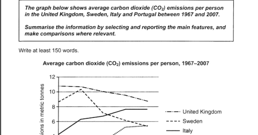
The image illustrates average carbon dioxide emissions per person (1967-2007), starting with United Kingdom: 1967 (10.5 metric tonnes), 1972 (10.8 metric tonnes), 1977 (11 metric tonnes), 1982 (9.9 metric tonnes), 1987 (9.8 metric tonnes), 1992 (9.4 metric tonnes), 1997 (9.1 metric tonnes), 2002 (9 metric tonnes), 2007 (8.5 metric tonnes); Sweden: 1967 (8.9 metric tonnes), 1972 (10 metric tonnes), 1977 (10.4 metric tonnes), 1982 (8.3 metric tonnes), 1987 (7.6 metric tonnes), 1992 (6.5 metric tonnes), 1997 (6 metric tonnes), 2002 (5.4 metric tonnes), 2007 (5 metric tonnes); Italy: 1967 (4 metric tonnes), 1972 (5.5 metric tonnes), 1977 (6.5 metric tonnes), 1982 (7 metric tonnes), 1987 (7.8 metric tonnes), 1992 (8 metric tonnes), 1997 (8.1 metric tonnes), 2002 (8 metric tonnes), 2007 (7.8 metric tonnes); Portugal: 1967 (1.5 metric tonnes), 1972 (2 metric tonnes), 1977 (3 metric tonnes), 1982 (3.9 metric tonnes), 1987 (4.9 metric tonnes), 1992 (5.1 metric tonnes), 1997 (5.7 metric tonnes), 2002 (6.3 metric tonnes), 2007 (5.8 metric tonnes).
Given the complexity of the image, the above description may not be entirely accurate.
Note: Both the topic and the answer were created by one of our users.

The line graph presents the amount of carbon dioxide emmited per person in the United Kingdom, Sweden, anf Italy from 1967 to 2007.

Overall, Italy has experienced a steady increase while Sweden and the United Kingdom decreased over the years. United Kingdom consistently produced the highest level of CO2 emmisions throughout the period.

The United Kingdom and Sweden had shown a drop. In 1977 the UK reached the highest emmisions at around 11 metric tonnes per person. However over the following four decades it slowly decreased, falling to just over 8 tonnes in 2007. It doesn’t change the fact that it generated the most CO2. Sweden, which started as the second most CO2 creating country at approximately 9 tonnes, reached its peak in 1977 but throughout the years dipped significantly falling to the least producing country by 2007.

On the other hand, the country that rose level in CO2 emmisions was Italy. Beginning with the lowest emmisions at roughly 4 tonnes, It escalated steadily ,until it became consistent at the rate of about 7 tonnes in 1997. by the year of 2007 it caught up Italy’s emmisions.

Word Count: 187

Answers On The Same Topic:

the line graph which i wrote when i get bored

The supplied illustration of line graph demonstrates common carbon dioxide emmissions per person across 4 regions, such as the UK, Sweden, Italy, and Portugal from 1967 to 2007. Overall, it is obvious that the Sweden individuals produced carbon emmissions fewer than other countries, while the rate of the italians increased. With regards to Italy and […]

the line graph which i wrote when i get bored

The bar graph illustrates the chemical compound carbon dioxide emissions per person in four different countries – United Kingdom,Sweden,Italy, and Portugal – between 1967 and 2007. Overall, it is clear that United Kingdom remained the highest throughout the period, while Sweden declined to become the lowest country, and Italy experienced steady growth. At first, Sweden […]

the line graph which i wrote when i get bored

The graph illustrates the amount of carbon dioxide emissions per person in the United Kingdom, Sweden, Italy and Portugal between 1967 and 2007. Overall, the emissions of all four countries fluctuated over the period,but Italy and Portugal showed a clear upward trend, while UK and Sweden experienced a significant fall. In detail, at the start […]

the line graph which i wrote when i get bored

The line graph illustrates information about generation of carbon dioxide per person in four different countries-United Kingdom,Sweden,Italy and Portugal-between 1967 and 2007. Overall,United Kingdom and Sweden declined for entire period,while Portugal and Italy rose.Also,Itally surprassed Sweden by replacing seconf highest amount of carbon dioxide as well as Portugal and Sweden reached a same amout in […]

See All

Other Topics:

You should spend about 20 minutes on this task. The graph below shows the production levels of the main kinds of fuel in the UK between 1981 and 2000. Summarize the formation by selecting and reporting the main features and make comparisons where relevant. You should write at least 150 words.

The given graph illustrates information regarding the production levels of the main fuels in the UK between 1981 and 2000. Units are measured in energy. Overall, it is evident that petroleum production levels dominated throughout the given period. Meanwhile, natural gas production experienced a significant increase, whereas coal decreased. Regarding the details, petroleum production levels […]

The line graph below shows changes in the proportion of energy produced from different sources in a country from 1980 to 2015. Summarise the information by selecting and reporting the main features, and make comparisons where relevant.

The line graph illustrates the change in energy production from fossil fuels, renewables, nuclear, and other sources over a thirty-five-year period between 1980 and 2015. Overall, energy production from fossil fuels constituted the largest share throughout the period. By contrast, nuclear and renewables accounted for the smallest percentage of energy production, they experienced slight growth […]

The line graph below shows changes in the proportion of energy produced from different sources in a country from 1980 to 2015. Summarise the information by selecting and reporting the main features, and make comparisons where relevant.

The line graph illustrates change of energy production by fossil fuels, renewables, nuclear, and other sources over a thirty five-year period between 1980 and 2015. Overall, energy production from fossil fuels constituted the largest share of throughout the period. By contrast, nuclear and renewables accounted for the smallest proportion of energy production, they experienced a […]

The chart below shows the changes in UK's birth rate for women in six different age groups from 1973 to 2008. Summarise the information by selecting and reporting the main features, and make comparisons where relevant.

The line graph illustrates changes in the birth rate of women in the UK across six age groups between 1973 and 2008. Overall, women aged 25-29 had the highest birth rate for the overall period. In contrast, the birth rates for women aged 30-35 and 35-39 increased. The rates for women under 20, 20-24 and […]

You should spend about 20 minutes on this task. The line graph shows the percentages of Australian exports with four countries. Summarize the information by selecting and reporting the main features and make comparisons where relevant You should write at least 150 words.

The line graph compares the proportion of goods exported from Australia to four different nations including Japan, The United States of America, China and India between the years 1990 and 2012. Overall, it is clear that export to China and India swelled over the two decades; albeit at different rates. That, however, opposes the figures […]

The line graph below provides the data about international tourist arrivals in different parts of the world

The line graph below provides the data on the amount of foreign visitors in various parts of the globe over a 15-year period. Overall, the figures of Sub-Saharan Africa, South America, Central and Eastern Europe, North America, and South-East Asia showed an upward trend. According to the data, the number of international tourist arrivals in […]

See All
We have detected unusual activity on your device.
Please verify your identity to continue.
Note: This verification step won't sign you in. If you have a premium account, please log in to access the service as usual.
Google/Gmail Verification
Or verify using Email/Code
We've sent a verification code to:
youremail@gmail.com (Not your email?)
Enter it below to complete the verification process.
Ensure your email address is correct, your inbox is not full, and you check your spam folder. If no email arrives, consider using an alternative email.
You will need a Premium plan to perform your action!
Note: If you already have a premium account, please log in to access our services as usual.

Plans & Pricing

Our mission is to make quality education accessible for everyone.
However, to keep our hardworking team running and this service alive, we genuinely need your support!
By opting for a premium plan, not only do you sustain us in achieving the mission, but you also unlock advanced features to enrich your learning experience.

Free

For learners who aren't pressed for time

What's included on Free
100+ Cambridge IELTS Tests
Instant IELTS Writing Task 1 & 2 Evaluation (2 times/month)
Instant IELTS Speaking Part 1, 2, & 3 Evaluation (5 times/month)
Instant IELTS Writing Task 1 & 2 Essay Generator (2 times/month)
500+ Dictation & Shadowing Exercises
100+ Pronunciation Exercises
Flashcards
Other Advanced Tools

Premium

For those serious about advancing their English proficiency, and for IELTS candidates aspiring to boost their band score by 1-2 points (especially in writing & speaking) in just 30 days or less

What's included on Premium
Save Your IELTS Test Progress
Unlock All Courses & IELTS Tests
Unlimited AI Conversations
Unlimited AI Writing Enhancement Exercises
Unlimited IELTS Writing Task 1 & 2 Evaluation
Unlimited IELTS Speaking Part 1, 2, & 3 Evaluation
Checked Answers Will Not Be Published
Unlimited IELTS Writing Task 1 & 2 Essay Generator
Unlimited IELTS Speaking Part 1, 2, & 3 Sample Generator
Unlimited Usage Of Advanced Tools
Priority Support within 24h (12-month plan only)

Due to the nature of our service and the provided free trials, payments are non-refundable.
Nếu bạn là người Việt Nam và không có hoặc không muốn trả bằng credit/debit cards, bạn có thể thanh toán bằng phương thức chuyển khoản:


Chọn gói:
419,000₫ 277,000 ₫ cho gói 1 tháng (chỉ 9,233₫/ngày)
1,239,000₫ 597,000 ₫ cho gói 3 tháng (chỉ 6,633₫/ngày)
2,469,000₫ 1,027,000 ₫ cho gói 6 tháng (chỉ 5,706₫/ngày)
4,929,000₫ 1,417,000 ₫ cho gói 12 tháng (chỉ 3,936₫/ngày)


Sau khi chuyển khoản, vui lòng đợi trình duyệt tự động điều hướng bạn trở lại Engnovate và bạn sẽ ngay lập tức nhận được mã kích hoạt tài khoản premium.
Nếu có lỗi xảy ra, bạn có thể liên hệ với team thông qua một trong các phương thức: email đến helloengnovate@gmail.com hoặc nhắn tin qua facebook.com/engnovate.
Vì toàn bộ công cụ trên website đều có thể sử dụng thử miễn phí, Engnovate không hỗ trợ hoàn tiền.