🔥 Today Only: Save 30% on Premium — Offer Ends Soon! - Upgrade Now!
Line Graph

Band 5+: The picture below shows the use of renewable energy accounting the total energy from 1971 to 2006. Summarize the information by selecting and reporting the main features and make comparisons where relevant

Image for topic: The picture below shows the use of renewable energy accounting the total energy from 1971 to 2006. Summarize the information by selecting and reporting the main features and make comparisons where relevant
Our system will evaluate the answer based on this AI-generated description.
The image displays a line graph comparing the use of renewable energy from 1971 to 2006 in six countries: Finland, Denmark, Germany, United States, France, and United Kingdom. The y-axis represents the percentage use of renewable energy ranging from 0 to 25%, while the x-axis covers selected years from 1971 to 2011 (1971, 1976, 1981, 1986, 1991, 1996, 2001, 2006, 2011). The lines fluctuate as follows: Finland starts near 15% in 1971, peaks around 25% in 1996, then slightly declines to just below 25% in 2006. Denmark begins slightly above 5% in 1971, shows a rising trend to nearly 20% by 2006. Germany starts at around 5%, gradually increases to approximately 10% by 2006. The US stays consistently around 5% throughout the entire period. France begins near 10% in 1971, decreases to about 5% in 1981, then remains stable through to 2006. The UK line remains consistently around 0%-2% from 1971 to 2006.
Given the complexity of the image, the above description may not be entirely accurate.
Note: Both the topic and the answer were created by one of our users.

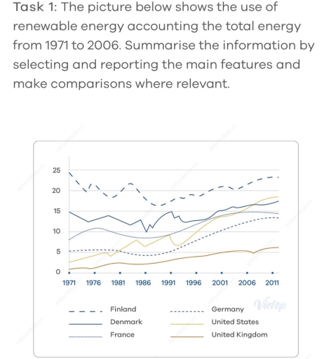
The line chart illustrates the use of renewable energy, accounting for the total power over a period of 35 years, from 1971 to 2006.

Overall, there was an increase in six specific countries throughout the period, with the majority of consumption being in Finland.

Regarding France,Germany, and the United Kingdom, showing less modifications, shared a relatively similar pattern during that time. Starting at roughly 10, 5 and almost none, after which it witnessed a slight fluctuation before ending at approximately 15, 13, and 6, respectively. In 2006, there was a decline to 5 before recovering its growth in the United Kingdom.

Concerning the remaining of nations, significant changes were shown, around 25 was utilized in Finland, but its use declined five times in the beginning of 1976 and experienced a fluctuation over the years before ending at around 24, one time less than its original value. Denmark was at 15 as opposed to around 3 for the United States. Although Denmark climbed to the peak at 9, which was equal with France in 1991, finally surpassing its competitor at 2 in the last year of the period, the United States declined in 2011.

Word Count: 193

Answers On The Same Topic:

The picture below shows the use of renewable energy accounting the total energy from 1971 to 2006. Summarize the information by selecting and reporting the main features and make comparisons where relevant

The line graph shows the share of renewable energy in overall energy use between 1971 and 2006. Overall, it is clear that the highest proportion was in Finland and the lowest number was in the United Kingdom. The most noticeable figure is Finland. In 1971, the number accounted for 25, while the United Kingdom stood […]

The picture below shows the use of renewable energy accounting the total energy from 1971 to 2006. Summarize the information by selecting and reporting the main features and make comparisons where relevant

The line graph shows the share of renewable energy in overall energy use between 1971 and 2006. Overall, it shows clear that the highest proportion have in Finland and the lowest number in the United Kingdom. The most noticeable figure is Finland. In 1971, the number accounted for 25, while the United Kingdom stood at […]

The picture below shows the use of renewable energy accounting the total energy from 1971 to 2006. Summarize the information by selecting and reporting the main features and make comparisons where relevant

The line chart demonstrates the use of renewable energy represented the entire amount energy from 1971 and 2006. Overall, there are large proportion of use of renewable energy represented in six state. There was a decline in Finland, despite that, Finland kept the high position in throughout the year. Looking at higher figures, there are […]

The picture below shows the use of renewable energy accounting the total energy from 1971 to 2006. Summarize the information by selecting and reporting the main features and make comparisons where relevant

The line graph demonstrates the use of renewable energy in six different countries (Finland, Denmark, France, Germany, United States and United Kingdom) from 1971 to 2011. Overall, it is clear that Finland was the highest and fluctuated according to usage of energy all the time, following by Denmark. However, United Kingdom was used the fewest […]

The picture below shows the use of renewable energy accounting the total energy from 1971 to 2006. Summarize the information by selecting and reporting the main features and make comparisons where relevant

The line graph illustrates the consumption of renewable energy in 6 different countries from 1971 to 2006. Overall, there was an upward trend in the proportion of renewable energy consumption in almost all countries, except for Finland. However, Finland remained the leading country in consuming this source of energy throughout a 35-year period . In […]

See All

Other Topics:

The graph below shows how people in one city in Australia buy music from 2015 to 2020.

The line graph illustrates how individual in one city bought music in Australia from 2015 between 2020 Overall, it is clear percentage of total music sales by method, there are three percentage it is streams, downloads, CDs purchased. Leader was streams it have highly increased line by the follow downloads line was flactuating and CDs […]

The given chart shows the proportion of residents of America (in millions) living in different regions between 2015 and 2020.Summarize the information by selecting and reporting the main features and make comparisons where relevant. Write at least 150 words.

The given chart illustrates the proportion of residents in America, measured in millions, who lived in different regions from 2015 to 2020. Overall, the population of all regions experienced some changes during the period. While certain regions showed a steady increase in the number of residents, others witnessed slight fluctuations. It is clear that one […]

The chart below shows the percentage of households in one country that owned a car, a computer, and a mobile phone from 1995 to 2015. Summarise the information by selecting and reporting the main features, and make comparisons where relevant. Write at least 150 words.

The line graph compares three different types of households’ properties (a car, a computer and a mobile phone) in one country between 1995 and 2015. Units are measured in percentages. Overall, it is noticeable that all categories only upward trend were observed over the period, albeit wity varying levels. Of particular note is mobile phones, […]

The graph below shows the production of three forest industry products in a European country, namely timber, pulp, and paper, from 1980 to 2000. Summarise the information by selecting and reporting the main features, and make Icomparison where relevant. Write at least 150 words.

The chart illustrates the development of forest industry production for the period 1980-2000, focusing on the processing of pulp, timber and paper. Overall, the amount of produced paper demonstrates almost linear improvement throughout the years, whilst pulp and timber appear rather wavery as significant ups and downs are evident in the production rate. What is […]

how teenagers (aged 12-19) in one state in the United States communicated with each other.

The line graph provides comprehensive data about what types of communication teenagers used throughout 3 years. Overall, it is notable that text messages were the most common way to communicate. However, interacting through email showed the lowest interest. To begin with, text messages started at 30% of all teenagers and increased slightly between 2006 and […]

The graph shows data about the annual earnings of three bakeries in London, 2000-2010. Summarize the information by selecting and reporting the main features, and make comparisons where relevant.

The line graph illustrates the annual net income of three bakeries in London between 2000 and 2010. Overall, Robbie’s Bakery experienced a substantial increase in revenue and became the most profitable bakery by the end of the period. By contrast, Bernie’s Buns fluctuated considerably and finished with the lowest income, while Lovely Loaves rose steadily […]

See All
We have detected unusual activity on your device.
Please verify your identity to continue.
Note: This verification step won't sign you in. If you have a premium account, please log in to access the service as usual.
Google/Gmail Verification
Or verify using Email/Code
We've sent a verification code to:
youremail@gmail.com (Not your email?)
Enter it below to complete the verification process.
Ensure your email address is correct, your inbox is not full, and you check your spam folder. If no email arrives, consider using an alternative email.
You will need a Premium plan to perform your action!
Note: If you already have a premium account, please log in to access our services as usual.

Plans & Pricing

Our mission is to make quality education accessible for everyone.
However, to keep our hardworking team running and this service alive, we genuinely need your support!
By opting for a premium plan, not only do you sustain us in achieving the mission, but you also unlock advanced features to enrich your learning experience.

Free

For learners who aren't pressed for time

What's included on Free
100+ Cambridge IELTS Tests
Instant IELTS Writing Task 1 & 2 Evaluation (2 times/month)
Instant IELTS Speaking Part 1, 2, & 3 Evaluation (5 times/month)
Instant IELTS Writing Task 1 & 2 Essay Generator (2 times/month)
500+ Dictation & Shadowing Exercises
100+ Pronunciation Exercises
Flashcards
Other Advanced Tools

Premium

For those serious about advancing their English proficiency, and for IELTS candidates aspiring to boost their band score by 1-2 points (especially in writing & speaking) in just 30 days or less

What's included on Premium
Save Your IELTS Test Progress
Unlock All Courses & IELTS Tests
Unlimited AI Conversations
Unlimited AI Writing Enhancement Exercises
Unlimited IELTS Writing Task 1 & 2 Evaluation
Unlimited IELTS Speaking Part 1, 2, & 3 Evaluation
Checked Answers Will Not Be Published
Unlimited IELTS Writing Task 1 & 2 Essay Generator
Unlimited IELTS Speaking Part 1, 2, & 3 Sample Generator
Unlimited Usage Of Advanced Tools
Priority Support within 24h (12-month plan only)

Due to the nature of our service and the provided free trials, payments are non-refundable.
Nếu bạn là người Việt Nam và không có hoặc không muốn trả bằng credit/debit cards, bạn có thể thanh toán bằng phương thức chuyển khoản:


Chọn gói:
419,000₫ 277,000 ₫ cho gói 1 tháng (chỉ 9,233₫/ngày)
1,239,000₫ 597,000 ₫ cho gói 3 tháng (chỉ 6,633₫/ngày)
2,469,000₫ 1,027,000 ₫ cho gói 6 tháng (chỉ 5,706₫/ngày)
4,929,000₫ 1,417,000 ₫ cho gói 12 tháng (chỉ 3,936₫/ngày)


Sau khi chuyển khoản, vui lòng đợi trình duyệt tự động điều hướng bạn trở lại Engnovate và bạn sẽ ngay lập tức nhận được mã kích hoạt tài khoản premium.
Nếu có lỗi xảy ra, bạn có thể liên hệ với team thông qua một trong các phương thức: email đến helloengnovate@gmail.com hoặc nhắn tin qua facebook.com/engnovate.
Vì toàn bộ công cụ trên website đều có thể sử dụng thử miễn phí, Engnovate không hỗ trợ hoàn tiền.