🔥 Today Only: Save 30% on Premium — Offer Ends Soon! - Upgrade Now!
Line Graph

Band 5+: The picture below shows the use of renewable energy accounting the total energy from 1971 to 2006. Summarize the information by selecting and reporting the main features and make comparisons where relevant

Image for topic: The picture below shows the use of renewable energy accounting the total energy from 1971 to 2006. Summarize the information by selecting and reporting the main features and make comparisons where relevant
Our system will evaluate the answer based on this AI-generated description.
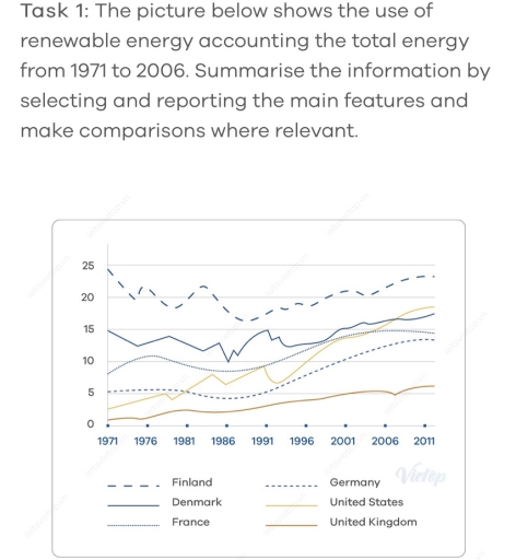
The image displays a line graph comparing the use of renewable energy from 1971 to 2006 in six countries: Finland, Denmark, Germany, United States, France, and United Kingdom. The y-axis represents the percentage use of renewable energy ranging from 0 to 25%, while the x-axis covers selected years from 1971 to 2011 (1971, 1976, 1981, 1986, 1991, 1996, 2001, 2006, 2011). The lines fluctuate as follows: Finland starts near 15% in 1971, peaks around 25% in 1996, then slightly declines to just below 25% in 2006. Denmark begins slightly above 5% in 1971, shows a rising trend to nearly 20% by 2006. Germany starts at around 5%, gradually increases to approximately 10% by 2006. The US stays consistently around 5% throughout the entire period. France begins near 10% in 1971, decreases to about 5% in 1981, then remains stable through to 2006. The UK line remains consistently around 0%-2% from 1971 to 2006.
Given the complexity of the image, the above description may not be entirely accurate.
Note: Both the topic and the answer were created by one of our users.

The line graph demonstrates the use of renewable energy in six different countries (Finland, Denmark, France, Germany, United States and United Kingdom) from 1971 to 2011.

Overall, it is clear that Finland was the highest and fluctuated according to usage of energy all the time, following by Denmark. However, United Kingdom was used the fewest energy source. But something interesting that all country’s usage of energy increased over the period except from Finland.

In detail, Finland was used the highest amount of energy in 1971 with 25% and continued to decreasing until the end. In 1996, it fell down to nearly 15% before increasing to 24 again in 2011 and remained the highest point regardless. However, the percentage of using energy in Denmark at 15% and United States by lower than 5% in 1996 and both countries usage increased continuously with some fluctuations until reaching to at 19% in 2011.

According to the usage of France and Germany were within 10% and 5% in 1996. Nevertheless, they increased sharply and reached to 15% at the end. However, the percentage of United Kingdom were the lowest with 1% in 1996, after which it increased to over 5% in 2011. Nevertheless, it remained the fewest point.

Word Count: 204

Answers On The Same Topic:

The picture below shows the use of renewable energy accounting the total energy from 1971 to 2006. Summarize the information by selecting and reporting the main features and make comparisons where relevant

The line graph shows the share of renewable energy in overall energy use between 1971 and 2006. Overall, it is clear that the highest proportion was in Finland and the lowest number was in the United Kingdom. The most noticeable figure is Finland. In 1971, the number accounted for 25, while the United Kingdom stood […]

The picture below shows the use of renewable energy accounting the total energy from 1971 to 2006. Summarize the information by selecting and reporting the main features and make comparisons where relevant

The line graph shows the share of renewable energy in overall energy use between 1971 and 2006. Overall, it shows clear that the highest proportion have in Finland and the lowest number in the United Kingdom. The most noticeable figure is Finland. In 1971, the number accounted for 25, while the United Kingdom stood at […]

The picture below shows the use of renewable energy accounting the total energy from 1971 to 2006. Summarize the information by selecting and reporting the main features and make comparisons where relevant

The line chart demonstrates the use of renewable energy represented the entire amount energy from 1971 and 2006. Overall, there are large proportion of use of renewable energy represented in six state. There was a decline in Finland, despite that, Finland kept the high position in throughout the year. Looking at higher figures, there are […]

The picture below shows the use of renewable energy accounting the total energy from 1971 to 2006. Summarize the information by selecting and reporting the main features and make comparisons where relevant

The line graph illustrates the consumption of renewable energy in 6 different countries from 1971 to 2006. Overall, there was an upward trend in the proportion of renewable energy consumption in almost all countries, except for Finland. However, Finland remained the leading country in consuming this source of energy throughout a 35-year period . In […]

See All

Other Topics:

The line graph below shows the electricity consumption in four different sectors (A, B, C, and D) between 2005 and 2020, measured in terawatt hours (TWh).

The line graph illustrates the consumption by four sectors during the period from 2005 to 2020. Overall, it is obvious that the amount of electricity consumed by sector A and D witnessed a steady increase, whereas the figure by sector B experienced a gradual decline over the period shown. Besides, that of sector C showed […]

The graph below shows the information about green transportation users from 1980 to 2020.

The line graph compares the number of monthy commuters traveling by 4 different types of transportation including subway, bus, tram ; and bike share over a period of 50 years from 1980 to 2030. As an overall trend it can be clearly seen that subway had the highest level of commuters over the time while […]

The grapgh below shows China's population by age group starting in 1960 and including forecast to 2050.

The graph above demonstrates the changes in the number of people grouped by different intervals of ages in China since 1960 and including a forecast to 2050. Overall, people aged between 15 and 64 are the most populated group in China while it is expected that the number of elderly people will exceed that of […]

Describe the graph shows the number of books read by men and women

The line graph compares the number of books read by men and women at Burnaby Public Library from 2011 to 2014. Overall, the number of books read by men increased gradually over the period. It is also noticeable that the figure for female readers increased initially but declined by the end of the period. In […]

The graph below shows the number of overseas visitors to three different areas of a European country between 1987 and 2007.

The line chart illustrates the number of overseas visitors to three various areas of a European country from 1987 to 2007. Overall, the coast area had the most visitors over the time of period. By contrast, the number of visitors of the lakes were the lowest at beginning and increased significantly over the period. In […]

Summarise the information by selecting and reporting the main features, and make comparison where relevent

The line graph illustrates varous activities at one social centre and their amount of participants in Melbourne, Australia between 2000 to 2020. It is evident that the most people participanted for film club among other activities despite of being stable over twenty years. Moreover, number of musical performances and that of table tennis increased. However, […]

See All
We have detected unusual activity on your device.
Please verify your identity to continue.
Note: This verification step won't sign you in. If you have a premium account, please log in to access the service as usual.
Google/Gmail Verification
Or verify using Email/Code
We've sent a verification code to:
youremail@gmail.com (Not your email?)
Enter it below to complete the verification process.
Ensure your email address is correct, your inbox is not full, and you check your spam folder. If no email arrives, consider using an alternative email.
You will need a Premium plan to perform your action!
Note: If you already have a premium account, please log in to access our services as usual.

Plans & Pricing

Our mission is to make quality education accessible for everyone.
However, to keep our hardworking team running and this service alive, we genuinely need your support!
By opting for a premium plan, not only do you sustain us in achieving the mission, but you also unlock advanced features to enrich your learning experience.

Free

For learners who aren't pressed for time

What's included on Free
100+ Cambridge IELTS Tests
Instant IELTS Writing Task 1 & 2 Evaluation (2 times/month)
Instant IELTS Speaking Part 1, 2, & 3 Evaluation (5 times/month)
Instant IELTS Writing Task 1 & 2 Essay Generator (2 times/month)
500+ Dictation & Shadowing Exercises
100+ Pronunciation Exercises
Flashcards
Other Advanced Tools

Premium

For those serious about advancing their English proficiency, and for IELTS candidates aspiring to boost their band score by 1-2 points (especially in writing & speaking) in just 30 days or less

What's included on Premium
Save Your IELTS Test Progress
Unlock All Courses & IELTS Tests
Unlimited AI Conversations
Unlimited AI Writing Enhancement Exercises
Unlimited IELTS Writing Task 1 & 2 Evaluation
Unlimited IELTS Speaking Part 1, 2, & 3 Evaluation
Checked Answers Will Not Be Published
Unlimited IELTS Writing Task 1 & 2 Essay Generator
Unlimited IELTS Speaking Part 1, 2, & 3 Sample Generator
Unlimited Usage Of Advanced Tools
Priority Support within 24h (12-month plan only)

Due to the nature of our service and the provided free trials, payments are non-refundable.
Nếu bạn là người Việt Nam và không có hoặc không muốn trả bằng credit/debit cards, bạn có thể thanh toán bằng phương thức chuyển khoản:


Chọn gói:
419,000₫ 277,000 ₫ cho gói 1 tháng (chỉ 9,233₫/ngày)
1,239,000₫ 597,000 ₫ cho gói 3 tháng (chỉ 6,633₫/ngày)
2,469,000₫ 1,027,000 ₫ cho gói 6 tháng (chỉ 5,706₫/ngày)
4,929,000₫ 1,417,000 ₫ cho gói 12 tháng (chỉ 3,936₫/ngày)


Sau khi chuyển khoản, vui lòng đợi trình duyệt tự động điều hướng bạn trở lại Engnovate và bạn sẽ ngay lập tức nhận được mã kích hoạt tài khoản premium.
Nếu có lỗi xảy ra, bạn có thể liên hệ với team thông qua một trong các phương thức: email đến helloengnovate@gmail.com hoặc nhắn tin qua facebook.com/engnovate.
Vì toàn bộ công cụ trên website đều có thể sử dụng thử miễn phí, Engnovate không hỗ trợ hoàn tiền.