🔥 Today Only: Save 30% on Premium — Offer Ends Soon! - Upgrade Now!
Pie Chart

Band 6+: the pie-chart shows the changes in annual spending by a particular uk school in 1981, 1991,and 2001

Image for topic: the pie-chart shows the changes in annual spending by a particular uk school in 1981, 1991,and 2001
Our system will evaluate the answer based on this AI-generated description.
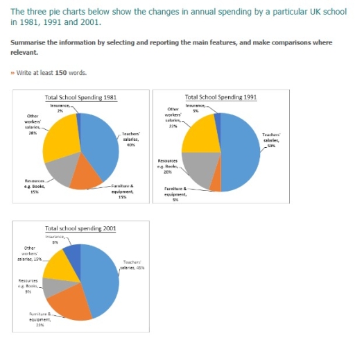
The image contains three pie charts depicting the annual spending breakdown of a UK school in the years 1981, 1991, and 2001. In 1981, the spending is allocated as follows: Teachers' salaries 46%, Furniture & Equipment 15%, Resources (e.g., books) 11%, Insurance 2%, Workers' wages 19%, and Other 7%. By 1991, the distribution changes slightly with Teachers' salaries at 51%, Furniture & Equipment 5%, Resources 10%, Insurance 8%, Workers' wages 22%, and Other 4%. In 2001, there's a notable shift with Teachers' salaries constituting 45% of the budget, Furniture & Equipment 23%, Resources 5%, Insurance 8%, Workers' wages 15%, and Other 4%. This overview illustrates a general trend over the two decades where the proportion of spending on teachers' salaries remains the largest though it slightly decreases by 2001, the allotment for furniture and equipment significantly increases, while the percentage for workers' wages and resources sees a decline.
Given the complexity of the image, the above description may not be entirely accurate.
Note: Both the topic and the answer were created by one of our users.

The given pie charts illustrate the percentage of annual spending, which was allocated in a particular UK school in 1981, 1991, and 2001, highlighting the distribution across the categories.

Overall, it is clear that Teachers´ salaries stood out as the most significant proportion, whereas insurance was represented comparatively smaller share. In general, the visual indicates noticeable changes in the overall categories over the period.

To begin with, in 1981, Teachers´ salaries accounted for 2% which rose to 50% in 1991 and further declined to 45% by 2001, reflecting the largest overall growth among all categories. Meanwhile, Furniture and equipment started at 15% in 1981, decreased moderately to 5% in 1991, and rey7$89bv ached 23% in 2001, showing a V-shaped trend over the period. In addition, Insurance experienced gradual growth, moving from 2% in 1981 to 3% in 1991 and finally peaking at 8% in 2001, showing a clear upward tendency.

By contrast, Resource book expanded from 15% in 1981 to 20% in 1991, before fell to 9% in 2001, marking the most notable decrease. Furthermore, Other workers´ salaries slipped slightly from 28% in 1981 to 22% in 1991 and 23% in 2001, reflecting a steady downward trend.

Word Count: 197

Answers On The Same Topic:

the pie-chart shows the changes in annual spending by a particular uk school in 1981, 1991,and 2001

The three pie charts illustrate how the yearly expenditure of a certain school in the UK changed between 1981,1991, and 2001. The figures are measured in percentages. Overall, the money spent on salaries of teachers remained highest, while insurance spendings made the least share throughout the period. Notably, furniture and equipment overtook the second leading […]

the pie-chart shows the changes in annual spending by a particular uk school in 1981, 1991,and 2001

The pie charts present data on the yearly expenditure changes at a public school in Canada in 1990, 2000 and 2010. Overall, although school providing salary for teachers remained the most popular type throughout the period, their share declined steadily. In contrast, school spending money on other decreased slighty, whereas expenditure for technology, and facilities […]

the pie-chart shows the changes in annual spending by a particular uk school in 1981, 1991,and 2001

The three pie charts illustrate how total school expenditure was distributed among five categories in 1981, 1991 and 2001. Overall, teachers’ salaries accounted for the largest proportion of spending in all three years, while insurance consistently represented the smallest share. Although most categories experienced fluctuations, expenditure on furniture and equipment rose noticeably by the end […]

the pie-chart shows the changes in annual spending by a particular uk school in 1981, 1991,and 2001

The three pie charts illustrate how a particular school distributed its annual expenditure across five categories in 1981, 1991 and 2001. Overall, teachers’ salaries consistently accounted for the largest proportion of spending throughout the period, while insurance remained the smallest item despite a gradual increase. Notable changes can be seen in furniture and equipment as […]

See All

Other Topics:

The diagram below shows time spent on smart phones and tablets by category.

The two pie charts compare the proportion of time spent on smartphones and tablets across six different activity categories. Overall, entertainment-related activities, particularly games and social networking, dominate usage on both devices. In contrast, other categories account for a significantly smaller share of total time spent. Regarding smartphones, games account for the largest proportion of […]

The three pie charts show the proportion of 4 kinds of vehicles used in the UK in 1965, 1985 and 2006. Summarise the information by selecting and reporting the main features, and make comparison where relevant.

The charts illustrates the ratio of four types of vehicles used in the UK namely Recreational vehicles, Public transpot, lorries and other car in 1996, 1985 and 2005. Overall, the private car used given period of time is higher than the other two types. Used of recreational vechicles less all the time. Public transport and […]

The pie chart below shows the percentage of total energy consumption by different sources in a country in 2023. Summarise the information by selecting and reporting the main features, and make comparisons where relevant. Energy Consumption by Source in a Country, 2023

The provided pie chart displays data on the Global Energy Consumption by Source in 2023 Overall, it can be seen the highest percentage was for oil (31%), while hydroelectric power(6%) accounts for the lowest portion. According to the pie chart, the Global Energy Consumption by Source in 2023 oil were highest 31%. Furthermore, coal fell […]

The charts below show information on free-time activities taken by teenagers in a specific country both in 2009 and 2019. Summarise the information by selecting and reporting the main features, and make comparisons where relevant.

The pie charts compare the percentage of time teenagers in a particular country spent on six distinct leisure activities in the years 2009 and 2019. Overall, music was the most popular pastime in 2009, whereas television became the dominant choice by 2019. Walking remained completely stable throughout the ten-year period. In 2009, listening to music […]

The pie charts below show the methods used by international students to book online English courses in three different countries in 2009 and 2010.

The given pie charts compare the percentages of four methods that international students use for booking online English courses in three countries (Australia, the USA and Canada) between 2009 and 2010. There were marginal changes in all four methods in the USA. However, proportion of the internet method in Australia experienced dramatic increase whereas proportion […]

The charts show the difference in how three countries learn English in 2010 and 2015. Summarize the information by selecting and reporting the main features, and make comparisons where relevant.

The pie chart illustrates various ways of learning English in three countries in the years of 2010 and 2015. Overall, while the figures for Evening class remained dominant across all categories, all of the data eventually decline. In contrast, most online figures experienced upward trends. Additionally, it is notable that Abroad figure was not seen […]

See All
We have detected unusual activity on your device.
Please verify your identity to continue.
Note: This verification step won't sign you in. If you have a premium account, please log in to access the service as usual.
Google/Gmail Verification
Or verify using Email/Code
We've sent a verification code to:
youremail@gmail.com (Not your email?)
Enter it below to complete the verification process.
Ensure your email address is correct, your inbox is not full, and you check your spam folder. If no email arrives, consider using an alternative email.
You will need a Premium plan to perform your action!
Note: If you already have a premium account, please log in to access our services as usual.

Plans & Pricing

Our mission is to make quality education accessible for everyone.
However, to keep our hardworking team running and this service alive, we genuinely need your support!
By opting for a premium plan, not only do you sustain us in achieving the mission, but you also unlock advanced features to enrich your learning experience.

Free

For learners who aren't pressed for time

What's included on Free
100+ Cambridge IELTS Tests
Instant IELTS Writing Task 1 & 2 Evaluation (2 times/month)
Instant IELTS Speaking Part 1, 2, & 3 Evaluation (2 times/month)
Instant IELTS Writing Task 1 & 2 Essay Generator (2 times/month)
500+ Dictation & Shadowing Exercises
100+ Pronunciation Exercises
Flashcards
Other Advanced Tools

Premium

For those serious about advancing their English proficiency, and for IELTS candidates aspiring to boost their band score by 1-2 points (especially in writing & speaking) in just 30 days or less

What's included on Premium
Save Your IELTS Test Progress & Analyze Mistakes By Question Type
Save Your Own Flashcard Sets & Use Them On Any Device
Unlock All Courses, IELTS Tests, Section & Part Practice
Unlimited AI Conversations
Unlimited AI Writing Enhancement Exercises
Unlimited IELTS Writing Task 1 & 2 Evaluation
Unlimited IELTS Speaking Part 1, 2, & 3 Evaluation
Checked Answers Will Not Be Published
Unlimited IELTS Writing Task 1 & 2 Essay Generator
Unlimited IELTS Speaking Part 1, 2, & 3 Sample Generator
Unlimited Usage Of Advanced Tools & AI Features
Priority Support within 24h (12-month plan only)

Due to the nature of our service and the provided free trials, payments are non-refundable.