🔥 Today Only: Save 30% on Premium — Offer Ends Soon! - Upgrade Now!
Multiple Graphs

Band 5+: The pie graphs show greenhouse gas emissions worldwide in 2002 and the forecast for 2030. The column chart shows carbon dioxide emissions around the world. Summarise the information by selecting and reporting the main features, and make comparisons where relevant.

Image for topic: The pie graphs show greenhouse gas emissions worldwide in 2002 and the forecast for 2030. The column chart shows carbon dioxide emissions around the world. Summarise the information by selecting and reporting the main features, and make comparisons where relevant.
Our system will evaluate the answer based on this AI-generated description.
The image contains two separate data representations on carbon dioxide emissions. The first part shows two pie charts for 2002 and 2030 with three categories: OECD, Transition economies, and Developing countries. In 2002, OECD has 52%, Transition economies 10%, and Developing countries 38%; in 2030, OECD has 43%, Transition economies 9%, and Developing countries 48%. The second part shows a bar graph titled "Worldwide Carbon Dioxide Emissions by sector" with two bars for each sector representing 2002 and 2030. Sectors include Other sectors, Waste combustion, Transportation, Consumer, and Industry. In 2002, Other sectors have less than 2 billion tons, Waste combustion around 1.5 billion tons, Transportation nearly 6 billion tons, Consumer over 2 billion tons, and Industry approximately 10 billion tons. By 2030, Other sectors increase to just under 4 billion tons, Waste combustion around 2 billion tons, Transportation nearly 10 billion tons, Consumer around 3.5 billion tons, and Industry close to 12 billion tons.
Given the complexity of the image, the above description may not be entirely accurate.
Note: Both the topic and the answer were created by one of our users.

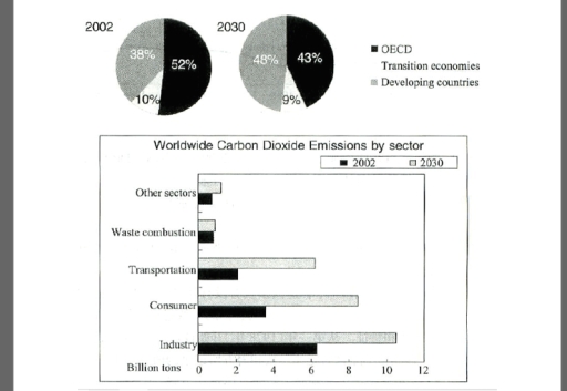
The two pie charts illustrate the percentage of gas emissions of greenhouses in year 2002 and predicting of year 2030.While the bar chart shows the worldwide carbon dioxide emissions in sa .years measure by billion tons

Overall, it is clear that the highest percentage of fuel emissions was in year 2002 for OECD type. However, the lowest percentage of fuel emissions is will be in year 2030 in transition economies part. In addition,the most rate for emissions of carbon dioxide was in industry class.

To begin, in 2002, the rate of fuel emissions in OECD type was about 52% but this percentage will decreased to exactly 43% in 2030.In contrast, there was an increased in developing countries proportion about 10 %.

On the other hand. the bar charts illustrate the number of carbon dioxide emissions.So there was several sources of emissions.First, the industry source which was the largest source of Carbon dioxide emissions compared to others sources about 6 billion tons in 2002 and almost 11 billion tons in 2030. In wast combustion column we can notice that in both years(2002,2030) the emissions rate is almost the same which is less than I billions tons.

Word Count: 195

Answers On The Same Topic:

The pie graphs show greenhouse gas emissions worldwide in 2002 and the forecast for 2030. The column chart shows carbon dioxide emissions around the world. Summarise the information by selecting and reporting the main features, and make comparisons where relevant.

The bar charts compare the proportion of greenhouse gas emissions worldwide in 2002 and prediction for 2030 and the chart illustrates global carbon dioxide emissions forecast among five sector in billions of tons. Overall, the most striking feature is that OECD accounted for the highest figure while the reverse was true for transition economies over […]

The pie graphs show greenhouse gas emissions worldwide in 2002 and the forecast for 2030. The column chart shows carbon dioxide emissions around the world. Summarise the information by selecting and reporting the main features, and make comparisons where relevant.

The pie charts compare the proportions of greenhouse gas emissions produced by three groups of countries worldwide in 2002 and provide a forecast for 2030. The bar chart illustrates global carbon dioxide emissions across five sectors in billions of tons. Overall, the main contributors to CO₂ emissions in both 2002 and the prediction for 2030 […]

The pie graphs show greenhouse gas emissions worldwide in 2002 and the forecast for 2030. The column chart shows carbon dioxide emissions around the world. Summarise the information by selecting and reporting the main features, and make comparisons where relevant.

The pie charts illustrate data the percentage of three categories – OECD, transition economies, and developing in 2002 and 2030, while the bar provides details on the proportion of carbon dioxide emissions according to five different departments in the same time. Overall, both OECD, and transition economies experienced downward trends, albeit to varying degrees over […]

The pie graphs show greenhouse gas emissions worldwide in 2002 and the forecast for 2030. The column chart shows carbon dioxide emissions around the world. Summarise the information by selecting and reporting the main features, and make comparisons where relevant.

The pie charts provide data about greenhouse gas emissions in whole world in 2002 and up to 2030, while the bar charts demonstrate carbon dioxide emissions globally. Overall, it is evident that OCED and developing countries sectors showed the dominance in given period, whereas transition economies had the lowest emissions in both years. Moreover, there […]

The pie graphs show greenhouse gas emissions worldwide in 2002 and the forecast for 2030. The column chart shows carbon dioxide emissions around the world. Summarise the information by selecting and reporting the main features, and make comparisons where relevant.

The pie charts demonstrate greenhouse gas emission by OECD,Transition economies and developing countries, while bar chart illustrate CO2 emission around the world by different sectors between 2002 and 2030. Overall,in the past the most produced greenhouse output producer was OECD nevertheless the predictions show developing countries will be the most produced greenhouse gas. In bar […]

See All

Other Topics:

The charts show average levels of participation in education and the highest education level of adults from 2000 to 2010 in Singapore.

The bar chart compares the average number of years of schooling completed by male and female adults in Singapore between 2000 and 2010. The pie charts illustrate the highest educational qualifications achieved by the population in 2000 and 2010. Overall, both men and women spent more years in education over the period, with males remaining […]

The charts below show the average percentage in typical meals of three types of nutrients, all of which may be unhealthy if eaten too much.

These three pie charts illustrate the average percentages in particular meals of three types of nutrients in average including sodium, saturated fat and added sugar respectively which influence the health negatively if overconsumed in USA. Overall, it is obvious that Sodium is the most absorption essence when having dinner, followed by Saturated fat. But, during […]

You will be shown a visual representation of information; a graph, table, chart or diagram, and you are asked to summarize, describe or explain the information you see. Make sure you organize your response into three main parts, the introduction, an overview and the main features supported by figures from the diagram.

Two pie charts represent the proportion of children’s activities. The first pie chart illustrates the percent of boys, who are engaged in different activities, while the second one displays girl’s activities. Overall, it can be observed that the largest proportions of boys’ leisure are computer games and basketball. Although reading is the least preferable option […]

the chart below show percentage of male and female students of different age groups who studied in Australia for full-time and part-time educaqtion in 2006.

The bar chart gives information about the number of full-time and part-time students male and female at different age bracket who studied in Australia in 2006. Overall, individuals aged 15 to 29 who engaged in part-time study recorded the highest percentage for both genders, with the exception of adult learners. Furthermore, young adults represented the […]

The charts below show the results of surveys conducted among three target groups about different aspects of a public library.

The pie charts illustrate the results of a survey conducted among three target groups about different aspects of a public library in an unspecified year and country. Overall, readers represented the largest share of surveyed groups, whereas the reverse was true for citizens. As for the library aspect rated most positively, while the highest percentage […]

The charts below show the percentage of visitors from the USA to Canada in different age groups in 2000 and 2020.

The provided charts display data on the proportion of the USA visitors, who travelled to Canada, in different age groups in 2000 and 2020. Overall, the percentage of young tourists and ones aged 55+ increased significantly, whereas the figure for people in middle-age reduced. In 2000, the 35-54 years group accounted for exact 50% of […]

See All
We have detected unusual activity on your device.
Please verify your identity to continue.
Note: This verification step won't sign you in. If you have a premium account, please log in to access the service as usual.
Google/Gmail Verification
Or verify using Email/Code
We've sent a verification code to:
youremail@gmail.com (Not your email?)
Enter it below to complete the verification process.
Ensure your email address is correct, your inbox is not full, and you check your spam folder. If no email arrives, consider using an alternative email.
You will need a Premium plan to perform your action!
Note: If you already have a premium account, please log in to access our services as usual.

Plans & Pricing

Our mission is to make quality education accessible for everyone.
However, to keep our hardworking team running and this service alive, we genuinely need your support!
By opting for a premium plan, not only do you sustain us in achieving the mission, but you also unlock advanced features to enrich your learning experience.

Free

For learners who aren't pressed for time

What's included on Free
100+ Cambridge IELTS Tests
Instant IELTS Writing Task 1 & 2 Evaluation (2 times/month)
Instant IELTS Speaking Part 1, 2, & 3 Evaluation (5 times/month)
Instant IELTS Writing Task 1 & 2 Essay Generator (2 times/month)
500+ Dictation & Shadowing Exercises
100+ Pronunciation Exercises
Flashcards
Other Advanced Tools

Premium

For those serious about advancing their English proficiency, and for IELTS candidates aspiring to boost their band score by 1-2 points (especially in writing & speaking) in just 30 days or less

What's included on Premium
Save Your IELTS Test Progress
Unlock All Courses & IELTS Tests
Unlimited AI Conversations
Unlimited AI Writing Enhancement Exercises
Unlimited IELTS Writing Task 1 & 2 Evaluation
Unlimited IELTS Speaking Part 1, 2, & 3 Evaluation
Checked Answers Will Not Be Published
Unlimited IELTS Writing Task 1 & 2 Essay Generator
Unlimited IELTS Speaking Part 1, 2, & 3 Sample Generator
Unlimited Usage Of Advanced Tools
Priority Support within 24h (12-month plan only)

Due to the nature of our service and the provided free trials, payments are non-refundable.
Nếu bạn là người Việt Nam và không có hoặc không muốn trả bằng credit/debit cards, bạn có thể thanh toán bằng phương thức chuyển khoản:


Chọn gói:
419,000₫ 277,000 ₫ cho gói 1 tháng (chỉ 9,233₫/ngày)
1,239,000₫ 597,000 ₫ cho gói 3 tháng (chỉ 6,633₫/ngày)
2,469,000₫ 1,027,000 ₫ cho gói 6 tháng (chỉ 5,706₫/ngày)
4,929,000₫ 1,417,000 ₫ cho gói 12 tháng (chỉ 3,936₫/ngày)


Sau khi chuyển khoản, vui lòng đợi trình duyệt tự động điều hướng bạn trở lại Engnovate và bạn sẽ ngay lập tức nhận được mã kích hoạt tài khoản premium.
Nếu có lỗi xảy ra, bạn có thể liên hệ với team thông qua một trong các phương thức: email đến helloengnovate@gmail.com hoặc nhắn tin qua facebook.com/engnovate.
Vì toàn bộ công cụ trên website đều có thể sử dụng thử miễn phí, Engnovate không hỗ trợ hoàn tiền.