🔥 Today Only: Save 30% on Premium — Offer Ends Soon! - Upgrade Now!
Multiple Graphs

Band 5+: The presented charts illustrate the average temperatures on a daily basis and the number of rainy days in two various cities in Australia.

Image for topic: The presented charts illustrate the average temperatures on a daily basis and the number of rainy days in two various cities in Australia.
Our system will evaluate the answer based on this AI-generated description.
The image features two graphs; the top graph displays the average daily temperatures in Brisbane and Canberra, with data points for both maximum and minimum temperatures across months Jan-Dec: Brisbane max (Jan 29, Feb 29, Mar 27, Apr 24, May 21, June 20, July 20, Aug 21, Sep 23, Oct 25, Nov 27, Dec 28), Brisbane min (Jan 21, Feb 21, Mar 19, Apr 16, May 12, June 11, July 9, Aug 10, Sep 13, Oct 15, Nov 18, Dec 20), Canberra max (Jan 28, Feb 27, Mar 24, Apr 20, May 15, June 12, July 11, Aug 13, Sep 16, Oct 19, Nov 22, Dec 26), Canberra min (Jan 13, Feb 13, Mar 11, Apr 7, May 3, June 1, July -1, Aug 1, Sep 3, Oct 6, Nov 9, Dec 11); the bottom graph displays the average number of days with rainfall in Brisbane and Canberra across months Jan-Dec: Brisbane (Jan 11, Feb 12, Mar 15, Apr 12, May 11, June 8, July 7, Aug 7, Sep 8, Oct 9, Nov 11, Dec 11), Canberra (Jan 8, Feb 7, Mar 9, Apr 7, May 8, June 8, July 7, Aug 7, Sep 8, Oct 9, Nov 9, Dec 7).
Given the complexity of the image, the above description may not be entirely accurate.
Note: Both the topic and the answer were created by one of our users.

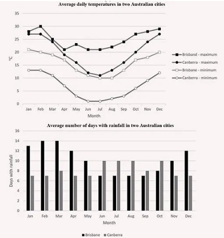
The bar chart illustrates the average number of days with rainfall while line graph shows the average daily temperatures in two Australian cities.Overall,it seems like that number of rainy days in Cariberra is constantly same every month,while in Brisbane,there is an increasing of its numbers and slight fall is taken place while daily temperatures of Cariberra and Brisbane are almost the same.

In Brisbane,number of days with rainfall remained stable between January and March,after that suddenly there happened a sharp fall,then it increased from September to December.Also in its number of daily temperatures,there sudden fall and slighly rise occured both in maximum and minimum.Number of days with rainfall remained stable,then increased sharply between June and October.Both in maximum and minimum,there occured a sharp fall,then it had a dramatic rise from August to December.

However,it seems like that in both trend we noticed a similar changes,there is a little difference between them in speed of fall or rise.

Word Count: 157

Answers On The Same Topic:

The presented charts illustrate the average temperatures on a daily basis and the number of rainy days in two various cities in Australia.

The charts illustrate the average daily temperatures and the average number of davs with rainfall in Brisbane and Canberra over the course of a year. Overall, Brisbane is warmer than Canberra throughout the year, and Canberra experiences greater seasonal variation, especially in winter. In terms of rainfall, Brisbane has more rainy days at the beginning […]

The presented charts illustrate the average temperatures on a daily basis and the number of rainy days in two various cities in Australia.

The line graph ensures information about how the temperature degrees of Brisband and Canbera cities changed as average whilst the bar chart demonstrates the number of days with precipitation averagely in the same cities. Overall, Brisband has the highest level of temperature on February whereas Canbera experience on December. Brisband starts that year with a […]

See All

Other Topics:

The first chart below shows the percentage of school-aged girls and boys who were at secondary school in four regions of the world in 2000. The second chart shows the percentages of college-aged men and women in higher education in the same year.

The two charts compare the proportions of school-aged boys and girls attending secondary school and the percentages of men and women in higher education across four world regions in 2000. Overall, participation in both secondary and higher education varied significantly by region, with developed regions showing higher enrolment rates. In addition, gender disparities were more […]

The charts below illustrate the proportions of American students at a university in the United States who were able to speak languages other than English, in 2005 and 2015. Summarise the information by selecting and reporting the main features, and make comparisons where relevant.

The two pie charts compare the percentage of American students in Unated States who able to speak on other languages from 2005 and 2015. Overall, it is easy to notice that the interest of the students in other language is increased significanlty after 10 years. In 2005, the share of residents who were not able […]

The pie charts above show a comparison of kinds of energy production in a European country in 1995 and 2005.

Overall, the two pie charts illustrate the distribution of energy production in France over a 10-year period. It is evident that coal and gas remained the dominant energy sources in both 1995 and 2005, while nuclear power and other alternative sources accounted for a smaller share. Notably, the contribution of the latter categories almost doubled […]

The pie charts above show a comparison of kinds of energy production in a European country in 1995 and 2005.

Overall, the two of pie charts show that all kind of energy production were still in demand even over 10 year period in FranceComparing the data in 1995 and 2005 ,it is clear that coal and gas were the most important energy sourse,whereas the others and nucleasr were used less.Since 1995, the latter sourse has […]

Some people think that students should study only subjects related to their future career. Others believe that learning a wide range of subjects is more important. Discuss both views and give your opinion

Nowadays, there is an ongoing debate about many people believe that student who studied only subject build succesful career on future.Others thought that students shoul improve cognitive skills with learning wide range of subjects.This essay will discuss both views and give my opinion. On the one hand,some people think that students who learned a only […]

Writing Task 1: Pie Chart & Table You should spend about 20 minutes on this task The charts below show the distribution of the world's water and the use of water in three countries.

The provided pie charts and table compare how the world’s water is divided and used among 3 distinct nations. At a glance, it is obvious that saltwater dominates all water resources, while ice and glaciers showed the maximum for fresh water. Another noteworthy point is that the higher rates for water usage in agriculture in […]

See All
We have detected unusual activity on your device.
Please verify your identity to continue.
Note: This verification step won't sign you in. If you have a premium account, please log in to access the service as usual.
Google/Gmail Verification
Or verify using Email/Code
We've sent a verification code to:
youremail@gmail.com (Not your email?)
Enter it below to complete the verification process.
Ensure your email address is correct, your inbox is not full, and you check your spam folder. If no email arrives, consider using an alternative email.
You will need a Premium plan to perform your action!
Note: If you already have a premium account, please log in to access our services as usual.

Plans & Pricing

Our mission is to make quality education accessible for everyone.
However, to keep our hardworking team running and this service alive, we genuinely need your support!
By opting for a premium plan, not only do you sustain us in achieving the mission, but you also unlock advanced features to enrich your learning experience.

Free

For learners who aren't pressed for time

What's included on Free
100+ Cambridge IELTS Tests
Instant IELTS Writing Task 1 & 2 Evaluation (2 times/month)
Instant IELTS Speaking Part 1, 2, & 3 Evaluation (5 times/month)
Instant IELTS Writing Task 1 & 2 Essay Generator (2 times/month)
500+ Dictation & Shadowing Exercises
100+ Pronunciation Exercises
Flashcards
Other Advanced Tools

Premium

For those serious about advancing their English proficiency, and for IELTS candidates aspiring to boost their band score by 1-2 points (especially in writing & speaking) in just 30 days or less

What's included on Premium
Save Your IELTS Test Progress
Unlock All Courses & IELTS Tests
Unlimited AI Conversations
Unlimited AI Writing Enhancement Exercises
Unlimited IELTS Writing Task 1 & 2 Evaluation
Unlimited IELTS Speaking Part 1, 2, & 3 Evaluation
Checked Answers Will Not Be Published
Unlimited IELTS Writing Task 1 & 2 Essay Generator
Unlimited IELTS Speaking Part 1, 2, & 3 Sample Generator
Unlimited Usage Of Advanced Tools
Priority Support within 24h (12-month plan only)

Due to the nature of our service and the provided free trials, payments are non-refundable.
Nếu bạn là người Việt Nam và không có hoặc không muốn trả bằng credit/debit cards, bạn có thể thanh toán bằng phương thức chuyển khoản:


Chọn gói:
419,000₫ 277,000 ₫ cho gói 1 tháng (chỉ 9,233₫/ngày)
1,239,000₫ 597,000 ₫ cho gói 3 tháng (chỉ 6,633₫/ngày)
2,469,000₫ 1,027,000 ₫ cho gói 6 tháng (chỉ 5,706₫/ngày)
4,929,000₫ 1,417,000 ₫ cho gói 12 tháng (chỉ 3,936₫/ngày)


Sau khi chuyển khoản, vui lòng đợi trình duyệt tự động điều hướng bạn trở lại Engnovate và bạn sẽ ngay lập tức nhận được mã kích hoạt tài khoản premium.
Nếu có lỗi xảy ra, bạn có thể liên hệ với team thông qua một trong các phương thức: email đến helloengnovate@gmail.com hoặc nhắn tin qua facebook.com/engnovate.
Vì toàn bộ công cụ trên website đều có thể sử dụng thử miễn phí, Engnovate không hỗ trợ hoàn tiền.