🔥 Today Only: Save 30% on Premium — Offer Ends Soon! - Upgrade Now!
Multiple Graphs

Band 6+: The table and graph below give information about Internet searches in the US between 2004 and 2010.

Image for topic: The table and graph below give information about Internet searches in the US between 2004 and 2010.
Our system will evaluate the answer based on this AI-generated description.
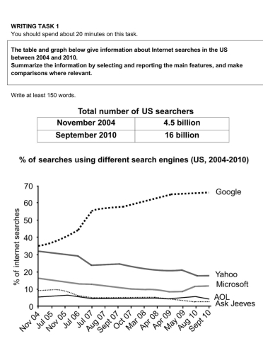
The image provides data on US internet searches, showing the total number of searchers was 4.5 billion in November 2004 and 16 billion in September 2010. A line graph shows the percentage of searches using different search engines from 2004-2010, with approximate shares (%) as follows: Google (Nov 04:35, Jul 05:38, Nov 05:40, Jul 06:43, Jul 07:55, Aug 07:56, Sept 07:57, Oct 07:58, Mar 08:60, Apr 08:61, Apr 09:62, May 09:63, Aug 10:65, Sept 10:66); Yahoo (Nov 04:32, Jul 05:30, Nov 05:30, Jul 06:29, Jul 07:23, Aug 07:24, Sept 07:25, Oct 07:23, Mar 08:22, Apr 08:21, Apr 09:21, May 09:18, Aug 10:18, Sept 10:18); Microsoft (Nov 04:17, Jul 05:15, Nov 05:14, Jul 06:13, Jul 07:12, Sept 07:11, Mar 08:10, Apr 08:10, Apr 09:10, May 09:9, Aug 10:11, Sept 10:11); Ask Jeeves (Nov 04:10, Jul 05:10, Nov 05:9, Jul 06:7, Jul 07:5, Aug 07:4, Sept 07:4, Oct 07:4, Mar 08:3, Apr 08:3, Apr 09:3, May 09:2, Aug 10:2, Sept 10:2); AOL (Nov 04:5, Jul 05:5.5, Nov 05:6, Jul 06:5, Jul 07:4.5, Aug 07:4, Sept 07:4, Oct 07:4, Mar 08:4, Apr 08:4, Apr 09:4, May 09:3, Aug 10:4, Sept 10:3).
Given the complexity of the image, the above description may not be entirely accurate.
Note: Both the topic and the answer were created by one of our users.

The graphs illustrate information about Internet searches using five search engines – Google, Yahoo, Microsoft, AOL and Ask Jeeves – from 2004 to 2010.

Overall, it can be seen that the Microsoft, AOL and Ask Jeeves experienced a slight decrease throughout the period. Another noticeable trend is that Yahoo underwent some fluctuation. However, google remained the most popular search engines.

At the beginning of the period, goggle stood at 35%. It then increased steadily, reaching 65% by 2010, making it the highest among all. In contrast, yahoo started at below 34% and slightly decreased to 30% in 2006. By 2010, it had experienced steady declined, fell at below 20%.

Meanwhile, Microsoft showed a different trend. It began at 17%, then slightly declined over the next few years. It eventually stayed constant at 10% in until 2010. Similarly, AOL experienced a slight fall, decreasing from 9% to 5% between 2004 and 2010. By contrast, Ask Jeeves remain the lowest percentage over six-year period.

Word Count: 162

Answers On The Same Topic:

The table and graph below give information about Internet searches in the US between 2004 and 2010.

The given graphs illustrate the usage of internet in the US during 2004 and 2010 by five engines(Google, Yahoo, Microsoft, AOL, and Ask Jeeves) Overall, the number of searchers increased throughout the given period. However, three platforms still had lower percentage of users and also number of people using Yahoo was declined. Interestingly, Google remained […]

The table and graph below give information about Internet searches in the US between 2004 and 2010.

The table below provide the information about the US’s internet searches between 2004 and 2010. Moreover, the graph illustrates the US’s percentages used of search in different search engines: Google, Yahoo, Microsoft, AOL, and Ask Jeeves. Analytically, the total number of US searchers in 2010 was larger than 2004. Percentage of employing Google had a […]

The table and graph below give information about Internet searches in the US between 2004 and 2010.

The bar charts compared the total number of searchers in the US from November 2004 to September 2010, while the line graph illustrated the number of searchers who used five different search engines over the period 6 years. Overall, it is readily apparent that the total number of people using engines searching in the US […]

See All

Other Topics:

The bar chart shows the share of poverty of the rural areas in the years 1993 and 2002. The pie chart shows the rural area share and the urban area share of poverty in 2002.Summarise the information by selecting and reporting the main features, and make comparisons where relevant.

The supplied bar graph llustrates rural share of poverty in percent impoverished population living rural areas in 1993 and 2002. The lie chart depicts how much of the poverty is in rural areas and how much of it is in urban areas. Overall, rural regions in East Asia and close Pasific ocean had the most […]

You should spend about 20 minutes on this task. The line graphs below show the subscriptions to mobile and fixed phone lines in four different countries between 2005 and 2015. Summarise the information by selecting and reporting the main features and make comparisons where relevant. Write at least 150 words.

The line graphs illustrates information regarding subscriptions to cell phones and landline telephones from the year 2005 to 2015 in four different countries (India, UK, Eritrea and Uruguay). Overall, mobile phone subscriptions had a higher connections per hundred people in comparison to fixed telephone connections, signifying the general preference for mobile phones. However, in the […]

The pie charts below show the percentage of five kinds of books sold by a bookseller between 1972 and 2012. Summarise the information by selecting and reporting the main features, and make comparisons where relevant.

The provided pie chart delineates data regarding the changes in the percentage of five kinds of books sold by bookseller over a forty-year period spanning from 1972 to 2012. Overall, it is immediately salient that adult fiction experienced a remarkable upward trend, whereas the converse was true for others which witnessed a steady decline throughout […]

The bar chart and pie chart show the amount of carbon dioxide (CO₂) emitted by three different income groups in 1990 and 2000, and the proportion of the world's population represented by each income group in 2000.

The charts compare the amount of carbon dioxide emissions released into the atmosphere by different income groups between 1990 and 2000, as well as these groups’ share in the proportion of world’s population in the year 2000. Overall, carbon dioxide released by high income groups saw a slight downward trajectory over the years although they […]

The chart below shows the electricity consumption in different sectors of Eastern Europe in 2007 and 2010. Summarize the information by selecting and reporting the main features and make comparisons where relevant.

The chart compares the proportion of electricity consumption in different sectors of Eastern Europe from 2007 and 2010. Overall,It is clear that the Residential witnessed highest among all groups,while agriculture were showing lowest proportion among all groups.out of 8 groups 4 were represented the period of stability. At the beginning ,the Residential recorded highest among […]

The charts below the protein and calorie intakes of people in different parts of the world. Summarize the information by selecting and reporting the main features, and make comparisons where relevant.

The charts below provides information about protein and calorie intakes of individuals in different parts of the world. overall , it is evident that , the highest value is of animal protein and other protein in the country north america and lowest value is of animal protein and other animal is in india. TO commence […]

See All
We have detected unusual activity on your device.
Please verify your identity to continue.
Note: This verification step won't sign you in. If you have a premium account, please log in to access the service as usual.
Google/Gmail Verification
Or verify using Email/Code
We've sent a verification code to:
youremail@gmail.com (Not your email?)
Enter it below to complete the verification process.
Ensure your email address is correct, your inbox is not full, and you check your spam folder. If no email arrives, consider using an alternative email.
You will need a Premium plan to perform your action!
Note: If you already have a premium account, please log in to access our services as usual.

Plans & Pricing

Our mission is to make quality education accessible for everyone.
However, to keep our hardworking team running and this service alive, we genuinely need your support!
By opting for a premium plan, not only do you sustain us in achieving the mission, but you also unlock advanced features to enrich your learning experience.

Free

For learners who aren't pressed for time

What's included on Free
100+ Cambridge IELTS Tests
Instant IELTS Writing Task 1 & 2 Evaluation (2 times/month)
Instant IELTS Speaking Part 1, 2, & 3 Evaluation (2 times/month)
Instant IELTS Writing Task 1 & 2 Essay Generator (2 times/month)
500+ Dictation & Shadowing Exercises
100+ Pronunciation Exercises
Flashcards
Other Advanced Tools

Premium

For those serious about advancing their English proficiency, and for IELTS candidates aspiring to boost their band score by 1-2 points (especially in writing & speaking) in just 30 days or less

What's included on Premium
Save Your IELTS Test Progress & Analyze Mistakes By Question Type
Save Your Own Flashcard Sets & Use Them On Any Device
Unlock All Courses, IELTS Tests, Section & Part Practice
Unlimited AI Conversations
Unlimited AI Writing Enhancement Exercises
Unlimited IELTS Writing Task 1 & 2 Evaluation
Unlimited IELTS Speaking Part 1, 2, & 3 Evaluation
Checked Answers Will Not Be Published
Unlimited IELTS Writing Task 1 & 2 Essay Generator
Unlimited IELTS Speaking Part 1, 2, & 3 Sample Generator
Unlimited Usage Of Advanced Tools & AI Features
Priority Support within 24h (12-month plan only)

Due to the nature of our service and the provided free trials, payments are non-refundable.