🔥 Today Only: Save 30% on Premium — Offer Ends Soon! - Upgrade Now!
Table

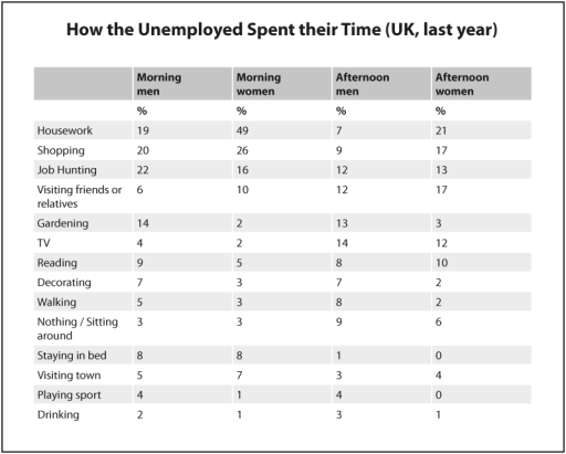
Band 7+: The table below shows how the UK unemployed spent their time last year. Summarise the information by selecting and reporting the main features, and make comparisons where relevant.

Image for topic: The table below shows how the UK unemployed spent their time last year. Summarise the information by selecting and reporting the main features, and make comparisons where relevant.
Our system will evaluate the answer based on this AI-generated description.
The image shows a chart of how unemployed individuals in the UK spent their time last year, divided into morning and afternoon activities for both men and women. Housework was the most common activity for women in the morning (49) and afternoon (21), while job hunting was the highest for men in the morning (22) and afternoon (12). Women also spent significant time visiting friends or relatives in the afternoon (17). Gardening was more common in the afternoon for both men (13) and women (3). Morning reading was slightly higher for men (9) than women (5), but the opposite was true in the afternoon with women at 10 and men at 8. Walking was more common in the afternoon for men (8) than women (2). Both men and women spent equal time staying in bed in the morning (8), but only men stayed in bed in the afternoon (1). Playing sports and drinking were the least common activities, with both being slightly higher in the afternoon for men (4).
Given the complexity of the image, the above description may not be entirely accurate.
Note: Both the topic and the answer were created by one of our users.

The graph demonstrates how people without jobs in the UK, made use of their time last year.

Overall, both genders are more active in the morning than they are in the afternoon. Women are usually much more proactive than men at all times of the day. Males are more likely to engage in leisure-driven activities, whereas women tend to focus more on “must-do” chores.

More than double of jobless women do their housework in the morning rather than in the afternoon, with 49% and 21%, respectively. Shopping and job hunting are also predominately done earlier in the day, with shopping having a significant increase from 17% in the afternoon to 26% in the morning. Job hunting, however, remains relatively constant during the whole day with only a 3% difference between times. Women tend to prefer leisure in the later part of the day, with half of them doing so.

Men also tend to engage in more pressing activities, such as housework, shopping and job hunting in the morning rather than the afternoon, with a very noticible margin of 41% and 28%, respectively. Jobless of the male gender, however, pursue leisure most of the day, regardless of time, with an average of 66% men joining in on more fun activities.

Word Count: 209

Answers On The Same Topic:

The table below shows how the UK unemployed spent their time last year. Summarise the information by selecting and reporting the main features, and make comparisons where relevant.

The table illustrates the activities undertaken by unemployed individuals in the UK during their free time last year, divided into percentages for men and women. Overall, both men and women spent the majority of their time on home-based activities, although there were noticeable differences in how each gender allocated their time. Men were more engaged […]

The table below shows how the UK unemployed spent their time last year. Summarise the information by selecting and reporting the main features, and make comparisons where relevant.

The table presents a detailed account of how unemployed individuals in the UK allocated their time during the previous year, categorizing activities by both gender and time of day. A clear trend emerges indicating that indoor activities, particularly housework for women and job hunting for men, dominated the daily schedules of the unemployed. Conversely, recreational […]

The table below shows how the UK unemployed spent their time last year. Summarise the information by selecting and reporting the main features, and make comparisons where relevant.

The table illustrates how the unemployed population in the UK allocated their time across various activities over the past year. Notably, housework emerged as the predominant activity for women, while men predominantly engaged in job hunting. Both genders exhibited minimal participation in sports and drinking. In the morning, a significant majority of women, accounting for […]

The table below shows how the UK unemployed spent their time last year. Summarise the information by selecting and reporting the main features, and make comparisons where relevant.

The table delineates the activities undertaken by unemployed individuals in the United Kingdom over the previous year, segmented by gender and varying time slots throughout the day. Overall, the data underscores significant gender disparities in how unemployed individuals allocate their time, particularly in housework and job hunting activities. In the morning, housework emerged as the […]

The table below shows how the UK unemployed spent their time last year. Summarise the information by selecting and reporting the main features, and make comparisons where relevant.

The table shows how men and women who were out of work last year spent their time. The information is broken down into parts of the day and fourteen different activities. First of all, it is interesting to note that the majority of both men and women who are unemployed are engaged in productive activities […]

See All

Other Topics:

The table below gives information about the amount of tax collected ( as % of GDP) in five countries for 4 years between 1975 and 2005. Summarise the information by selecting and reporting the main features and make comparisons where relevant.

The table provides data on tax collected percentage of GDP in five countries between 1975 and 2005 . In general ,Sweden country tax collected was higher than other country ,also in 2005 .In addition , in 2005 year most country showed a good result compare with other years . Sweden country show high tax collected […]

The tables below show response to a questionnaire given by two groups of people (club members and the general public) who showed their opinions about a new theatre. Summarise the information by selecting and reporting the main features, and make comparisons where relevant.

The given table illustrates the percentage of respondents, including club members and the general population, showing their perspectives about three different categories of a new theatre. Overall, both groups showed their positive views of the theatre, with “excellent” the most common rating in every category. Club member were most positive with Quality, while public population […]

This table illustrates the number of people making a journey and the money they pay for one ticket with the distance travelled in six underground systems of different cities.

The given table depicts the figure of individuals commuting by a train and the payed amount of money per one ticket, as well as the distance travelled in six subway systems of different megapolises. Overall, it is evident that the London metro system accounts for the least sum of routes and annual journeys commited, yet […]

The table below shows the percentage of patients who were satisfied with four aspects of three hospitals. Summarise the information by selecting and reporting the main features, and make comparisons where relevant.

The table compares the proportion of patients’ satisfaction in four different aspects of three hospitals. Overall, Hospital C provides the most satisfied services in staff and waiting time, while Hospital A accounted for the highest shares of treatment quality and aftercare quality. Additionally, Hospital B shows the least satisfaction in all aspects. In terms of […]

The first table below shows changes in the total population of New York city from 1800 to 2000. The second and third tables show changes in the population of the field other districts of the city (Manhattan, Brookland, Bronx, Queens, staten islands) over the same period.summarise the information by selecting and reporting the main features and make comparisons where relevant.

The first table illustrates how the total population of New York City changed between 1800 and 2000, while the second and third tables provide information on population changes in the city’s five districts, namely Manhattan, Brooklyn, the Bronx, Queens, and Staten Island, over the same period. Overall, the total citizens of New York City rose […]

The table below gives information about the average monthly salaries (in US dollars) for workers in five different industries in Australia in 2010 and 2020.

The table provides information about the average monthly salaries in Australia (Units are measured in US dollars) for workers in five various industries such as healthcare, education, construction, information tech and retail between 2010 and 2020. Overall, the average salaries for information tech workers was the highest in both first and final years among another […]

See All
We have detected unusual activity on your device.
Please verify your identity to continue.
Note: This verification step won't sign you in. If you have a premium account, please log in to access the service as usual.
Google/Gmail Verification
Or verify using Email/Code
We've sent a verification code to:
youremail@gmail.com (Not your email?)
Enter it below to complete the verification process.
Ensure your email address is correct, your inbox is not full, and you check your spam folder. If no email arrives, consider using an alternative email.
You will need a Premium plan to perform your action!
Note: If you already have a premium account, please log in to access our services as usual.

Plans & Pricing

Our mission is to make quality education accessible for everyone.
However, to keep our hardworking team running and this service alive, we genuinely need your support!
By opting for a premium plan, not only do you sustain us in achieving the mission, but you also unlock advanced features to enrich your learning experience.

Free

For learners who aren't pressed for time

What's included on Free
100+ Cambridge IELTS Tests
Instant IELTS Writing Task 1 & 2 Evaluation (2 times/month)
Instant IELTS Speaking Part 1, 2, & 3 Evaluation (2 times/month)
Instant IELTS Writing Task 1 & 2 Essay Generator (2 times/month)
500+ Dictation & Shadowing Exercises
100+ Pronunciation Exercises
Flashcards
Other Advanced Tools

Premium

For those serious about advancing their English proficiency, and for IELTS candidates aspiring to boost their band score by 1-2 points (especially in writing & speaking) in just 30 days or less

What's included on Premium
Save Your IELTS Test Progress & Analyze Mistakes By Question Type
Save Your Own Flashcard Sets & Use Them On Any Device
Unlock All Courses, IELTS Tests, Section & Part Practice
Unlimited AI Conversations
Unlimited AI Writing Enhancement Exercises
Unlimited IELTS Writing Task 1 & 2 Evaluation
Unlimited IELTS Speaking Part 1, 2, & 3 Evaluation
Checked Answers Will Not Be Published
Unlimited IELTS Writing Task 1 & 2 Essay Generator
Unlimited IELTS Speaking Part 1, 2, & 3 Sample Generator
Unlimited Usage Of Advanced Tools & AI Features
Priority Support within 24h (12-month plan only)

Due to the nature of our service and the provided free trials, payments are non-refundable.