🔥 Today Only: Save 30% on Premium — Offer Ends Soon! - Upgrade Now!
Table

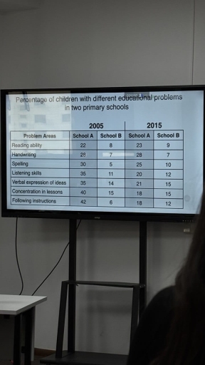
Band 5+: The table below shows the percentage of children with different educational problems in two primary schools (School A and School B) in the years 2005 and 2015. Summarize the information by selecting and reporting the main features, and make comparisons where relevant.

Image for topic: The table below shows the percentage of children with different educational problems in two primary schools (School A and School B) in the years 2005 and 2015. Summarize the information by selecting and reporting the main features, and make comparisons where relevant.
Our system will evaluate the answer based on this AI-generated description.
The image shows a table detailing percentage of children with different educational problems in two primary schools for the years 2005 and 2015; in 2005, School A had these percentages: Reading ability 22, Handwriting 28, Spelling 30, Listening skills 35, Verbal expression of ideas 45, Concentration in lessons 40, Following instructions 42; School B had these percentages: Reading ability 8, Handwriting 20, Spelling 5, Listening skills 11, Verbal expression of ideas 14, Concentration in lessons 15, Following instructions 16; in 2015, School A had these percentages: Reading ability 23, Handwriting 28, Spelling 25, Listening skills 25, Verbal expression of ideas 21, Concentration in lessons 18, Following instructions 18; School B had these percentages: Reading ability 9, Handwriting 7, Spelling 10, Listening skills 15, Verbal expression of ideas 12, Concentration in lessons 15, Following instructions 12.
Given the complexity of the image, the above description may not be entirely accurate.
Note: Both the topic and the answer were created by one of our users.

The table below illustrates the proportion of children with non-similar educational problems in two primary schools (School A and School B) between the years 2005 and 2015.

Overall, it is clear that school A had lots of problems with higher proportion of students than school B and many pupil in school A had more difficulties in following the instructions and concentration skills like school B.

In 2005, most of school children in school A have had challenges in following the instructions which revealed 42 per cent when only 6 per cent of student in school B had this problem and after 10 years this numbers where picked down in school A to 18 % while don’t chsnged in school B. Moreover, the consertration in lessons was very complicated for class A with 40 % and with 15 % in Class B and this abilities were reduced in Class A to 18 and do not changed in class B.

Listening skills and verbal expression of ideas had got similar percent of student with this problems and in school A it indicated 35% and in class B it was 14 % and in 2015 In school A these numbers decreased to 15%. Additionally, reading, handwriting and spelling abilities in both years revealed the same percentages in both schools.

Word Count: 216

Answers On The Same Topic:

The table below shows the percentage of children with different educational problems in two primary schools (School A and School B) in the years 2005 and 2015. Summarize the information by selecting and reporting the main features, and make comparisons where relevant.

The table shows the percentages of children with seven different educational problems in two primary schools in 2005 and 2015. Overall, School A had higher percentages of children with educational problems than School B in both years. However, the figures for School A decreased in all categories over the 10-year period, while most of the […]

The table below shows the percentage of children with different educational problems in two primary schools (School A and School B) in the years 2005 and 2015. Summarize the information by selecting and reporting the main features, and make comparisons where relevant.

In this report, We analyse the problems found in students in two different primary schools and make comparisons where relevant and make a conclusion The school A and B are two primary schools, and the chart shows how the students are performing exactly a decade apart, in the chart we see the students from school […]

The table below shows the percentage of children with different educational problems in two primary schools (School A and School B) in the years 2005 and 2015. Summarize the information by selecting and reporting the main features, and make comparisons where relevant.

The table compares the proportion of pupils experiencing various educational difficulties in two primary schools in 2005 and 2015. Overall, School A showed a significant reduction in problems over the decade, while School B saw little change or slight increases in some areas. In 2005, School A had notably high levels of issues, especially in […]

The table below shows the percentage of children with different educational problems in two primary schools (School A and School B) in the years 2005 and 2015. Summarize the information by selecting and reporting the main features, and make comparisons where relevant.

The table illustrates the propotion of pupils in two primary schooll with various learning difficulties between 2005 and 2015 Overall, as can be seen that the percentage of children with different education problem decrease in both school the over-ten year periods. School A showed a significant improvement, whereas students in school B experenced minimal increase […]

The table below shows the percentage of children with different educational problems in two primary schools (School A and School B) in the years 2005 and 2015. Summarize the information by selecting and reporting the main features, and make comparisons where relevant.

The table illustrates the percentage of children with different educational problems in two primary schools, School A and School B, in the years 2005 and 2015. Overall, this table shows that school A has positive change and school B has negative change. The percentage of children with different education issues in school A is more […]

See All

Other Topics:

The tables below give information about sales of Fairtrade*-labelled tea and pineapples in 2010 and 2015 in five European countries.

The tables show Fairtrade tea and pineapple sales in 2010 and 2015 across five European nations. Overall, it is conspicuos that tea sales increased in all five European countries, while the trade of pineapples showed a varied trend. Most countries experienced rising sales for pineapples, except for Norway and Germany, which both recorded a decline. […]

The chart shows the number of cars made in three countries from 2003-2009. Summarise the information by selecting and reporting the main features, and make comparisons where relevant.

The chart compares the data about car manufacturing figures in three different countries, such as Argentina, Australia and Thailand over the period from 2003 to 2009. As can be seen from the chart the highest propotion of producing cars was in Thailand overall. While Argentina had the enormously big climb of transport over the period […]

The table below shows the rate at which people saved money, expressed as a percentage GDP, in seven countries from 1990 to 2008.

The table chart illustrates how fast people accumulated funds in terms of percentage of GDP across the globe between 1990 and 2008. Overall, the rate in countries such as China, Germany, India, and Singapore witnessed an increase, albeit to varying degrees, while the opposite was true for the US, South Korea, and Italy. Noticeably, despite […]

The table below shows the number of students from three countries who studied abroad in 2010, 2015 and 2020.

The table illustrates the number of students from three countries who studied abroad in 2010, 2015 and 2020. Overall, it is clear that the number of students who studied abroad from Kazakhstan was the highest in the first year, while by the end of the period, the number of students who studied abroad from Uzbekistan […]

The table compares population growth, average number of births per woman and life expectancy at birth across nations with various income groups in 2002 and 2004.

The table compares population growth, average number of births per woman and life expectancy at birth across nations with various income groups in 2002 and 2004. Overall, a clear divergence is evident, as high-income countries occupied the top spot in terms of life expectancy at birth throughout the period. Meanwhile, low-income nations recorded the highest […]

The table presents how much people from five employment sectors earned, in three different salary levels in 2009. Summarise the information by selecting and reporting the main features, and make comparisons where relevant.

The table illustrates the maximum, minimum and average earnings across five employment sectors in 2009. Overall, finance was the highest-paying sector at every level, while hospitality and construction paid the least. Another notable feature is that finance had the biggest gap between its top and bottom earners. Finance workers earned the most, with maximum, minimum […]

See All
We have detected unusual activity on your device.
Please verify your identity to continue.
Note: This verification step won't sign you in. If you have a premium account, please log in to access the service as usual.
Google/Gmail Verification
Or verify using Email/Code
We've sent a verification code to:
youremail@gmail.com (Not your email?)
Enter it below to complete the verification process.
Ensure your email address is correct, your inbox is not full, and you check your spam folder. If no email arrives, consider using an alternative email.
You will need a Premium plan to perform your action!
Note: If you already have a premium account, please log in to access our services as usual.

Plans & Pricing

Our mission is to make quality education accessible for everyone.
However, to keep our hardworking team running and this service alive, we genuinely need your support!
By opting for a premium plan, not only do you sustain us in achieving the mission, but you also unlock advanced features to enrich your learning experience.

Free

For learners who aren't pressed for time

What's included on Free
100+ Cambridge IELTS Tests
Instant IELTS Writing Task 1 & 2 Evaluation (2 times/month)
Instant IELTS Speaking Part 1, 2, & 3 Evaluation (2 times/month)
Instant IELTS Writing Task 1 & 2 Essay Generator (2 times/month)
500+ Dictation & Shadowing Exercises
100+ Pronunciation Exercises
Flashcards
Other Advanced Tools

Premium

For those serious about advancing their English proficiency, and for IELTS candidates aspiring to boost their band score by 1-2 points (especially in writing & speaking) in just 30 days or less

What's included on Premium
Save Your IELTS Test Progress & Analyze Mistakes By Question Type
Save Your Own Flashcard Sets & Use Them On Any Device
Unlock All Courses, IELTS Tests, Section & Part Practice
Unlimited AI Conversations
Unlimited AI Writing Enhancement Exercises
Unlimited IELTS Writing Task 1 & 2 Evaluation
Unlimited IELTS Speaking Part 1, 2, & 3 Evaluation
Checked Answers Will Not Be Published
Unlimited IELTS Writing Task 1 & 2 Essay Generator
Unlimited IELTS Speaking Part 1, 2, & 3 Sample Generator
Unlimited Usage Of Advanced Tools & AI Features
Priority Support within 24h (12-month plan only)

Due to the nature of our service and the provided free trials, payments are non-refundable.