🔥 Today Only: Save 30% on Premium — Offer Ends Soon! - Upgrade Now!
Table

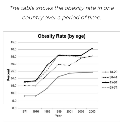
Band 6+: The table shows the obesity rate in one country over a period of time.

Image for topic: The table shows the obesity rate in one country over a period of time.
Our system will evaluate the answer based on this AI-generated description.
The image exhibits a line graph titled 'Obesity Rate (by age)' with years on the x-axis ranging from 1971 to 2005 and percent on the y-axis from 0 to 45. There are four labeled trend lines: 18-29, 30-44, 45-64, and 65-74. The 18-29 age group starts at approximately 5% in 1971, gradually increasing to 15% in 1988, then to 17.5% in 1999, and reaching just over 17.5% in 2005. The 30-44 age group begins around 12.5% in 1971, escalating to 25% in 1988, surging to just below 35% in 1999, and peaking around 37.5% in 2005. The 45-64 segment initiates at just below 15% in 1971, climbing to just below 30% in 1988, soaring to approximately 37.5% in 1999, and attaining nearly 40% in 2005. Lastly, the 65-74 cohort commences at roughly 12.5% in 1971, advances to just below 20% in 1988, amplifies to just over 20% in 1999, and culminates at 22.5% in 2005.
Given the complexity of the image, the above description may not be entirely accurate.
Note: Both the topic and the answer were created by one of our users.

The picture demonstrates the percentage of obesity in one country from 1971 to 2005. There is a general trend between 1975 and 1999; it can be seen that the proportion of people who suffered from obesity in all age groups steeply increased. Nevertheless, the proportion for those aged 18-29 was at the bottom.

It is noticeable that the figures for the 30-44 years and 45-64 years were almost the same. Between 1971 and 1976, their trend was at an equal level, around 17.0 percent. Then, the amount of obesity rate peaked at around 30.0 percent in 1968. Finally, from 1999 ad 2003, the figure of 30-44 and 46-64 age groups remained stable. However, by 2005, the percentage of 45-64 years noticed the upward trend by 5percent. Meanwhile, the figure of the Middle Ages did not change.

In contrast, the proportions for the 18-29 and 65-74 age groups showed a similar trend to the Middle Ages, but it was lower by 5-10 percent. The number of elderly people illustrated a fluctrating trend between 1999 and 2003. At the same time, the number of the young generation remained unchanged.

Word Count: 187

Answers On The Same Topic:

The table shows the obesity rate in one country over a period of time.

The line graph illustrates the obesity rate in one country between 1971 and 2005. Overall, the figure of obesity was fluctuated in 4 different groups. It’s clear the percentage of overweight 45 – 65 years was elevated while people who younger 29 was lower. The number of overweight people who younger 29 didn’t change between […]

The table shows the obesity rate in one country over a period of time.

The line graph illustrates the rate of overweight by age categories in a country from 1971 to 2005. Overall, it is seen that all age categories recorded an upward trend throughout the period. Regarding the 45-64 age bracket, it consistently experienced the highest prevalence of obesity across the 34 years, whereas the youngest category consistently […]

The table shows the obesity rate in one country over a period of time.

The line graph illustrates the percentage of the population classified as obese in a particular country from 1971 to 2005, categorized into four distinct age brackets. Overall, it is evident that obesity rates increased across all age groups over the 34-year period. Additionally, individuals aged 45 to 64 consistently experienced the highest prevalence of obesity, […]

The table shows the obesity rate in one country over a period of time.

The graph illustrates the percentage of those struggling with obesity in a country over nearly three decades. Overall, the trend remains positive, although some periods of stability were present in more recent years. It is noteworthy that younger people are less affected by such problem than older generations. The most drastic climb for all age […]

The table shows the obesity rate in one country over a period of time.

The table illustrate the obseity rate in one country from 1971 to 2005 in terms of their age groups. Units are measured in percentage. Overall, there has been an excessive increase in the percentage of people suffering from obesity over the past years. The highest number of obesity is found among 45-64 age group and […]

See All

Other Topics:

The table below shows the percentage of first year students who get "very good" rating to the resources provided by the college for three courses

The table provides information on the percentage of first-year students who rated various college resources as ‘very good’ across three distinct fields of study:Economics, Law, Commerce. The categories include pre course information, teaching, tutor, resources (print) and other resources. Overall, Commerce students were the most satisfied, givingthe highest results, conversely, law students lowest satistaction, particularly […]

The chart below shows the amount of energy consumed in three countries in the year 2000 and the rate of increase in energy consumption as compared with the year 1999. Summarise the information by selecting and reporting the main features, and make comparisons where relevant

The table illustrates different economic sectors in three countries in 2000 and the growth rate of energy consumption compared with the year 1999 Overall, the US took the lead in the energy consumption. But the fastest growth rate of energy use belonged to Japan Looking first at the industry field, the US kept the lion’share […]

The table below shows the results of a survey that asked 6800 scottish adults whether they had taken part in different cultural activties

The table chart given illustrates the outcome of an investigation about the rate of the participation of scottish adults (aged 16 years and over) to various cultural activities in that year. Overall; the biggest participation is by far in the performance based activities(dancing,singing,acting…) with a downright trend based on the ages.In the other hand the […]

The table compares the data of the work's large-scale and small-scale sea fishing industries.

The provided table compares various metrics between global company-owned large scale and artisanal small scale sea fishing industries. Overall, there are clear differences between large and small scale industries regarding financial funding, number of fishermen employed, fish caught for industrial reduction and other. In huge scale fishing industries that are company owned, they employ around […]

The tables below give information about the average number of Iphones ans Samsung phones sold each day in 5 countries during 2010 and 2020.

The provided tables illustrate the average figure of iPhone and Samsung mobile phones sold daily in 5 nations between 2010 and 2020 Overall, it is apparent that Bangladesh was the largest iPhone mobile users in the first period before Vietnam took it in last periode. Meanwhile, Bangladesh was tend to buy Samsung mobile product and […]

The table below compares data for the world's large-scale and small-scale sea fishing industries Summarise the information by selecting and reporting the main features, and make comparisions where relevant Write at least 150 words

The table illustrates data about the type of the world’s marine fishing industries, particularly focusing on statistics about large and small scale industries.Overall, it is clear that small-scale fishing provides far more employment than large-scale industrial companies. It should also be noted that large-scale industrial processing is carried out by large ships opposed to small […]

See All
We have detected unusual activity on your device.
Please verify your identity to continue.
Note: This verification step won't sign you in. If you have a premium account, please log in to access the service as usual.
Google/Gmail Verification
Or verify using Email/Code
We've sent a verification code to:
youremail@gmail.com (Not your email?)
Enter it below to complete the verification process.
Ensure your email address is correct, your inbox is not full, and you check your spam folder. If no email arrives, consider using an alternative email.
You will need a Premium plan to perform your action!
Note: If you already have a premium account, please log in to access our services as usual.

Plans & Pricing

Our mission is to make quality education accessible for everyone.
However, to keep our hardworking team running and this service alive, we genuinely need your support!
By opting for a premium plan, not only do you sustain us in achieving the mission, but you also unlock advanced features to enrich your learning experience.

Free

For learners who aren't pressed for time

What's included on Free
100+ Cambridge IELTS Tests
Instant IELTS Writing Task 1 & 2 Evaluation (2 times/month)
Instant IELTS Speaking Part 1, 2, & 3 Evaluation (2 times/month)
Instant IELTS Writing Task 1 & 2 Essay Generator (2 times/month)
500+ Dictation & Shadowing Exercises
100+ Pronunciation Exercises
Flashcards
Other Advanced Tools

Premium

For those serious about advancing their English proficiency, and for IELTS candidates aspiring to boost their band score by 1-2 points (especially in writing & speaking) in just 30 days or less

What's included on Premium
Save Your IELTS Test Progress & Analyze Mistakes By Question Type
Save Your Own Flashcard Sets & Use Them On Any Device
Unlock All Courses, IELTS Tests, Section & Part Practice
Unlimited AI Conversations
Unlimited AI Writing Enhancement Exercises
Unlimited IELTS Writing Task 1 & 2 Evaluation
Unlimited IELTS Speaking Part 1, 2, & 3 Evaluation
Checked Answers Will Not Be Published
Unlimited IELTS Writing Task 1 & 2 Essay Generator
Unlimited IELTS Speaking Part 1, 2, & 3 Sample Generator
Unlimited Usage Of Advanced Tools & AI Features
Priority Support within 24h (12-month plan only)

Due to the nature of our service and the provided free trials, payments are non-refundable.