🔥 Today Only: Save 30% on Premium — Offer Ends Soon! - Upgrade Now!
Table

Band 5+: The table shows the passenger and aircraft movements for last year at Singapore Changi Airport. Summarise the information by selecting and reporting the main features, and make comparisons where relevant.

Image for topic: The table shows the passenger and aircraft movements for last year at Singapore Changi Airport. Summarise the information by selecting and reporting the main features, and make comparisons where relevant.
Our system will evaluate the answer based on this AI-generated description.
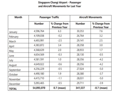
The image shows data for Singapore Changi Airport's passenger and aircraft movements over the last year by month: January passenger traffic 4,596,764 (6.3%), aircraft movements 30,353 (7.6%); February passenger traffic 4,109,038 (-0.2%), aircraft movements 26,764 (3.2%); March passenger traffic 4,493,991 (-2.5%), aircraft movements 29,141 (2.5%); April passenger traffic 4,383,872 (-3.7%), aircraft movements 28,419 (-3.7%); May passenger traffic 4,368,639 (2.0%), aircraft movements 28,933 (1.7%); June passenger traffic 4,654,569 (5.0%), aircraft movements 28,356 (-4.2%); July passenger traffic 4,581,591 (-0.8%), aircraft movements 28,542 (-0.6%); August passenger traffic 4,649,022 (-0.6%), aircraft movements 28,356 (-4.2%); September passenger traffic 4,256,229 (-3.5%), aircraft movements 27,836 (-8.7%); October passenger traffic 4,490,180 (1.9%), aircraft movements 28,380 (-5.0%); November passenger traffic 4,415,710 (0.3%), aircraft movements 29,651 (-3.9%); December passenger traffic 5,093,465 (0.5%), aircraft movements 29,711 (-5.9%); total passenger traffic 54,093,070 (0.7% mean), total aircraft movements 341,537 (-0.7% mean).
Given the complexity of the image, the above description may not be entirely accurate.
Note: Both the topic and the answer were created by one of our users.

The figure illustrates the passengers trafic and flights mouvments by number, monthes, and percentages of changes from the previous year in Changi Airport.

Overall, it can be seen that the passengers slightly fluctuated over the year and with a slight increase compared the last year, it reached a high numbers in winter’s monthes( November, and december, and January ), while the least number of passengers was in Febuary and September. Meanwhile, airplans mouvments vary also throughout the year. However, this number declined slightly from the last year, it peaked in January and reached a dip in Fabuary.

Beginning with the number of travlers where it witnessed a regular changes over the year, where the highest number was in winter, it started the year by over 4.5 millions passenger in January, then declined to reached the lowest point of the year in Febuary with 4.1 millions, after that increased to reach over 4.6 millions passenger in June, then declined to 4.4 in November, and peaked in December by more than 5 millions. The number of passengers increased by a mean of 0.7% compared to the last year.

On the other hand, the number of flights started the year with a peak of mor than 30 thousand flights, after that declined in Febuary, then increased and remained a steady level of more than 28 thousand from April, after that ancreased again in December. The number of flight witnessed a slight decline with a mean of 0.7% from the last year.

Word Count: 248

Answers On The Same Topic:

The table shows the passenger and aircraft movements for last year at Singapore Changi Airport. Summarise the information by selecting and reporting the main features, and make comparisons where relevant.

The table shows the number of passengers and aircraft movements at Singapore Changi Airport over a one-year period. Overall, it can be seen that passenger traffic increased on average, while aircraft movements experienced a small overall decline. In teams of passenger traffic, the number of passenger fluctuated over the year. January recorded about 4.5 million […]

The table shows the passenger and aircraft movements for last year at Singapore Changi Airport. Summarise the information by selecting and reporting the main features, and make comparisons where relevant.

The Plans represent the layout of a university’s sports centre now, and now it will look afmer development. It is clear that the university sports centre have Witnessed massive infrastructural development in the Present, while the map will mordenized compare to at present, in the mean time, Dance studio, cafe, studio, sports shap and leisure […]

The table shows the passenger and aircraft movements for last year at Singapore Changi Airport. Summarise the information by selecting and reporting the main features, and make comparisons where relevant.

This chart gives a lot of information. Not only number of aircraft movements but also about number of passengers.According to it in the beginning of year or if I say mor detailed January the percentage of passengers grew really high. Higher than it was last year.Also it’s the highest percentage among all the months.But in […]

The table shows the passenger and aircraft movements for last year at Singapore Changi Airport. Summarise the information by selecting and reporting the main features, and make comparisons where relevant.

The table provides information about monthly passenger traffic and aircraft movements at Singapore Changi Airport over the course of last year, together with the percentage change from the previous year. Overall, while the total number of passengers slightly increased, the reverse was true for aircraft movements. Passenger traffic peaked in December, whereas aircraft movements were […]

See All

Other Topics:

The charts below show the percentage of household income spent on different categories in 2000 and 2020 in a particular country. Summarize the information by selecting and reporting the main features, and make comparisons where relevant.

The chart provides information about the percantage of family income spent on various categories in 2000 and 2020 in a particular country. Overall, it was clear that the “Housing” had the biggest percentage than others in both of years. Another significant point is that the “Entertainment” had the smallest percentage in 2000 year. First of […]

The table below gives information about the average annual distance travelled by adults and the types of travel in 1997 and 2007

The table provides information about the average annual travelling distance that were done by adults and the variety of travel types between 1977 and 2007. Overall, in 1997, adult people mostly use cars to travel, while in 2007, the trend of driving cars increased fourfold. In 1997, a considerable amount of miles were travelled by […]

The table below given the information about the underground railway systems in 6 countries.

The table compares six underground railway networks based on their opening dates, total route lengths, and annual passenger figures. Overall, London has the oldest and most extensive underground system, while Tokyo serves the highest number of passengers per year. In contrast, the more recently established networks in Kyoto and Los Angeles are significantly smaller in […]

The table below shows information about the population of New Zealand from 2011 to 2012 by age group. Summarize the formation by selecting and reporting the main features and make comparisons where relevant.

The table illustrates data regarding the population of New Zealand across five distinct age brackets between 2011 and 2012. Overall, it is clear that New Zealand’s total population experienced a marginal increase during the one-year period. It is also noticeable that while the older demographics saw an upward trend, with the elderly group growing the […]

The graph below shows the percentage of people using the Internet in three countries from 2000 to 2020.

The table illustrates overall trend in the proportion of internet users in three countries over a twenty-year period from 2000 to 2020. Overall, it is immediately apparent that it experienced gradual increase in three parts of the world such as the USE, Canada, and Mexico throughout the entire period. In 2000, the number of people […]

The table below describes percentage of home schooled students in some country in199-2004. Write a report for a university lecturer describing the information shown.

The table illustrates changes in the proportion of home schooled pupils across five different categories in a particular nation between 1999 and 2004. In general, it is noticeable that different trends were observed in all the given years. While kindergarten was the most common grade group for the whole period, the opposite was true for […]

See All
We have detected unusual activity on your device.
Please verify your identity to continue.
Note: This verification step won't sign you in. If you have a premium account, please log in to access the service as usual.
Google/Gmail Verification
Or verify using Email/Code
We've sent a verification code to:
youremail@gmail.com (Not your email?)
Enter it below to complete the verification process.
Ensure your email address is correct, your inbox is not full, and you check your spam folder. If no email arrives, consider using an alternative email.
You will need a Premium plan to perform your action!
Note: If you already have a premium account, please log in to access our services as usual.

Plans & Pricing

Our mission is to make quality education accessible for everyone.
However, to keep our hardworking team running and this service alive, we genuinely need your support!
By opting for a premium plan, not only do you sustain us in achieving the mission, but you also unlock advanced features to enrich your learning experience.

Free

For learners who aren't pressed for time

What's included on Free
100+ Cambridge IELTS Tests
Instant IELTS Writing Task 1 & 2 Evaluation (2 times/month)
Instant IELTS Speaking Part 1, 2, & 3 Evaluation (5 times/month)
Instant IELTS Writing Task 1 & 2 Essay Generator (2 times/month)
500+ Dictation & Shadowing Exercises
100+ Pronunciation Exercises
Flashcards
Other Advanced Tools

Premium

For those serious about advancing their English proficiency, and for IELTS candidates aspiring to boost their band score by 1-2 points (especially in writing & speaking) in just 30 days or less

What's included on Premium
Save Your IELTS Test Progress
Unlock All Courses & IELTS Tests
Unlimited AI Conversations
Unlimited AI Writing Enhancement Exercises
Unlimited IELTS Writing Task 1 & 2 Evaluation
Unlimited IELTS Speaking Part 1, 2, & 3 Evaluation
Checked Answers Will Not Be Published
Unlimited IELTS Writing Task 1 & 2 Essay Generator
Unlimited IELTS Speaking Part 1, 2, & 3 Sample Generator
Unlimited Usage Of Advanced Tools
Priority Support within 24h (12-month plan only)

Due to the nature of our service and the provided free trials, payments are non-refundable.
Nếu bạn là người Việt Nam và không có hoặc không muốn trả bằng credit/debit cards, bạn có thể thanh toán bằng phương thức chuyển khoản:


Chọn gói:
419,000₫ 277,000 ₫ cho gói 1 tháng (chỉ 9,233₫/ngày)
1,239,000₫ 597,000 ₫ cho gói 3 tháng (chỉ 6,633₫/ngày)
2,469,000₫ 1,027,000 ₫ cho gói 6 tháng (chỉ 5,706₫/ngày)
4,929,000₫ 1,417,000 ₫ cho gói 12 tháng (chỉ 3,936₫/ngày)


Sau khi chuyển khoản, vui lòng đợi trình duyệt tự động điều hướng bạn trở lại Engnovate và bạn sẽ ngay lập tức nhận được mã kích hoạt tài khoản premium.
Nếu có lỗi xảy ra, bạn có thể liên hệ với team thông qua một trong các phương thức: email đến helloengnovate@gmail.com hoặc nhắn tin qua facebook.com/engnovate.
Vì toàn bộ công cụ trên website đều có thể sử dụng thử miễn phí, Engnovate không hỗ trợ hoàn tiền.