24 Hours Only: Get 39% OFF on Our Premium Plan - Check Out Now!
Bar Chart

Band 6+: This bar chart illustrates the number of students studying different subjects at university level over a five-year period.

Image for topic: This bar chart illustrates the number of students studying different subjects at university level over a five-year period.
Our system will evaluate the answer based on this AI-generated description.
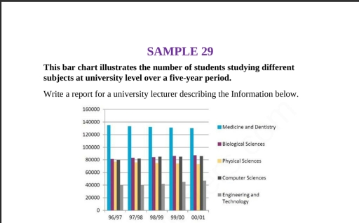
The image displays a bar chart of student numbers by subject across five academic years. 96/97: Medicine and Dentistry 135,000; Biological Sciences 82,000; Physical Sciences 80,000; Computer Sciences 82,000; Engineering and Technology 40,000. 97/98: Medicine and Dentistry 133,000; Biological Sciences 84,000; Physical Sciences 82,000; Computer Sciences 85,000; Engineering and Technology 41,000. 98/99: Medicine and Dentistry 132,000; Biological Sciences 86,000; Physical Sciences 84,000; Computer Sciences 87,000; Engineering and Technology 43,000. 99/00: Medicine and Dentistry 130,000; Biological Sciences 87,000; Physical Sciences 85,000; Computer Sciences 88,000; Engineering and Technology 44,000. 00/01: Medicine and Dentistry 129,000; Biological Sciences 88,000; Physical Sciences 86,000; Computer Sciences 89,000; Engineering and Technology 45,000.
Given the complexity of the image, the above description may not be entirely accurate.
Note: Both the topic and the answer were created by one of our users.

The chart below demonstrates the number of students attended different subjects in a university from 1996 to 2001.

Overall, medicine and dentistry were the most populated subject among students, while engineering and technology were experienced the lowest proportion of students.

In 96/97, 40000 students were studying engineering and technology. The rate for computer, physical, and biological sciences was almost the same, which was approximately 80000 in average. Regarding medicine and dentistry, this field accounted for around 135000 students. In the next year, a corresponding trend occurred in engineering and technology, on the other hand, there was a slight decrease in the rate of medicine and dentistry, physical sciences; however, other subjects saw an increase slightly.

From 1998 to 2001, medicine and dentistry had a gradual trend, in contrast, engineering and technology had a growth in the last three years. When it comes to the changes of computer sciences, it had a stable number of educators. About biological and physical sciences, they faced a rise and a decrease, respectively.

Word Count: 168

Answers On The Same Topic:

This bar chart illustrates the number of students studying different subjects at university level over a five-year period.

The bar chart below depicts the proportion of students studying different subject at university level between1996 and 2001. Overall, medicine and dentistry recorded the largest proportion of students; on the other hand, engineering and technology witnessed the lowest participation. Sectors belonging to subjects did not undergo considerable changes. It is evident that the number of […]

This bar chart illustrates the number of students studying different subjects at university level over a five-year period.

This bar graph represents the number of students studying different subjects at university level over a five year period .As we can see the subject are Medicine and dentistry,Biological science,physical science,computer science,Engineering and technology. It is clear that Most number of students have studied medicine and dentistry in the five year period .and the total […]

See All

Other Topics:

The bar chart details information about the proportion of households with various items—a telephone, microwave, CD player, mobile phone, home computer, clothes dryer, internet, and dishwasher—between 2001 and 2008.

The bar chart illustrates about percentage of British households that had several items in 2001 and 2008. Overall, Househods items are experienced with garadually increase, while, only telephone users is the highest in 2001. However, in 2008 several items undergone with sharply increase through the period. In addition, for the least figure is the internet […]

The bar chart below shows transport preference among young people in four countries in a single year.

Intro: Information regarding youth preferences of traveling methods is big depicted by the bar graph. The data has been calibneted in numbers. Overall: In general the maximum can be seen in Italy in case of car. On the other hand inverse can be seen also In Italy in case of motorcycle. It is worth noticing […]

The chart below shows the percentage of male and female teachers in six different types of education setting in the uk in 2010

The bar chart illustrates the percentage of male and female teachers in six variations types of learning setting in the United Kingdom in 2010. The chart was diffrents six types of educational: Nursery, Primary school, Secoundary school, Collage, Private training institude and University. Their are first there types of learning high teachers in women and […]

The chart below shows the internet users (in millions) in different countries in the Middle East as of June 2017.

The graph illustrates the internet users(in millions) in several countries in the Middle East as of June 2017 Overall, all of these countries( Iran, Saudi Arabia, Iraq, UAE,Yemen, Israel, Jordan,Syria,Lebonon) were using internet not enough for their population. This mean these countries’ internet users constitute approximetly 30 or 40 percent of their population in 2017. […]

The chart below gives information about active video games players by country in 2012. Summarise the information by selecting and reporting the main features, and make comparisons where relevant. Write at least 150 words.

The charts shows proportions about of the number of active video games players by country in the year 2012. Overall, US players were the bigger part, and the gap between their percentage and the other countries players percentages was very wide. In the year 2012 the percentage of active players in US was 85 percent, […]

The chart below gives information about active video games players by country in 2012. Summarise the information by selecting and reporting the main features, and make comparisons where relevant. Write at least 150 words.

The recent graphic shows the data about the active video games players in differents countries around the world in 2012. Here, we can say that the country with the most number of players in 2012 was United States with 85 players, meanwhile the country with the least number of players in 2012 was Spain with […]

See All
We have detected unusual activity on your device.
Please verify your identity to continue.
Note: This verification step won't sign you in. If you have a premium account, please log in to access the service as usual.
Google/Gmail Verification
Or verify using Email/Code
We've sent a verification code to:
youremail@gmail.com (Not your email?)
Enter it below to complete the verification process.
Ensure your email address is correct, your inbox is not full, and you check your spam folder. If no email arrives, consider using an alternative email.
You will need a Premium plan to perform your action!
Note: If you already have a premium account, please log in to access our services as usual.

Plans & Pricing

Our mission is to make quality education accessible and free for everyone.
However, to keep our hardworking team running and this service alive, we genuinely need your support!
By opting for a premium plan, not only do you sustain us in achieving the mission, but you also unlock advanced features to enrich your learning experience.

Free

For learners who aren't pressed for time

What's included on Free
1000+ IELTS Tests & Samples
Instant IELTS Writing Task 1 & 2 Evaluation (2 times/month)
Instant IELTS Speaking Part 1, 2, & 3 Evaluation (5 times/month)
Instant IELTS Writing Task 1 & 2 Essay Generator (2 times/month)
500+ Dictation & Shadowing Exercises
100+ Pronunciation Exercises
Flashcards
Other Advanced Tools

Premium

For those serious about advancing their English proficiency, and for IELTS candidates aspiring to boost their band score by 1-2 points (especially in writing & speaking) in just 30 days or less

What's included on Premium
Save Your IELTS Test Progress
Unlock All Courses & Content
Unlimited AI Conversations
Unlimited AI Writing Enhancement Exercises
Unlimited IELTS Writing Task 1 & 2 Evaluation
Unlimited IELTS Speaking Part 1, 2, & 3 Evaluation
Checked Answers Will Not Be Published
Unlimited IELTS Writing Task 1 & 2 Essay Generator
Unlimited IELTS Speaking Part 1, 2, & 3 Sample Generator
Unlimited Usage Of Advanced Tools

Due to the nature of our service and the provided free trials, payments are non-refundable.
Nếu bạn là người Việt Nam và không có hoặc không muốn trả bằng credit/debit cards, bạn có thể thanh toán bằng phương thức chuyển khoản:


Chọn gói:
279,000₫ 157,000 ₫ cho gói 1 tháng (chỉ 5,233₫/ngày)
819,000₫ 397,000 ₫ cho gói 3 tháng (chỉ 4,411₫/ngày)
1,649,000₫ 667,000 ₫ cho gói 6 tháng (chỉ 3,706₫/ngày)
3,299,000₫ 857,000 ₫ cho gói 12 tháng (chỉ 2,381₫/ngày)


Sau khi chuyển khoản, vui lòng đợi trình duyệt tự động điều hướng bạn trở lại Engnovate và bạn sẽ ngay lập tức nhận được mã kích hoạt tài khoản premium.
Nếu có lỗi xảy ra, bạn có thể liên hệ với team thông qua một trong các phương thức: email đến helloengnovate@gmail.com hoặc nhắn tin qua facebook.com/engnovate.
Vì toàn bộ công cụ trên website đều có thể sử dụng thử miễn phí, Engnovate không hỗ trợ hoàn tiền.