🔥 Today Only: Save 30% on Premium — Offer Ends Soon! - Upgrade Now!
Bar Chart

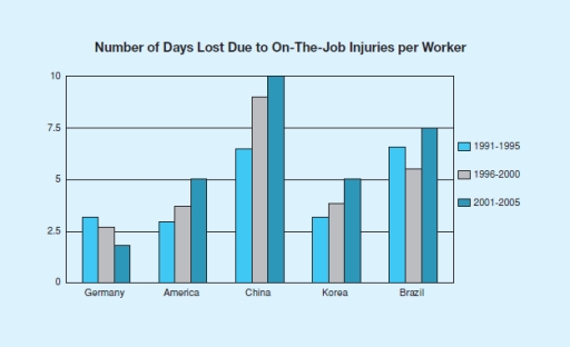
Band 7+: This bar graph shows the number of days lost due to injury per worker for three countries. There are three time periods shown beginning with the year 1991 and ending in 2005. Write a report for a university lecturer describing the information. You should write at least 150 words.

Image for topic: This bar graph shows the number of days lost due to injury per worker for three countries. There are three time periods shown beginning with the year 1991 and ending in 2005. Write a report for a university lecturer describing the information. You should write at least 150 words.
Our system will evaluate the answer based on this AI-generated description.
The image is a bar graph representing the number of days lost due to on-the-job injuries per worker across five countries over three-time periods. In Germany, 1991-1995 shows 2.5 days, 1996-2000 shows 5 days, and 2001-2005 shows 3.75 days. In America, 1991-1995 shows 5 days, 1996-2000 shows 7.5 days, and 2001-2005 shows 5.75 days. In China, 1991-1995 shows 7.5 days, 1996-2000 shows 10 days, and 2001-2005 shows 6.25 days. In Korea, 1991-1995 shows 10 days, 1996-2000 shows 2.5 days, and 2001-2005 shows 5 days. In Brazil, 1991-1995 shows 5 days, 1996-2000 shows 3.75 days, and 2001-2005 shows 2.5 days. The x-axis lists the countries Germany, America, China, Korea, and Brazil, and the y-axis measures the number of days from 0 to 10 in increments of 2.5. There are three sets of bars for each country, each representing a different time period with the key indicating light blue for 1991-1995, dark blue for 1996-2000, and medium blue for 2001-2005.
Given the complexity of the image, the above description may not be entirely accurate.
Note: Both the topic and the answer were created by one of our users.

The bar chart illustrates the working days missed because of job injuries per employee in four different European countries from 1991 to 2005 divided into three time periods. Overall, the figures for China were dominant compared to the countries.The opposite is true for Germany. In addition, the number of days lost in America, China, Brazil and Korea increased, whereas Germany saw a decrease over the period of time.

Looking at the categories which increased in all three time periods, in 1991, the number of non-working days in China started at 6 days per worker, while the numbers were around 3 days in America and Korea. From 1996 to 2000, they rose to 8.5, 3.5, and 3.5 days, respectively. Over the next five years, the working days missed because of job injuries in China rose to the peak of about 10 days, while both figures for days lost in America and Korea grew to 5.

Turning to the decreasing category, in 1991, the number of non-working days in Germany was 3 days, then it decreased to 2.5 in the next five years, before dropping to the lowest point at 2 days from 2001 to 2005. Regarding the other category, the figures for days lost in Brazil started at 7 days, then it fell to 6 days before bouncing back to 7.5 days in the last five years mentioned.

Word Count: 227

Answers On The Same Topic:

This bar graph shows the number of days lost due to injury per worker for three countries. There are three time periods shown beginning with the year 1991 and ending in 2005. Write a report for a university lecturer describing the information. You should write at least 150 words.

The bar graph illustrates the three times periods shown beginning with the year 1991 and ending in 2005. China show the most amount of days since year 2001 till 2005. Germany show the lowest level among all of the countries. We can see the drop, unstabillity, grow. also, it is noticeable that before workers were […]

This bar graph shows the number of days lost due to injury per worker for three countries. There are three time periods shown beginning with the year 1991 and ending in 2005. Write a report for a university lecturer describing the information. You should write at least 150 words.

The bar chart illustrates the lost days causes by worker’s injuries in five particular countries. Along with the numbers of days lost are three periods of year starting from 1991 to 2005. From a quick glance at the chart, the numbers of days lost in the given countries increased in each five-year period, except for […]

This bar graph shows the number of days lost due to injury per worker for three countries. There are three time periods shown beginning with the year 1991 and ending in 2005. Write a report for a university lecturer describing the information. You should write at least 150 words.

The bar chart illustrates the working days missed because of job injuries per employee in four different European countries from 1991 to 2005 divided into three time periods. Overall, the figures for China were dominant compared to the countries.The opposite is true for Germany. In addition, the number of days lost in America, China, Brazil […]

This bar graph shows the number of days lost due to injury per worker for three countries. There are three time periods shown beginning with the year 1991 and ending in 2005. Write a report for a university lecturer describing the information. You should write at least 150 words.

The chart illustrates the number of day-offs due to injury per worker in Germany, America, China, Korea, and Brazil. The data is divided to three periods of time, from 1991 to 1995, continued with 1996 to 2000, and followed by 2001 to 2005. Overall, China had the highest number of days lost, while Germany had […]

See All

Other Topics:

The bar chart below provides information about energy generation from fossil fuels, nuclear and renewables in 2024. Summarise the information by selecting and reporting the main features, and make comparisons where relevant.

The graph shows sources of electricity generation in the year 2024 by different countries which are represented on the Y-axis while on the X-axis we have the % production of electricity. Africa has the highest presentation of fossil fuels represented at 75% while south America has the least percentage at 22 %. Asia comes second […]

The bar chart below shows the percentage of New Zealander men and women who did regular physical activity in 2010 across different age groups. Summarise the information by selecting and reporting the main features, and make comparisons where relevant.

The bar chart demonstrates a comparison of New Zealander individuals who were regularly active across age groups for 2010. Overall, males showed a downward trend in activity level from age range 34 to 63, Whereas females revealed an upward trend across the same ages. In 2010, figures for men and women in 64-and-over age group […]

The graph below shows the information on waste disposal in a European country from 2005 to 2008. Summarise the information making comparisons where relevant.

The bar chart compares the amounts of waste disposed of by landfill, burning and sea dumping in a European country in 2005, 2006 and 2008, measured in million tonnes. Overall, landfill use declined substantially over the period, whereas the quantity of waste dumped at sea rose steadily and became the dominant disposal method by 2008. […]

The chart below shows the percentage of people born in and outside of Australia living in cities, towns, and rural areas in 1950 and 2010. Summarise the information by selecting and reporting the main features of the graph and make comparisons where relevant.

The charts illustrate the propotion of individuals born inside and outside of Australia living in cities, towns and rural areas in 1950 and 2010. Overall, the percentage of people who live in cities was higher than the other people who live in towns and rural areas in both years especially the people who born outside […]

The graph below shows the three different kinds of sources (oil/coal/gas) of greenhouse gas in the UK. Summarise the information by selecting and reporting the main features and make comparisons where relevant.

The bar chart compares the carbon emissions produced by three fossil fuels over two decades. Overall, the only one that has faced a surge is gas, while the other two pummeted. The coal turned from being the major cause of emission to the less relevant among the three fuels. Gas is the only that rose […]

The chart below shows the percentage of UK households with selected consumer durables between 1998 and 2005. Summarise the information by selecting and reporting the main features and make comparisons where relevant.

The bar chart illustrates the proportion of chosen consumer durable with the UK households from 1998 to 2005. Overall, selection of durable goods rose over the years in all categories. Telephone was still the most popular among all categories in both years. Of particular note, internet connection, a durable with the most pronounced growth, and […]

See All
We have detected unusual activity on your device.
Please verify your identity to continue.
Note: This verification step won't sign you in. If you have a premium account, please log in to access the service as usual.
Google/Gmail Verification
Or verify using Email/Code
We've sent a verification code to:
youremail@gmail.com (Not your email?)
Enter it below to complete the verification process.
Ensure your email address is correct, your inbox is not full, and you check your spam folder. If no email arrives, consider using an alternative email.
You will need a Premium plan to perform your action!
Note: If you already have a premium account, please log in to access our services as usual.

Plans & Pricing

Our mission is to make quality education accessible for everyone.
However, to keep our hardworking team running and this service alive, we genuinely need your support!
By opting for a premium plan, not only do you sustain us in achieving the mission, but you also unlock advanced features to enrich your learning experience.

Free

For learners who aren't pressed for time

What's included on Free
100+ Cambridge IELTS Tests
Instant IELTS Writing Task 1 & 2 Evaluation (2 times/month)
Instant IELTS Speaking Part 1, 2, & 3 Evaluation (2 times/month)
Instant IELTS Writing Task 1 & 2 Essay Generator (2 times/month)
500+ Dictation & Shadowing Exercises
100+ Pronunciation Exercises
Flashcards
Other Advanced Tools

Premium

For those serious about advancing their English proficiency, and for IELTS candidates aspiring to boost their band score by 1-2 points (especially in writing & speaking) in just 30 days or less

What's included on Premium
Save Your IELTS Test Progress & Analyze Mistakes By Question Type
Save Your Own Flashcard Sets & Use Them On Any Device
Unlock All Courses, IELTS Tests, Section & Part Practice
Unlimited AI Conversations
Unlimited AI Writing Enhancement Exercises
Unlimited IELTS Writing Task 1 & 2 Evaluation
Unlimited IELTS Speaking Part 1, 2, & 3 Evaluation
Checked Answers Will Not Be Published
Unlimited IELTS Writing Task 1 & 2 Essay Generator
Unlimited IELTS Speaking Part 1, 2, & 3 Sample Generator
Unlimited Usage Of Advanced Tools & AI Features
Priority Support within 24h (12-month plan only)

Due to the nature of our service and the provided free trials, payments are non-refundable.